-
维度灾难((curse\,of\,dimensionality))
- 随着维度(例如特征或自由度)的增多,问题的复杂性(或计算代价)呈指数级增长的现象
-
1961年美国数学家(Richard\,Bellman)在研究动态规划时首次提出
-
很多问题困难的根本来源,例如经典或量子多体问题,基于第一性原理的药物和材料设计、蛋白质折叠、湍流、塑性和非牛顿流体
(d)维空间半径为(r)的球体体积公式
-
高维空间中,球体内部的体积与表面积处的体积相比可以忽略不计
-
(d)维空间样本(x_1)和(x_2)的欧式距离为:(d(x_1,x_2)=sqrt{sum^d_{i=1}(x_{1i}-x_{2i})})
-
随着维数的增加,单个维度对距离的影响越来越小,任意样本间的距离趋于相同
-
在高维空间里,(欧式)距离不是那么有效
-
过度拟合((overfitting)):模型对已知数据拟合较好,新的数据拟合较差
-
高维空间中样本变得极度稀疏,容易会造成过度拟合问题
-
随着维数的增加,计算复杂度指数增长
-
只能近似求解,得到局部最优解而非全局最优解
-
例子:决策树
-
选择切分点对空间进行划分
-
每个特征值(m)个取值,侯选划分数量(m^d)(维度灾难!)
计算复杂度:朴素贝叶斯
- (X={X_1,X_2,...,X_d})是(d)维随机向量,类标签(Yin{1,2,...,c})
- 利用贝叶斯定理进行预测
- 似然函数(p(X|Y=k)=p(X_1,X_2,...,X_d|Y=k))的估计
- 假设每个特征取值数量为(m),(X)取值数量(m^d)(m^d)(维度灾难!)
- 解决办法:条件独立性假设
- 机器学习的应用:在能够获得较好的拟合效果前提下,尽量使用较为简单的模型
- 特征选择((feature\,selection)):选取特征子集
- 降维((dimensionality\,reduction)):使用一定变换,将高维数据转换为低维数据,(PCA),流行学习,(t-SNE)等
应对维度灾难:核技巧
-
支持向量机(L(w)=frac{1}{2}||w||^2_2+Csum^n_{i=1}max(0,1-y_i(w^Tx_i+b)))
-
对偶问题:(max_alphasum^n_{i=1}alpha_i-frac{1}{2}sum^N_{i=1}sum^N_{j=1}[alpha_iy_i(X_i)^T(X_j)y_jalpha_j])
(s.t.\,\,sum^N_{i=1}alpha_iy_i=0,\,\,0lealpha_ile C)
-
核技巧:核函数(K(x_i,x_j)=phi(x_i)cdotphi(x_j))代替內积(x_icdot x_j)
-
好处:利用了高维的好处,避免了高维的计算量
-
更多应用:核(PCA)、核逻辑回归等
案例:
假设维度为 (d),球体的半径为 (r) ,则高维球体的体积为 $ V(d,r) = frac{pi{d/2}}{Gamma(d/2+1)}rd$。
import numpy as np
import math

from scipy.special import gamma


def V(d, r):
    return math.pi ** (d / 2) * (r ** d) / gamma(d / 2 + 1)


print(V(3, 1))
import pandas as pd

df = pd.DataFrame()

df["d"] = np.arange(1, 20)
df["V"] = V(df["d"], 1)
df.round(9)
import matplotlib.pyplot as plt

%matplotlib inline
fig, ax = plt.subplots(figsize=(12, 6))  # 设置图片大小
ds = np.arange(1, 50)
plt.plot(ds, V(ds, 1), color="#E4007F", marker="o")
plt.xlabel("维度$d$")
plt.ylabel("单位球体积$V_d$")
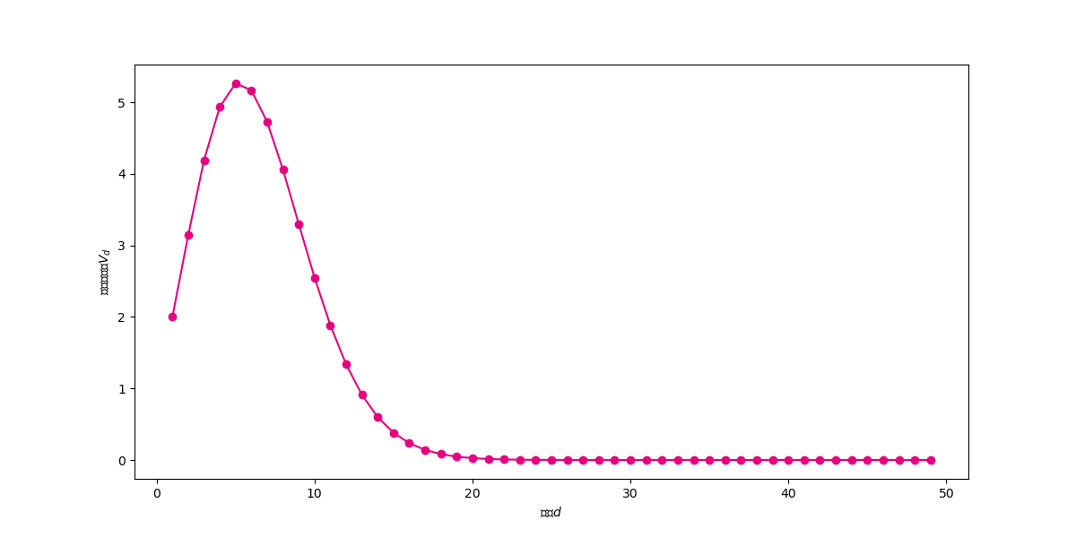
观察上图可以发现,单位球体积先随着维度增大而增大(维度小于5),然后随着维度的增大不断体积不断减小,不断向0靠近。
import numpy as np
import math
from scipy.special import gamma


def V(d, r):
    return math.pi ** (d / 2) * (r ** d) / gamma(d / 2 + 1)


import pandas as pd

df = pd.DataFrame()
df["d"] = np.arange(1,20)
df["V"] = V(df["d"],1)
df.round(9)

def ratio(d):
    return (V(d, 1) - V(d, 0.9)) / V(d, 1)


df["ratio90"] = 1 - 0.9 ** (df.d)
df.round(6).head(20)
import matplotlib.pyplot as plt

# %matplotlib inline
fig, ax = plt.subplots(figsize=(12, 6))  # 设置图片大小
ds = np.arange(1, 50)
plt.plot(ds, ratio(ds), color="#E4007F", marker="o")
plt.xlabel("维度$d$")
plt.ylabel("0.1边界体积占比")
plt.show()
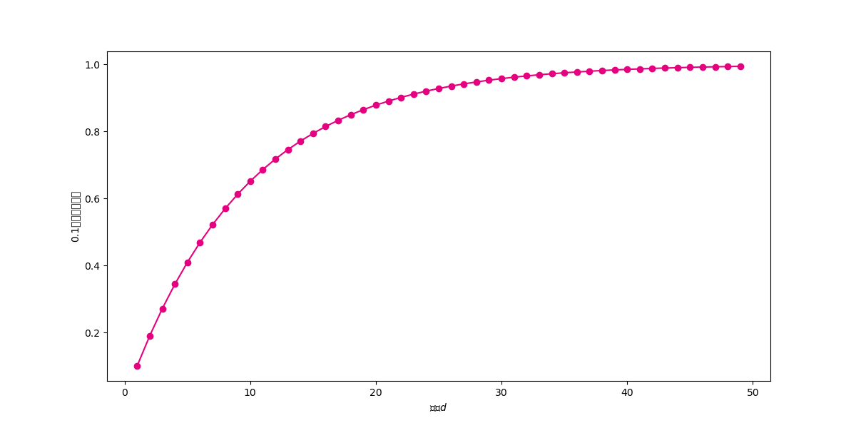
在高维空间中,距离度量失效,样本之间的最大距离和最小距离的差距不断减小。也即样本之间的欧式距离差别不大。首先看看欧式距离的计算公式:
假设数据表示为 (n imes d) 矩阵 X,实现函数 data_euclidean_dist 计算两两样本之间的欧式距离,返回对称的 (n imes n) 距离矩阵。
def data_euclidean_dist(x):
    sum_x = np.sum(np.square(x), 1)
    dist = np.add(np.add(-2 * np.dot(x, x.T), sum_x).T, sum_x)
    return dist
x = np.array([[0, 1, 3], [3, 8, 9], [2, 3, 5]])
dist_matrix = data_euclidean_dist(x)
dist_matrix
mask = np.ones(dist_matrix.shape, dtype=bool)
np.fill_diagonal(mask, 0)
dist_matrix[mask].min()
min_max = (dist_matrix.max() - dist_matrix.min())/dist_matrix.max()
min_max
# 生成一个包含5000个样本500个维度的数据集。每一个维度都是从[-1,1]之间随机生成。
X = np.random.uniform(-1,1,(5000,500))
X
X.shape
# 下面我们来观察,随着维度的增大,样本之间欧式距离最大值和最小值之间的差距的变化趋势。注意最大值和最小值应该去掉对角线的元素。
min_max_list = []
for d in range(1,500):
    dist_matrix = data_euclidean_dist(X[:,:d])
    mask = np.ones(dist_matrix.shape, dtype=bool)
    np.fill_diagonal(mask, 0)
    min_max = (dist_matrix[mask].max() - dist_matrix[mask].min())/dist_matrix[mask].max()
    if d%10 == 0:
        print(d,min_max.round(3))
    min_max_list.append(min_max)
import matplotlib.pyplot as plt

fig, ax = plt.subplots(figsize=(16, 4)) #设置图片大小
ds = np.arange(0,len(min_max_list))
plt.plot(ds,min_max_list,color="#E4007F")
plt.xlabel("维度$d$")
plt.ylabel("最大-最小距离差距")
plt.show()
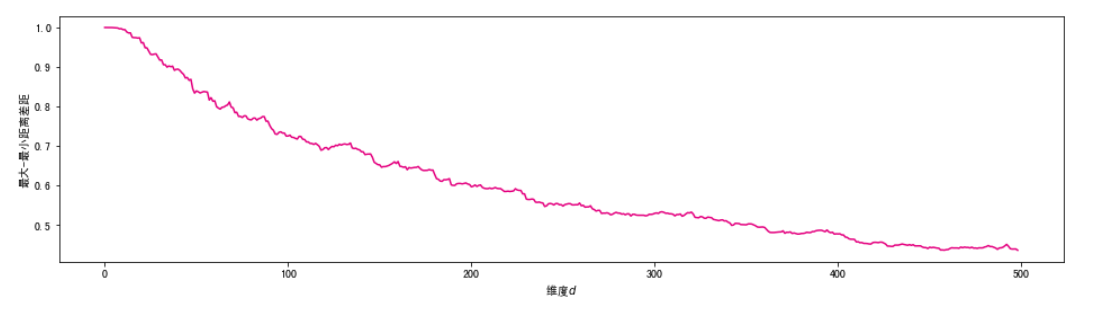
可见,随着维度的不断增大,样本之间的欧式距离趋向相同,距离的度量将不再有效。这会影响一系列基于距离的机器学习算法的有效性,包括K近邻,K-Means聚类,支持向量机等。
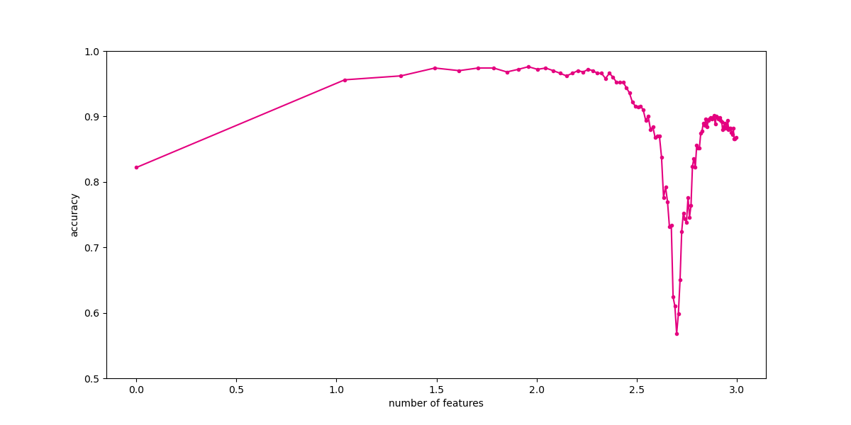
1979 年 G.V. Trunk 发表了论文 a very clear and simple example of the peaking phenomenon。这篇论文被多次引用用来解释和说明在分类模型中的 Hughes 现象:随着维数的增加,分类器的效果会先上升后下降。
下面我们通过 Trunk 中的方法来理解 Hughes 现象。首先,需要生成随机数据集。数据集样本有两个类别,按照如下方法不断生成特征:
-
- 每一个特征 (i) 的方差均为 1
-
- 对于特征 (i),正类样本的均值为 ((frac{1}{i})^{frac{1}{2}}),负类样本的均值为 (-(frac{1}{i})^{frac{1}{2}})。
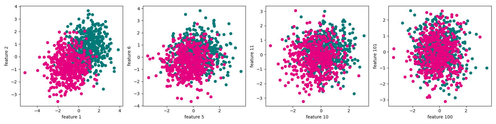
从上述生成过程可以看到,随着特征的增多,两类数据的可区分性越来越小。
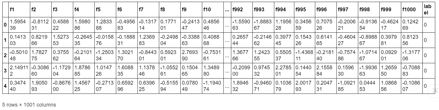
首先,生成 Trunk 数据集。
import pandas as pd
import numpy as np

max_features, num_samples = 1000, 500  # 最大特征数量和样本数量
X_pos = pd.DataFrame()
X_neg = pd.DataFrame()

for i in range(max_features):
    X_pos["f" + str(i + 1)] = np.random.randn(num_samples) + np.sqrt(1 / (i + 1))  # 生成当前特征的正类样本
    X_neg["f" + str(i + 1)] = np.random.randn(num_samples) - np.sqrt(1 / (i + 1))  # 生成当前特征的负类样本

X_pos["label"], X_neg["label"] = 0, 1  # 添加标签
trunk_data = pd.concat([X_pos, X_neg], axis=0)  # 合并正类和负类样本
trunk_data.head()
import matplotlib.pyplot as plt
# %matplotlib inline
features = [1,5,10,100]
fig, ax = plt.subplots(figsize=(16, 4)) #设置图片大小

for i in range(len(features)):
    plt.subplot(1,4,i+1)
    plt.scatter(trunk_data[trunk_data.label == 0]["f" + str(features[i])], trunk_data[trunk_data.label == 0]["f" + str(features[i]+1)], color="#007979")
    plt.scatter(trunk_data[trunk_data.label == 1]["f" + str(features[i])], trunk_data[trunk_data.label == 1]["f" + str(features[i]+1)],color="#E4007F")
    plt.xlabel("feature " + str(features[i]))
    plt.ylabel("feature " + str(features[i]+1))
plt.tight_layout()
plt.show()
# 下面,我们不断增加特征数量,观察分类性能随着维数的变化。
from sklearn.model_selection import train_test_split
X_train,X_test,y_train,y_test = train_test_split(trunk_data.iloc[:,:-1],trunk_data["label"],test_size=0.5)#训练集和测试集划分
from sklearn.discriminant_analysis import LinearDiscriminantAnalysis
num_features = np.arange(1,max_features,10)
exp_times = 10 #试验次数
test_result = np.zeros(len(num_features))
train_result = np.zeros(len(num_features))
for t in range(exp_times): #运行多次试验
    scores_train = [] #记录训练集正确率
    scores_test = [] #记录测试集正确率
    for num_feature in num_features:  #使用不同特征数量
        clf = LinearDiscriminantAnalysis()
        clf.fit(X_train.iloc[:,:num_feature],y_train)
        score_train = clf.score(X_train.iloc[:,:num_feature],y_train)
        score_test = clf.score(X_test.iloc[:,:num_feature],y_test)
        scores_train.append(score_train)
        scores_test.append(score_test)
    train_result += np.array(scores_train)
    test_result += np.array(scores_test)
    print(t)
test_result /= exp_times
train_result /= exp_times
fig, ax = plt.subplots(figsize=(12, 6))
ax.plot(np.log10(num_features),test_result,color="#E4007F",marker=".")
plt.ylim(0.5,1)
plt.xlabel("number of features")
plt.ylabel("accuracy")
plt.show()
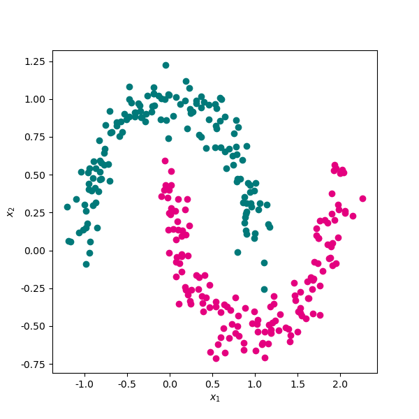
# 生成一份月牙形随机线性不可分随机数据集。
import pandas as pd
from sklearn import datasets
sample,target = datasets.make_moons(n_samples=300,shuffle=True,noise=0.1,random_state=0)
data = pd.DataFrame(data=sample,columns=["x1","x2"])
data["label"] = target
# 将两类数据使用散点图进行可视化。
import matplotlib.pyplot as plt
plt.rcParams['axes.unicode_minus']=False  # 用来正常显示负号
fig, ax = plt.subplots(figsize=(6, 6)) #设置图片大小
ax.scatter(data[data.label==0]["x1"],data[data.label==0]["x2"],color="#007979")
ax.scatter(data[data.label==1]["x1"],data[data.label==1]["x2"],color="#E4007F")
plt.xlabel("$x_1$")
plt.ylabel("$x_2$")
plt.show()
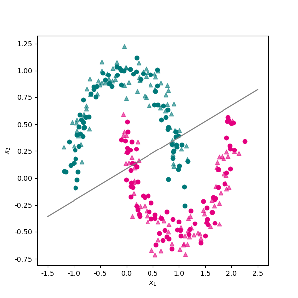
from sklearn.model_selection import train_test_split
X_train,X_test,y_train,y_test = train_test_split(data[["x1","x2"]],data.label,test_size=0.5)
from sklearn.svm import LinearSVC
svm_linear = LinearSVC()
svm_linear.fit(X_train,y_train)
svm_linear.score(X_test,y_test)
svm_linear.coef_
svm_linear.intercept_
# 将线性分类器的决策直线绘制出来。
fig, ax = plt.subplots(figsize=(6, 6)) #设置图片大小
ax.scatter(X_train[y_train==0]["x1"],X_train[y_train==0]["x2"],color="#007979")
ax.scatter(X_train[y_train==1]["x1"],X_train[y_train==1]["x2"],color="#E4007F")
ax.scatter(X_test[y_test==0]["x1"],X_test[y_test==0]["x2"],color="#007979",marker="^",alpha=0.6)
ax.scatter(X_test[y_test==1]["x1"],X_test[y_test==1]["x2"],color="#E4007F",marker="^",alpha=0.6)
x1 = np.linspace(-1.5,2.5,50)
x2 = - x1*svm_linear.coef_[0][0]/svm_linear.coef_[0][1] - svm_linear.intercept_[0]/svm_linear.coef_[0][1]
ax.plot(x1,x2,color="gray")
plt.xlabel("$x_1$")
plt.ylabel("$x_2$")
plt.show()
from sklearn.svm import SVC
svm_rbf = SVC(kernel='rbf')
svm_rbf.fit(X_train,y_train)
svm_rbf.score(X_test,y_test)
# 可以看到,使用核函数映射到高维空间后,非线性分类问题得到更好地解决。在测试集上的分类正确率上升到 95% 以上。 下面我们来看下使用核函数的支持向量机的决策面。
# 下面是两个绘制分类决策面的辅助函数,代码来源于Sklearn官网示例。
def plot_contours(ax, clf, xx, yy, **params):
    Z = clf.predict(np.c_[xx.ravel(), yy.ravel()])
    Z = Z.reshape(xx.shape)
    out = ax.contourf(xx, yy, Z, **params)
    return out
def make_meshgrid(x, y, h=.02):
    x_min, x_max = x.min() - 1, x.max() + 1
    y_min, y_max = y.min() - 1, y.max() + 1
    xx, yy = np.meshgrid(np.arange(x_min, x_max, h),np.arange(y_min, y_max, h))
    return xx, yy
# 将决策平面绘制出来。
xx, yy = make_meshgrid(X_train["x1"], X_train["x2"])

fig, ax = plt.subplots(figsize=(6, 6)) #设置图片大小
ax.scatter(X_train[y_train==0]["x1"],X_train[y_train==0]["x2"],color="#007979")
ax.scatter(X_train[y_train==1]["x1"],X_train[y_train==1]["x2"],color="#E4007F")
ax.scatter(X_test[y_test==0]["x1"],X_test[y_test==0]["x2"],color="#007979",marker="^",alpha=0.6)
ax.scatter(X_test[y_test==1]["x1"],X_test[y_test==1]["x2"],color="#E4007F",marker="^",alpha=0.6)

plot_contours(ax, svm_rbf, xx, yy, cmap=plt.cm.coolwarm, alpha=0.5)

plt.xlabel("$x_1$")
plt.ylabel("$x_2$")
plt.show()
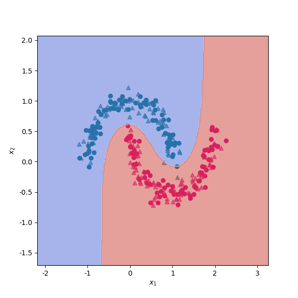
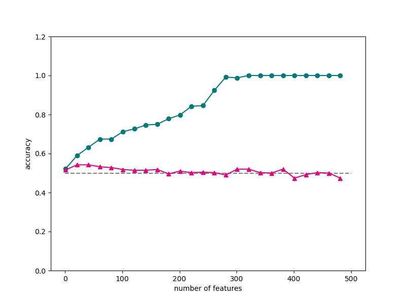
从上一小节的分析我们看到,支持向量机使用核函数,帮助我们解决了低维空间线性不可分的问题。维度的增加也可能给我们带来一系列问题,使得我们在训练集上的训练误差不断减小,造成模型效果不断提升的错觉。实际上,模型只是在不断尝试拟合训练数据中的误差而已,在测试机上的效果会很差。这种问题也称为过度拟合。
下面来看一个比较极端的例子。我们随机生成一份满足标准正态分布的数据集,包含 1000 个样本,500 个特征。类别标签是从 0 和 1 中随机生成的。然后我们将数据集以 1:1 划分为训练集和测试集。
X = np.random.randn(1000,500) #生成满足标准正太分布的特征
y = np.random.randint(0,2,1000) #生成标签
X_train,X_test,y_train,y_test = train_test_split(X,y,test_size=0.5)#训练集和测试集划分
from sklearn.svm import LinearSVC
num_features = np.arange(1,X.shape[1],20)
scores_train = [] #记录训练集正确率
scores_test = [] #记录测试集正确率
for num_feature in num_features:
    linear_svm = LinearSVC() #新建线性支持向量机
    linear_svm.fit(X_train[:,:num_feature],y_train)
    score_train = linear_svm.score(X_train[:,:num_feature],y_train)
    score_test = linear_svm.score(X_test[:,:num_feature],y_test)
    scores_train.append(score_train)
    scores_test.append(score_test)
    print(num_feature,score_train,score_test)
# 将训练集和测试集的分类正确率随着维数的变化使用折线图进行可视化。
fig, ax = plt.subplots(figsize=(8, 6)) #设置图片大小
ax.plot(num_features,scores_train,color="#007979",marker="o")
ax.plot(num_features,scores_test,color="#E4007F",marker="^")
ax.hlines(0.5,0,500,color="gray",linestyles="--")
plt.ylim(0,1.2)
plt.xlabel("number of features")
plt.ylabel("accuracy")
plt.show()
通过一些数据集和案例展示了机器学习中的维度灾难问题。