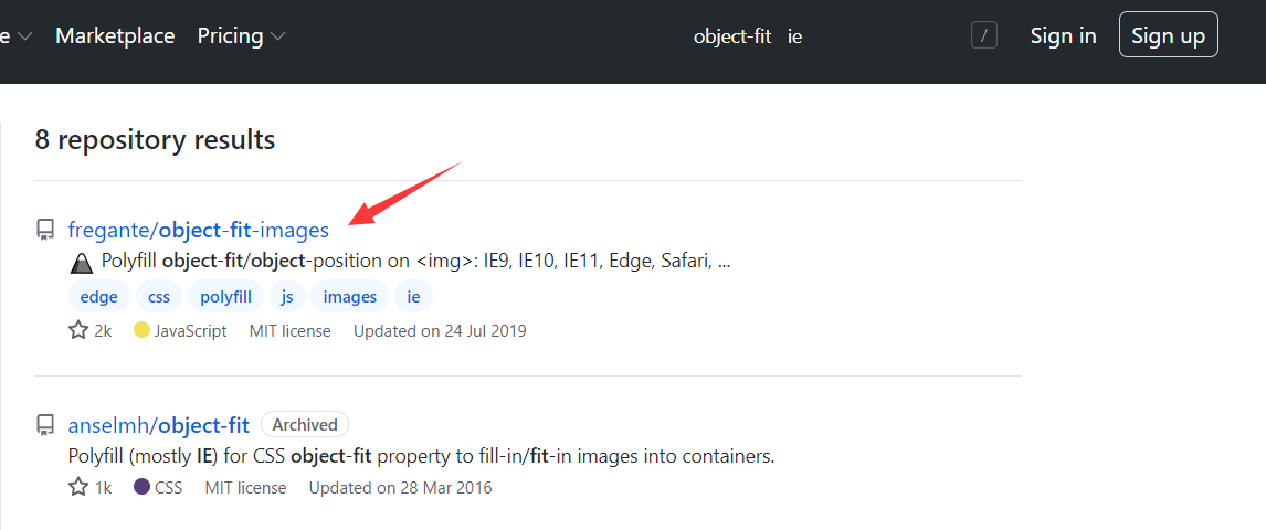
通过 github 搜索 object-fit ie , 借鉴大佬兼容 ie 的经验。
下载解压到文件夹 , 打开测试目录 , 查看 demo

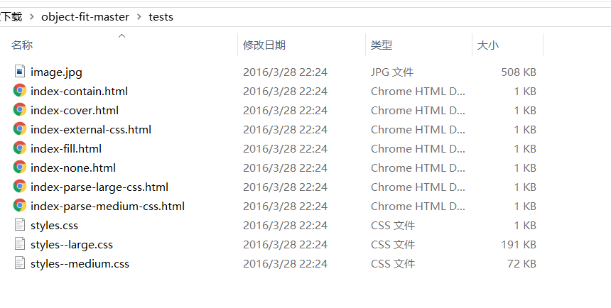
使用 ie 打开demo , 查看显示效果 :

代码 :
<!DOCTYPE HTML>
<html>
<head>
    <meta charset="utf-8">
    <link rel="stylesheet" href="styles.css">
    <link rel="stylesheet" href="../dist/polyfill.object-fit.css">
    <style>
        img {
            width: 100%;
            height: 35em;

            margin: 10px 0;
            border: 5px solid red;

            object-fit: cover;
            overflow: hidden;
        }
    </style>
</head>
<body>
    <h1><code>object-fit: cover;</code></h1>
    <img src="image.jpg">

    <script src="../dist/polyfill.object-fit.js"></script>
    <script>
        // Call polyfill to fit in images
        document.addEventListener('DOMContentLoaded', function () {
            objectFit.polyfill({
                selector: 'img',
                fittype: 'cover'
            });
        });
    </script>
</body>
</html>
通过 demo 可以发现 需要引入的文件 :polyfill.object-fit.css 和 dist/polyfill.object-fit.js 。
还需要 底部初始化 , 在 fittype 后 输入 object-fit 的类型。 即可实现对 ie 的兼容
以下是我个人的实践 :
<!DOCTYPE html>
<html lang="en">
<head>
    <meta charset="UTF-8">
    <meta name="viewport" content="width=device-width, initial-scale=1.0">
    <link rel="stylesheet" href="./polyfill.object-fit.min.css">
    <title>响应式图片</title>
    <style>
        body{
            margin: 0;
        }
        img{
            height: 100vh;
            width: 100%;
            display: block;
            object-fit: cover;
        }
    </style>
</head>
<body>

    <picture>
        <!-- 横屏 320px-->
        <source media="(min- 320px) and (max- 640px) and (orientation: landscape)" srcset="./img/lx.png">

        <!-- 竖屏 320px-->
        <source media="(min- 320px) and (max- 640px) and (orientation: portrait)" srcset="./img/lx2.png">

        <!-- 横屏 640px -->
        <source media="(min- 640px) and (orientation: landscape)" srcset="./img/lx.png">

        <!-- 竖屏 640px-->
        <source media="(min- 640px) and (orientation: portrait)" srcset="./img/lx.png">

        <!-- 默认 -->
        <img src="./img/lx.png" alt="this is a picture">
    </picture>


    <script src="./polyfill.object-fit.min.js"></script>
    <script>
        document.addEventListener('DOMContentLoaded', function () {
            objectFit.polyfill({
                selector: 'img',
                fittype: 'cover'
            });
        });
    </script>
</body>
</html>


<!-- 解决图片下的白边
    /* 第一种 display: block; */
    /* 第二种 */
    vertical-align:bottom;
    /* 第三种  img的父级容器,添加属性overflow:hidden */
 -->