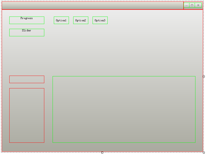
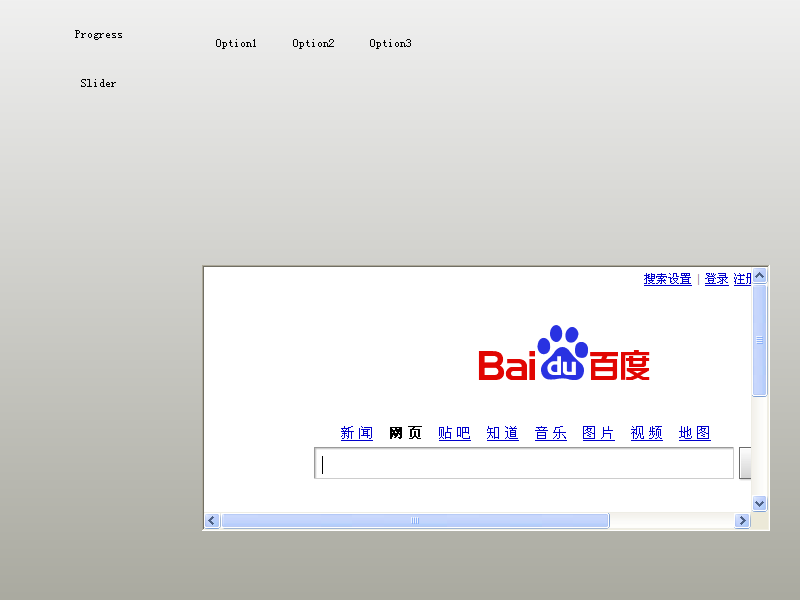
首先将本节要介绍的控件全部拖到界面上,并调整好位置,如图:
然后将Name属性改成其他名字,
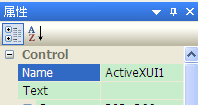
不能是【控件名+UI+数字】这种,因为这是DuiDesigner默认的名字,它不会实际写入到XML,所以如果控件的名字被取成ActiveXUI1、ActiveXUI2、ButtonUI1这种格式的话,Name属性会被忽略,可以看到XML是没有Name属性的:
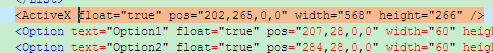
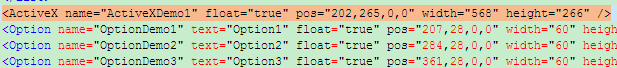
所以我们必须给它们指定其他的名字,这里格式统一为【控件名+Demo+数字】,如图:
XML如下(删除了暂时没用到的属性,删除了标题栏区域,要关闭窗口请按Esc或者在任务栏右键关闭):
<?xml version="1.0" encoding="utf-8" standalone="yes" ?>
<Window size="800,600" sizebox="4,4,4,4" caption="0,0,0,32" mininfo="600,400">
    <VerticalLayout bkcolor="#FFF0F0F0" bkcolor2="#FFAAAAA0">
        <HorizontalLayout>
            <Progress name="ProgressDemo1" text="Progress" float="true" pos="30,28,0,0" width="139" height="30" />
            <Slider name="SliderDemo1" text="Slider" float="true" pos="30,77,0,0" width="139" height="30" />
            <Combo name="ComboDemo1" float="true" pos="30,264,0,0" width="139" height="30" />
            <List name="ListDemo1" float="true" pos="30,314,0,0" width="139" height="218" >
                <ListHeader />
            </List>
            <ActiveX name="ActiveXDemo1" float="true" pos="202,265,0,0" width="568" height="266" />
            <Option name="OptionDemo1" text="Option1" float="true" pos="207,28,0,0" width="60" height="30" />
            <Option name="OptionDemo2" text="Option2" float="true" pos="284,28,0,0" width="60" height="30" />
            <Option name="OptionDemo3" text="Option3" float="true" pos="361,28,0,0" width="60" height="30" />
        </HorizontalLayout>
    </VerticalLayout>
</Window>
各种控件的图片资源请点击这里下载(这是整个工程的地址,资源都在Release目录下),也是解压到exe目录即可。
由于复杂控件都需要初始化,所以这里介绍一个初始化函数InitWindow,相当于MFC的OnInitDialog,所有的初始化操作都在这里进行。
一、ActiveX控件
由于ActiveX控件必须要初始化,否则启动时会崩溃,所以第一个介绍它。
因为ActiveX控件用到了COM,所以需要初始化COM,此时main.cpp的代码如下:
class CDuiFrameWnd : public WindowImplBase
{
public:
    virtual LPCTSTR    GetWindowClassName() const   {   return _T("DUIMainFrame");  }
    virtual CDuiString GetSkinFile()                {   return _T("duilib.xml");    }
    virtual CDuiString GetSkinFolder()              {   return _T("");  }

    virtual void       InitWindow()
    {
        CActiveXUI* pActiveXUI = static_cast<CActiveXUI*>(m_PaintManager.FindControl(_T("ActiveXDemo1")));

        if( pActiveXUI )
        {
            IWebBrowser2* pWebBrowser = NULL;

            pActiveXUI->SetDelayCreate(false);              // 相当于界面设计器里的DelayCreate属性改为FALSE,在duilib自带的FlashDemo里可以看到此属性为TRUE
            pActiveXUI->CreateControl(CLSID_WebBrowser);    // 相当于界面设计器里的Clsid属性里填入{8856F961-340A-11D0-A96B-00C04FD705A2},建议用CLSID_WebBrowser,如果想看相应的值,请见<ExDisp.h>
            pActiveXUI->GetControl(IID_IWebBrowser2, (void**)&pWebBrowser);

            if( pWebBrowser != NULL )
            {
                //pWebBrowser->Navigate(L"https://code.google.com/p/duilib/",NULL,NULL,NULL,NULL);
                pWebBrowser->Navigate(L"http://www.baidu.com/",NULL,NULL,NULL,NULL);  // 由于谷歌时不时被墙,所以换成反应快的网站
                pWebBrowser->Release();
            }
        }
    }
};

int APIENTRY _tWinMain(HINSTANCE hInstance, HINSTANCE hPrevInstance, LPTSTR lpCmdLine, int nCmdShow)
{
    CPaintManagerUI::SetInstance(hInstance);
    HRESULT Hr = ::CoInitialize(NULL);
    if( FAILED(Hr) ) return 0;

    CDuiFrameWnd duiFrame;
    duiFrame.Create(NULL, _T("DUIWnd"), UI_WNDSTYLE_FRAME, WS_EX_WINDOWEDGE);
    duiFrame.CenterWindow();
    duiFrame.ShowModal();

    ::CoUninitialize();
    return 0;
}
此Demo用的是浏览器控件,其他的ActiveX控件也是一样的原理,就不赘述了,duilib自带了一个FlashDemo,里面用的是Flash控件,请自行参阅。不过关闭窗口后,会发现产生了崩溃,这是CActiveXUI的一个Bug,详情请点击这里~ 暂时给出一个临时的快速解决方案,就是将主框架用new的方式生成,而不是直接用变量生成,所以_tWinMain改为下面这样:
int APIENTRY _tWinMain(HINSTANCE hInstance, HINSTANCE hPrevInstance, LPTSTR lpCmdLine, int nCmdShow)
{
    CPaintManagerUI::SetInstance(hInstance);
    HRESULT Hr = ::CoInitialize(NULL);
    if( FAILED(Hr) ) return 0;

    CDuiFrameWnd *pFrame = new CDuiFrameWnd;
    pFrame->Create(NULL, _T("DUIWnd"), UI_WNDSTYLE_FRAME, WS_EX_WINDOWEDGE);
    pFrame->CenterWindow();
    pFrame->ShowModal();

    delete pFrame;
    ::CoUninitialize();
    return 0;
}
二、进度条控件
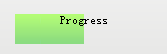
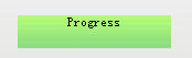
给Progress 加上背景图片(foreimage属性)和位置信息(value属性)即可生成如下效果:
XML代码如下:
<Progress name="ProgressDemo1" text="Progress" float="true" pos="30,28,0,0" width="139" height="30" foreimage="Progress/progress_fore.png" min="0" max="100" value="50" hor="true" align="center" />
如果要改变进度条的位置,则调用以下代码即可:
    CProgressUI* pProgress = static_cast<CProgressUI*>(m_PaintManager.FindControl(_T("ProgressDemo1")));
    pProgress->SetValue(100);
三、滑块控件
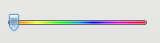
给Slider 加上背景图片(bkimage属性)和滑块图片(thumbimage属性)即可生成如下效果:
XML代码如下:
<Slider name="SliderDemo1" float="true" pos="30,77,0,0" width="139" height="18" thumbsize="12,20" bkimage="file='Slider/slider_fore.bmp' mask='0xffff00ff'" thumbimage="file='Slider/SliderBar.png' mask='0xffffffff'"/>
其他的操作和进度条类似~
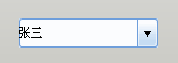
四、组合框控件
XML如下:
            <Combo name="ComboDemo1" float="true" pos="30,264,0,0" width="139" height="30" normalimage="file='ComboBox/Combo_nor.bmp'" hotimage="file='ComboBox/Combo_over.bmp' " pushedimage="file='ComboBox/Combo_over.bmp' " >
                <ListLabelElement text="张三" selected="true" />
                <ListLabelElement text="李四" />
            </Combo>
由于此教程是入门教程,所以只加上了最基本的属性,如果想要将文字对齐等等,请参阅duilib自带的GameDemo的登录窗口。
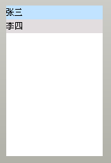
五、列表控件
由于ListBox只是ListCtrl的一个子集,并且比较简单,所以先介绍ListBox控件。XML如下:
            <List name="ListDemo1" float="true" pos="30,314,0,0" width="139" height="218" header="hidden" bkcolor="#FFFFFFFF" itemtextcolor="#FF000000" itembkcolor="#FFE2DDDF" itemselectedtextcolor="#FF000000" itemselectedbkcolor="#FFC1E3FF" itemhottextcolor="#FF000000" itemhotbkcolor="#FFE9F5FF" itemdisabledtextcolor="#FFCCCCCC" itemdisabledbkcolor="#FFFFFFFF" >
                <ListLabelElement text="张三" selected="true" />
                <ListLabelElement text="李四" />
            </List>
亲们可以发现ListBox和上面的ComboBox基本没啥区别,这是因为duilib的各个控件并没有严格的界限,很多控件都是通过一些基本控件组合起来的~
需要说明的就是:这里需要加上header="hidden" 隐藏ListCtrl的表头。
接下来介绍ListCtrl,只有一列的ListCtrl和ListBox并无明显区别,只需要将header="hidden"去掉,并且设置好ListHeader属性即可,这里直接介绍多列的ListCtrl。
先加上表头,XML如下:
            <List name="ListDemo1" float="true" pos="30,314,0,0" width="139" height="218" bkcolor="#FFFFFFFF" itemtextcolor="#FF000000" itembkcolor="#FFE2DDDF" itemselectedtextcolor="#FF000000" itemselectedbkcolor="#FFC1E3FF" itemhottextcolor="#FF000000" itemhotbkcolor="#FFE9F5FF" itemdisabledtextcolor="#FFCCCCCC" itemdisabledbkcolor="#FFFFFFFF" >
                <ListHeader name="domain" bkimage="List/list_header_bg.png">
                    <ListHeaderItem text="序号" width="40" height="23" minwidth="16"  sepwidth="1" align="center" hotimage="List/list_header_hot.png" pushedimage="List/list_header_pushed.png" sepimage="List/list_header_sep.png" />
                    <ListHeaderItem text="文件名称" width="84" height="23" minwidth="16"  sepwidth="1" align="center" hotimage="List/list_header_hot.png" pushedimage="List/list_header_pushed.png" sepimage="List/list_header_sep.png" />
                </ListHeader>
                <ListLabelElement text="张三" selected="true" />
                <ListLabelElement text="李四" />
            </List>
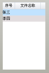
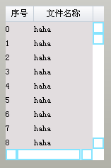
可以发现虽然表头有两列了,但是内容还只是一列,由于在XML里直接添加多列并不方便,所以这里采取和MFC类似的方式,即内容动态添加。那么XML代码需改为如下:
            <List name="ListDemo1" float="true" pos="30,314,0,0" width="139" height="218" vscrollbar="true" hscrollbar="true" bkcolor="#FFFFFFFF" itemtextcolor="#FF000000" itembkcolor="#FFE2DDDF" itemselectedtextcolor="#FF000000" itemselectedbkcolor="#FFC1E3FF" itemhottextcolor="#FF000000" itemhotbkcolor="#FFE9F5FF" itemdisabledtextcolor="#FFCCCCCC" itemdisabledbkcolor="#FFFFFFFF" >
                <ListHeader name="domain" bkimage="List/list_header_bg.png">
                    <ListHeaderItem text="序号" width="40" height="23" minwidth="16"  sepwidth="1" align="center" hotimage="List/list_header_hot.png" pushedimage="List/list_header_pushed.png" sepimage="List/list_header_sep.png" />
                    <ListHeaderItem text="文件名称" width="84" height="23" minwidth="16"  sepwidth="1" align="center" hotimage="List/list_header_hot.png" pushedimage="List/list_header_pushed.png" sepimage="List/list_header_sep.png" />
                </ListHeader>
            </List>
然后在main.cpp的InitWindow里添加如下代码:
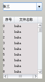
        CDuiString str;
        CListUI* pList = static_cast<CListUI*>(m_PaintManager.FindControl(_T("ListDemo1")));

        // 添加List列表内容,必须先Add(pListElement),再SetText
        for (int i = 0; i < 100; i++)
        {
            CListTextElementUI* pListElement = new CListTextElementUI;
            pListElement->SetTag(i);
            pList->Add(pListElement);

            str.Format(_T("%d"), i);
            pListElement->SetText(0, str);
            pListElement->SetText(1, _T("haha"));
        }
即可生成如下效果:
是不是比duilib自带的Demo简洁明了得多呢~O(∩_∩)O~
不过还没完工,因为滚动条好像不太美观~~~
还记得前面介绍的Default属性吗?它不仅仅让我们少敲更多代码,而且还减少了错误的几率,提高了代码的可读性,真是一个强大的属性,那么我们的滚动条继续沿用此属性~
滚动条的XML代码如下:
<Default name="VScrollBar" value="button1normalimage="file='ScrollBar/scroll.png' source='0,0,16,16'" button1hotimage="file='ScrollBar/scroll.png' source='0,0,16,16' mask='#FFFF00FF'" button1pushedimage="file='ScrollBar/scroll.png' source='0,16,16,32' mask='#FFFF00FF'" button1disabledimage="file='ScrollBar/scroll.png' source='0,0,16,16' mask='#FFFF00FF'" button2normalimage="file='ScrollBar/scroll.png' source='0,32,16,48' mask='#FFFF00FF'" button2hotimage="file='ScrollBar/scroll.png' source='0,32,16,48' mask='#FFFF00FF'" button2pushedimage="file='ScrollBar/scroll.png' source='0,48,16,64' mask='#FFFF00FF'" button2disabledimage="file='ScrollBar/scroll.png' source='0,32,16,48' mask='#FFFF00FF'" thumbnormalimage="file='ScrollBar/scroll.png' source='0,64,16,80' corner='2,2,2,2' mask='#FFFF00FF'" thumbhotimage="file='ScrollBar/scroll.png' source='0,64,16,80' corner='2,2,2,2' mask='#FFFF00FF'" thumbpushedimage="ffile='ScrollBar/scroll.png' source='0,64,16,80' corner='2,2,2,2' mask='#FFFF00FF'" thumbdisabledimage="file='ScrollBar/scroll.png' source='0,64,16,80' corner='2,2,2,2' mask='#FFFF00FF'" railnormalimage="file='ScrollBar/scroll.png' source='0,80,16,96' corner='2,2,2,2' mask='#FFFF00FF'" railhotimage="file='ScrollBar/scroll.png' source='0,80,16,96' corner='2,2,2,2' mask='#FFFF00FF'" railpushedimage="file='ScrollBar/scroll.png' source='0,96,16,112' corner='2,2,2,2' mask='#FFFF00FF'" raildisabledimage="file='ScrollBar/scroll.png' source='0,80,16,96' corner='2,2,2,2' mask='#FFFF00FF'" bknormalimage="file='ScrollBar/scroll.png' source='0,128,16,146' corner='2,2,2,2' mask='#FFFF00FF'" bkhotimage="file='ScrollBar/scroll.png' source='0,128,16,146' corner='2,2,2,2' mask='#FFFF00FF'" bkpushedimage="file='ScrollBar/scroll.png' source='0,128,16,146' corner='2,2,2,2' mask='#FFFF00FF'" bkdisabledimage="file='ScrollBar/scroll.png' source='0,128,16,146' corner='2,2,2,2' mask='#FFFF00FF'" " /> <Default name="HScrollBar" value="button1normalimage="file='ScrollBar/scrollH.png' source='0,0,16,16'" button1hotimage="file='ScrollBar/scrollH.png' source='0,0,16,16' mask='#FFFF00FF'" button1pushedimage="file='ScrollBar/scrollH.png' source='16,0,32,16' mask='#FFFF00FF'" button1disabledimage="file='ScrollBar/scrollH.png' source='0,0,16,16' mask='#FFFF00FF'" button2normalimage="file='ScrollBar/scrollH.png' source='32,0,48,16' mask='#FFFF00FF'" button2hotimage="file='ScrollBar/scrollH.png' source='32,0,48,16' mask='#FFFF00FF'" button2pushedimage="file='ScrollBar/scrollH.png' source='48,0,64,16' mask='#FFFF00FF'" button2disabledimage="file='ScrollBar/scrollH.png' source='32,0,48,16' mask='#FFFF00FF'" thumbnormalimage="file='ScrollBar/scrollH.png' source='64,0,80,16' corner='2,2,2,2' mask='#FFFF00FF'" thumbhotimage="file='ScrollBar/scrollH.png' source='64,0,80,16' corner='2,2,2,2' mask='#FFFF00FF'" thumbpushedimage="ffile='ScrollBar/scrollH.png' source='64,0,80,16' corner='2,2,2,2' mask='#FFFF00FF'" thumbdisabledimage="file='ScrollBar/scrollH.png' source='64,0,80,16' corner='2,2,2,2' mask='#FFFF00FF'" railnormalimage="file='ScrollBar/scrollH.png' source='80,0,96,16' corner='2,2,2,2' mask='#FFFF00FF'" railhotimage="file='ScrollBar/scrollH.png' source='80,0,96,16' corner='2,2,2,2' mask='#FFFF00FF'" railpushedimage="file='ScrollBar/scrollH.png' source='96,0,112,16' corner='2,2,2,2' mask='#FFFF00FF'" raildisabledimage="file='ScrollBar/scrollH.png' source='80,0,96,16' corner='2,2,2,2' mask='#FFFF00FF'" bknormalimage="file='ScrollBar/scrollH.png' source='128,0,146,16' corner='2,2,2,2' mask='#FFFF00FF'" bkhotimage="file='ScrollBar/scrollH.png' source='128,0,146,16' corner='2,2,2,2' mask='#FFFF00FF'" bkpushedimage="file='ScrollBar/scrollH.png' source='128,0,146,16' corner='2,2,2,2' mask='#FFFF00FF'" bkdisabledimage="file='ScrollBar/scrollH.png' source='128,0,146,16' corner='2,2,2,2' mask='#FFFF00FF'" " />
XML好乱,复制到XML编辑器上慢慢看吧~(*^__^*)
稍微说明下:
source='0,0,16,16' 相当于source='0,0,16,16',意思就是只显示图片中'0,0,16,16'矩形包含的那一部分,其中'0,0,16,16'分别是矩形的左上右下四个点
至此,列表控件就大功告成啦~
六、Tab控件
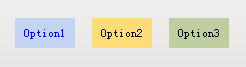
MFC的Tab控件在duilib被称为Option控件,我们先给Tab上个色,XML如下:
            <Option name="OptionDemo1" text="Option1" float="true" pos="207,28,0,0" width="60" height="30" bkcolor="#FFC5D4F2" selectedtextcolor="#FF0000FF" selectedbkcolor="#FFC5D4F2" group="tabDemo" selected="true" />
            <Option name="OptionDemo2" text="Option2" float="true" pos="284,28,0,0" width="60" height="30" bkcolor="#FFFFDC78" group="tabDemo" />
            <Option name="OptionDemo3" text="Option3" float="true" pos="361,28,0,0" width="60" height="30" bkcolor="#FFBECEA1" group="tabDemo" />
接下来给每个Tab的点击做出响应,这里介绍一个新的布局,名为TabLayout,专门用于给Tab布局。
由于我们添加了3个Option,所以要给TabLayout也加上三个控件,分别对应3个Option,在Option 节点下面添加如下XML代码:
            <TabLayout name="tabTest" bkcolor="#FF757676">
                <Label text="Option1" bkcolor="#FFC5D4F2" align="center" />
                <Text  text="Option2" bkcolor="#FFFFDC78" align="centerwrap" />
                <Text  text="Option3" bkcolor="#FFBECEA1" align="center" />
            </TabLayout>
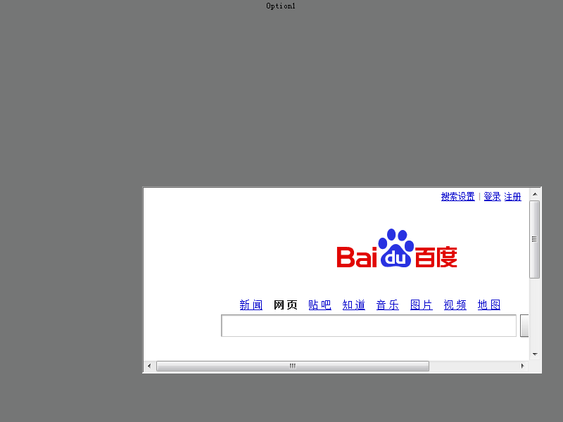
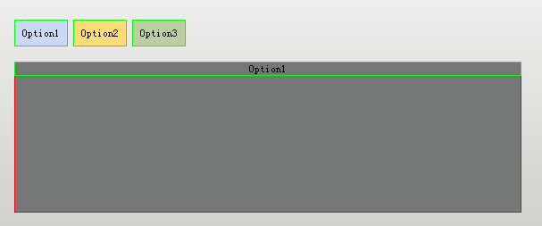
咦~ 怎么整个背景都变色了?其他控件呢?
这是因为前面忘记指定TabLayout的位置和大小了,下面我们继续使用界面设计器来调整它的位置和大小吧,
由于我们已经在XML里面添加了TabLayout节点,所以无需再从DuiDesigner里面添加此控件,直接调节大小和位置即可,记得将float设置为true哦~
XML如下:
            <TabLayout name="tabTest" float="true" pos="202,75,0,0" width="568" height="169" bkcolor="#FF757676">
                <Label text="Option1" bkcolor="#FFC5D4F2" align="center" />
                <Text  text="Option2" bkcolor="#FFFFDC78" align="centerwrap" />
                <Text  text="Option3" bkcolor="#FFBECEA1" align="center" />
            </TabLayout>
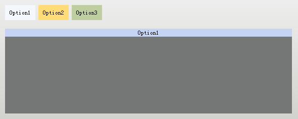
但是点击后还是没有反应,因为Tab控件还需要手动添加代码来切换,代码如下:
    virtual void Notify( TNotifyUI& msg )
    {
        if(msg.sType == _T("selectchanged"))
        {
            CDuiString    strName     = msg.pSender->GetName();
            CTabLayoutUI* pControl = static_cast<CTabLayoutUI*>(m_PaintManager.FindControl(_T("tabTest")));

            if(strName == _T("OptionDemo1"))
                pControl->SelectItem(0);
            else if(strName == _T("OptionDemo2"))
                pControl->SelectItem(1);
            else if(strName == _T("OptionDemo3"))
                pControl->SelectItem(2);
        }

        __super::Notify(msg);
    }
注释:Notify函数是消息通知函数,所有的控件消息(比如点击、切换)都会经过这里。
而Tab控件的切换会触发selectchanged消息,所以我们可以在这里处理它,此处的处理是切换到相应的Tab页(不过我觉得duilib应该做成自动切换的,无需写代码,只需写前面的XML即可自动切换)
此时tab控件可以切换了,不过可以看到Option1并没有占据全部的Tab界面,这是因为没有布局的情况下,Label 和Text只会自动调整宽度(TabLayout的父节点是HorizontalLayout)、或高度(TabLayout的父节点是VerticalLayout)之一,而Control则会同时调整宽度和高度来沾满屏幕。
所以此时我们可以给TabLayout的子节点添加布局,或者手动调整高度,这些已经在前面的教程里介绍过啦,下面就直接上代码了,
            <TabLayout name="tabTest" float="true" pos="202,75,0,0" width="568" height="169" bkcolor="#FF757676">
                <HorizontalLayout>
                    <Label text="Option1" bkcolor="#FFC5D4F2" align="center" />
                </HorizontalLayout>
                <Text   text="Option2" bkcolor="#FFFFDC78" align="centerwrap" height="160"/>
                <Button text="Option3" bkcolor="#FFBECEA1" align="centerwrap" width="300"/>
            </TabLayout>
到现在为止,DuiDesigner上面除了Container、TileLayout这两个控件,其他控件都介绍完毕啦,由于Alberl学习duilib的时间非常有限,还没看到这两个控件,并且现在已能实现绝大部分界面,所以这两个控件将排到Alberl的下一轮学习中,如果有大神愿意贡献一下教程就太感谢啦~O(∩_∩)O~
全家福: