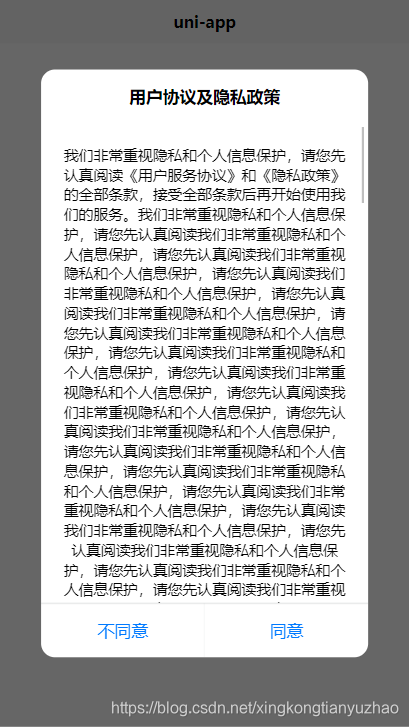
先上效果:
组件源码:slot-modal.vue
<template>
	<view class="modal-container" v-if="show" @click.stop="cancel(2)">
		<view class="modal-content">
			<view class="modal-head modal-title-padding">
				<slot name="modal-head"></slot>
			</view>
			<view class="modal-body">
				<slot name="modal-body"></slot>
			</view>
			<view class="modal-footer">
				<view class="modal-col" hover-class="modal-hover" v-if="cancelText" @click.stop="cancel('cancel')">
					<text :style="cancelStyle" class="modal-row-text">{{cancelText}}</text>
				</view>
				<view :style="confirmStyle" class="modal-col modal-confirm" hover-class="modal-hover" @click.stop="confirm">
					<text :style="confirmStyle" class="modal-row-text">{{confirmText}}</text>
				</view>
			</view>
		</view>
	</view>
</template>
<script>
	export default {
		name: 'modal',
		props: {
			//默认是否显示
			show: {
				type: Boolean,
				default: true
			},
			//取消按钮文字
			cancelText: {
				type: String,
				default: ''
			},
			//取消样式
			cancelStyle: {
				type: [String, Object]
			},
			//确定按钮文字
			confirmText: {
				type: String,
				default: '确定'
			},
			//确定样式
			confirmStyle: {
				type: [String, Object]
			},
			//阻止点击对话框外侧锁屏
			disableScreenClick: {
				type: Boolean,
				default: false
			}
		},
		methods: {
			confirm() {
				this.$emit('confirm')
			},
			cancel(type) {
				if (!this.disableScreenClick || type === 'cancel') {
					this.$emit('cancel')
				}
			}
		}
	}
</script>
<style lang="scss" scoped>
	$fontSizeLg:17px;
	$fontSizeSm:15px;

	.modal-container {
		position: fixed;
		top: 0;
		left: 0;
		right: 0;
		bottom: 0;
		z-index: 999;
		background-color: rgba(0, 0, 0, .6);
		transition: all 5s;
		display: flex;
		align-items: center;
		justify-content: center;

		.modal-content {
			 80%;
			border-radius: 26rpx;
			background: #FFFFFF;
			overflow: hidden;
			animation: fadeZoom .15s linear;

			.modal-head {
				padding: 30rpx 30rpx 0;
				text-align: center;
				color: #000;
				font-size: $fontSizeLg;
				font-weight: 700;
			}

			.modal-title-padding {
				padding-bottom: 30rpx;
			}

			.modal-body {
				overflow:auto;
				padding: 40rpx 30rpx;
				font-size: $fontSizeSm;
				color: #000;
				text-align: center;
			}

			.modal-footer {
				display: flex;
				position: relative;
				text-align: center;
				font-size: $fontSizeLg;
				line-height: 100rpx;
				color: #007AFF;
				border-top: 0.5px solid rgba(9, 20, 31, 0.13);

				.modal-col {
					flex: 1;
					 100%;
					position: relative;
				}

				.modal-col:first-child::after {
					content: '';
					position: absolute;
					top: 0;
					bottom: 0;
					right: 0;
					border-right: 1px solid rgba(9, 20, 31, 0.13);
					transform: scaleX(.36);
				}

				.modal-confirm {
					color: rgb(0, 122, 255);
				}

				.modal-hover {
					background-color: #f2f2f2;
				}
			}

			.modal-footer::after {
				content: '';
				position: absolute;
				left: 0;
				right: 0;
				top: 0;
				border-top: 0.5px solid rgba(9, 20, 31, 0.13);
				transform: scaleY(.36);
			}
		}

		@keyframes fadeZoom {
			0% {
				transform: scale(.7);
				opacity: .6;
			}

			80% {
				transform: scale(1.2);
				opacity: .3;
			}

			100% {
				transform: scale(1);
				opacity: 1;
			}
		}
	}
</style>
使用示例:
<template>
	<view class="content">
		<image class="logo" src="/static/logo.png"></image>
		<view class="text-area">
			<text class="title">{{title}}</text>
		</view>
		<view><button type="default" @click="privacyDialogShow=true">用户协议</button></view>
		<slot-modal
			class="modal-privacy"
			:show="privacyDialogShow"
			:disableScreenClick="true"
			confirmText="同意"
			cancelText="不同意"
			@cancel="cancelPrivacy"
			@confirm="confirmPrivacy">
			<template slot="modal-head">
				<text>用户协议及隐私政策</text>
			</template>
			<template slot="modal-body">
				<view class="index-content">
					<text>
						我们非常重视隐私和个人信息保护,请您先认真阅读
						<text class="privacyPolicy" @click.stop="goPage('agreement')">《用户服务协议》</text>和
						<text class="privacyPolicy" @click.stop="goPage('privacy')">《隐私政策》</text>的全部条款,接受全部条款后再开始使用我们的服务。
						<text v-for="item in 40">我们非常重视隐私和个人信息保护,请您先认真阅读我们非常重视隐私和个人信息保护,请您先认真阅读我们非常重视隐私和个人信息保护,请您先认真阅读</text>
					</text>
				</view>

			</template>
		</slot-modal>
	</view>
</template>

<script>
	export default {
		data() {
			return {
				title: 'Hello',
				privacyDialogShow:false
			}
		},
		onLoad() {

		},
		methods: {
			goPage(pageUrl){
				console.log(pageUrl)
				uni.navigateTo({
					url:'../agreement/agreement'
				})
			},
			confirmPrivacy(){
				console.log('同意了用户协议')
				console.log(this.privacyDialogShow)
				this.privacyDialogShow = false
				console.log(this.privacyDialogShow)
			},
			cancelPrivacy(){
				console.log('拒绝了用户协议')
				this.privacyDialogShow=false
			}
		}
	}
</script>

<style>
	.content {
		display: flex;
		flex-direction: column;
		align-items: center;
		justify-content: center;
	}

	.logo {
		height: 200rpx;
		 200rpx;
		margin-top: 200rpx;
		margin-left: auto;
		margin-right: auto;
		margin-bottom: 50rpx;
	}

	.text-area {
		display: flex;
		justify-content: center;
	}

	.title {
		font-size: 36rpx;
		color: #8f8f94;
	}
	.index-content{
		max-height: 800rpx;
	}
</style>
通过这次学习,遗留了一个问题还未解决:如何限制modal-body的高度为80%,尝试了多种方法无效,只能写固定高度了。
练习了
- (1). 组件自定义事件
- (2). 对话框的css布局