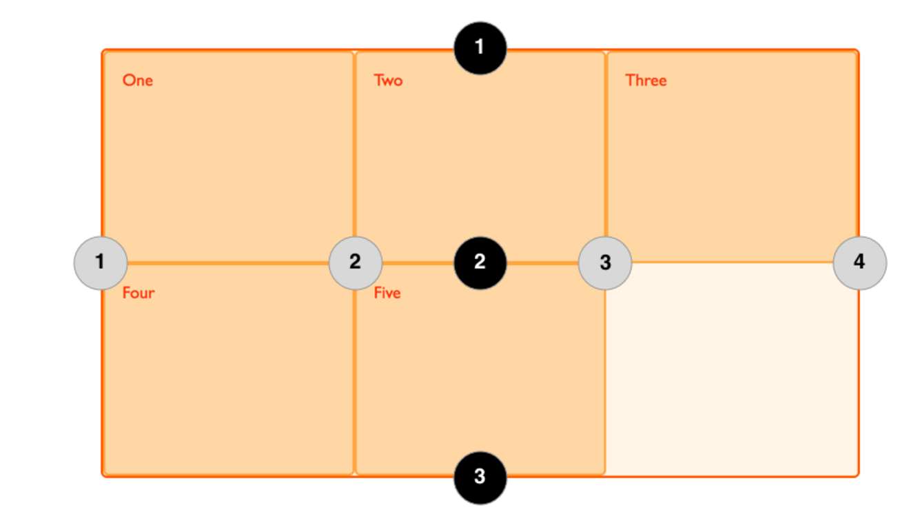
We can use named grid lines to describe our grid layout. Let’s see how to apply this to our grid-template-columns and grid-template-rows, and how to refer to these from our grid items.
Syntax like:
            grid-template-columns:
            [left-sidebar-start] 1fr
            [main-content-start] 2fr
            [right-sidebar-start] 1fr;
We can name those whatever we want to.
You can also give multi names for one line:
            grid-template-columns:
            [left-sidebar-start] 1fr
            [left-sidebar-end main-content-start] 2fr
            [main-content-end right-sidebar-start] 1fr
            [right-sidebar-end];
And we also named the last columns name as 'right-sidebar-end'.
Later we can contorl the position like this:
            grid-template-rows:
                [body-start] 6fr
                [body-end footer-start] 2fr
                [footer-end];
The same for the rows:
            grid-template-rows:
                [body-start] 6fr
                [body-end footer-start] 2fr
                [footer-end];

So for four column lines:

1 --> left-sidebar-start

2 --> left-sidebar-end, main-content-start

3 --> main-content-end, right-sidebar-start

4 --> right-sidebar-end

For three row lines:

1 --> body-start

2 --> body-end, footer-start

3 --> footer-end
For more information, check the article