设置 ComboBox圆角样式
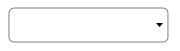


 1    <Style  TargetType="{x:Type ComboBox}">
 2             <Setter Property="Width" Value="120"></Setter>
 3             <Setter Property="HorizontalAlignment" Value="Stretch"></Setter>
 4             <Setter Property="Template">
 5                 <Setter.Value>
 6                     <ControlTemplate TargetType="{x:Type ComboBox}">
 7                         <Border  BorderBrush="Gray" BorderThickness="1" CornerRadius="5" Background="Transparent">
 8                             <Grid>
 9                                 <!--下拉箭头-->
10                                 <ToggleButton ClickMode="Press" Focusable="False" IsChecked="{Binding IsDropDownOpen, Mode=TwoWay, RelativeSource={RelativeSource TemplatedParent}}" Margin="2" MinWidth="0" MinHeight="0" Width="Auto">
11                                     <ToggleButton.Style>
12                                         <Style TargetType="{x:Type ToggleButton}">
13                                             <Setter Property="MinWidth" Value="0"/>
14                                             <Setter Property="MinHeight" Value="0"/>
15                                             <Setter Property="Width" Value="Auto"/>
16                                             <Setter Property="Height" Value="Auto"/>
17                                             <Setter Property="Background" Value="Transparent"/>
18                                             <Setter Property="BorderBrush" Value="#00000000"/>
19                                             <Setter Property="BorderThickness" Value="2"/>
20                                             <Setter Property="Template">
21                                                 <Setter.Value>
22                                                     <ControlTemplate TargetType="{x:Type ToggleButton}">
23                                                         <DockPanel Background="{TemplateBinding Background}" LastChildFill="False" SnapsToDevicePixels="True">
24                                                             <Border x:Name="Border" BorderBrush="{TemplateBinding BorderBrush}" BorderThickness="{TemplateBinding BorderThickness}"  DockPanel.Dock="Right" >
25                                                                 <Path Data="M0,0L3.5,4 7,0z" Fill="{TemplateBinding Foreground}" HorizontalAlignment="Center" VerticalAlignment="Center"/>
26                                                             </Border>
27                                                         </DockPanel>
28                                                         <ControlTemplate.Triggers>
29                                                             <Trigger Property="IsChecked" Value="True">
30
31                                                             </Trigger>
32                                                         </ControlTemplate.Triggers>
33                                                     </ControlTemplate>
34                                                 </Setter.Value>
35                                             </Setter>
36                                             <Style.Triggers>
37                                                 <Trigger Property="IsEnabled" Value="False">
38                                                     <Setter Property="Foreground" Value="{DynamicResource {x:Static SystemColors.ControlDarkBrushKey}}"/>
39                                                 </Trigger>
40                                             </Style.Triggers>
41                                         </Style>
42                                     </ToggleButton.Style>
43                                 </ToggleButton>
44                                 <!--项内容-->
45                                 <ContentPresenter  IsHitTestVisible="False" Content="{TemplateBinding SelectionBoxItem}" ContentTemplate="{TemplateBinding SelectionBoxItemTemplate}" ContentTemplateSelector="{TemplateBinding ItemTemplateSelector}" VerticalAlignment="Center" Margin="3" HorizontalAlignment="Stretch" />
46                                 <TextBox x:Name="PART_EditableTextBox" HorizontalAlignment="Stretch" Focusable="True" Visibility="Collapsed" IsReadOnly="False"/>
47                                 <!--下拉显示面板HorizontalOffset:设置下拉面板的相对位置-->
48                                 <Popup HorizontalOffset="-1" Width="{TemplateBinding ActualWidth}"
49                                        IsOpen="{TemplateBinding IsDropDownOpen}" Focusable="False"    PopupAnimation="Slide">
50                                     <Grid  SnapsToDevicePixels="True" HorizontalAlignment="Stretch">
51                                         <Border  BorderThickness="1,1,1,1" BorderBrush="Gray" HorizontalAlignment="Stretch" CornerRadius="5">
52                                             <Border.Background>
53                                                 <SolidColorBrush Color="White" />
54                                             </Border.Background>
55                                         </Border>
56                                         <ScrollViewer  SnapsToDevicePixels="True" HorizontalAlignment="Stretch" >
57                                             <StackPanel IsItemsHost="True" KeyboardNavigation.DirectionalNavigation="Contained" HorizontalAlignment="Stretch" />
58                                         </ScrollViewer>
59                                     </Grid>
60                                 </Popup>
61                             </Grid>
62                         </Border>
63                     </ControlTemplate>
64                 </Setter.Value>
65             </Setter>
66         </Style>
设置 Button圆角样式

1  <ControlTemplate x:Key="ButtonTemplate" TargetType="{x:Type Button}">
2             <Border x:Name="Border"  BorderThickness="2" CornerRadius="5" Background="#1A3F7B" TextBlock.Foreground="White">
3                 <!--设置控件的边框,圆角,背景色,字体颜色-->
4                 <ContentPresenter Margin="{TemplateBinding Padding}" HorizontalAlignment="Center" VerticalAlignment="Center">
5                     <!--显示控件的内容-->
6                 </ContentPresenter>
7             </Border>
8         </ControlTemplate>