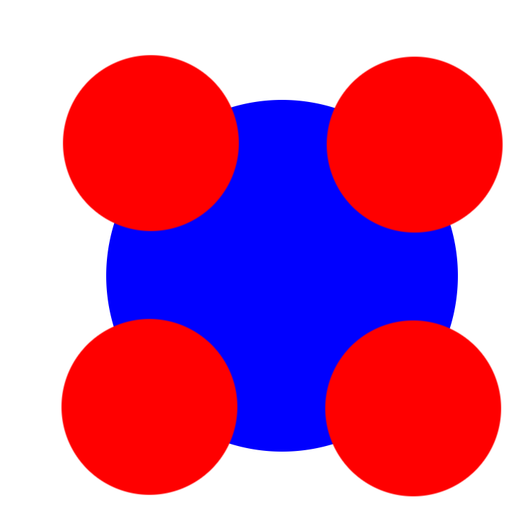
4个圆形球作圆周运动
代码:
1 <div class="box">
2         <div class="box1"></div>
3         <div class="box2"></div>
4         <div class="box3"></div>
5         <div class="box4"></div>
6     </div>
*{
    margin: 0;
    padding: 0;
}
body{
    margin: auto;
    padding-top: 200px;
    padding-left: 600px;
}
.box{
     400px;
    height: 400px;
    border-radius: 50%;
    background-color: blue;
    position: relative;
}
.box div{
     200px;
    height: 200px;
    border-radius: 50%;
    background-color: red;
}
.box1{
    position: absolute;
    left: 100px;
    top: -200px;
    animation-name: div1;
    animation-duration: 2s;
    animation-iteration-count: infinite;
    animation-timing-function: linear;
}
.box2{
    position: absolute;
    left: -200px;
    top: 100px;
    animation-name: div2;
    animation-duration: 2s;
    animation-iteration-count: infinite;
    animation-timing-function: linear;
}
.box3{
    position: absolute;
    left: 100px;
    bottom: -200px;
    animation-name: div3;
    animation-duration: 2s;
    animation-iteration-count: infinite;
    animation-timing-function: linear;
}
.box4{
    position: absolute;
    top: 100px;
    left: 400px;
    animation-name: div4;
    animation-duration: 2s;
    animation-iteration-count: infinite;
    animation-timing-function: linear;
}
@keyframes div1{
    from{transform:translate(0,0)}
    50%{transform:translate(150,150)}
    to{transform: translate(300px,300px)};
}
@keyframes div2{
    from{transform: translate(0,0)}
    50%{transform: translate(150,-150px)}
    to{transform: translate(300px,-300px)}
}
@keyframes div3{
    form{transform: translate(0,0)}
    50%{transform: translate(-150px,-150px)}
    to{transform: translate(-300px,-300px)}
}
@keyframes div4{
    from{transform: translate(0,0)}
    50%{transform: translate(-150px,150px)}
    to{transform: translate(-300px,300px)}
}
完成图形: