概要
在上一篇文章中,我讨论了一些WPF应用的基础知识,它们是使用WPF的基本架构和内部结构。在本文中,我将讨论编写你的第一个WPF程序的基本的东西和怎么在你的窗口中布局控件。这是每一个想使用WPF的人应该知道的最基础的知识。我将讨论最常用的一些。
窗口
当你创建WPF程序的时候,你最先注意到的是一个窗口。窗口是用户交互,产生窗口和弹出窗的生命周期的最主要的类。像普通的windows程序一样,它使用基本的API来产生窗口对象。一个窗口有两个部分:
- Non-Client Area:非客户端区域,它显示窗口的外边界,就像我们在其他普通窗口中看到的那样。其中最主要的部分是图标,系统菜单,标题栏,和边框。
- Client part:客户端部分,这是WPF控件呈现的最主要的部分。你可以使用WPF来自定义这部分。
窗口的类型
WPF窗口有三个类型:
- Window:这是一个普通窗口化程序的基本的类型,每个控件都放在同一个窗口中。跟我之前说的那样,窗口就像平常那样显示。客户端区域可以使用XAML完全进行定制。
- NavigationWindow:这是从基本的窗口类型继承来的特殊窗口,在顶部拥有一个导航面板。如果你想创建一个向导程序,你可以使用导航窗口。你也可以把导航区域自定义为想要的外观。
- Page:基本和导航窗口相似,最主要的区别是,Page窗口可以作为XBAP程序在浏览器中打开。
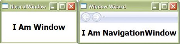
在上图中,你能够看出普通窗口和导航窗口的区别。导航窗口和普通的窗口有非常大的不同,但是当你的应用需要一些特殊的使用时它将非常有用。
我将说一点儿你怎么在应用中使用页面。

多个页面可以被创建用在同一个窗口中。从一个页面转到另外一个非常的简单。Page类暴露了一个NavigationService类的对象,你可以用来在不同的页面间进行导航。NavigationService对象还有很多事件,比如Navigating, NavigationFailed, NavigationProgress, NavigationStopped,等。你可以用来在页面正在重定向的过程中显示进度条。像GoBack, GoForward和Navigate这些方法是用来导航的最好的方式。
private void Button_Click(object sender, RoutedEventArgs e)
{
this.NavigationService.Navigate(new Uri("Page2.xaml", UriKind.Relative));
}
如你所见,我只是使用了NavigationService服务从一个页面重定向到另外一个页面,而不是调用一个新窗口。
如果想了解更多,你可以查看MSDN的文章:OverView of Navigation
容器的类型
WPF窗口继承自ContentControl。在和控件打交道的时候,你可能遇到很多构成WPF控件基础的控件类型。一个ContentControl可以包含任何内容。可以是一个字符串,一个任意类型的对象,甚至可以是一个UIElement比如Button,TextBox等。换句话说,一个Content是一个可以被放入容器的任意元素。下面让我们一个一个地过一遍:
- ContentControl:一个ContentControl 可以包含单个的子内容。窗口继承自ContentControl ,所以每个窗口都只能包含一个子元素。比如:Windows, Button等。
- HeaderedContentControl:它基本上和 ContentControl 相同,不过它包含了一个多出来的内容的标题。例如: GroupBox, Expander 都是 HeaderedContentControl 。
- ItemsControl:ItemsControl 可以包含多个内容。因此,你可以在 ItemsControl 中放入很多任意的元素。例如: ListBox , ListView 。
- HeaderedItemsControl:每个 Collection 都包含了一个特别的标题内容。HeaderedItemsControl 是一个包含了每个都有单独标题的元素的复杂元素。 TreeView 就是一个 HeaderedItemsControl 。
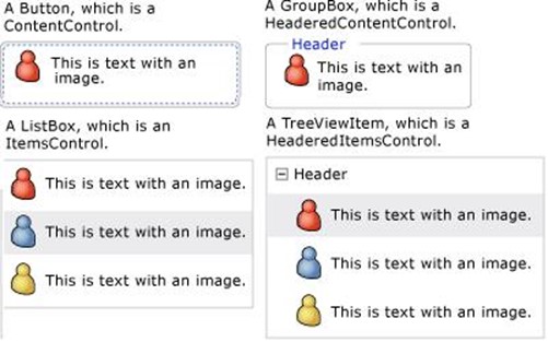
上图表示了不同的 ContentControl 之间的区别。每个 ContentControl 都包含了一个 Content 属性用来存放它的内容。在你的XAML中,你可以声明使用 Content 属性,或者你可以直接在标签内直接写 Content。就像下面这样:
- <Button Content="This is a Button" />
和下面是一样的:
- <Button>This is a Button</Button>
XAML转换器将自动把卸载标签里面的内容转换为 Content 。
对齐-外边距-内边距
对齐,外边距和内边距是三个最重要的你通常需要为每个UI元素考虑的属性。在进一步了解容器之前,你应该了解这些。
Alignment(对齐):对齐决定了子元素应该在父元素分配的空间内怎样摆放。换句话说,它确定在给定的空间中的位置。有两种对齐方式:
- 1. **HorizontalAlignment(横向)**:它有四个可能的取值:`Left`,`Right`,`Center`和 `Stretch`。`Stretch (拉伸)`是默认值。
- 2. *VerticalAlignment(纵向)**:它有4个可能的取值:`Top`,`Center`,`Bottom`和 `Stretch`。`Stretch (拉伸)`是默认值。
Margin(外边距):它决定元素在放置的空间中距离边缘的距离。它可以通过统一的使用数字来声明或者使用 TypeConverter 把所有的声明放到一起。举个例子:
Margin="20" 意思就是:Left=20 , Top=20 , Right=20 , Bottom=20 。
你也可以这样声明:
Margin="20,10,0,10" 表示: Left=20 , Top=10 ,Right=0 , Bottom=10 。
- <Button Margin="0,10,0,10">Button 1</Button>
- <Button Margin="0,10,0,10">Button 2</Button>
- <Button Margin="0,10,0,10">Button 3</Button>
Padding(内边距):Padding 的值表示控件内的元素可以扩大到多大。因此基本上和 Margin 是相似的,不过 Margin 表示元素距离控件外边缘的空间而 Padding 表示的是内部的空间。
- <Button Padding="0,10,0,10">Button 1</Button>
- <Button Padding="0,10,0,10">Button 2</Button>
- <Button Padding="0,10,0,10">Button 3</Button>
每个 Margin 和 Padding 都可以使用 Thickness 的对象。
- Button bb = new Button();
- bb.Margin = new Thickness(20);
- bb.Padding = new Thickness(10, 20, 30, 10);
- this.MyGrid.Children.Add(bb);
布局容器
在WPF中另外一个重要的部分是定义屏幕的布局。WPF引入了多个面板,每个都是继承自抽象类 Panel 。如果你想的话,你可以可以通过继承 Panel 来自定义面板。我们将在后面讨论你怎么自定义面板。现在我们讨论一下WPF支持的基本面板。

Panel
Panel是每个面板都要继承的抽象类。所以每个我们将要讨论的面板元素都是继承自Panel并且包含一些在我讨论 Concrete 对象前需要说的属性。
- Z-Index:它确定了一个UI元素重叠到另外一个元素的位置。ZIndex是一个在分层元素中确定位置的附加属性。拥有更大的ZIndex的属性的元素将显示在其他的元素的上面。
- InternalChildren:这是基本的 UIElementCollection 元素使用 Children 属性暴露出来的基本。当定义自定义的面板时,你可以使用它来获取元素。
- Background:这是每个面板都有的,表示面板的背景颜色。
自定义面板
要创建自定义面板,你必须要重写两个方法:
MeasureOverride:当一个元素加入到面板时该方法会被调用。它使用 可用的大小作为输入并返回传入元素的要求大小。你应该计算大小来让元素可以调整到要求的大小。
ArrangeOverride:当决定元素的排列时该方法会被调用。当布局被创建时它将被调用一次,返回面板的要求大小。当布局更改的时候它将被再次调用。
你可以通过尝试MSDN的例子来获得创建自定义面板的更详细的知识: http://go.microsoft.com/fwlink/?LinkID=159979
GRID
表格是用来呈现整个框架的最基本的布局方式。GRID生成了一个表格,你可以通过行和列来进行定位。你可以通过声明RowDefination和ColumnDefination来指定表格的行和列。你也可以通过RowDefination和ColumnDefination轻松地修改行和列的宽高。
行和列的大小
如上文所说,可以使用RowDefination和ColumnDefination来指定每个表格元素的宽高,大小可以有多种指定方式。可以是:
- Auto:大小通过放入的元素来决定,这是默认的。
- *(星号):如果使用*,意思就是将会使用比例来决定大小。2*表示是1*的两倍。所以如果你像创建宽度为2:1的两列,你应该指定宽度为 2*和1*。
- Absolute:你可以定义宽高的绝对大小。意思就是如果你把高度定义为100,它将相应地使用它。
根据我自己的经验来说,如果你像严格的定义布局而不是根据子元素调整的话,你最好是使用 MinHeight 和 MaxWidth 来代替 Width 和 Height 。
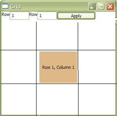
在示例程序中,我创建了一个包含3x3矩阵的表格。你可以使用上面的文本框来动态地改变盒子的位置。
<Grid Grid.Row="1">
<Grid.RowDefinitions>
<RowDefinition />
<RowDefinition />
<RowDefinition />
</Grid.RowDefinitions>
<Grid.ColumnDefinitions>
<ColumnDefinition/>
<ColumnDefinition/>
<ColumnDefinition/>
</Grid.ColumnDefinitions>
<Border Background="BurlyWood" x:Name="brdElement">
<TextBlock x:Name="tbElement" Text="Row 0, Column 0"
HorizontalAlignment="Center" VerticalAlignment="Center"/>
</Border>
</Grid>
上面的代码将把Border元素放入到3x3表格的0,0位置。
StackPanel
下面我将开始介绍的一个控件是 StackPanel 。StackPanel 是一个所有子元素按照栈一样放置的容器,意思就是一个挨着一个,所以不会有一个元素重叠在另外一个的上面。
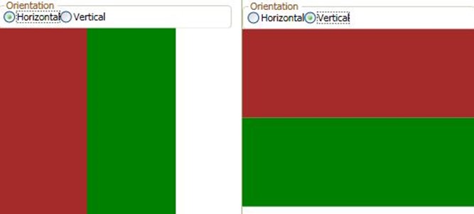
StackPanel 基于 PositiveInfinity ,意味着他可以使用正数的大小。StackPanel 最主要的属性是 Orientation(方向)。有两个支持的方向:
Vertical:纵向:这是默认的方向,所有的子元素从高到底一个一个地纵向排列。 Horizontal:横向:下面是从左到右依次排列的元素:
<StackPanel x:Name="spMain" Orientation="Horizontal">
<Border Background="Brown" Padding="50"></Border>
<Border Background="Green" Padding="50" />
</StackPanel>
WrapPanel
WrapPanel跟StackPanel相似,但当它排到边缘时它将产生新的一行。所以当空间受限的时候 WrapPanel有更大的灵活性。另外一个重要的不同是:WrapPanel总是根据内容的大小来确定自己的大小,而不是像 StackPanel那样使用 PositiveInfinity 。
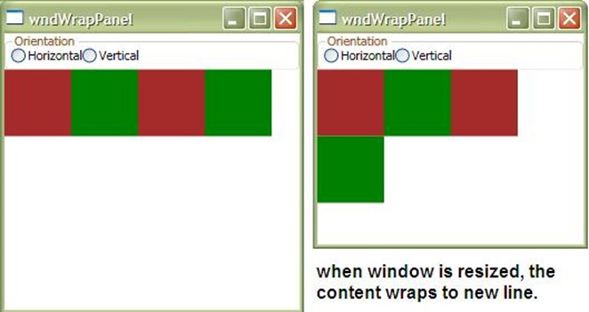
如果你调整窗口的大小,内容将自动换到新的一行中去。WrapPanel也有跟StackPanel一样的Orientation 属性。
<WrapPanel x:Name="wpMain" Grid.Row="1">
<Border Background="Brown" Padding="30"/>
<Border Background="Green" Padding="30" />
<Border Background="Brown" Padding="30" />
<Border Background="Green" Padding="30" />
</WrapPanel>
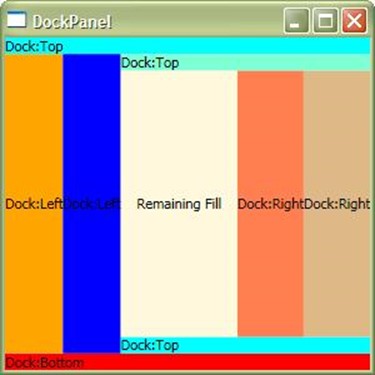
DockPanel
DockPanel是应用布局中使用的最广泛的布局控件。它使用DockPanel.Dock附加属性来确定元素的位置。如果Dock是Top或者Bottom,元素将显示在顶部或底部,当使用Left或Right,将是左边或右边。
使用DockPanel的时候,如果宽度和高度不定义的话,元素将占用所有可用空间。

<DockPanel>
<Border Background="Aqua" DockPanel.Dock="Top">
<TextBlock Text="Dock:Top" />
</Border>
<Border Background="Red" DockPanel.Dock="Bottom">
<TextBlock Text="Dock:Bottom" />
</Border>
<Border Background="Orange" DockPanel.Dock="Left">
<TextBlock HorizontalAlignment="Center" VerticalAlignment="Center"
Text="Dock:Left" />
</Border>
<Border Background="Blue" DockPanel.Dock="Left">
<TextBlock HorizontalAlignment="Center" VerticalAlignment="Center"
Text="Dock:Left" />
</Border>
<Border Background="Aqua" DockPanel.Dock="Bottom">
<TextBlock Text="Dock:Top" />
</Border>
<Border Background="Aquamarine" DockPanel.Dock="Top">
<TextBlock Text="Dock:Top" />
</Border>
<Border Background="BurlyWood" DockPanel.Dock="Right">
<TextBlock HorizontalAlignment="Center" VerticalAlignment="Center"
Text="Dock:Right" />
</Border>
<Border Background="Coral" DockPanel.Dock="Right">
<TextBlock HorizontalAlignment="Center" VerticalAlignment="Center"
Text="Dock:Right" />
</Border>
<Border Background="Cornsilk" >
<TextBlock HorizontalAlignment="Center" VerticalAlignment="Center"
Text="Remaining Fill" />
</Border>
</DockPanel>
从代码中你可以看出来,你必须明确地指明每个单独元素的Dock属性,这样才能得到想要的显示。在DockPanel中声明序列也扮演着至关重要的角色。如果你在一行中声明了两个使用DockPanel.Dock=Top的元素,意思就是这两个元素将像StackPanel的垂直排列一样放置。
一个叫做LastChildFill的属性将让没有dock属性的元素填充剩余的空间。在上面的图中你可以看出来,最后一个元素充满了剩下的整个空间。如果你不想使用的话,你可以把这个属性的值设为false。
如果你想通过编码来实现,你应该使用DockPanel.SetDock。
VirtualizingStackPanel
WPF引入了一种特殊的面板,当内容被绑定到元素时,他会虚拟化它的内容。虚拟化的意思就是内容只会当元素可见时才会创建。者将极大地提升性能。
- <ListBox x:Name="lstElements" VirtualizingStackPanel.IsVirtualizing="True"
- VirtualizingStackPanel.VirtualizationMode="Recycling" ItemsSource="{Binding}"/>
下面是代码:
private void Window_Loaded(object sender, RoutedEventArgs e)
{
ObservableCollection<int> obs = new ObservableCollection<int>();
Random rnd = new Random(1000);
for (int i = 0; i < 100000; i++)
obs.Add(rnd.Next());
this.lstElements.DataContext = obs;
}
这段代码将会创建 100000 个元素添加到 ListBox 中。如果你使用了 VirtualizingStackPanel.IsVirtualizing=True ,内容将会立即呈现,他不会等到所有的 LixtBoxItem 都创建。如果设置 IsVirtualizing=false ,由于创建 100000 个 ListboxItem 将耗费很长的时间,整个应用都会被挂起。
VirtualizationMode 有两种方式:
- Standard: 表示当 ScrollViewer 滚动的时候会创建项。
- Recycling:表示当 ScrollViewer 滚动的时候会替换项。
Canvas
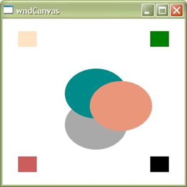
Canvas 是一种特殊的布局,使用x和y坐标对元素进行绝对定位。在Canvas中使用的元素不受任何的限制。当位置和其他控件交叉时可能被重叠。每个元素根据声明的顺序来确定位置。你可以使用 Panel.ZIndex 来去掉声明的影响。
Canvas 对元素不使用任何限制。所以每个元素的宽度和高度都应该特别指定。你可以使用Canvas.Left, Canvas.Right, Canvas.Top 和 Canvas.Bottom 来指定坐标。你唯一应该注意的事是 Canvas.Left 和 Canvas.Right是相同的,但是它确定了坐标系是从左端还是右端开始的。
<Canvas>
<Border Canvas.Top="20" Canvas.Left="25" Background="Bisque" Width="30"
Height="25" />
<Border Canvas.Top="20" Canvas.Right="25" Background="Green" Width="30"
Height="25" />
<Border Canvas.Bottom="20" Canvas.Right="25"
Background="Black" Width="30" Height="25" />
<Border Canvas.Bottom="20" Canvas.Left="25" Background="IndianRed"
Width="30" Height="25" />
<Ellipse Fill="DarkGray" Canvas.Left="100" Canvas.Top="130" Width="100"
Height="80"></Ellipse>
<Ellipse Fill="DarkCyan" Canvas.Left="100" Canvas.Top="80" Width="100"
Height="80"></Ellipse>
<Ellipse Fill="DarkSalmon" Canvas.Left="140" Canvas.Top="100" Width="100"
Height="80" />
</Canvas>
在上面的代码中,你可以看出虽然 Border 是在同样的区域,但是 Canvas 属性改变了他们的相对坐标,所以他们被放在了四个不同的位置。
椭圆形按照他们的声明顺序重叠在了一起。
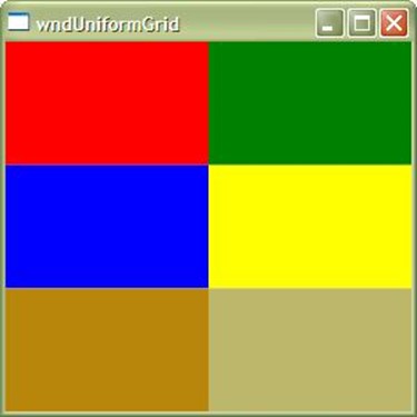
UniformGrid
UniformGrid 是一个特殊的控件,他均匀地调整他的元素。如果你想让你的表格中的行和列均匀,你可以使用 UniformGrid 替代普通的 Grid。
<UniformGrid Columns="2" Rows="3">
<Border Background="Red" />
<Border Background="Green" />
<Border Background="Blue" />
<Border Background="Yellow" />
<Border Background="DarkGoldenrod" />
<Border Background="DarkKhaki" />
</UniformGrid>
上面是一个3x2的网格,所有的元素都按照声明的顺序均匀地放置。
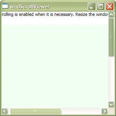
ScrollViewer
我们经常会发现元素跑到了显示区域的外面。在这种情况下,ScrollViewer 自动放置一个滚动条,这样我们就可以看到边缘外面的区域。ScrollViewer 封装了滚动条(Scrollbar),只要需要的时候他将自动显示它。由于 ScrollViewer 在滚动区域内实现了 IScrollInfo 接口,所以 ScrollViewer 可以响应鼠标和键盘事件。

<ScrollViewer HorizontalScrollBarVisibility="Auto">
<StackPanel VerticalAlignment="Top" HorizontalAlignment="Left">
<TextBlock TextWrapping="Wrap" Margin="0,0,0,20">Scrolling is
enabled when it is necessary. Resize the window, making it larger
and smaller.</TextBlock>
<Rectangle Fill="Honeydew" Width="500" Height="500"></Rectangle>
</StackPanel>
</ScrollViewer>
ScrollViewer 的属性 CanContentScroll 用来确定元素是否可以滚动。HorizontallScrollBarVisibility 和 VerticalScrollBarVisibility 显示或隐藏相应的滚动条。它们的默认值是 Auto ,只有当需要显示的时候才显示。
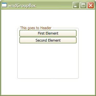
GroupBox
GroupBox 允许把一组内容放到一起,并且提供一个自定义的头。这跟windows中的 GroupBox 一样。属性 Header 使用文本元素,放到GroupBox的头部。因为 GroupBox 是一个 ContentControl,所以他只能包含一个元素在里面。因此你必须要使用 Panel 来把子元素放进去。

<GroupBox Header="This goes to Header" Margin="50">
<StackPanel>
<Button Content="First Element"/>
<Button Content="Second Element" />
</StackPanel>
</GroupBox>
Expander
Expander 和 Groupbox相似,不过它多出来一个可以展开内容的功能。它也是继承自 HeaderedContentControl 所以他只能包含一个子元素。IsExpanded 属性用来确定面板是否展开。
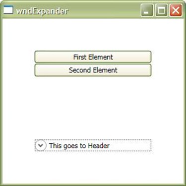
ExpandDirection 决定内容展开的行为。他又四个方向:向下(Down),向上(Up),向左(Left)和向右(Right)。你可以使用它们来控制内容展开的方向。
<Expander Header="This goes to Header" Margin="50" IsExpanded="True"
ExpandDirection="Down">
<StackPanel>
<Button Content="First Element"/>
<Button Content="Second Element" />
</StackPanel>
</Expander>
ViewBox
ViewBox 是WPF中一个特殊的空间,可以用来拉伸或者压缩元素的内容。这样就可以非常方便地控制元素的位置,在 ViewBox中,内容永远不会改变位置,只是整个内容可能拉伸或者缩小。
ViewBox 的 Stretch 属性可以有四个值:
- Fill:填充内容并保持切面比例。
- None:不会设置拉伸行为
- UniformToFill:整体填充元素,可以改变比例。
- Uniform:整体放大内容。
属性 stretchDirection 可以使用 Both,DownOnly 和 UpOnly 这几个取值。
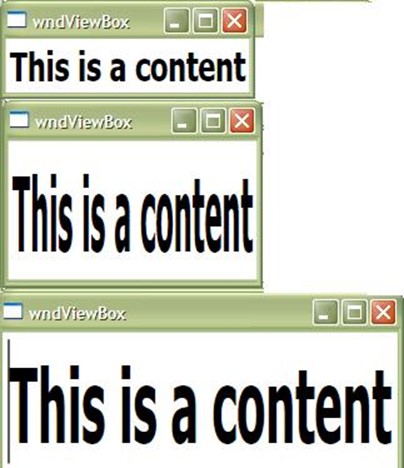
<Viewbox Stretch="None" StretchDirection="Both" >
<Grid>
<TextBox Text="This is a content" FontWeight="Bold" FontSize="30" />
</Grid>
</Viewbox>
弹出窗口(Popup)
弹出窗口是一个用来在实际窗口上创建浮动窗口的特殊控件。弹出窗口控件总是呈现在窗口的最顶层。Popup 用在不需要改变原来窗口并快速显示元素的情况。
一个弹出窗口控件可以使用 PlacementTarget,PlacementRectangle,Placement,HorizontalOffset,VerticalOffset 等来确定位置。弹出窗口是可以脱离当前WPF窗口的区域的窗口,所以它可以被移动到XAML整个内容区域的外面。WPF弹出窗口窗口支持多种动画,例如:Fade,Scroll,Slide 等。你可以用在 PopupAnimation 属性上。当 AllowsTransparency 属性被设置为 True 时,弹出窗口支持透明。

<ToggleButton IsChecked="{Binding ElementName=pup, Path=IsOpen}" Content="Open Popup" Margin="100" />
<Popup Placement="Bottom" AllowsTransparency="True" PopupAnimation="Fade" x:Name="pup" VerticalOffset="-100">
  <StackPanel>
    <TextBlock Name="McTextBlock" Background="Black" Foreground="White">This is popup text</TextBlock>
    <Button Content="This is button on a Popup" />
  </StackPanel>
</Popup>
以上的代码中,当 ToggleButton 的选中的值被绑定到了弹出窗口的 IsOpen 属性上。所以当 IsOpen 是 true 的时候,弹出窗口将显示。
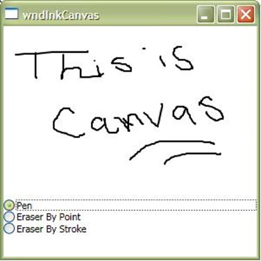
InkCanvas
WPF中我们将介绍的另一个强大的控件是 InkCanvas 。这个控件允许你在画布上拖动并且最终获得保存的图形。它非常的强大,你可以轻松地获得获得画笔画出来的对象。
在WPF中放置一个 InkCanvas ,你会发现你已经可以在屏幕上画图了。
<StackPanel>
<InkCanvas Height="200" x:Name="icBox">
</InkCanvas>
<RadioButton GroupName="mode" Checked="Pen_Checked" Content="Pen"/>
<RadioButton GroupName="mode" Checked="Erase_Checked"
Content="Eraser By Point" />
<RadioButton GroupName="mode" Checked="EraseByStroke_Checked"
Content="Eraser By Stroke" />
</StackPanel>
Transformation
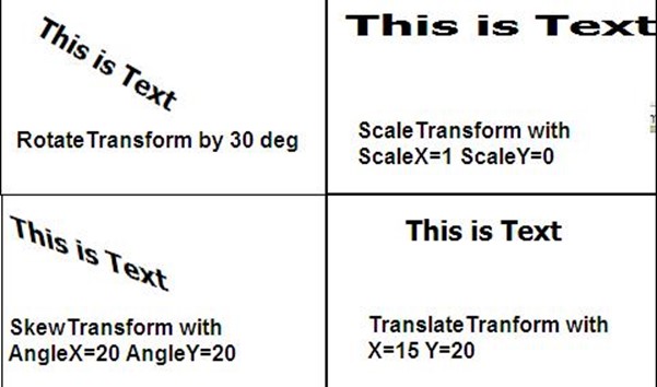
变换是WPF引入的一种重要的特性。变换允许将一个元素从一个坐标控件映射到另一个坐标控件。变换映射采用变换举证在二维空间进行映射。通过操纵矩阵值,你可以变换元素的:Rotate(角度),Scale(规模),Skew(倾斜),Translate(位移)。

变换有四种基本类型:
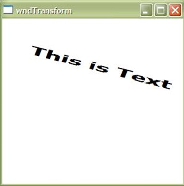
- RotateTranform(旋转变换):使用一个特殊的角度旋转元素。你可以声明选择的角度,元素将在二维空间内旋转。
- ScaleTransform(比例变换):比例变换允许在2维控件内增大或者减小元素的尺寸。
- SkewTransform(倾斜变换):通过一个角度来倾斜元素。倾斜将使元素按照 NonUniform 的风格延伸,这样元素看起来就像变换到了3D空间中。
- TranslateTransform(位移变换):位移变换将移动元素的X,Y坐标。
这里同样提供了使用 TransformGroup 或者 MatrixTransform 来应用多个变换。TransformGroup 允许在单个元素上声明并应用多种变换,从而为你的控件提供混合的变换效果。

<TextBlock FontWeight="Bold" FontSize="20" Text="This is Text" Margin="20">
<TextBlock.RenderTransform>
<TransformGroup>
<RotateTransform Angle="20" />
<SkewTransform AngleX="10" AngleY="10" />
<TranslateTransform X="15" Y="19"/>
<ScaleTransform ScaleX="2" ScaleY="1" />
</TransformGroup>
</TextBlock.RenderTransform>
</TextBlock>
总结
这是整个系列的第二篇文章。我希望你喜欢。不要忘了写下你的反馈。为了不让文章过长,我故意省略了一些东西(例如 InkCanvas)的详细介绍。我将在单独的文章中讨论。
WPF Tutorial : Layout-Panels-Containers & Layout Transformation
This article describes the basics of WPF application, how you can deal with layout, placements of controls and position.
-
Introduction
In my previous article, I discussed few basics of WPF applications, its architecture and internal structure to start with WPF. In this article of the series, I am going to discuss about the very basics of writing your first WPF application and how you can place controls in your window. This is very basic to anybody who wants to start with WPF. I will discuss most of them which are commonly used.
While building your application, the first thing you notice is a Window. Window is the main class that interacts with the user and produces the lifetime of windows and dialog boxes. Like in normal windows application, it produces the object windows using the normal API. A window has two sections:
- Non-Client Area: which displays the outer boundary of the window, that we normally see with any windows. The main parts of them are Icon, System Menu, a title Bar and Border.
-
Client part: This is the main part where the WPF controls will appear. You can customize this area using WPF.
Type of Window
WPF window is of 3 types:
- Window: This is basically a normal windowed application, where every control is placed within the same window. The window appears normally as I told you earlier. The Client area is fully customizable using XAML.
- NavigationWindow: This is a special type of window which is inherited from Windows, but with a Navigation panel top of it. So if you want to create an application that makes sense when used as Wizards, you might better go with NavigationWindow. You can also customize the navigation panel yourself so that it goes with your own look and feel.
-
Page: Almost similar to NavigationWindow, the main difference is that, Page can be opened in Web Browser as XBAP applications.

In the above image, you can see how Normal Window differs from NavigationWindow. NavigationWindow is very uncommon in general case, but might come in handy when you need special treatment for your application.
Let me discuss a bit on how you can use Pages in your application.
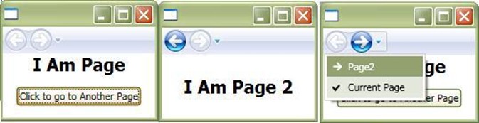
Pages are created to be used as a Page for the Same Window. Navigating from one page to another is very simple. Page class exposes an object of NavigationService which you can use to navigate between pages. NavigationService has few events like Navigating, NavigationFailed, NavigationProgress, NavigationStopped, etc. which you can use to show progressbar while the page is navigating. Methods like GoBack, GoForward and Navigate are the best way to navigate from one page to another.
private
void Button_Click(object sender, RoutedEventArgs e)
{
    this.NavigationService.Navigate(new Uri("Page2.xaml", UriKind.Relative));
}
Thus you can see, rather than calling a new window for Page2.xaml, I just used NavigationService to navigate from one page to another.
For further reference, you can use MSDN article:
-
Types of Containers
WPF Window is derived from ContentControl. Basically while working with Controls, you might come across a few types of controls which form the basis for any WPF control. A ContentControl holds any arbitrary content. It may be a string, an object of any type or even a UIElement like Button, TextBox, etc. In other words, A Content is an arbitrary element that might be placed inside a container. Let's take a look at them one by one:
- ContentControl: A ContentControl holds a single child Content. As Window is derived from ContentControl, every window can have only a single Child. For Example: Window, Button, etc.
- HeaderedContentControl: It is basically the same as ContentControl, but additionally there is a header part which shows the Header for the Content. For instance, a GroupBox, Expander are HeaderedContentControl.
- ItemsControl: The content of ItemsControl is multiple. Therefore, you can place many arbitrary elements inside an ItemsControl. For instance : ListBox, ListView are examples of ItemsControl.
-
HeaderedItemsControl: Here, each Collection has a specific header content of it. A HeaderedItemsControl is a complex element which holds each content with a specific header. TreeView is an example of HeaderedItemsControl.

The above picture shows the distinction between different ContentControls. Each contentControl contains a Content property which stores the inner content. In your XAML, you can specify using Content attribute, or you can directly write the Content inside the Tag. Thus,
<Button Content="This is a Button"/>
is the same as:
<Button>This is a Button</Button>
XAML parser parses the element written inside the XAML ContentControl Tag as Content.
Alignment-Margin-Padding
Alignment, Margin and padding are the 3 most important properties that you should always consider for every UIElement. Before going further with the containers, you need to know about them.
Alignment: Alignment determines how the child elements will be placed within the allocated space of the Parent Element. In other words, it determines the position on the space it was provided. There are two types of Alignment:
- HorizontalAlignment: It has 4 possible values - Left, Right, Center and Stretch. Stretch is the default value of any HorizontalAlignment.
-
VerticalAlignment: It has 4 possible Values - Top, Center, Bottom and Stretch. Stretch is the default value of any VerticalAlignment.
Margin: It determines the distance between one control to the boundary of the cell where it is placed. It can be uniform when specified as a integer value, or you can use TypeConverter to specify the value of all its sides. For instance:
Margin = "20" means Left=20, Top=20, Right=20 and Bottom=20.
You can also specify as
Margin="20,10,0,10" which means Left =20, Top=10, Right=0, and Bottom=10.<Button Margin="0,10,0,10">Button 1</Button> <Button Margin="0,10,0,10">Button 2</Button> <Button Margin="0,10,0,10">Button 3</Button>
Padding: Padding is present in few of the controls that help in enlarging the size of the control by its value. So it is almost similar, but Margin places space outside the boundary of the control whereas padding places it inside the boundary of the control.
<Button Padding="0,10,0,10">Button 1</Button>
<Button Padding="0,10,0,10">Button 2</Button>
<Button Padding="0,10,0,10">Button 3</Button>
Each of the Margin and padding takes an object of Thickness.
Button bb = new Button();
bb.Margin = new Thickness(20);
bb.Padding = new Thickness(10, 20, 30, 10);
this.MyGrid.Children.Add(bb);
Layout Containers
Another important part of any WPF application is to define the Layout of the screen. WPF introduces a number of Panels each are derived from abstract class Panel. You can also derive Panel to define your custom Panel if you wish. We will look into how you can define your own CustomPanel later. Now let's discuss about all the basic Panels supported by WPF.
PANEL
Panel is the abstract class from which each and every panel is derived from. So each layout element that we will talk about is derived from the Panel class and has few properties which I should discuss before talking about Concrete objects.
- Z-Index: It determines the index of the UIElement which overlapped with another element. ZIndex is an Attached property which determines the index in layered elements. One with higher Zindex will show above the other.
- InternalChildren: This is the basic UIElementCollection element which is exposed using Children property. When defining your custom Panel, you can use it to get the elements.
-
Background: This is also present for any panel element, which specifies the Background Color for the Panel.
Custom Panel
To create a custom Panel yourself, you need to override two methods:
MeasureOverride: This method is called whenever an element is added on the Panel. It takes the availableSize as input and returns the DesiredSize for the element passed. You need to calculate the Sizeso that it could be placed accordingly in desired size.
ArrangeOverride: This method is called to determine the arrangement of the Element. It will be called once for the whole panel, when Layout is created and the final desired size for the panel is returned from it. It will again be called when Layout is updated.
You can try the MSDN sample for more details of creating Custom Panel:
-
GRID
Grid is the most basic layout panel which forms a graph in the whole frame. Grid forms a Table which you can address using Row and Column. You can specify the RowDefination and ColumnDefination for Rows and columns of the Grid. You can specify the height of a Row and Width of a Column easily using RowDefinationsand ColumnDefinations.
Sizing of Rows and Columns
As I already said, Height and Width of each Cell in a Grid can be specified using RowDefinations and ColumnDefinations, the sizing can be specified in more than one way. The Sizing can be:
- Auto: This is the default Sizing which is determined by the element you place within the Control.
- * (Star): When you use star, it means the measurement will be done using ratio. 2* means double of 1*. So if you want to make two columns in 2:1 ratio, you mention the width as 2* and 1*.
-
Absolute: You can also specify the absolute value of the height and width. Means if you specify 100 as height, it will take it accordingly.
From my own experience, it is better practice to use MinHeight and MaxWidth instead of Width and Height when you want your layout to be strict and doesn't depend on the child elements.

In the sample application, I have created a Grid with 3X3 matrix. You can use TextBoxes specified on the top to position the Box in Row and Columns Dynamically.
<Grid Grid.Row="1">
  <Grid.RowDefinitions>
    <RowDefinition />
    <RowDefinition />
    <RowDefinition />
  </Grid.RowDefinitions>
  <Grid.ColumnDefinitions>
    <ColumnDefinition />
    <ColumnDefinition />
    <ColumnDefinition />
  </Grid.ColumnDefinitions>
  <Border Background="BurlyWood" x:Name="brdElement">
    <TextBlock x:Name="tbElement" Text="Row 0, Column 0" HorizontalAlignment="Center" VerticalAlignment="Center" />
  </Border>
</Grid>
This will place the Border in 0,0 column of the 3X3 Table.
STACKPANEL
The very next control that I must start with is a StackPanel. StackPanel is a container where all the child elements are placed in stacks, that means one after another, so that no one overlaps on one another.

Stackpanel places controls based on PositiveInfinity, which means the size that it can take in positive direction. The main property of StackPanel is its Orientation. There are two Orientations supported.
Vertical: This is the default orientation for StackPanel where the child items are placed vertically one after another from top to bottom.
Horizontal: Here the items are placed from left to Right one after another.
<StackPanel x:Name="spMain" Orientation="Horizontal">
  <Border Background="Brown" Padding="50"></Border>
  <Border Background="Green" Padding="50" />
</StackPanel>
WRAPPANEL
WrapPanel is almost similar to StackPanel, but it produces a newLine when it reaches the edge of the panel. Thus WrapPanel has additional flexibility to wrap elements when space matters. Another difference is, WrapPanel always determines the size based on the size of the content rather than PositiveInfinity as of StackPanel.

So if you resized the window, the content will be automatically wrapped to the new line. WrapPanel also exposes Orientation Property as StackPanel.
<WrapPanel x:Name="wpMain" Grid.Row="1">
  <Border Background="Brown" Padding="30" />
  <Border Background="Green" Padding="30" />
  <Border Background="Brown" Padding="30" />
  <Border Background="Green" Padding="30" />
</WrapPanel>
DOCKPANEL
DockPanel is the most widely used control to determine the layout of an application. It uses DockPanel.Dockattached property to determine the position of the element. The Dock element when Top or Bottom, will make the element appear Top or Bottom of each other, and when its Left and right, it is left and right of each other.
In case of DockPanel, if the height and width of the element placed within it is not specified, it takes the size of the area it is provided with.
<DockPanel>
  <Border Background="Aqua" DockPanel.Dock="Top">
    <TextBlock Text="Dock:Top" />
  </Border>
  <Border Background="Red" DockPanel.Dock="Bottom">
    <TextBlock Text="Dock:Bottom" />
  </Border>
  <Border Background="Orange" DockPanel.Dock="Left">
    <TextBlock HorizontalAlignment="Center" VerticalAlignment="Center" Text="Dock:Left" />
  </Border>
  <Border Background="Blue" DockPanel.Dock="Left">
    <TextBlock HorizontalAlignment="Center" VerticalAlignment="Center" Text="Dock:Left" />
  </Border>
  <Border Background="Aqua" DockPanel.Dock="Bottom">
    <TextBlock Text="Dock:Top" />
  </Border>
  <Border Background="Aquamarine" DockPanel.Dock="Top">
    <TextBlock Text="Dock:Top" />
  </Border>
  <Border Background="BurlyWood" DockPanel.Dock="Right">
    <TextBlock HorizontalAlignment="Center" VerticalAlignment="Center" Text="Dock:Right" />
  </Border>
  <Border Background="Coral" DockPanel.Dock="Right">
    <TextBlock HorizontalAlignment="Center" VerticalAlignment="Center" Text="Dock:Right" />
  </Border>
  <Border Background="Cornsilk">
    <TextBlock HorizontalAlignment="Center" VerticalAlignment="Center" Text="Remaining Fill" />
  </Border>
</DockPanel>
So, you can see that you need to explicitly mention Dock property of each individual element to make it appear accordingly. The sequence of declaration also plays a vital role in case of DockPanels. If you mention two elements in a row with DockPanel.Dock=Top, that means the two individual elements will appear as Vertically Oriented StackPanel.
A property called LastChildFill makes the remaining space to be filled with undocked element. You can see in the figure the last element is filled with the entire space left. You can make it false if you don't need it.
If you want to do this with code, you need to use DockPanel.SetDock.
VirtualizingStackPanel
WPF introduces a special type of panel which Virtualizes its content when the content is bound to Data elements. The word virtualize means the content will only be produced when the element is visible to the screen. Thus the performance will be improved a lot.
<ListBox x:Name="lstElements" VirtualizingStackPanel.IsVirtualizing="True"
VirtualizingStackPanel.VirtualizationMode="Recycling" ItemsSource="{Binding}"/>
Now from code if you write:
private
void Window_Loaded(object sender, RoutedEventArgs e)
{
    ObservableCollection<int> obs = new ObservableCollection<int>();
    Random rnd = new Random(1000);

    for (int i = 0; i <
            100000; i++)
        obs.Add(rnd.Next());

    this.lstElements.DataContext = obs;
}
This will produce 100000 elements to be added over the ListBox. If you use VirtualizingStackPanel.IsVirtualizing=True, the content will appear instantly, as it doesn't require to produce all the ListBoxItem elements from the first time. The application will hang if you make IsVirtualizing=false as creating 100000 ListboxItem elements takes a lot of time.
VirtualizationMode can be of two types:
- Standard: It means the Item will be created when the ScrollViewer is scrolled.
-
Recycling: It means the item will be replaced with Data when ScrollViewer is scrolled.
CANVAS
Canvas is a special Layout panel which positions elements with absolute position means using x and y co-ordinates. When used within a Canvas, elements are not restricted to anything. It can be overlapped when the position intersects with other controls. Each element is drawn based on the sequence of its declaration. You can easily use Panel.ZIndex to make this declaration unspecific.
Canvas doesn't employ any restriction to its elements. So the width and height of individual elements is very necessary to be specified. You can use Canvas.Left, Canvas.Right, Canvas.Top and Canvas.Bottom to specify the co-ordinates. The only thing you need to remember is that Canvas.Left and Canvas.Right are the same, but it determines the start point of co-ordinate system from the extreme left or extreme right.
<img width="300" height="300" style=" 300px; height: 300px; " alt="Canvas.JPG" src="/KB/WPF/wpf2/Canvas.JPG" border="0" hspace="0" complete="true" />
<Canvas>
  <Border Canvas.Top="20" Canvas.Left="25" Background="Bisque" Width="30" Height="25" />
  <Border Canvas.Top="20" Canvas.Right="25" Background="Green" Width="30" Height="25" />
  <Border Canvas.Bottom="20" Canvas.Right="25" Background="Black" Width="30" Height="25" />
  <Border Canvas.Bottom="20" Canvas.Left="25" Background="IndianRed" Width="30" Height="25" />
  <Ellipse Fill="DarkGray" Canvas.Left="100" Canvas.Top="130" Width="100" Height="80"></Ellipse>
  <Ellipse Fill="DarkCyan" Canvas.Left="100" Canvas.Top="80" Width="100" Height="80"></Ellipse>
  <Ellipse Fill="DarkSalmon" Canvas.Left="140" Canvas.Top="100" Width="100" Height="80" />
</Canvas>
Here you can see the Border elements even though placed in the same area, the Canvas properties change the Co-ordinate system and thus place on the four sides of the window.
The ellipses are Overlapped between one another in the same sequence as it is specified.
UNIFORMGRID
UniformGrid is a special control which adjusts its elements uniformly. If you want your Rows and Columns to be uniform in your grid, you can use UniformGrid instead of Normal Grid declaration.
In case of UniformGrid, the child elements will always be of the same size.

<UniformGrid Columns="2" Rows="3">
  <Border Background="Red" />
  <Border Background="Green" />
  <Border Background="Blue" />
  <Border Background="Yellow" />
  <Border Background="DarkGoldenrod" />
  <Border Background="DarkKhaki" />
</UniformGrid>
So its 3X2 Grid and all elements are placed according to the sequence it is specified.
ScrollViewer
It is often happens that the elements go outside of the Display area. In that case, ScrollViewer places an Automatic Scrollbars which can be used to view the area outside the bounds. ScrollViewer encapsulates the ScrollBars within it and displays it whenever it is required. As the ScrollViewer implements IScrollInfo in the main scrolling area inside the scrollviewer. ScrollViewer also responds to mouse and keyboard commands.
<ScrollViewer HorizontalScrollBarVisibility="Auto">
  <StackPanel VerticalAlignment="Top" HorizontalAlignment="Left">
    <TextBlock TextWrapping="Wrap" Margin="0,0,0,20">Scrolling is enabled when it is necessary. Resize the window, making it larger and smaller.</TextBlock>
    <Rectangle Fill="Honeydew" Width="500" Height="500"></Rectangle>
  </StackPanel>
</ScrollViewer>
The CanContentScroll property of a ScrollViewer determines whether the elements would be scrollable or not. HorizontallScrollBarVisibility and VerticalScrollBarVisibility make the scrollbar appear accordingly. The default behaviour is Auto which means the scrollbar will appear only when it is required.
GroupBox
GroupBox allows to group content with a custom header in it. This is the same as GroupBox we know in windows. The Header property takes the text element which is placed as header of the GroupBox. As GroupBox is a ContentControl, it can have only a single element in the body. So you need to use Panels to add children within it.
<GroupBox Header="This goes to Header" Margin="50">
  <StackPanel>
    <Button Content="First Element" />
    <Button Content="Second Element" />
  </StackPanel>
</GroupBox>
Expander
Expander is same as groupbox but has extra facility to expand content. It is also derived form HeaderedContentControl and thus has one single content within it. The IsExpanded property determines if the panel is expanded or not.

ExpandDirection is used to make the content expanded behaviour. It has four Directions, Down, Up, Right and Left. You can use them to change the Expanded direction of the content.
<Expander Header="This goes to Header" Margin="50" IsExpanded="True" ExpandDirection="Down">
  <StackPanel>
    <Button Content="First Element" />
    <Button Content="Second Element" />
  </StackPanel>
</Expander>
ViewBox
ViewBox is a special WPF control which stretches or scales the contents of the elements. This comes in very handy to allow anchoring of the elements, as in case of ViewBox the controls will never change its position, rather the whole content will be stretched or shrunk.
The Stretch property of ViewBox can have four properties:
- Fill: Fills the content and also makes the Aspect Ratio intact.
- None: Stretch behaviour will not be set.
- UniformToFill: Fills the element uniformly, and changes the Aspect Ratio.
-
Uniform: Uniformly enlarges the content.
The stretchDirection can be specified as Both, DownOnly and UpOnly.
<img width="323" height="374" style=" 323px; height: 374px; " alt="viewBox.JPG" src="/KB/WPF/wpf2/viewBox.JPG" border="0" hspace="0" complete="true" />
<Viewbox Stretch="None" StretchDirection="Both">
  <Grid>
    <TextBox Text="This is a content" FontWeight="Bold" FontSize="30" />
  </Grid>
</Viewbox>
Popup
Popup is a special control that is used to create floating window over the actual window. Popup is a control that is rendered always on Top of the window. Popup is used to display quick elements whenever it is needed without altering the whole window.
A Popup control can be positioned using properties called PlacementTarget, PlacementRectangle, Placement, HorizontalOffset, VerticalOffset, etc. A popup is a window outside the bounds of the existing WPF window, and thus it can be moved outside the whole content area of the XAML. WPF popupcontrol supports few animation like Fade, Scroll, Slide, etc. which you can apply to it using PopupAnimation property. A WPF Popup supports transparency when AllowsTransparency is set to true.
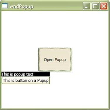
<ToggleButton IsChecked="{Binding ElementName=pup, Path=IsOpen}" Content="Open Popup" Margin="100" />
<Popup Placement="Bottom" AllowsTransparency="True" PopupAnimation="Fade" x:Name="pup" VerticalOffset="-100">
  <StackPanel>
    <TextBlock Name="McTextBlock" Background="Black" Foreground="White">This is popup text</TextBlock>
    <Button Content="This is button on a Popup" />
  </StackPanel>
</Popup>
Here, the Popup will be displayed when the ToggleButton is clicked as IsChecked is bound to IsOpen of Popup. When IsOpen is true, the popup will be displayed.
InkCanvas
Another most powerful control which is introduced with WPF is InkCanvas. This control allows you to draw over the Canvas and ultimately get the image bytes saved. It is very powerful as you can easily get the strokes drawn over the canvas as Objects.
Just place an InkCanvas on the WPF Window and you will find that you can draw over the screen. The EditingMode gives you few editing mode for the InkCanvas. We will discuss with this control later in another article.
<img width="301" height="301" style=" 301px; height: 301px; " alt="inkcanvas.JPG" src="/KB/WPF/wpf2/inkcanvas.JPG" border="0" hspace="0" complete="true" />
<StackPanel>
  <InkCanvas Height="200" x:Name="icBox"></InkCanvas>
  <RadioButton GroupName="mode" Checked="Pen_Checked" Content="Pen" />
  <RadioButton GroupName="mode" Checked="Erase_Checked" Content="Eraser By Point" />
  <RadioButton GroupName="mode" Checked="EraseByStroke_Checked" Content="Eraser By Stroke" />
</StackPanel>
Transformation
Transformation is one of the important features that is introduced with WPF. Transformation allows to map element from one co-ordinate space to another co-ordinate space. The transformation is mapped using Transformation Matrix in 2D space. By manipulating the matrix values, you can Transform elements to Rotate, Scale, Skew and Translate.
Transformation is of 4 basic types:
- RotateTranform: Rotates an element by a specified Angle. You can specify the Angle of Rotation and the element will be rotated in 2D space.
- ScaleTransform: ScaleTransform allows you to scale the element means increase/decrease the size of the element in the 2D space.
- SkewTransform: It skews the element by specified angle. Skew stretches elements in a NonUniformmanner and thus the element will be transformed so as in 3D space.
-
TranslateTransform: This transformation will make the element move by a specified X and Y co-ordinates.
There is also a provision to apply more than one Transformation using TransformGroup or MatrixTransform. TransformGroup allows you to specify more than one Transformation to be applied on the single element and thus gives you a hybrid Transformation for your control.
<TextBlock FontWeight="Bold" FontSize="20" Text="This is Text" Margin="20">
  <TextBlock.RenderTransform>
    <TransformGroup>
      <RotateTransform Angle="20" />
      <SkewTransform AngleX="10" AngleY="10" />
      <TranslateTransform X="15" Y="19" />
      <ScaleTransform ScaleX="2" ScaleY="1" />
    </TransformGroup>
  </TextBlock.RenderTransform>
</TextBlock>
Conclusion
This is the second part of the series. I hope you like it. Please don't forget to write your feedback. I have skipped few things intentionally (like details of InkCanvas) as it would make the article very long. I will discuss that in a separate article.