介绍
边框是每个WPF程序的主要构成块。在我现在的程序中,我使用了很多的边框来装饰界面。从把边框直接放到窗口中到把边框放到控件模板和列表项中,边框在创建一个好的应用界面上扮演了一个非常重要的角色。在这个程序中,你将轻松了解到怎么使用边框和它大部分的属性。
每个人都知道边框到底是什么。它是一个用来装饰UI元素的矩形区域。矩形和边框最大的不同是你可以把一个单独的元素放入到边框中。Border.Child 属性允许你包含一个子 DependancyObject 在边框中。让我们看一个边框的例子:
<Border Width="50" Height="50" x:Name="brdElement">
                            <Border.Background>
                            <SolidColorBrush Color="Bisque"></SolidColorBrush>
                            </Border.Background>
                            <Border.Effect>
                            <DropShadowEffect BlurRadius="10" Color="Red" Direction="235" Opacity=".5"
           RenderingBias="Quality" ShadowDepth="10"
                                            />
                            </Border.Effect>
</Border>

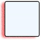
如果你使用上面这段代码,你将看到上图中的效果。让我们看看我到底做了什么。
首先,Width/Height 决定了元素的尺寸。 Border.Background 决定了画刷将在边框内部画的颜色。你能看到颜色是 Bisque (橘黄色)。你可以定义任意的画刷。SolidColorBrush 使用一种颜色(这里我们定义的是橘黄色)然后使用这个颜色填充边框的背景。还有一些其他的属性,例如 CornerRadius,用来创建一个圆角边框,等。我将在本文的后面讨论它们。
Border.Effect 可以应用到边框上。这里我已经添加了一个 DropShadowEffect 的效果。它允许放置一个阴影呈现在边框外。下面是一些你应该注意的依赖的属性:
-
Color(颜色):定义阴影的颜色
-
Opacity(透明度):淡出边框。你可以看到这里的红色淡出到了 .5;透明度的取值范围是0-1;
-
BlurRadius(模糊的圆角):它定义了阴影圆角的半径。如果你增加 BlurRadius 的大小,将会增加阴影的大小。
-
Direction(方向):它是光线方向的度数。235度以为着阴影将聚集到哪里,你可以看到360-235 的值是光源纺织的角度。取值范围是 0-360。
-
ShadownDepth(阴影深度):它定义了阴影的深度。意思是:对象从阴影提高了多少。如果你增加 ShadownDepth 的值,你会看到对象被提升了。
有了这些,让我们来创建更多阴影:

<Border Width="50" Height="50" x:Name="brdElement">
                            <Border.Background>
                            <LinearGradientBrush StartPoint="0,0" EndPoint="0,1">
                            <LinearGradientBrush.GradientStops>
                            <GradientStop Color="Red" Offset="0"/>
                            <GradientStop Color="Pink" Offset=".5"/>
                            <GradientStop Color="Azure" Offset="1"/>
                            </LinearGradientBrush.GradientStops>
                            </LinearGradientBrush>
                            </Border.Background>
                            <Border.Effect>
                            <DropShadowEffect BlurRadius="10" Color="Red"
             Direction="45" Opacity=".4" RenderingBias="Performance" ShadowDepth="30"
                                                            />
                            </Border.Effect>
                            </Border>
在第一个例子中,我把 SolidColorBrush 修改为 有3个 GradientStops 的 LinearGradientBrush 。它从 StartPoint 到 EndPoint 。StartPoint 定义了 Gradient 从哪里开始。所以 0,0 的意思是从左上角开始。第一个0表示X坐标,第二个表示Y坐标。
这里我使用 Gradient 从左上角到右下角,所以 Gradient 将是直线。GradientStops 定义了 Gradient 上的不同颜色。我定义了所有的颜色从0到1.所以 Gradient 将从 0,0 (红色)到 1,1 (天蓝色)。如果我从 0,1 开始到 1,0,它将是一个斜对角的梯度。
<Border Width="50" Height="50" x:Name="brdElement" BorderBrush="Goldenrod"
             BorderThickness="2">
                            <Border.Background>
                            <LinearGradientBrush StartPoint="0,1" EndPoint="1,0">
                            <LinearGradientBrush.GradientStops>
                            <GradientStop Color="BurlyWood" Offset="0"/>
                            <GradientStop Color="MediumBlue" Offset=".5"/>
                            <GradientStop Color="SlateGray" Offset="1"/>
                            </LinearGradientBrush.GradientStops>
                            </LinearGradientBrush>
                            </Border.Background>
                            <Border.Effect>
                            <DropShadowEffect BlurRadius="10" Color="CadetBlue" Direction="0"
            Opacity=".4" RenderingBias="Performance" ShadowDepth="15"
                                                    />
                            </Border.Effect>
                            </Border>
在这个版本中,我使用 Gradient 替代了 Color 。你可以看到 下拉阴影的颜色,阴影深度和方向演示了你的修改带来的变化。
BorderBrush 和 BorderThickness 定义了Border元素的边框。意思是它画出Border组件的外边界。
关于Border的更多
像我之前说的那样,最常见的画刷(Brush)是 LinearGradientBrush 和 SolidColorBrush。下面让我们看看其他可用的画刷。
-
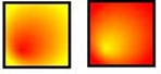
RadialGradientBrush(圆形梯度刷):它产生一个圆形的梯度。我使用一个 RadialGradientBrush 替代了 LinearGradientBrush , 它将显示一个圆形的梯度:

在上面的图中,使用了 RadialGradientBrush 产生边框。让我们来看看代码:
                                <Border Width="50" Height="50" BorderBrush="Black" BorderThickness="2">
                            <Border.Background>
                            <RadialGradientBrush GradientOrigin=".25,.75" RadiusX=".6"
                     RadiusY=".6">
                            <RadialGradientBrush.GradientStops>
                            <GradientStop Color="Red" Offset="0"></GradientStop>
                            <GradientStop Color="Yellow" Offset="1"></GradientStop>
                            </RadialGradientBrush.GradientStops>
                            </RadialGradientBrush>
                            </Border.Background>
                            </Border>
当我们把整个区域设置为1的时候, 渐变起源决定了哪里是原点。如果你设置一个大于1的值,原点将超出边框的范围。这个例子中我使用了 .25,.75。
RadiusX 和 RadiusY 确定了梯度的圆角。最后 GradientStop 决定梯度的真实颜色。只需要增加偏移量,我们就能得到第二张图。
-
ImageBrush(图片刷):它允许你使用Image对象。你必须声明 ImageSource 来确定画的图片。

这是一个使用我自己照片的 ImageBrush。我还添加了一个 BitmapEffect 到边框上制造一些噪点来让图像失真。
<Border Width="100" Height="100"
                                                    >
                            <Border.Background>
                            <ImageBrush ImageSource="logo.jpg" Opacity=".7">
                            <!--<ImageBrush.Transform>
                            <SkewTransform AngleX="10" AngleY="10" />
                        </ImageBrush.Transform>-->
                            </ImageBrush>
                            </Border.Background>
                            <Border.BitmapEffect>
                            <OuterGlowBitmapEffect GlowColor="Brown" GlowSize="20" Noise="3"/>
                            </Border.BitmapEffect>
                            </Border>
Opacity 属性用来声明边框内图片的透明度。
除此之外,我还添加了一个有 OuterGlowEffect 的 BitmapEffect 。OuterGlow 允许增长到边框的外部。我使用了棕色,大小为20,噪点为3。噪点用来让图片失真,就像图中那样。
-
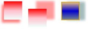
VisualBrush(视觉刷):这允许你使用一个已经存在的可视化元素作为画刷。它用起来非常简单。下面来看:

在第一张图中,我使用 VisualBrush 来画右边的图,就像它自己在左边画的那样。在后一个版本中我将 OuterGlowBitmapEffect 修改为 BevelBitmapEffect 来得到倾斜的图片。VisualBrush 同时翻转了他的XY坐标,看起来就像翻上去了一样。来看看代码:
<Border Width="100" Height="100" x:Name="brdElement" CornerRadius="5"
                                                                    >
                            <Border.Background>
                            <ImageBrush ImageSource="logo.jpg" Opacity=".7">
                            </ImageBrush>
                            </Border.Background>
                            <Border.BitmapEffect>
                            <BevelBitmapEffect BevelWidth="5" EdgeProfile="BulgedUp"
                   LightAngle="90" Smoothness=".5" Relief=".7"/>
                            </Border.BitmapEffect>
                            </Border>
                            <Border Width="100" Height="100" Margin="20,0,0,0">
                            <Border.Background>
                            <VisualBrush TileMode="FlipXY" Viewport="1,1,1,1"
         Stretch="UniformToFill" Visual="{Binding ElementName=brdElement}">
        </VisualBrush>
                            </Border.Background>
                            </Border>
BisualBrush 被绑定到了 brdElement,它代表了在窗口中呈现的可视元素。TileMode 用来表明实际可视化元素的翻转方向。如果出了边框还有其他的按钮或其他的可视化元素,它也会看起来像翻转了一样。所以有时候 VisualBrush 用起来非常顺手。
除了这些,还有许多的画刷比如 DrawingBrush 用来画集合对象等。
边框效果
我之前已经用了一些边框效果,让我们一起来看一下你在真实使用中可能用的主要效果。
边框元素或者任何继承自边框的都支持两种效果:
-
Effect:效果是应用在整个边框上的。任何在边框内的控件也会受到影响。
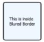
这里你可以看到使用模糊效果同样影响了放在边框内的文本框的文字。下面的代码中将让你看得更明白:
    <Border Background="AliceBlue" Width="100" Height="100" CornerRadius="5"
       BorderBrush="Black" BorderThickness="2">
                            <Border.Effect>
                            <BlurEffect Radius="3" RenderingBias="Quality"
                                                        />
                            </Border.Effect>
                            <TextBlock HorizontalAlignment="Center"
         VerticalAlignment="Center" Text="This is inside Blured Border"
            TextWrapping="Wrap" TextTrimming="WordEllipsis"/>
                            </Border>
-
DropShadowEffect:它用来在边框外添加阴影。我已经在上面讨论过这个了,这里就没有必要详细描述了。
边框位图效果
边框也定义了 BitmapEffect (位图效果)。我已经讨论过了 OuterGlowBitmapEffect 和 BevelBitmapEffect,让我们来说说剩下的。
-
EmbossBitmapEffect(浮雕效果):将让整个边框呈现出浮雕的效果。LightAngle 用来声明放在边框上的光源的角度。所以如果你在边框内写点东西,它将会自动有一个像下面这样的阴影效果:
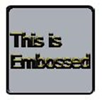
下面是代码:
<Border Background="AliceBlue" Width="100" Height="100" CornerRadius="5"
             BorderBrush="Black" BorderThickness="2">
                            <Border.BitmapEffect>
                            <EmbossBitmapEffect LightAngle="270" Relief=".4" />
                            </Border.BitmapEffect>
                            <TextBlock HorizontalAlignment="Center" Foreground="Gold"
      FontSize="20" VerticalAlignment="Center" Text="This is Embossed"
       TextWrapping="Wrap" TextTrimming="WordEllipsis"/>
</Border>
在文本块中的文本有和边框一样的浮雕效果。-
DropShadowBitmapEffect:你也可以使用 BitmapEffect 声明一个下拉阴影效果。它也允许给自己添加噪点。

下面是代码:
<DropShadowBitmapEffect Color="Red" Direction="200" Noise=".6"
ShadowDepth="10" Opacity=".6"/>
这和 DropShadowEffect 基本相同,但是有一点点增强。使用 BitmapEffect 的时候,你可以使用 BitmapEffectGroup 同时添加多个效果。
要注意的点
在工作中,我发现 Effect 和 BitmapEffect 虽然看起来非常棒,但是可能会影响程序的性能。所以一般最好不要用 Effect 。如果你仍然想用,一般把效果加到小的元素上。不要把 BitmapEffect 加到承载整个窗口的边框上。这将极大地拖慢WPF应用。
总结
边框和画刷是XAML中最常用的组件。
WPF Tutorial : Fun with Border & Brush
In this article, you will find most of the interesting things with Border and Brush elements.
-
Introduction
Border is the primary building block of any application in WPF. In my current application, I have been using lots of borders to adorn the User Interface. Starting from placing borders directly to the Window to putting borders in ControlTemplate of ListBoxItem, borders generally play a very important role in creating a better look and feel for the application. In this application, you will see how you can use Borders and most of the properties with ease.
Everyone knows what exactly the Border is. It is a rectangular area used to decorate the UI elements. The main difference between a Rectangle and a Border is that Border allows you to add one single child element inside it. Border.Child allows you to include a child DependancyObject inside a Border. Let us see a sample Border:
<Border Width="50" Height="50" x:Name="brdElement"> <Border.Background> <SolidColorBrush Color="Bisque"></SolidColorBrush> </Border.Background> <Border.Effect> <DropShadowEffect BlurRadius="10" Color="Red" Direction="235" Opacity=".5" RenderingBias="Quality" ShadowDepth="10" /> </Border.Effect> </Border>

If you place this in your code, you will see something like the above. Let us look into detail what exactly I have done.
First of all, Width / Height determines the dimension of the Border element. Border.Background determines what will be the color of the Brush which will draw the inside of the Border. You can see the color is Bisque. You can define any type of Brush here. SolidColorBrush takes one Color element (which is here defined as Bisque) and fills the Border Background with that color. There are other properties too like CornerRadius, used to create RoundedCornerBorder, etc. I will discuss them later in the article.
Border Effect can also be applied to a Border. Here I have added a DropShadowEffect. It allows you to put a shadow rendered outside the Border. The dependency properties that you need to take note of are:
-
Color: Defines the Color of the Shadow.
-
Opacity: Fades out the Color. You can see the Red color is faded out here to .5; Opacity ranges between 0 - 1.
-
BlurRadius: It defines the extent of shadow radius. Thus if you increase the size of BlurRadius, it will increase the Shadow.
-
Direction: It is the Light Direction in degrees. 235 degree implies where the shadow will focus, thus you can see 360 -235 is the angle where light is placed. Value ranges from 0 to 360.
-
ShadowDepth: It defines the depth of the Shadow. It means, how much the object is raised from the Shadow. If you increase the value of ShadowDepth, you will see, the being raised.
Now with these, let's create a few more:
<Border Width="50" Height="50" x:Name="brdElement"> <Border.Background> <LinearGradientBrush StartPoint="0,0" EndPoint="0,1"> <LinearGradientBrush.GradientStops> <GradientStop Color="Red" Offset="0"/> <GradientStop Color="Pink" Offset=".5"/> <GradientStop Color="Azure" Offset="1"/> </LinearGradientBrush.GradientStops> </LinearGradientBrush> </Border.Background> <Border.Effect> <DropShadowEffect BlurRadius="10" Color="Red" Direction="45" Opacity=".4" RenderingBias="Performance" ShadowDepth="30" /> </Border.Effect> </Border>
In the first sample, I have modified the SolidColorBrush to LinearGradientBrush with 3 GradientStops. It takes StartPoint and EndPoint. StartPoint defines where the Gradient will start. So 0,0 means starts from the TopLeft corner. First 0 represents the X axis Offset color, and second defines Y - axis Offset color.
Here I have used Gradient from TopLeft to BottomRight, so the Gradient will be straight. GradientStops defines the different colors on the Gradient. Here I have defined all the colors from 0 to 1. Thus the Gradient will start from 0,0 means Red to 1,1 as Azure. If I start as 0,1 to 1,0 it would have been a Diagonal Gradient.
<Border Width="50" Height="50" x:Name="brdElement" BorderBrush="Goldenrod" BorderThickness="2"> <Border.Background> <LinearGradientBrush StartPoint="0,1" EndPoint="1,0"> <LinearGradientBrush.GradientStops> <GradientStop Color="BurlyWood" Offset="0"/> <GradientStop Color="MediumBlue" Offset=".5"/> <GradientStop Color="SlateGray" Offset="1"/> </LinearGradientBrush.GradientStops> </LinearGradientBrush> </Border.Background> <Border.Effect> <DropShadowEffect BlurRadius="10" Color="CadetBlue" Direction="0" Opacity=".4" RenderingBias="Performance" ShadowDepth="15" /> </Border.Effect> </Border>
In this version, I have modified the Colors of the Gradient. You can see the DropShadowColor, ShadowDepth and Direction is changed as well to demonstrate to you how it modifies.
The BorderBrush and BorderThickness defines the border element of the Border. It means it draws the outer boundary of the Border.
More of Brushes
As I have already discussed, the most common Brush viz LinearGradientBrush, SolidColorBrush; Let us look into other brushes that are available to us.
-
RadialGradientBrush: It produces a circular gradient. Thus if I place a RadialGradientBrush instead a LinearGradientBrush, it will show you the Circular gradient.
In the above, RadialGradientBrush is used to produce these borders. Let's look at the code:
<Border Width="50" Height="50" BorderBrush="Black" BorderThickness="2"> <Border.Background> <RadialGradientBrush GradientOrigin=".25,.75" RadiusX=".6" RadiusY=".6"> <RadialGradientBrush.GradientStops> <GradientStop Color="Red" Offset="0"></GradientStop> <GradientStop Color="Yellow" Offset="1"></GradientStop> </RadialGradientBrush.GradientStops> </RadialGradientBrush> </Border.Background> </Border>
The GradientOrigin determines where the Origin is when we take the whole area to be 1. So If you place a value more than 1, Origin will lie outside the border. I have placed .25,.75 in this case.
The RadiusX and RadiusY determines the Radius of the Gradient. Finally the GradientStopsdetermines the actual gradient colors. Just interchanging the Offsets will produce the 2nd image.
-
ImageBrush: It allows you to draw using Image. You need to specify the ImageSource to determine what Image is to be drawn.

Here an ImageBrush is specified with my image. I have also added a BitmapEffect to the Borderwith some noise to distort the image a little.
<Border Width="100" Height="100" > <Border.Background> <ImageBrush ImageSource="logo.jpg" Opacity=".7"> <!--<ImageBrush.Transform> <SkewTransform AngleX="10" AngleY="10" /> </ImageBrush.Transform>--> </ImageBrush> </Border.Background> <Border.BitmapEffect> <OuterGlowBitmapEffect GlowColor="Brown" GlowSize="20" Noise="3"/> </Border.BitmapEffect> </Border>
The Opacity specifies the opacity of the image drawn inside the Border.
In addition to this, I have added one BitmapEffect with OuterGlowEffect. OuterGlow allows you to glow the outer section of the Border. I used Brown glow with GlowSize = 20 and Noise=3. Noise is used to distort the image, just seen in the image.
-
VisualBrush: This allows you to draw using an already visual element. It is very simple to use. Just see:

In the first Image, I have used VisualBrush to draw the Image on the right side which draws itself as the left side. I have modified the OuterGlowBitmapEffect to BevelBitmapEffect in the next version, to have a bevel effect to the image. The VisualBrush is also flipped XY so it seems upside down. See how the code looks like:
<Border Width="100" Height="100" x:Name="brdElement" CornerRadius="5" > <Border.Background> <ImageBrush ImageSource="logo.jpg" Opacity=".7"> </ImageBrush> </Border.Background> <Border.BitmapEffect> <BevelBitmapEffect BevelWidth="5" EdgeProfile="BulgedUp" LightAngle="90" Smoothness=".5" Relief=".7"/> </Border.BitmapEffect> </Border> <Border Width="100" Height="100" Margin="20,0,0,0"> <Border.Background> <VisualBrush TileMode="FlipXY" Viewport="1,1,1,1" Stretch="UniformToFill" Visual="{Binding ElementName=brdElement}"> </VisualBrush> </Border.Background> </Border>
The VisualBrush is bound to brdElement, which represents the Visual element placed in the window. TileMode indicates the Flip direction of the actual visual. Thus if there is a button or any other visual placed other than the border, it would look flipped as well. So VisualBrush comes in very handy at times.
Other than that, there are lots of Brushes as well like DrawingBrush, used to draw Geometry objects, etc.
Border Effects
As I have already used some Border Effects previously, let's see what are the main effects that you might use in real life.
Border element or any element inherited from Border supports two types of Effects.
-
Effect: Effects are applied to the whole Border. Thus any control inside the Border will also be affected with the effect.

Thus you can see using BlurEffect in the Border actually affects the Text written in the TextBlockinside the Border. You will get a clear idea by looking at the code below:
<Border Background="AliceBlue" Width="100" Height="100" CornerRadius="5" BorderBrush="Black" BorderThickness="2"> <Border.Effect> <BlurEffect Radius="3" RenderingBias="Quality" /> </Border.Effect> <TextBlock HorizontalAlignment="Center" VerticalAlignment="Center" Text="This is inside Blured Border" TextWrapping="Wrap" TextTrimming="WordEllipsis"/> </Border>
-
DropShadowEffect: It is used to place a shadow outside the Border. I have already discussed it in the previous section of the article, so there is no need to elaborate this anymore.
Border BitmapEffects
Border also defines BitmapEffect. I have already discussed about OuterGlowBitmapEffect and BevelBitmapEffect, so let's discuss about the rest.
-
EmbossBitmapEffect: This effect will emboss the whole border. The LightAngle specifies the angular direction of light placed on the border. So if you write something inside the Border, it would have a shadow effect automatically just like the below:

If you see the code, it looks like:
<Border Background="AliceBlue" Width="100" Height="100" CornerRadius="5" BorderBrush="Black" BorderThickness="2"> <Border.BitmapEffect> <EmbossBitmapEffect LightAngle="270" Relief=".4" /> </Border.BitmapEffect> <TextBlock HorizontalAlignment="Center" Foreground="Gold" FontSize="20" VerticalAlignment="Center" Text="This is Embossed" TextWrapping="Wrap" TextTrimming="WordEllipsis"/> </Border>
The Text inside the textblock is Embossed with the whole border itself.
-
DropShadowBitmapEffect: You can also specify dropshadow using BitmapEffect. It allows to add Noise to it as well.
The code will look like:
<DropShadowBitmapEffect Color="Red" Direction="200" Noise=".6"ShadowDepth="10" Opacity=".6"/>This is the same as normal DropShadowEffect but a bit of enhancements. For BitmapEffects, you can also add all the effects at a time using BitmapEffectGroup.
Points to Remember
While working, I have found both Effect and BitmapEffect of Border, even though it looks great for an application, it may often deteriorate performance of the application. So it is always better to avoid Effects. If you still like to use them, always use the effects to small elements. Do not put say BitmapEffect to a border that spans the whole window. This will seriously slow down the WPF application.
Conclusion
Borders and brushes are the most commonly used objects in XAML. So I hope you like the article and that it has helped you a lot. Thanks for reading.