- WPF Tutorial : Beginning [^]
- WPF Tutorial : Layout-Panels-Containers & Layout Transformation [^]
- WPF Tutorial : Fun with Border & Brush [^]
- WPF Tutorial - TypeConverter & Markup Extension [^]
- WPF Tutorial - Dependency Property [^]
- WPF Tutoriall - Concept Binding [^]
- WPF Tutorial - Styles, Triggers & Animation [^]
-
介绍
也许对于任何WPF应用程序最有趣和最重要的功能是Styling。样式意味着定义控件的样式,并以可重复使用的方式存储,
ResourceDictionaries随后可以通过调用其名称来使用。WPF中的样式可以与CSS样式进行比较。它们在大多数情况下都是相似的,而前者扩展了允许WPF具有大部分功能的特性。在本文中,我将主要讨论如何Style在WPF应用程序中使用它来增强UI的丰富体验。在我们继续进行风格之前,让我们记下迄今为止我们已经讨论过的内容。
- WPF教程:开始 [ ^ ]
- WPF教程:布局面板 - 容器和布局转换 [ ^ ]
- WPF教程:带边框和画笔的乐趣 [ ^ ]
- WPF教程 - TypeConverter和标记扩展 [ ^ ]
- WPF教程 - 依赖属性 [ ^ ]
- WPF教程1- 概念绑定 [ ^ ]
- WPF教程 - 样式,触发器和动画 [ ^ ]
所以基本上,如果你已经阅读过系列文章,那么你必须已经了解了如何应用你的风格的大部分内容,你怎么定义风格对象等。在本文中,我将讨论如何更好地编写样式为您的应用程序。
样式
WPF
Style为每个Control 公开一个属性。如果你看看对象层次,样式基本上是暴露的对象的属性Style在FrameworkElement。所以每个对象都可以关联它并定义自定义设置器来操纵控件的基本外观。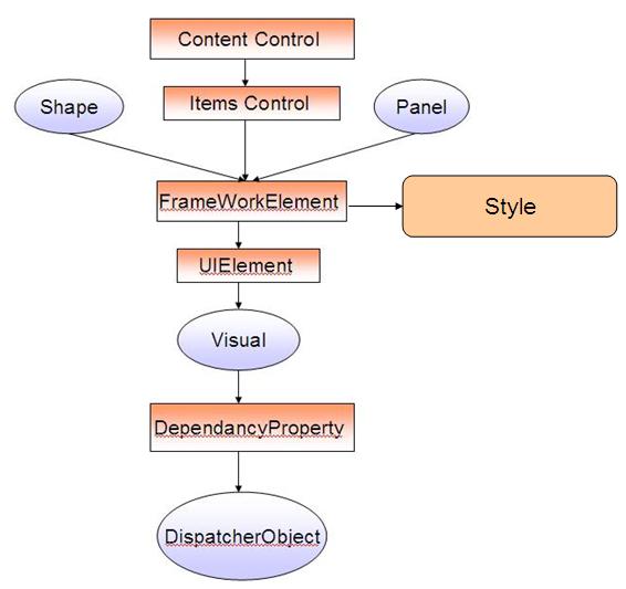
显然,上面的图显示的关联
Style中FrameworkElement,并从对象分层结构中的每个控制某种方式从继承FrameworkElement,因此样式将提供给它。Style也是一个WPF对象,它是继承的形式DispatcherObject,它有助于设置UI元素的不同属性。风格与主题有何不同?
在我们进一步进入样式之前,让我们讨论主题。主题与Styles完全不同。主题是在操作系统级别定义的,或者更确切地说,主题可以参与在桌面上传递样式的一部分,同时
Styles限制在WPF窗口的上下文区域。WPF能够检索OS级定义的配色方案。举例来说,如果您没有为应用程序定义样式,屏幕中的元素将自动从外部环境获取样式。举例来说,在XP中,如果将主题更改为其他内容,则会看到TextBoxWPF窗口上的按钮会立即更改其颜色。您甚至可以设置应用程序在您的代码中以编程方式 [ ^ ] 使用的主题 。什么模板?
每个控件定义一个
ControlTemplate。AControlTemplate定义了控件的整体结构。正如我已经告诉过你的,比如说你有一个Button。按钮是由多个控件组成的控件。它会有一个ContentPresenter写在Text控制之上,它会有一个Rectangle保持等的边界Button。因此,模板是一个特殊的属性与一个控制,它指定了控制将在结构上看起来如何。我们可以轻松定义Template和改变控件的整体结构。模板基本上有两种类型:
- 控件模板
- DataTemplate中
ControlTemplate定义了结构Control。这意味着举例说,你定义了ControlTemplate一个ComboBox。因此,从ControlTemplate您可以轻松地更改ToggleButton与ComboBox哪个打开 关联DropDown,您可以更改该结构TextBox,Popup等等。因此,ControlTemplate允许您更改该控件的整体结构。每个控件都由数据组成。举例来说,一个
ItemsControl包含许多数据元素的构建Popup内的项目。这DataTemplate可能会与ItemsTemplate并将建立数据块的ComboBox。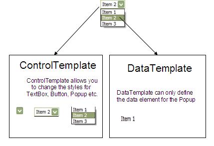
所以,你应该永远记住,
ControlTemplate在DataTemplate定义每个单独的数据元素的同时定义整个控件。如何定义样式?
通常,样式是用于设置WPF控件样式的唯一对象。每个WPF元素都包含许多依赖属性。依赖项属性定义UI中控件的基本行为和外观。样式维护一个
Setters列举DependencyProperty它的价值的集合。因此,你可以说风格是一组
DependencyProperty设置,当应用在目标上时,它会改变它的行为。让我们假设你要设计一个
TextBox。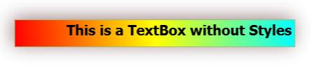
<TextBox Text="This is a TextBox without Styles"

            HorizontalAlignment="Center"

            VerticalAlignment="Center"

            CharacterCasing="Lower"

            FlowDirection="RightToLeft"

            FontSize="20"

            FontWeight="UltraBlack"

            Width="400"

            Height="40">
    <TextBox.Background>
        <LinearGradientBrush>
            <GradientStop Color="Cyan" Offset="0.0"/>
            <GradientStop Color="Yellow" Offset="0.5"/>
            <GradientStop Color="Red" Offset="1.0"/>
        </LinearGradientBrush>
    </TextBox.Background>
    <TextBox.Foreground>
        <SolidColorBrush Color="Black"/>
    </TextBox.Foreground>
    <TextBox.Effect>
        <DropShadowEffect BlurRadius="40" Color="Maroon"

           Direction="50" Opacity