1、页面布局
题目:假设高度已知,请写出三栏布局,其中左栏右栏宽度为300px,中间自适应?
1、浮动
-
浮动布局
-
优点:兼容性比较好
-
缺点:浮动后,元素是脱离文档流的,需要处理清除浮动clear:both;处理好与周边元素关系
-
div是left-right-center
-
效果图

css
* {
        margin: 0;
        padding: 0;
    }
    .layout .content div{
        min-height: 100px;
    }
    .layout .content .left{
        float: left;
         300px;
        background: pink;

    }
    .layout .content .right{
        float: right;
         300px;
        background: yellow;
    }
     .layout .content .center {
        background: red;
     }
html
<section class="layout">
    <article class="content">
        <div class="left">左边内容</div>
        <div class="right">右边内容</div>
        <div class="center">浮动布局中间内容</div>
    </article>
</section>
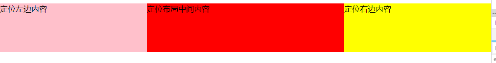
2、绝对定位
-
绝对定位布局
-
优点:布局相对迅速
-
缺点: 定位的元素脱离了文档流,意味着子元素也要脱离文档流,所以这种方式的可使用性比较差
-
效果图
css
.layout-absolute .absolute-content {
    position: relative;
 }
 .layout-absolute .absolute-content div {
    min-height: 100px;
 }
 .layout-absolute .absolute-content .left {
    position: absolute;
    left: 0;
     300px;
    background: pink;
 }
 .layout-absolute .absolute-content .right {
    position: absolute;
    right: 0;
     300px;
    background: yellow;
 }
 .layout-absolute .absolute-content .center {
    position:absolute;
    left: 300px;
    right: 300px;
    background: red;
 }
html
<section class="layout-absolute">
    <article class="absolute-content">
        <div class="left">定位左边内容</div>
        <div class="center">定位布局中间内容</div>
        <div class="right">定位右边内容</div>
    </article>
</section>
3、固定定位(比较完善)
-
flex
-
优点: 非常有效的解决了浮动和绝对定位的问题
-
缺点:兼容性比较差(css3的属性),不兼容IE8及以下
-
效果图

css
.flexbox-content {
    display: flex;
     100%;

 }
 .flexbox-content div {
    min-height: 100px;
 }
 .flexbox-content .left {
     300px;
    background: pink;
 }
 .flexbox-content .right {
     300px;
    background: yellow;
}
.flexbox-content .center {
    flex: 1;
    background: red;
}
html
<section class="flexbox">
    <article class="flexbox-content">
        <div class="left">固定定位左边内容</div>
        <div class="center">固定定位中间内容</div>
        <div class="right">固定定位右边内容</div>
    </article>
</section>
4、表格布局(兼容性很好)
-
表格布局
-
优点:兼容性非常好,弥补了flex布局兼容的问题
-
缺点:操作繁琐,当三栏中其中某一栏高度超出时,其他两栏的高度也会自动跟着调整(不符合某些场景)
-
效果图

css
.table-content {
    display: table;
     100%;
}
 .table-content div{
    display: table-cell;
    height: 100px;
 }
 .table-content .left {
     300px;
    background: pink;
 }
 .table-content .center {
    background: red;
 }
 .table-content .right {
     300px;
    background: yellow;
 }
html
<section class="flexbox">
    <article class="flexbox-content">
        <div class="left">固定定位左边内容</div>
        <div class="center">固定定位中间内容</div>
        <div class="right">固定定位右边内容</div>
    </article>
</section>
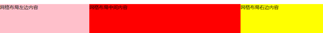
5、网格布局
- 效果图
css
.grid-content {
    display: grid;
     100%;
    grid-template-rows: 100px;
    grid-template-columns: 300px auto 300px;
 }
 .grid-content .left {
    background: pink;

 }
 .grid-content .center {
    background: red;

 }
 .grid-content .right {
    background: yellow;
 }
html
<section class="grid">
    <article class="grid-content">
        <div class="left">网格布局左边内容</div>
        <div class="center">网格布局中间内容</div>
        <div class="right">网格布局右边内容</div>
    </article>
</section>
- 假如把高度已知去掉或者高度超出
- 1.flex布局高度可以自适应
- 2.表格布局高度可以自适应
- 3.浮动,绝对定位,网格布局不能自适应高度