一、案例介绍
- 采用HTML5和CSS3制作
- 使用用几幅很大的图片或色块做背景,再添加一些简单的内容,实现全屏切换的效果
- 适用于制作各种宣传页、活动页
二、知识点
- 使用动画分为js实现的动画(帧动画,使用定时器,每隔一段时间更改当前元素的状态)和css3显示的动画(补间动画,加过渡只需状态改变产出动画,多个节点来控制动画),css3动画性能会更好,并且在支持H5C3的浏览器尽可能的使用css3动画,比如移动端开发
- 2D转换有缩放scale、位移translate、旋转rotate、倾斜skew,关于动画速度有ease、linear、ease-in、ease-out、ease-in-out都是特殊的动画速度,都是由贝塞尔曲线,2D转换和3D转换的区别一是参数,二是在移动端使用3D转换可以优化性能(如果设备有3D加速引擎GPU可以提高性能,是2D转换是无法调用GPU)
- 背景图的百分比不是按照容器的大小去换算的,百分比的背景图定位基于容器的宽度-背景的宽度,计算公式:背景图的X定位 = (容器的宽度 - 背景的宽度) * 百分比
三、实现方法:fullPage.js 插件
①介绍:fullPage.js 是一个基于 jQuery 的插件,它能够很方便、很轻松的制作出全屏网站,主要功能有支持鼠标滚动、支持前进后退和键盘控制多个回调函数、支持手机平板触摸事件、支持 CSS3 动画、支持窗口缩放、窗口缩放时自动调整、可设置滚动宽度、背景颜色、滚动速度、循环选项、回调、文本对齐方式等等。兼容 jQuery 1.7+,兼容IE8+。下载和了解更多可以点击这里。
②原理:
window.onmousewheel=function(){
    //代码
}
③使用:
-
引入文件
<link rel="stylesheet" href="css/jquery.fullPage.css">
<script src="js/jquery.min.js"></script>

<!-- jquery.easings.min.js 用于 easing 参数,也可以使用完整的 jQuery UI 代替,如果不需要设置 easing 参数,可去掉改文件 -->
<script src="js/jquery.easings.min.js"></script>

<!-- 如果 scrollOverflow 设置为 true,则需要引入 jquery.slimscroll.min.js,一般情况下不需要 -->
<script src="js/jquery.slimscroll.min.js"></script>

<script src="js/jquery.fullPage.js"></script>
-
HTML
div id="dowebok">
    <div class="section">第一屏</div>
    <div class="section">第二屏</div>
    <div class="section">
        <div class="slide">第三屏的第一屏</div>
        <div class="slide">第三屏的第二屏</div>
        <div class="slide">第三屏的第三屏</div>
        <div class="slide">第三屏的第四屏</div>
    </div>
    <div class="section">第四屏</div>
</div>
-
JavaScript初始化
$(function(){
    $(选择器).fullpage();
});
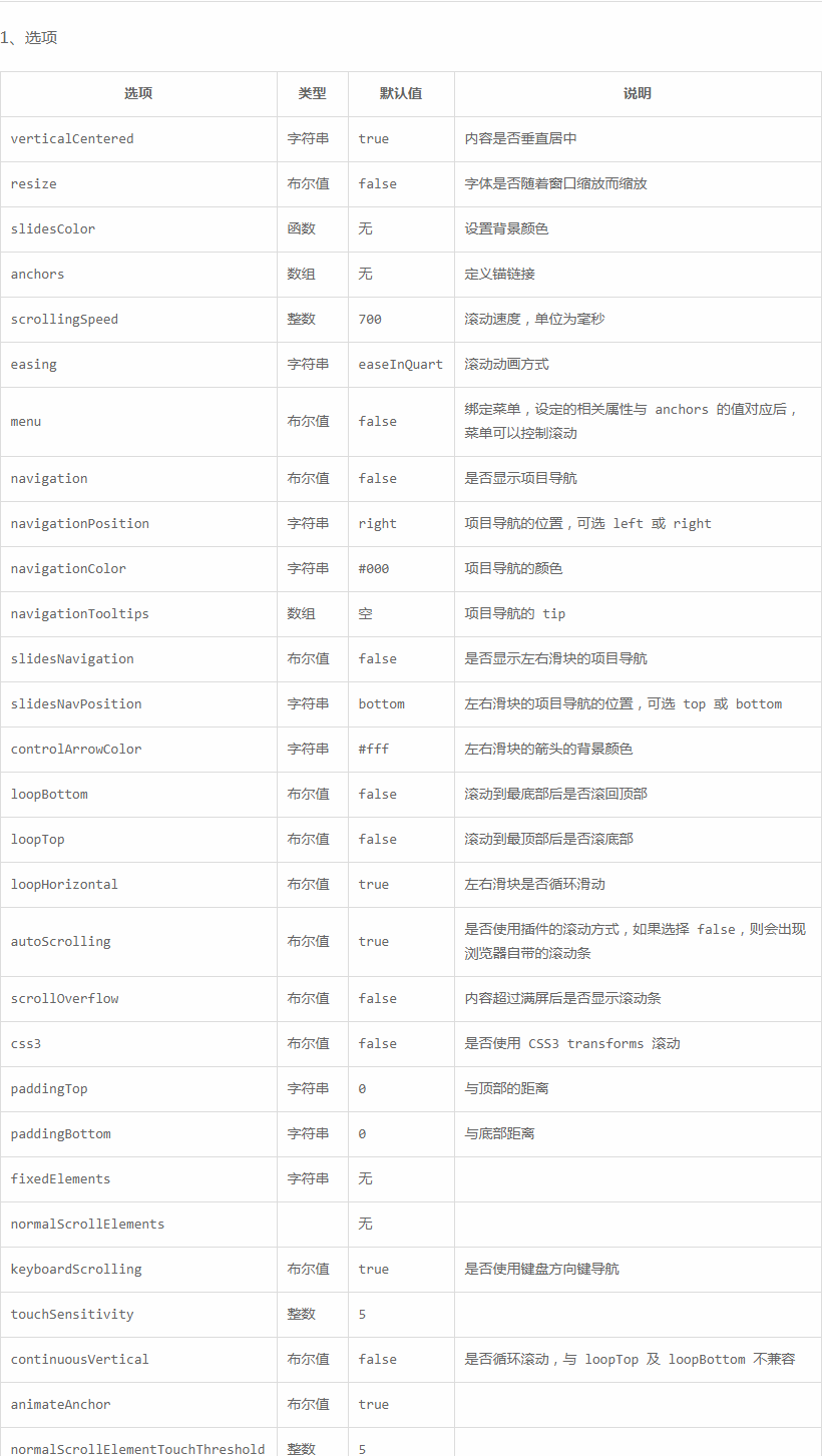
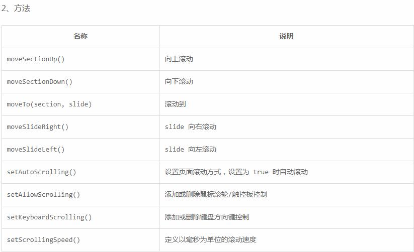
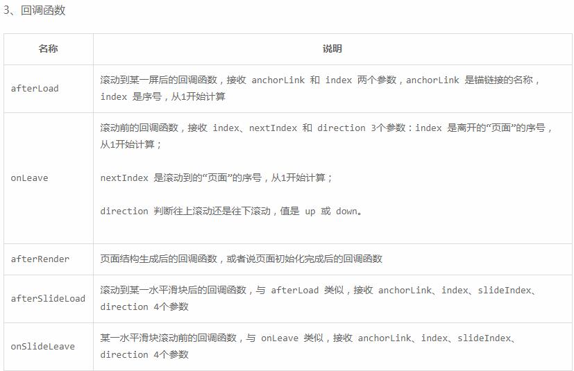
④常用配置:
四、具体操作
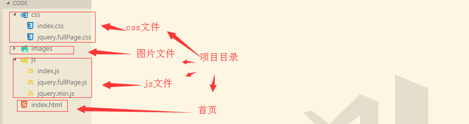
①目录结构:
②思路
- 第一步:八页屏全屏切换效果,使用fullpage插件,以及公用的元素(全部屏都有的元素和效果)
- 第二步:第一屏的布局和动画实现
- 第三步:第一屏的布局和动画实现
- 第四步:第二屏的布局和动画实现
- 第五步:二、三屏的切换效果和第三屏的布局以及动画实现
- 第六步:三、四屏的切换效果和第四屏的布局以及动画实现
- 第七步:四、五屏的切换效果和第五屏的布局以及动画实现
- 第八步:五、六屏的切换效果和第六屏的布局以及动画实现
- 第九步:六、七屏的切换效果和第七屏的布局以及动画实现
- 第十步:第八屏的布局以及动画实现
③代码:


<!DOCTYPE html>
<html lang="en">
<head>
    <meta charset="UTF-8">
    <meta name="viewport" content="width=device-width, initial-scale=1.0">
    <title>购物车</title>
    <link rel="stylesheet" href="css/jquery.fullPage.css">
    <link rel="stylesheet" href="css/index.css">
</head>
<body>
    <!-- 公用的元素 -->
    <a href="#" class="go"><img src="images/00-go.png" alt=""></a>
    <a href="javascript:;" class="more"><img src="images/00-more.png" alt=""></a>
    <!-- 整体容器 -->
    <!-- 指示器点容器navigation -->
    <div class="container">
        <!-- 每一个切换的屏幕 -->
        <!-- 第一屏 -->
        <div class="section screen01">
            <!-- 如果是大屏幕,是基于top定位,脱离显示区域,固定在一个区域内,用一个固定大小的容器装内容 -->
            <div class="content">
                <!-- 电脑,平板,手机 -->
                <div class="pad"><img src="images/01-pad.png" alt=""></div>
                <div class="pc"><img src="images/01-pc.png" alt=""></div>
                <div class="phone"><img src="images/01-phone.png" alt=""></div>
            </div>
        </div>
        <!-- 第二屏 -->
        <div class="section screen02">
            <!-- 动画特点:完全进入当前屏的时候执行动画,可以采用通过js dom操作增加类 -->
            <div class="content">
                <!-- 商品列表 -->
                <div class="goods"><img src="images/02-goods.png" alt=""></div>
                <!-- 手机 -->
                <div class="phone"><img src="images/02-phone.png" alt=""></div>
                <!-- 搜索框、关键字-->
                <div class="input">
                    <img class="search" src="images/02-search.png" alt="">
                    <img class="key" src="images/02-key.png" alt="">
                </div>
                <!-- 文字 -->
                <div class="text">
                    <img class="text01" src="images/02-text01.png" alt="">
                    <img class="text02" src="images/02-text02.png" alt="">
                </div>
            </div>
        </div>
        <div class="section screen03">
            <div class="content">
                <div class="phone"><img src="images/02-phone.png" alt=""></div>
                <div class="change">
                    <img src="images/03-change01.png" alt="">
                    <img src="images/03-change02.png" alt="">
                </div>
                <div class="cart">
                    <img src="images/03-card01.png" alt="">
                    <img src="images/03-card02.png" alt="">
                </div>
            </div>
        </div>
        <div class="section screen04">
            <div class="content">
                <!-- 白云 -->
                <div class="cloud"><img src="images/04-clloud.png" alt=""></div>
                <!-- 文字 -->
                <div class="text">
                    <img src="images/04-text01.png" alt="">
                    <img src="images/04-text02.png" alt="">
                </div>
                <!-- 购物车 -->
                <div class="cart"><img src="images/04-cart.png" alt=""></div>
                <!-- 手机 -->
                <div class="phone"><img src="images/02-phone.png" alt=""></div>
                <!-- 收货地址 -->
                <div class="address">
                    <img src="images/04-address01.png" alt="">
                    <img src="images/04-address02.png" alt="">
                </div>
            </div>
        </div>
        <div class="section screen05">
            <div class="content">
                <!-- 文字 -->
                <div class="text"><img src="images/05-text.png" alt=""></div>
                <!-- 手机 -->
                <div class="phone"><img src="images/02-phone.png" alt=""></div>
                <!-- 银行卡 -->
                <div class="card">
                    <img class="cardImg" src="images/05-card.png" alt="">
                    <img class="orderImg" src="images/05-order.png" alt="">
                </div>
                <!-- 点鼠标 -->
                <div class="mouse">
                    <img class="m1" src="images/05-mouse01.png" alt="">
                    <img class="m2" src="images/05-mouse02.png" alt="">
                    <img class="hand" src="images/05-hand.png" alt="">
                </div>
            </div>
        </div>
        <div class="section screen06">
            <div class="content">
                <!-- 白云 -->
                <div class="cloud">
                    <img src="images/06-cloud01.png" alt="">
                    <img src="images/06-cloud02.png" alt="">
                </div>
                <!-- 文字 -->
                <div class="text">
                    <img src="images/06-text01.png" alt="">
                    <img src="images/06-text02.png" alt="">
                </div>
                <!--盒子 -->
                <div class="box"><img src="images/06-box.png" alt=""></div>
                <!-- 汽车 -->
                <div class="car">
                    <img class="carImg" src="images/06-car.png" alt="">
                    <img class="worker" src="images/06-worker.png" alt="">
                    <img class="say" src="images/06-say.png" alt="">
                </div>
                <!-- 收货人 -->
                <div class="person">
                    <img class="personImg" src="images/06-person.png" alt="">
                    <img class="door" src="images/06-door.png" alt="">
                </div>
            </div>
        </div>
        <div class="section screen07">
            <div class="content">
                <div class="star">
                    <img src="images/07-star.png" alt="">
                    <img src="images/07-star.png" alt="">
                    <img src="images/07-star.png" alt="">
                    <img src="images/07-star.png" alt="">
                    <img src="images/07-star.png" alt="">
                </div>
                <div class="text"><img src="images/07-text.png" alt=""></div>
            </div>
        </div>
        <div class="section screen08">
            <div class="content">
                <div class="btn">
                    <img src="images/08-btn1.png" alt="">
                    <img src="images/08-btn2.png" alt="">
                </div>
                <div class="again"><img src="images/08-again.png" alt=""></div>
                <div class="hand"><img src="images/08-hand.png" alt=""></div>
            </div>
        </div>
    </div>
    <script src="js/jquery.min.js"></script>
    <script src="js/jquery.fullPage.js"></script>
    <script src="js/index.js"></script>
</body>
</html>
/* 公用样式 */
.go{
    widows: 100px;
    height: 100px;
    border-radius: 50%;
    position: fixed;
    right: 30px;
    top: 30px;
    z-index: 1001;
}
.more{
    position: fixed;
    right: 60px;
    bottom: 80px;
    z-index: 1001;
    animation: more 0.4s linear infinite alternate;
}
/* 内容容器 */
.content{
    width: 900px;
    height: 600px;
    /* background: rgba(0,0,0,.1); */
    position: absolute;
    bottom: 0;
    left: 50%;
    margin-left: -450px;
}
/* 第一屏布局 */
.screen01{
    background:url("../images/01-bg.png") no-repeat center bottom;
}
.screen01 .pad{
    position: absolute;
    left: 0px;
    top: -200px;
    animation: phone01 1.5s linear infinite alternate;
}
.screen01 .pc{
    position: absolute;
    left: -400px;
    top: -200px;
    animation: pc01 0.5s linear infinite alternate;
}
.screen01 .phone{
    position: absolute;
    right: -300px;
    top: -300px;
    /* 调用动画 */
    animation: phone01 1s linear infinite alternate;
}
/* 第一屏动画 */
@keyframes phone01{
    from{
        transform: translateY(-30px);
    }to{
        text-replace: transform(30px);
    }
}
@keyframes more{
    from{
        transform: translateY(-10px);
    }to{
        text-replace: transform(10px);
    }
}
@keyframes pc01{
    from{
        transform: translateY(-20px);
    }to{
        text-replace: transform(20px);
    }
}
@keyframes pad01{
    from{
        transform: translateY(-40px);
    }to{
        text-replace: transform(40px);
    }
}
/* 第二屏 */
.screen02 {
    background: url("../images/02-bg.png") no-repeat center bottom;
}
.screen02 .goods{
    position: absolute;
    left: 50%;
    margin-left: -445px;
    bottom: 225px;
    transform-origin: right bottom;
    transform: scale(0);
}
.screen02 .phone{
    position: absolute;
    left: 496px;
    top: 160px;
    opacity: 0;
    z-index: 1001;
}
.screen02 .input{
    position: absolute;
    right: 0px;
    top: -78px;
    /* 右上角 transform:scale(1); */
    /* 中心位置 transform: translate(-220px,200px); */
    /* 最右边 transform: translate(2000px,130px); */
    transform-origin: right top;
    opacity: 0;
}
.screen02 .input .key{
    position: absolute;
    left: 50px;
    top: 20px;
    opacity: 0;
}
.screen02 .text{
    text-align: center;
    margin-top: -230px;
}
.screen02 .text .text02{
    position: absolute;
    opacity: 0;
}
/* 第二屏动画 */
.screen02.now .text .text01{
    position: absolute;
    opacity: 0;
}
.screen02.now .text .text02{
    position: static;
    opacity: 1;
    transition: opacity 1s;
}
.screen02.now .input{
    /* 动画完成状态控制,默认属性backwards回到起点,forwards保持位置 */
    animation: input02 3s linear forwards;
}
.screen02.now .input .key{
    opacity: 1;
    transition: all 1s linear 1s;
}
.screen02.now .goods{
    /* none清空所以转换属性 */
    transform: none;
    transition: all 1s linear 2s;
}
@keyframes input02 {
    /* 搜索框在右边动画的出来 */
    /* 在显示器中间停留,显示关键字 */
    /* 商品列表动画显示,搜索框动画位移到右上角 */
    0%{
        /* 初始位置 */
        opacity: 1;
        transform: translate(2000px,130px);
    }
    33.3%{
        transform: translate(-220px,200px);
    }
    67%{
        transform: translate(-220px,200px);
    }
    100%{
        opacity: 1;
    }
}
/* 第二屏到第三屏的过渡动画 和页面的滚动同步动画时间保持一致 */
.screen02.leaved .phone{
    animation: phone02 1s linear;
}
@keyframes phone02{
    from{
        opacity: 1;
    }
    to{
        opacity: 1;
        transform: translate(-390px,835px);
    }
}
/* 第三屏 */
.screen03{
    background: url("../images/03-bg.png") no-repeat center;
}
.screen03 .phone{
    position: absolute;
    left:100px;
    top: 50px;
    display: none;
}
.screen03 .change{
    position: absolute;
    right: 20px;
    bottom: 270px;
}
.screen03 .change img:last-child{
    position: absolute;
    opacity: 0;
}
.screen03 .cart{
    position: absolute;
    right: 115px;
    bottom: 150px;
}
.screen03 .cart img:last-child{
    position: absolute;
    opacity: 0;
}
.screen03.now .change img:first-child{
    display: none;
}
.screen03.now .change img:last-child{
    position: static;
    opacity: 1;
    transition: all 1s linear;
}
.screen03.now .cart img:first-child{
    display: none;
}
.screen03.now .cart img:last-child{
    position: static;
    opacity: 1;
    transition: all 1s linear;
}
.screen03.now .phone{
    display: block;
    z-index: 1001;
}
/* 第三屏到第四屏的过渡动画 */
.screen03.leaved .phone{
    /*transform的组合写法中,如果先旋转,坐标轴也会旋转,所以最好先位移再旋转 */
    /* transform: translate(300px,1140px) rotate(45deg); */
    animation: phone03 1s linear;
}
@keyframes phone03{
    frim{}
    to{
        transform: translate(300px,1140px) rotate(45deg);
    }
}
/* 第四屏 */
.screen04{
    background: url("../images/04-bg.png") no-repeat center bottom;
}
.screen04 .cloud{
    position: absolute;
    left: -400px;
    top: -300px;
    animation: cloud04 20s linear infinite alternate;
}
@keyframes cloud04{
    from{

    }
    to{
        transform: translateX(1000px);
    }
}
.screen04 .text{
    text-align: center;
    margin-top: -120px;
}
.screen04 .text img:last-child{
    position: absolute;
    opacity: 0;
}
.screen04 .text.show img:first-child{
    position: absolute;
    opacity: 0;
}
.screen04 .text.show img:last-child{
    position: static;
    opacity: 1;
    transform: all 1s linear;
}
.screen04 .cart{
    text-align: center;
    margin-top: 325px;
    position: relative;
    z-index: 1002;
}
.screen04 .phone{
    position: absolute;
    top: 240px;
    left: 400px;
    transform: rotate(45deg);
    opacity: 0;
}
.screen04 .address{
    position: absolute;
    width: 500px;
    height: 500px;
    left: 50%;
    transform: translate(-60%);
    bottom: 200px;
    display: none;
}
.screen04 .address img:last-child{
    position: absolute;
    top: 60px;
    left: 50%;
    transform: translate(-35%);
    z-index: 1;
    display: none;
}
.screen04.now .phone{
   opacity: 1;
   transform: translateX(1500px) rotate(45deg);
   transition: transform 2s linear;
}
.screen04.now .cart{
    transform: translateX(1500px);
    transition: all 2s linear;
}
/* 第五屏 */
.screen05 .text{
    text-align: center;
    margin-top: -200px;
}
.screen05 .phone{
    position: absolute;
    bottom: 250px;
    left: 150px;
    transform: rotate(30deg);
    opacity: 0;
    z-index: 1001;
}
.screen05 .card{
    position: absolute;
    left: 0;
    top: 0;
    z-index: 1002;
}
.screen05 .card .cardImg{
    position: relative;
    z-index: 1;
}
.screen05 .card .orderImg{
    position: absolute;
    left: 80px;
    top: -150px;
    transform: translateY(80px);
}
.screen05 .mouse{
    position: absolute;
    right: 0px;
    top: 0;
}
.screen05 .mouse .m1,
.screen05 .mouse .m2{
    position: absolute;
    top: 140px;
    right: 0;
}
.screen05 .mouse .m2{
    opacity: 0;
}
.screen05 .mouse .hand{
    position: absolute;
    top: 200px;
    right: 50px;
    transform: translateY(500px);
}
/* 第五屏动画 */
.screen05.now .mouse .hand{
    transform: none;
    transition: all 1s linear;
}
.screen05.now .mouse .m2{
    opacity: 1;
    transition: all 0.2s linear 1s;
}
.screen05.now .phone{
    animation: phone05 2s linear 1.2s forwards;
}
@keyframes phone05{
    from{
        transform: translateY(-1000px) rotate(30deg);
        opacity: 1;
    }
    50%{
        transform: translateY(-150px) rotate(30deg);
    }
    to{
        opacity: 1;
        transform: rotate(30deg);
    }
}
.screen05.now .card .orderImg{
    transform: none;
    transition: all 1s linear 2.2s;
}
/* 第五到第六屏过渡 */
.screen05.leaved .phone{
    animation: phone05-06 1s linear;
}
@keyframes phone05-06{
    from{
        opacity: 1;
        transform: rotate(30deg);
    }
    to{
        opacity: 1;
        transform: translateY(750px) scale(0.2) rotate(30deg);
    }
}
/* 第六屏 */
.screen06{
    background: url("../images/06-bg.png") no-repeat 0% bottom;
}
.screen06.now {
    background: url("../images/06-bg.png") no-repeat 100% bottom;
    transition: background 1s linear 1s;
}
.screen06 .cloud{
    position: absolute;
    top: -300px;
    left: 0;
}
.screen06 .cloud img:first-child{
    animation: cloud06 40s linear infinite alternate;
}
.screen06 .cloud img:last-child{
    position: absolute;
    top: 50px;
    left: 0;
    animation: cloud06 20s linear infinite alternate;
}
@keyframes cloud06{
    from{}
    to{
        transform: translateX(1000PX);
    }
}
.screen06 .text{
    position:  absolute;
    top: -100px;
    left: -30px;
    z-index: 1002;
}
.screen06 .text img:last-child{
    position: absolute;
    opacity: 0;
    left: 0;
    top: 0;
}
.screen06 .box{
    position: absolute;
    top: 0;
    left: 200px;
    z-index: 1002;
}
.screen06 .box.show{
    animation: box06 2s linear forwards;
}
@keyframes box06{
    from{
        transform: translateX(-500px);
    }
    50%{
        transform: none;
    }
    to{
        transform: translateY(490px);
    }
}
.screen06 .car{
    position: absolute;
    bottom: 0;
    left: 160px;
    z-index: 1003;
}
.screen06 .car img{
    position: absolute;
    opacity: 0;
    /* left: 0;
    right: 0; */
}
.screen06 .car .carImg{
    opacity: 1;
    position: relative;
}
.screen06 .car .worker{
    left:0;
    bottom: 0;
    opacity: 1;
    transform: scale(0);
    transform-origin: left bottom;
}
.screen06.now .car .worker{
    animation: worker06 2.1s linear 2s forwards;
}
@keyframes worker06{
    from{opacity: 1;}
    33.3%{transform: scale(1);}
    66.7%{transform: scale(1) translateY(-100px);}
    100%{transform: scale(1) translateY(-100px) translateX(250px);}
}
.screen06 .car .say{
    right: -280px;
    top: -400px;
}
.screen06.now .car .say{
    opacity: 1;
    transition: all 0.5s linear 4.1s;
}
.screen06 .person{
    position: absolute;
    right: -50px;
    bottom: 95px;
}
.screen06 .person .door{
    opacity: 0;
}
.screen06 .person .personImg{
    position: absolute;
    right: 40px;
    top: -90px;
    transform-origin: right bottom;
    transform: scale(0);
}
.screen06.now .person .door {
    opacity: 1;
    transition: all 0.4s linear 4.6s;
}
.screen06.now .person .personImg{
    transform: none;
    right: 200px;
    transition:  transform 0.5s linear 5s,right 0.5s linear 5.5s;
}
.screen06.now .text img:first-child{
    opacity: 0;
    transition: all 0.1s linear 3s;
}
.screen06.now .text img:last-child{
    opacity: 1;
    transition: all 1s linear 3s;
}
/* 第七屏 */
.screen07{
    background: url("../images/07-bg.png") no-repeat center bottom;
}
.screen07 .star{
    position: absolute;
    left: 110px;
    top: 40px;
}
.screen07 .star img{
    opacity: 0;
}
.screen07 .star.show img:first-child{
    opacity: 1;
    transition: all 1s linear 1s;
}
.screen07 .star.show img:nth-child(2){
    opacity: 1;
    transition: all 1s linear 1.2s;
}
.screen07 .star.show img:nth-child(3){
    opacity: 1;
    transition: all 1s linear 1.4s;
}
.screen07 .star.show img:nth-child(4){
    opacity: 1;
    transition: all 1s linear 1.3s;
}
.screen07 .star.show img:last-child{
    opacity: 1;
    transition: all 1s linear 1.8s;
}
.screen07 .text{
    position: absolute;
    left: 120px;
    top: 80px;
    opacity: 0;
    transform-origin: left bottom;
    transform: scale(0);
}
.screen07 .text.show{
    opacity: 1;
    /* transform: none; */
    animation: text07 1.5s linear 2.3s forwards;
}
@keyframes text07{
    from{
        transform: scale(1.2);
    }
    to{
        transform :none;
    }
}
/* 第八屏 */
.screen08{
    background: url("../images/08-snow.png") repeat-y center top;
}
.screen08 .btn{
    position: absolute;
    left: 50%;
    transform: translateX(-50%);
}
.screen08 .btn img:last-child{
    position: absolute;
    left: 0;
    top: 0;
    opacity: 0;
}
.screen08 .btn:hover img:last-child{
    opacity: 1;
}
.screen08 .again{
    position: absolute;
    right: -100px;
    top: 80px;
}
.screen08 .hand{
    position: absolute;
    left: 50%;
    top: 100px;
    transform: translateX(-50%);
}
$(function(){
    // 初始化fullpage组件
    $(".container").fullpage({
        //1.设置每一个屏幕的背景颜色
        sectionsColor:["#FE5D41","#84a2d4","#ef674d","#ffeedd","#d04759","#84d9ed","#ef4759","#7bd1ed"],
        //2.设置屏幕内容的对齐方式,默认是垂直居中的
        verticalCentered:false,
        //3.设置导航 设置指示器 点容器
        navigation: true,
        //4.监听进入某一屏的时候,回调函数(加载完所要做的事)
        afterLoad:function(link,index){
            // index序号1开始,表示当前屏的序号
            $(".section").eq(index-1).addClass("now");
        },
        //5.离开某一屏的时候出发触发
        onLeave:function(index,nextIndex,dirction){
            if(index==2 && nextIndex==3){
                //当前是从第二页到第三页
                $('.section').eq(index-1).addClass('leaved');
            }else if(index==3 && nextIndex==4){
                //当前是从第三页到第四页
                $(".section").eq(index-1).addClass("leaved");
            }else if(index==5 && nextIndex==6){
                //当前是从第五页到第六页
                $(".section").eq(index-1).addClass("leaved");
                $(".screen06 .box").addClass('show');
            }else if(index==6 && nextIndex==7){
                //当前是从第6页到第7页
                $(".screen07 .star").addClass("show");
                $(".screen07 .text").addClass("show");
            }
        },
        //6. 在组件初始完毕或者内容渲染完毕的时候,执行该事件
        afterRender:function(){
            //jquery本身没有的方法通过$.fn的方式追加
            //点击更多切换下一页
            $(".more").on("click",function(){
                $.fn.fullpage.moveSectionDown();
            });
            // 当第四屏的购物车动画结束之后执行收货地址的动画,jquery的动画函数的回调函数可以监听
            //css3中,过渡transitionend 动画animationed也可以监听
            $(".screen04 .cart").on("transitionend",function(){
                $(".screen04 .address").show().find("img:last").fadeIn(1000);
                $(".screen04 .text").addClass("show");
            });
            //第八屏功能
            //1.手跟着鼠标移动
            $(".screen08").on("mousemove",function(e){
                $(this).find(".hand").css({
                    left:e.clientX-450,
                    top:e.clientY-300
                });
            }).find(".again").on("click",function(){
                    //2.点击再拉一次重置动画回到第一页
                    //上述做动画用了:now类,leaved类,show类,加css属性(加了style属性),
                    $(".now,.leaved,.show").removeClass("now").removeClass("leaved").removeClass("show");
                    //用jquery的show()和fadein()(也增加了一个style属性)
                    $(".content [style]").removeAttr("style");
                    //调回第一页
                    $.fn.fullpage.moveTo(1);
            });
        },
        //页面切换的时间,默认是700
        scrollingSpeed:1000,
    });
});
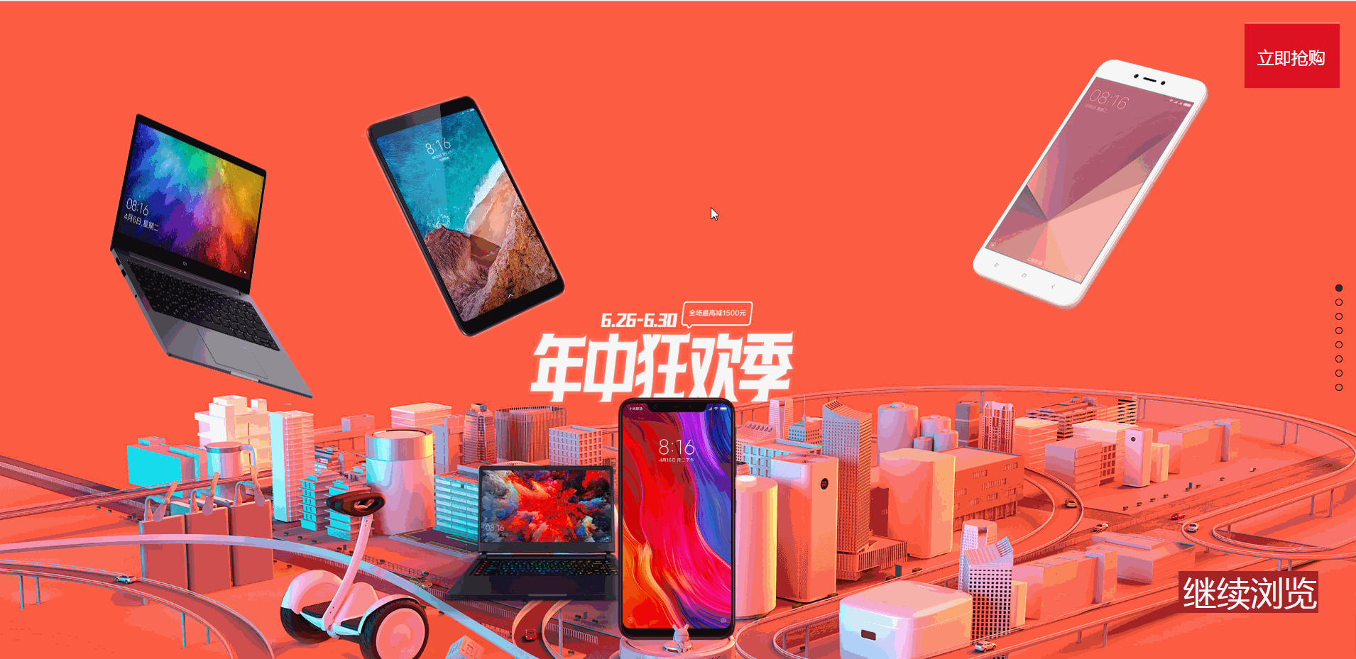
④效果展示(因为单次只能上传10M文件,所以图片画质略渣,如需全部文件,请联系本人)