axis轴指的是x轴或者是y轴的坐标。
例:假设一天中每隔两个小时(range(2,26,2))的气温(℃)分别是[15,16,17,5,17,20,26,17,28,26,25,24,18]
import matplotlib.pyplot as plt
x = [i for i in range(2,26,2)]
y = [16,17,5,17,20,26,17,28,26,25,24,18]
plt.plot(x,y,'r')
plt.title('Temperature')
plt.show()

图片进行优化:
matplotlib默认不支持中文字符,因为默认的英文字体无法显示汉字,那如何修改matplotlib的默认字体?通过matplotlib.rc可以修改,通过matplotlib下的font_manager可以解决。
linux下查看支持的字体:fc-list
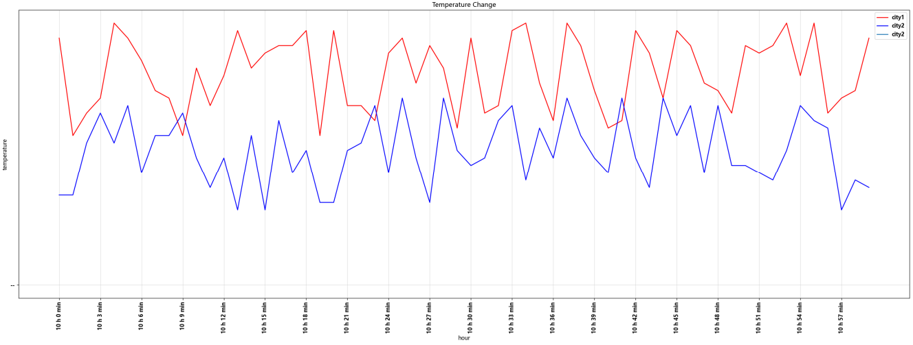
import matplotlib.pyplot as plt
import random

x = [i for i in range(0,60)]
y_city1 = [random.randint(20,35) for i in range(60)]
y_city2 = [random.randint(10,25) for i in range(60)]

#设置图片大小
plt.figure(figsize=(30,10),dpi=120)

#保存图片
plt.savefig('./plot_fig.png')

#调整x,y轴的刻度
xTicks = ['10 h {} min'.format(i) for i in range(60)]
plt.xticks(x[::3],xTicks[::3],rotation=90)

#设置x,y的标签
plt.xlabel('hour')
plt.ylabel('temperature')

#绘制网格
plt.grid(alpha=0.4)

#绘制
plt.plot(x,y_city1,'r',label='city1')
plt.plot(x,y_city2,'b',label='city2')
plt.title('Temperature Change')

#添加图例
plt.legend()
plt.show()
常用统计图:
①折线图:以折线的上升或下降表示统计数量的增减变化的统计图。
特点:能够显示数据的变化趋势,反应事物的变化情况。
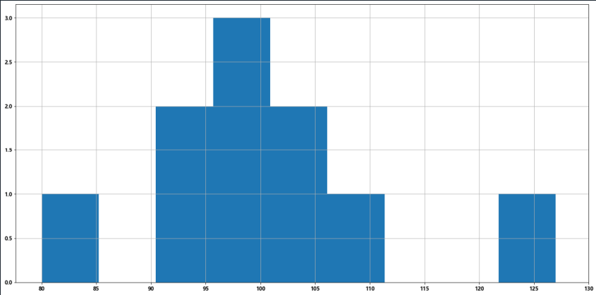
②直方图:由一系列高度不等的纵向条纹或线段表示数据分布的情况。一般用横轴表示数据范围,纵轴表示分布情况。
特点:绘制连连续性的数据,展示一组或多组数据的分布状况。
import matplotlib.pyplot as plt
import random

movie_times = [random.randint(80,130) for times in range(10)]

#组数=极差/组距=(max(a)-min(a))/bin_width
plt.figure(figsize=(20,10))
bin_width = 5
num_bins = int((max(movie_times)-min(movie_times))/bin_width)

plt.hist(movie_times,num_bins)
plt.xticks(range(min(movie_times),max(movie_times)+bin_width,bin_width))
plt.grid(0.5)

plt.show()
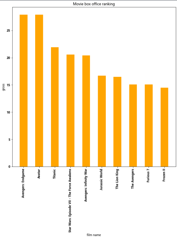
③条形图:排列在工作表的列或者行中的数据可以绘制到条形图中。
特点:绘制离散的数据,能够一眼看出各个数据的大小,比较数据之间的差别。
例1:
import matplotlib.pyplot as plt
import random

film_names = ['Avengers: Endgame','Avatar','Titanic','Star Wars: Episode VII - The Force Awakens','Avengers: Infinity War',
              'Jurassic World','The Lion King','The Avengers','Furious 7','Frozen II']
gross = [27.9,27.9,21.9,20.6,20.4,16.7,16.5,15.1,15.1,14.5]

plt.figure(figsize=(10,10))
plt.bar(range(len(film_names)),gross,width=0.5,color='orange')

plt.xticks(range(len(film_names)),film_names,rotation=90)
plt.xlabel('film name')
plt.ylabel('gross')
plt.title('Movie box office ranking')
plt.show()
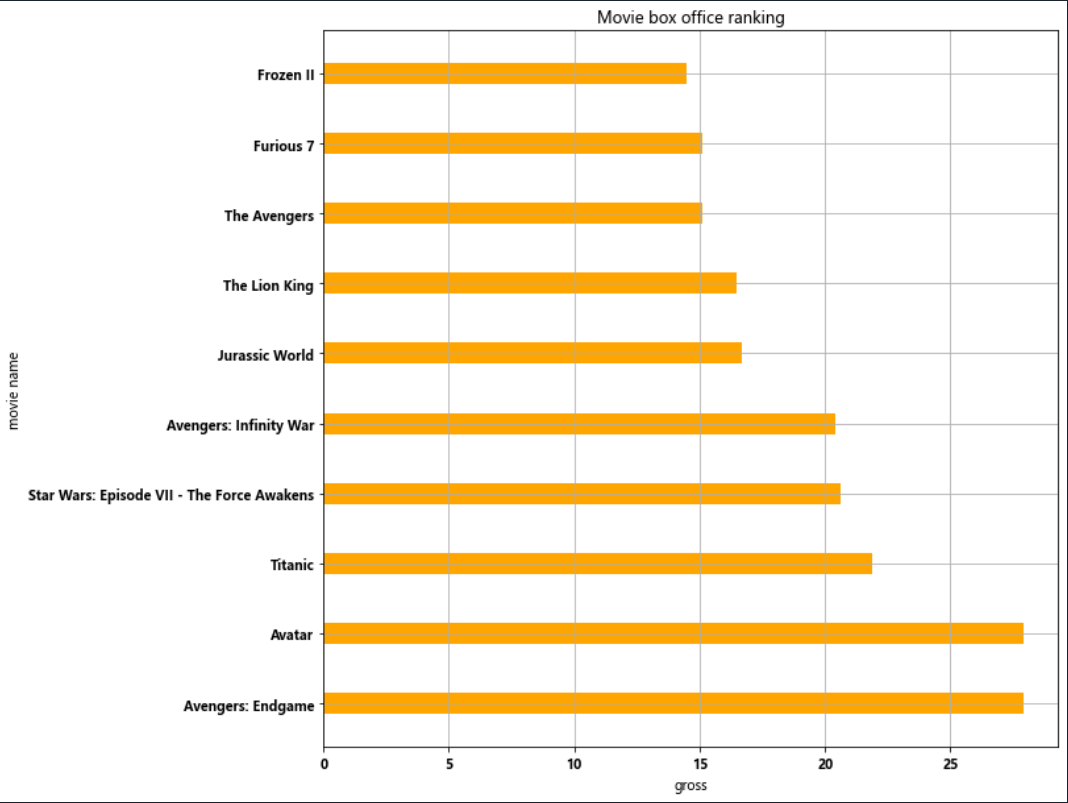
例2:
import matplotlib.pyplot as plt

film_names = ['Avengers: Endgame','Avatar','Titanic','Star Wars: Episode VII - The Force Awakens','Avengers: Infinity War',
              'Jurassic World','The Lion King','The Avengers','Furious 7','Frozen II']
gross = [27.9,27.9,21.9,20.6,20.4,16.7,16.5,15.1,15.1,14.5]

plt.figure(figsize=(10,10))
plt.barh(range(len(film_names)),gross,height=0.3,color='orange')
plt.grid(0.7)
plt.yticks(range(len(film_names)),film_names,rotation=0)
plt.ylabel('movie name')
plt.xlabel('gross')
plt.title('Movie box office ranking')
plt.show()
例3:
import matplotlib.pyplot as plt
import numpy as np

film_names = ['Avengers: Endgame','Avatar','Titanic','Star Wars: Episode VII - The Force Awakens','Avengers: Infinity War',
              'Jurassic World','The Lion King','The Avengers','Furious 7','Frozen II']
gross_1 = [27.9,27.9,21.9,20.6,20.4,16.7,16.5,15.1,15.1,14.5]
gross_2 = [26.4,26.7,20.8,19.6,19.6,15.4,13.2,14.0,14.9,13.9]
gross_3 = [26.0,25.5,19.0,18.6,17.9,13.0,13.1,13.5,12.9,10.2]

height = 0.25

plt.figure(figsize=(10,10))
plt.barh(np.arange(len(film_names))-height/3,gross_1,height=0.2,color='orange')
plt.barh(np.arange(len(film_names))+height/3,gross_2,height=0.2,color='blue')
plt.barh(np.arange(len(film_names))-3.2*height/3,gross_3,height=0.2,color='red')

plt.grid(0.7)
plt.yticks(range(len(film_names)),film_names,rotation=0)
plt.ylabel('movie name')
plt.xlabel('gross')
plt.title('Movie box office ranking')
plt.show()

④散点图:用两组数据构成多个坐标点,考察坐标点的分布,判断两变量之间是否存在某种关联或总结坐标的分布模式。
特点:判断变量之间是否存在数量关联趋势,展示离群点。
import matplotlib.pyplot as plt
import random

data_1 = [random.randint(0,100) for i in range(30)]
data_2 = [random.randint(0,100) for i in range(30)]

num_1 = [i for i in range(30)]
num_2 = [i for i in range(30,60)]

plt.figure(figsize=(20,8),dpi=80)

plt.scatter(num_1,data_1,label='class 1')
plt.scatter(num_2,data_2,label='class 2')

plt.xticks(list(num_1+num_2)[::3],rotation=45)
plt.yticks([score for score in range(0,110,10)],rotation=45)

plt.xlabel('student numbers')
plt.ylabel('score')
plt.title('Figure')
plt.legend()

plt.show()

关于其他:
1.seaborn:https://seaborn.pydata.org/
2.plotly:https://plotly.com/python/
3.echarts:https://echarts.apache.org/zh/index.html