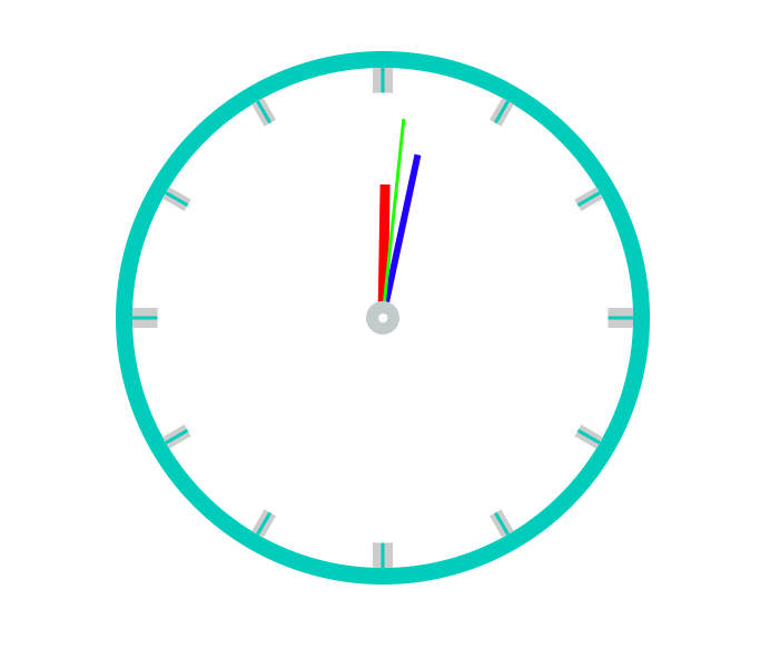
1.html代码
 1 <div class="clock">
 2         <div class="line line1">
 3             <div class="line-1"></div>
 4         </div>
 5         <div class="line line2">
 6             <div class="line-1"></div>
 7         </div>
 8         <div class="line line3">
 9             <div class="line-1"></div>
10         </div>
11         <div class="line line4">
12             <div class="line-1"></div>
13         </div>
14         <div class="line line5">
15             <div class="line-1"></div>
16         </div>
17         <div class="line line6">
18             <div class="line-1"></div>
19         </div>
20
21         <div class="cover"></div>
22         <div class="hour"></div>
23         <div class="minute"></div>
24         <div class="second"></div>
25         <div class="center">
26             <div class="center1"></div>
27         </div>
28 </div>
2.css代码
  1     <style>
  2         *{
  3             margin: 0;
  4             padding: 0;
  5         }
  6         /*钟表的外圈*/
  7         .clock{
  8             width: 300px;
  9             height: 300px;
 10             border: 10px solid #00ccbb;
 11             border-radius: 50%;
 12             margin: 100px auto;
 13             position: relative;
 14         }
 15         .cover,.hour,.minute,.second,.center,.center1{
 16             position: absolute;
 17             left: 50%;
 18             top: 50%;
 19         }
 20         .line,.line-1{
 21             position: absolute;
 22             left: 50%;
 23             top: 0;
 24             transform: translate(-50%,0%);
 25         }
 26         .cover,.center,.center1{
 27             border-radius: 50%;
 28             transform: translate(-50%,-50%);
 29         }
 30         .hour,.minute,.second{
 31             transform: translate(-50%,-100%);
 32             /*设置旋转中心*/
 33             transform-origin: center bottom;
 34         }
 35         /*钟表的刻度基本样式*/
 36         .line{
 37             width: 8px;
 38             height: 300px;
 39             background-color: #ccc;
 40         }
 41         /*钟表刻度  1和4需要加粗*/
 42         .line1,.line4{
 43             width: 12px;
 44         }
 45         /*钟表样式的一一定位*/
 46         .line2{
 47             transform: translate(-50%,0%) rotate(30deg);
 48         }
 49         .line3{
 50             transform: translate(-50%,0%) rotate(60deg);
 51         }
 52         .line4{
 53             transform: translate(-50%,0%) rotate(90deg);
 54         }
 55         .line5{
 56             transform: translate(-50%,0%) rotate(120deg);
 57         }
 58         .line6{
 59             transform: translate(-50%,0%) rotate(150deg);
 60         }
 61         /*钟表刻度的装饰*/
 62         .line-1{
 63             width: 2px;
 64             height: 300px;
 65             background-color: #00ccbb;
 66         }
 67         /*覆盖物*/
 68         .cover{
 69             width: 270px;
 70             height: 270px;
 71             background-color: #fff;
 72         }
 73         /*时针*/
 74         .hour{
 75             width: 6px;
 76             height: 80px;
 77             background-color: red;
 78
 79             /*添加动画*/
 80             animation: clockAnimation  43200s linear infinite;
 81
 82         }
 83         /*分针*/
 84         .minute{
 85             width: 4px;
 86             height: 100px;
 87             background-color: #2000ff;
 88
 89             /*添加动画*/
 90             animation: clockAnimation  3600s linear infinite;
 91         }
 92         /*秒针*/
 93         .second{
 94             width: 2px;
 95             height: 120px;
 96             background-color: #22ff00;
 97
 98             /*添加动画*/
 99             animation: clockAnimation  60s steps(60) infinite;
100         }
101         /*中心点*/
102         .center{
103             width: 20px;
104             height: 20px;
105             background-color: #c1cbcc;
106         }
107         .center1{
108             width: 5px;
109             height: 5px;
110             background-color: #fff;
111         }
112
113         /*创建动画*/
114         @keyframes clockAnimation {
115             from{
116                 transform: translate(-50%,-100%) rotate(0deg);
117             }
118             to{
119                 transform: translate(-50%,-100%) rotate(360deg);
120             }
121         }
122     </style>
3.效果图