前言
在ubuntu 18.04,可以通过修改/etc/alternatives/gdm3.css来进行修改
本来想直接使用flat-remix主题,但是只有这个登录界面没有达到作者演示的效果,所以手动覆盖修改
flat-remix主题
修改开始
1首先,进行备份,这个可以在错误时进行恢复,这个很重要
sudo cp /etc/alternatives/gdm3.css /etc/alternatives/gdm3_bak.css
2如果只需要修改登录背景
sudo gedit /etc/alternatives/gdm3.css
找到lockDialogGroup
#lockDialogGroup {
  background: #2c001e url(在这里填写你想要的图片);
  background-repeat: no-repeat;
  background-size: cover;
  background-position: center;
}
url格式如下:
file:///usr/share/backgrounds/login-background2
3修改后的gdm3.css
在这里,我修改了部分原来涉及需要下载主题的图片,直接使用系统自带的,所以copy之后可以直接用
/* This stylesheet is generated, DO NOT EDIT */
/* Copyright 2009, 2015 Red Hat, Inc.
 *
 * Portions adapted from Mx's data/style/default.css
 *   Copyright 2009 Intel Corporation
 *
 * This program is free software; you can redistribute it and/or modify it
 * under the terms and conditions of the GNU Lesser General Public License,
 * version 2.1, as published by the Free Software Foundation.
 *
 * This program is distributed in the hope it will be useful, but WITHOUT ANY
 * WARRANTY; without even the implied warranty of MERCHANTABILITY or FITNESS
 * FOR A PARTICULAR PURPOSE.  See the GNU Lesser General Public License for
 * more details.
 *
 * You should have received a copy of the GNU Lesser General Public License
 * along with this program; if not, write to the Free Software Foundation,
 * Inc., 51 Franklin St - Fifth Floor, Boston, MA 02110-1301 USA.
 */
/* GLOBALS */
stage {
  font-family: Cantarell, Sans-Serif;
  font-size: 10pt;
  color: #FFF; }

/* WIDGETS */
/* Buttons */
.button {
  border-radius: 6px;
  border: none;
  margin-top: 0.5em;
  padding: 4px 32px;
  color: #DBDEE0;
  font-weight: bold;
  background-color: transparent;
  background-gradient-direction: none;
  background-gradient-start: transparent;
  background-gradient-end: transparent;
  box-shadow: none;
  text-shadow: none;
  icon-shadow: none; }
  .button:hover, .button:focus {
    color: #FFF;
    border: none;
    background-color: rgba(255, 255, 255, 0.1);
    background-gradient-direction: none;
    background-gradient-start: none;
    background-gradient-end: none;
    box-shadow: none;
    text-shadow: none;
    icon-shadow: none; }
  .button:insensitive {
    color: rgba(255, 255, 255, 0.3);
    border: none;
    background-color: transparent;
    background-gradient-direction: none;
    box-shadow: none;
    text-shadow: none;
    icon-shadow: none; }
  .button:active {
    color: #FFF;
    border: none;
    background-color: rgba(0, 0, 0, 0.1);
    background-gradient-direction: none;
    background-gradient-start: rgba(0, 0, 0, 0.1);
    background-gradient-end: rgba(0, 0, 0, 0.1);
    box-shadow: none;
    text-shadow: none;
    icon-shadow: none; }

.modal-dialog-linked-button {
  padding: 1.1em;
  outline: 0;
  border-radius: 0;
  border: none;
  color: #2F343F;
  background-color: #FFF;
  box-shadow: none;
  font-weight: bold;
  box-shadow: inset 0 -4px 0 rgba(0, 0, 0, 0.3); }
  .modal-dialog-linked-button:focus {
    box-shadow: inset 0 -4px 0 #383C4A; }
  .modal-dialog-linked-button:first-child {
    border-radius: 0px 0px 0px 3px; }
  .modal-dialog-linked-button:last-child {
    border-radius: 0px 0px 3px 0px; }
  .modal-dialog-linked-button:first-child:last-child {
    border-radius: 0px 0px 3px 3px; }

/* Entries */
StEntry {
  border-radius: 6px;
  padding: .4em;
  border: none;
  color: #FFF;
  background-color: #383C4A;
  background-gradient-direction: none;
  box-shadow: none;
  selection-background-color: #367BF0;
  selected-color: #383C4A; }
  StEntry:focus {
    background-color: #383C4A;
    color: #FFF;
    box-shadow: none;
    border-color: transparent; }
  StEntry:insensitive {
    color: #cccccc;
    box-shadow: none; }
  StEntry StIcon.capslock-warning {
    icon-size: 1em;
    warning-color: #FD7D00; }

/* Scrollbars */
StScrollView.vfade {
  -st-vfade-offset: 6.8em; }
StScrollView.hfade {
  -st-hfade-offset: 6.8em; }

StScrollBar {
  padding: 0; }
  StScrollView StScrollBar {
    min- 1.2em;
    min-height: 1.2em; }
  StScrollBar StBin#trough {
    border-radius: 0;
    background-color: transparent; }
  StScrollBar StButton#vhandle, StScrollBar StButton#hhandle {
    background: rgba(255, 255, 255, 0.1);
    border-radius: 6px;
     1em;
    margin: .3em; }

/* Slider */
.slider {
  height: 1.09em;
  -barlevel-height: .35em;
  -barlevel-background-color: rgba(255, 255, 255, 0.05);
  -barlevel-border-color: #367BF0;
  -barlevel-active-background-color: #367BF0;
  -barlevel-overdrive-color: #D41919;
  -barlevel-overdrive-separator- 0.1em;
  -barlevel-border- 0;
  -slider-height: .35em;
  -slider-background-color: rgba(255, 255, 255, 0.05);
  -slider-border-color: #367BF0;
  -slider-active-background-color: #367BF0;
  -slider-active-border-color: #D41919;
  -slider-border- 0;
  -slider-handle-radius: 0;
  -slider-handle-radius: 0; }

/* Check Boxes */
.check-box StBoxLayout {
  spacing: .8em; }

.check-box StBin {
   24px;
  height: 22px;
  background-image: url("resource:///org/gnome/shell/theme/checkbox-off.svg"); }

.check-box:focus StBin {
  background-image: url("ubuntu-checkbox-off-focused.svg"); }

.check-box:checked StBin {
  background-image: url("resource:///org/gnome/shell/theme/checkbox.svg"); }

.check-box:focus:checked StBin {
  background-image: url("ubuntu-checkbox-focused.svg"); }

/* Switches */
.toggle-switch {
   65px;
  height: 22px;
  background-size: contain; }

.toggle-switch-us {
  background-image: url("resource:///org/gnome/shell/theme/toggle-off-us.svg"); }
  .toggle-switch-us:checked {
    background-image: url("resource:///org/gnome/shell/theme/toggle-on-us.svg"); }

.toggle-switch-intl {
  background-image: url("resource:///org/gnome/shell/theme/toggle-off-intl.svg"); }
  .toggle-switch-intl:checked {
    background-image: url("resource:///org/gnome/shell/theme/toggle-on-intl.svg"); }

/* links */
.shell-link {
  color: #4a90d9; }
  .shell-link:hover {
    color: #74aae2; }

/* Modal Dialogs */
.headline {
  font-size: 110%; }

.lightbox {
  background-color: black; }

.flashspot {
  background-color: white; }

.modal-dialog {
  border-radius: 9px;
  color: #eeeeec;
  background-color: rgba(23, 25, 26, 0.95);
  border: 1px solid rgba(238, 238, 236, 0.2); }
  .modal-dialog .modal-dialog-content-box {
    padding: 24px; }
  .modal-dialog .run-dialog-entry {
     20em;
    margin-bottom: 6px; }
  .modal-dialog .run-dialog-error-box {
    padding-top: 16px;
    spacing: 6px; }
  .modal-dialog .run-dialog-button-box {
    padding-top: 1em; }
  .modal-dialog .run-dialog-label {
    font-size: 12pt;
    font-weight: bold;
    color: #d6d6d1;
    padding-bottom: .4em; }

.mount-dialog-subject,
.end-session-dialog-subject {
  font-size: 14pt; }

/* Message Dialog */
.message-dialog-main-layout {
  padding: 12px 20px 0;
  spacing: 12px; }

.message-dialog-content {
  max- 28em;
  spacing: 20px; }

.message-dialog-icon {
  min- 48px;
  icon-size: 48px; }

.message-dialog-title {
  font-weight: bold; }

.message-dialog-subtitle {
  color: #8e8e80;
  font-weight: bold; }

/* End Session Dialog */
.end-session-dialog {
  spacing: 42px;
  border: 1px solid rgba(238, 238, 236, 0.2); }

.end-session-dialog-list {
  padding-top: 20px; }

.end-session-dialog-layout {
  padding-left: 17px; }
  .end-session-dialog-layout:rtl {
    padding-right: 17px; }

.end-session-dialog-description {
   28em;
  padding-bottom: 10px; }
  .end-session-dialog-description:rtl {
    text-align: right; }

.end-session-dialog-warning {
   28em;
  color: #f57900;
  padding-top: 6px; }
  .end-session-dialog-warning:rtl {
    text-align: right; }

.end-session-dialog-logout-icon {
  border-radius: 5px;
   48px;
  height: 48px;
  background-size: contain; }

.end-session-dialog-shutdown-icon {
  color: #eeeeec;
   48px;
  height: 48px; }

.end-session-dialog-inhibitor-layout {
  spacing: 16px;
  max-height: 200px;
  padding-right: 65px;
  padding-left: 65px; }

.end-session-dialog-session-list,
.end-session-dialog-app-list {
  spacing: 1em; }

.end-session-dialog-list-header {
  font-weight: bold; }
  .end-session-dialog-list-header:rtl {
    text-align: right; }

.end-session-dialog-app-list-item,
.end-session-dialog-session-list-item {
  spacing: 1em; }

.end-session-dialog-app-list-item-name,
.end-session-dialog-session-list-item-name {
  font-weight: bold; }

.end-session-dialog-app-list-item-description {
  color: #e2e2df;
  font-size: 10pt; }

/* ShellMountOperation Dialogs */
.shell-mount-operation-icon {
  icon-size: 48px; }

.mount-dialog {
  spacing: 24px; }
  .mount-dialog .message-dialog-title {
    padding-top: 10px;
    padding-left: 17px;
    padding-bottom: 6px;
    max- 34em; }
  .mount-dialog .message-dialog-title:rtl {
    padding-left: 0px;
    padding-right: 17px; }
  .mount-dialog .message-dialog-body {
    padding-left: 17px;
     28em; }
  .mount-dialog .message-dialog-body:rtl {
    padding-left: 0px;
    padding-right: 17px; }

.mount-dialog-app-list {
  max-height: 200px;
  padding-top: 24px;
  padding-left: 49px;
  padding-right: 32px; }

.mount-dialog-app-list:rtl {
  padding-right: 49px;
  padding-left: 32px; }

.mount-dialog-app-list-item {
  color: #d6d6d1; }
  .mount-dialog-app-list-item:hover {
    color: #eeeeec; }
  .mount-dialog-app-list-item:ltr {
    padding-right: 1em; }
  .mount-dialog-app-list-item:rtl {
    padding-left: 1em; }

.mount-dialog-app-list-item-icon:ltr {
  padding-right: 17px; }

.mount-dialog-app-list-item-icon:rtl {
  padding-left: 17px; }

.mount-dialog-app-list-item-name {
  font-size: 10pt; }

/* Password or Authentication Dialog */
.prompt-dialog {
   34em;
  border: 3px solid rgba(238, 238, 236, 0.2); }
  .prompt-dialog .message-dialog-main-layout {
    spacing: 24px;
    padding: 10px; }
  .prompt-dialog .message-dialog-content {
    spacing: 16px; }
  .prompt-dialog .message-dialog-title {
    color: #b2b2a9; }

.prompt-dialog-description:rtl {
  text-align: right; }

.prompt-dialog-password-box {
  spacing: 1em;
  padding-bottom: 1em; }

.prompt-dialog-error-label {
  font-size: 10pt;
  color: #cc0000;
  padding-bottom: 8px; }

.prompt-dialog-info-label {
  font-size: 10pt;
  padding-bottom: 8px; }

.hidden {
  color: transparent; }

.prompt-dialog-null-label {
  font-size: 10pt;
  padding-bottom: 8px; }

/* Polkit Dialog */
.polkit-dialog-user-layout {
  padding-left: 10px;
  spacing: 10px; }
  .polkit-dialog-user-layout:rtl {
    padding-left: 0px;
    padding-right: 10px; }

.polkit-dialog-user-root-label {
  color: #f57900; }

.polkit-dialog-user-icon {
  border-radius: 5px;
  background-size: contain;
   48px;
  height: 48px; }

/* Audio selection dialog */
.audio-device-selection-dialog {
  spacing: 30px; }

.audio-selection-content {
  spacing: 20px;
  padding: 24px; }

.audio-selection-title {
  font-weight: bold;
  text-align: center; }

.audio-selection-box {
  spacing: 20px; }

.audio-selection-device {
  border: 1px solid rgba(238, 238, 236, 0.2);
  border-radius: 12px; }
  .audio-selection-device:active, .audio-selection-device:hover, .audio-selection-device:focus {
    background-color: #dd4814; }

.audio-selection-device-box {
  padding: 20px;
  spacing: 20px; }

.audio-selection-device-icon {
  icon-size: 64px; }

/* Access Dialog */
.access-dialog {
  spacing: 30px; }

/* Geolocation Dialog */
.geolocation-dialog {
  spacing: 30px; }

/* Extension Dialog */
.extension-dialog .message-dialog-main-layout {
  spacing: 24px;
  padding: 10px; }

.extension-dialog .message-dialog-title {
  color: #b2b2a9; }

/* Inhibit-Shortcuts Dialog */
.inhibit-shortcuts-dialog {
  spacing: 30px; }

/* Network Agent Dialog */
.network-dialog-secret-table {
  spacing-rows: 15px;
  spacing-columns: 1em; }

.keyring-dialog-control-table {
  spacing-rows: 15px;
  spacing-columns: 1em; }

/* Popovers/Menus */
.popup-menu {
  min- 15em; }
  .popup-menu .popup-sub-menu {
    background-color: #3a3a34;
    box-shadow: inset 0 -1px 0px #2c2c28; }
  .popup-menu .popup-menu-content {
    padding: 1em 0em; }
  .popup-menu .popup-menu-item {
    spacing: 12px; }
    .popup-menu .popup-menu-item:ltr {
      padding: .4em 1.75em .4em 0em; }
    .popup-menu .popup-menu-item:rtl {
      padding: .4em 0em .4em 1.75em; }
    .popup-menu .popup-menu-item:checked {
      background-color: #3a3a34;
      box-shadow: inset 0 1px 0px #2c2c28;
      font-weight: bold; }
    .popup-menu .popup-menu-item.selected {
      background-color: rgba(238, 238, 236, 0.1);
      color: #eeeeec; }
    .popup-menu .popup-menu-item:active {
      background-color: #dd4814;
      color: #ffffff; }
    .popup-menu .popup-menu-item:insensitive {
      color: rgba(238, 238, 236, 0.5); }
  .popup-menu .popup-inactive-menu-item {
    color: #eeeeec; }
    .popup-menu .popup-inactive-menu-item:insensitive {
      color: rgba(238, 238, 236, 0.5); }
  .popup-menu.panel-menu {
    -boxpointer-gap: 4px;
    margin-bottom: 1.75em; }

.popup-menu-ornament {
  text-align: right;
   1.2em; }

.popup-menu-boxpointer,
.candidate-popup-boxpointer {
  -arrow-border-radius: 3px;
  -arrow-background-color: #3f3e39;
  -arrow-border- 1px;
  -arrow-border-color: #1f1f1c;
  -arrow-base: 24px;
  -arrow-rise: 11px;
  -arrow-box-shadow: 0 1px 3px black; }

.popup-separator-menu-item {
  height: 1px;
  margin: 6px 64px;
  background-color: transparent;
  border-color: #2c2c28;
  border-bottom- 1px;
  border-bottom-style: solid; }

.background-menu {
  -boxpointer-gap: 4px;
  -arrow-rise: 0px; }

/* fallback menu
- odd thing for styling App menu when apparently not running under shell. Light Adwaita styled
  app menu inside the main app window itself rather than the top bar
*/
/* OSD */
.osd-window {
  text-align: center;
  font-weight: bold;
  spacing: 1em;
  margin: 32px;
  min- 64px;
  min-height: 64px; }
  .osd-window .osd-monitor-label {
    font-size: 3em; }
  .osd-window .level {
    height: 0.6em;
    border-radius: 0.3em;
    background-color: rgba(12, 13, 11, 0.5);
    color: #eeeeec; }
  .osd-window .level-bar {
    background-color: #eeeeec;
    border-radius: 0.3em; }

/* Pad OSD */
.pad-osd-window {
  padding: 32px;
  background-color: rgba(0, 0, 0, 0.8); }
  .pad-osd-window .pad-osd-title-box {
    spacing: 12px; }
  .pad-osd-window .pad-osd-title-menu-box {
    spacing: 6px; }

.combo-box-label {
   15em; }

/* App Switcher */
.switcher-popup {
  padding: 8px;
  spacing: 16px; }

.switcher-list-item-container {
  spacing: 8px; }

.switcher-list .item-box {
  padding: 8px;
  border-radius: 4px; }

.switcher-list .item-box:outlined {
  padding: 6px;
  border: 2px solid #e95420; }

.switcher-list .item-box:selected {
  background-color: #e95420;
  color: #ffffff; }

.switcher-list .thumbnail-box {
  padding: 2px;
  spacing: 4px; }

.switcher-list .thumbnail {
   256px; }

.switcher-list .separator {
   1px;
  background: #1f1f1c; }

.switcher-arrow {
  border-color: transparent;
  color: rgba(238, 238, 236, 0.8); }
  .switcher-arrow:highlighted {
    color: #dd4814; }

.input-source-switcher-symbol {
  font-size: 34pt;
   96px;
  height: 96px; }

/* Window Cycler */
.cycler-highlight {
  border: 5px solid #dd4814; }

/* Workspace Switcher */
.workspace-switcher-group {
  padding: 12px; }

.workspace-switcher {
  background: transparent;
  border: 0px;
  border-radius: 0px;
  padding: 0px;
  spacing: 8px; }

.ws-switcher-active-up, .ws-switcher-active-down {
  height: 50px;
  background-color: #dd4814;
  color: #ffffff;
  background-size: 32px;
  border-radius: 8px; }

.ws-switcher-box {
  height: 50px;
  border: 1px solid rgba(238, 238, 236, 0.1);
  background: transparent;
  border-radius: 8px; }

.osd-window,
.resize-popup,
.switcher-list, .workspace-switcher-container {
  color: #eeeeec;
  background-color: #3f3e39;
  border: 1px solid rgba(238, 238, 236, 0.2);
  border-radius: 12px;
  padding: 12px; }

/* Tiled window previews */
.tile-preview {
  background-color: rgba(187, 62, 17, 0.5);
  border: 1px solid #dd4814; }

.tile-preview-left.on-primary {
  border-radius: 6px 6px 0 0; }

.tile-preview-right.on-primary {
  border-radius: 0 6px 0 0; }

.tile-preview-left.tile-preview-right.on-primary {
  border-radius: 6px 6px 0 0; }

/* TOP BAR */
#panel {
  background-color: rgba(0, 0, 0, 0.2);
  /* transition from solid to transparent */
  transition-duration: 500ms;
  font-weight: bold;
  height: 1.86em; }
  #panel.unlock-screen, #panel.login-screen, #panel.lock-screen {
    background-color: transparent; }
  #panel #panelLeft, #panel #panelCenter {
    spacing: 4px; }
  #panel .panel-corner {
    -panel-corner-radius: 6px;
    -panel-corner-background-color: rgba(0, 0, 0, 0.2);
    -panel-corner-border- 2px;
    -panel-corner-border-color: transparent; }
    #panel .panel-corner:active, #panel .panel-corner:overview, #panel .panel-corner:focus {
      -panel-corner-border-color: #e95420; }
    #panel .panel-corner.lock-screen, #panel .panel-corner.login-screen, #panel .panel-corner.unlock-screen {
      -panel-corner-radius: 0;
      -panel-corner-background-color: transparent;
      -panel-corner-border-color: transparent; }
  #panel .panel-button {
    -natural-hpadding: 12px;
    -minimum-hpadding: 6px;
    font-weight: bold;
    color: #eee;
    text-shadow: 0px 0px 2px rgba(0, 0, 0, 0.9);
    transition-duration: 100ms; }
    #panel .panel-button .app-menu-icon {
      margin-left: 4px;
      margin-right: 4px; }
    #panel .panel-button .system-status-icon,
    #panel .panel-button .app-menu-icon > StIcon,
    #panel .panel-button .popup-menu-arrow {
      icon-shadow: 0px 0px 2px rgba(0, 0, 0, 0.9); }
    #panel .panel-button:hover {
      color: white;
      text-shadow: 0px 0px 8px black; }
      #panel .panel-button:hover .system-status-icon,
      #panel .panel-button:hover .app-menu-icon > StIcon,
      #panel .panel-button:hover .popup-menu-arrow {
        icon-shadow: 0px 0px 8px black; }
    #panel .panel-button:active, #panel .panel-button:overview, #panel .panel-button:focus, #panel .panel-button:checked {
      background-color: rgba(0, 0, 0, 0.01);
      box-shadow: inset 0 -2px 0px #e95420;
      color: white; }
      #panel .panel-button:active > .system-status-icon, #panel .panel-button:overview > .system-status-icon, #panel .panel-button:focus > .system-status-icon, #panel .panel-button:checked > .system-status-icon {
        icon-shadow: black 0 2px 2px; }
    #panel .panel-button .system-status-icon {
      icon-size: 1.09em;
      padding: 0 5px; }
    .unlock-screen #panel .panel-button,
    .login-screen #panel .panel-button,
    .lock-screen #panel .panel-button {
      color: white; }
      .unlock-screen #panel .panel-button:focus, .unlock-screen #panel .panel-button:hover, .unlock-screen #panel .panel-button:active,
      .login-screen #panel .panel-button:focus,
      .login-screen #panel .panel-button:hover,
      .login-screen #panel .panel-button:active,
      .lock-screen #panel .panel-button:focus,
      .lock-screen #panel .panel-button:hover,
      .lock-screen #panel .panel-button:active {
        color: white; }
  #panel .panel-status-indicators-box,
  #panel .panel-status-menu-box {
    spacing: 2px; }
  #panel .power-status.panel-status-indicators-box {
    spacing: 0; }
  #panel .screencast-indicator {
    color: #f57900; }
  #panel.solid {
    background-color: black;
    /* transition from transparent to solid */
    transition-duration: 300ms; }
    #panel.solid .panel-corner {
      -panel-corner-background-color: black; }
    #panel.solid .panel-button {
      color: #ccc;
      text-shadow: none; }
      #panel.solid .panel-button:hover, #panel.solid .panel-button:active, #panel.solid .panel-button:overview, #panel.solid .panel-button:focus, #panel.solid .panel-button:checked {
        color: white; }
    #panel.solid .system-status-icon,
    #panel.solid .app-menu-icon > StIcon,
    #panel.solid .popup-menu-arrow {
      icon-shadow: none; }

#calendarArea {
  padding: 0.75em 1.0em; }

.calendar {
  margin-bottom: 1em; }

.calendar,
.datemenu-today-button,
.datemenu-displays-box,
.message-list-sections {
  margin: 0 1.5em; }

.datemenu-calendar-column {
  spacing: 0.5em; }

.datemenu-displays-section {
  padding-bottom: 3em; }

.datemenu-displays-box {
  spacing: 1em; }

.datemenu-calendar-column {
  border: 0 solid rgba(238, 238, 236, 0.1); }
  .datemenu-calendar-column:ltr {
    border-left- 1px; }
  .datemenu-calendar-column:rtl {
    border-right- 1px; }

.datemenu-today-button,
.world-clocks-button,
.weather-button,
.events-section-title {
  border-radius: 4px;
  padding: .4em; }

.message-list-section-list:ltr {
  padding-left: .4em; }

.message-list-section-list:rtl {
  padding-right: .4em; }

.datemenu-today-button:hover, .datemenu-today-button:focus,
.world-clocks-button:hover,
.world-clocks-button:focus,
.weather-button:hover,
.weather-button:focus,
.events-section-title:hover,
.events-section-title:focus {
  background-color: rgba(238, 238, 236, 0.1); }

.datemenu-today-button:active,
.world-clocks-button:active,
.weather-button:active,
.events-section-title:active {
  color: white;
  background-color: #dd4814; }

.datemenu-today-button .date-label {
  font-size: 1.5em;
  font-weight: 300; }

.world-clocks-header,
.weather-header,
.events-section-title {
  color: #8e8e80;
  font-weight: bold; }

.world-clocks-grid {
  spacing-rows: 0.4em; }

.weather-box {
  spacing: 0.4em; }

.calendar-month-label {
  color: #e2e2df;
  font-weight: bold;
  padding: 8px 0; }

.pager-button {
  color: white;
  background-color: transparent;
   32px;
  border-radius: 4px; }
  .pager-button:hover, .pager-button:focus {
    background-color: rgba(238, 238, 236, 0.05); }
  .pager-button:active {
    background-color: rgba(63, 63, 57, 0.05); }

.calendar-change-month-back {
  background-image: url("resource:///org/gnome/shell/theme/calendar-arrow-left.svg"); }
  .calendar-change-month-back:rtl {
    background-image: url("resource:///org/gnome/shell/theme/calendar-arrow-right.svg"); }

.calendar-change-month-forward {
  background-image: url("resource:///org/gnome/shell/theme/calendar-arrow-right.svg"); }
  .calendar-change-month-forward:rtl {
    background-image: url("resource:///org/gnome/shell/theme/calendar-arrow-left.svg"); }

.calendar-day-base {
  font-size: 80%;
  text-align: center;
   2.4em;
  height: 2.4em;
  padding: 0.1em;
  margin: 2px;
  border-radius: 1.4em; }
  .calendar-day-base:hover, .calendar-day-base:focus {
    background-color: rgba(238, 238, 236, 0.1); }
  .calendar-day-base:active, .calendar-day-base:selected {
    color: white;
    background-color: #dd4814;
    border-color: transparent; }
  .calendar-day-base.calendar-day-heading {
    color: #8e8e80;
    margin-top: 1em;
    font-size: 70%; }

.calendar-day {
  border- 0; }

.calendar-day-top {
  border-top- 1px; }

.calendar-day-left {
  border-left- 1px; }

.calendar-nonwork-day {
  color: #949796; }

.calendar-today {
  font-weight: bold;
  border: 1px solid rgba(28, 31, 31, 0.5); }

.calendar-day-with-events {
  color: white;
  font-weight: bold;
  background-image: url("resource:///org/gnome/shell/theme/calendar-today.svg"); }

.calendar-other-month-day {
  color: rgba(238, 238, 236, 0.15);
  opacity: 0.5; }

.calendar-week-number {
  font-size: 70%;
  font-weight: bold;
   2.3em;
  height: 1.8em;
  border-radius: 2px;
  padding: 0.5em 0 0;
  margin: 6px;
  background-color: rgba(238, 238, 236, 0.3);
  color: #3f3e39; }

/* Message list */
.message-list {
   31.5em; }

.message-list-clear-button.button {
  background-color: transparent;
  margin: 1.5em 1.5em 0; }
  .message-list-clear-button.button:hover, .message-list-clear-button.button:focus {
    background-color: rgba(238, 238, 236, 0.1); }

.message-list-sections {
  spacing: 1em; }

.message-list-section,
.message-list-section-list {
  spacing: 0.4em; }

.message {
  border-radius: 3px; }
  .message:hover, .message:focus {
    background-color: rgba(238, 238, 236, 0.1); }

.message-icon-bin {
  padding: 10px 3px 10px 10px; }
  .message-icon-bin:rtl {
    padding: 10px 10px 10px 3px; }

.message-icon-bin > StIcon {
  color: #bebeb6;
  icon-size: 16px;
}

.message-secondary-bin {
  padding: 0 12px; }

.message-secondary-bin > .event-time {
  color: #8e8e80;
  font-size: 0.7em;
  /* HACK: the label should be baseline-aligned with a 1em label,
                     fake this with some bottom padding */
  padding-bottom: 0.13em; }

.message-secondary-bin > StIcon {
  icon-size: 1.45em; }

.message-title {
  color: #FFF;
  font-size: 1em;
  padding: .2em 0 .2em 0; }

.message-content {
  color: #FFF;
  padding: .5em 1em; }

.message-media-control {
  padding: .6em;
  color: #FFF; }
  .message-media-control:last-child:ltr {
    padding-right: 1.8em; }
  .message-media-control:last-child:rtl {
    padding-left: 1.8em; }
  .message-media-control:hover {
    color: #cccccc; }
  .message-media-control:insensitive {
    color: #999999; }

.media-message-cover-icon {
  icon-size: 4.2em !important; }
  .media-message-cover-icon.fallback {
    color: #4e5467;
    background-color: #383C4A;
    border: 0.2em solid #383C4A;
    border-radius: 6px;
    icon-size: 1.6em;
    padding: .8em; }

.system-switch-user-submenu-icon, .system-switch-user-submenu-icon.default-icon, .system-switch-user-submenu-icon.default-icon, .system-switch-user-submenu-icon.default-icon.default-icon {
  icon-size: 1.091em;
  padding: 0 .36em; }
.system-switch-user-submenu-icon.user-icon, .system-switch-user-submenu-icon.default-icon.user-icon {
  icon-size: 1.81em;
  padding: 0 .18em; }

#appMenu {
  spinner-image: url("resource:///org/gnome/shell/theme/process-working.svg");
  spacing: .4em; }
  #appMenu .label-shadow {
    color: transparent; }
.app-menu,
.app-well-menu {
  max- 27.25em; }

.aggregate-menu {
  min- 21em; }
  .aggregate-menu .popup-menu-icon {
    padding: 0 .36em; }
  .aggregate-menu .popup-sub-menu .popup-menu-item :first-child:ltr {
    /* 12px spacing + 2*4px padding */
    padding-left: 1.18em;
    margin-left: 1.09em; }
  .aggregate-menu .popup-sub-menu .popup-menu-item :first-child:rtl {
    /* 12px spacing + 2*4px padding */
    padding-right: 1.18em;
    margin-right: 1.09em; }

.system-menu-action {
  -st-icon-style: symbolic;
  color: #FFF;
  border-radius: 100px;
  /* wish we could do 50% */
  padding: 1.3em;
  border: 0; }
  .system-menu-action:hover, .system-menu-action:focus {
    background-color: rgba(255, 255, 255, 0.1);
    color: #FFF; }
  .system-menu-action:active {
    background-color: #367BF0;
    color: #FFF; }
  .system-menu-action > StIcon {
    icon-size: 1em; }

.ripple-box {
   52px;
  height: 52px;
  background-image: url("resource:///org/gnome/shell/theme/corner-ripple-ltr.png");
  background-size: contain; }

.ripple-box:rtl {
  background-image: url("resource:///org/gnome/shell/theme/corner-ripple-rtl.png"); }

.popup-menu-arrow {
   1em;
  height: 1em; }

.popup-menu-icon {
  icon-size: 1.09em; }

.window-close {
  background-image: url("resource:///org/gnome/shell/theme/close-window.svg");
  background-size: 32px;
  background-color: transparent;
  border: 0;
  box-shadow: none;
  color: transparent;
  height: 32px;
   32px;}

.window-close {
  -shell-close-overlap: 16px; }
  .window-close:rtl {
    -st-background-image-shadow: 2px 2px 6px rgba(0, 0, 0, 0.5); }

/* NETWORK DIALOGS */
.nm-dialog {
  max-height: 34em;
  min-height: 31em;
  min- 32em; }

.nm-dialog-content {
  spacing: 1.81em;
  padding: 2.18em; }

.nm-dialog-header-hbox {
  spacing: 0.9em; }

.nm-dialog-airplane-box {
  spacing: 1.09em; }

.nm-dialog-airplane-headline {
  font-weight: bold;
  text-align: center; }

.nm-dialog-airplane-text {
  color: #FFF; }

.nm-dialog-header-icon {
  icon-size: 2.9em; }

.nm-dialog-scroll-view {
  border: 0; }

.nm-dialog-header {
  font-weight: bold; }

.nm-dialog-item {
  font-size: 110%;
  border-bottom: 0;
  padding: 1em;
  spacing: 1.66em; }
  .nm-dialog-item:selected {
    background: rgba(255, 255, 255, 0.05);
    box-shadow: inset 0 -0.25em 0 0 #FFF; }

.nm-dialog-icons {
  spacing: .5em; }

.nm-dialog-icon {
  icon-size: 1em; }

.no-networks-label {
  color: #FFF; }

.no-networks-box {
  spacing: 1.08em; }

/* OVERVIEW */
#overview {
  spacing: 24px; }

.overview-controls {
  padding-bottom: 32px; }

.window-picker {
  -horizontal-spacing: 32px;
  -vertical-spacing: 32px;
  padding-left: 32px;
  padding-right: 32px;
  padding-bottom: 48px; }
  .window-picker.external-monitor {
    padding: 32px; }

.window-clone-border {
  border: 6px solid #FFF;
  border-radius: 6px; }

.window-caption {
  spacing: 25px;
  color: #000;
  background-color: #FFF;
  border-radius: 6px;
  padding: 4px 12px;
  -shell-caption-spacing: 12px; }

.search-entry {
   21em;
  border: none;
  color: #FFF;
  caret-color: #000;
  caret-size: .1em;
  text-shadow: 0px 1px 2px rgba(0, 0, 0, 0.9);
  background-color: rgba(255, 255, 255, 0.2);
  font-weight: bold;
  background-gradient-direction: none;
  padding: .63em .81em;
  border-radius: 100px;
  box-shadow: none;
  transition-duration: 200ms;
  font-size: 1.1em; }
  .search-entry:focus, .search-entry:hover {
    font-weight: 400;
    background-color: #FFF;
    color: #000;
    box-shadow: none;
    text-shadow: none; }
    .search-entry:focus .search-entry-icon, .search-entry:hover .search-entry-icon {
      color: #000;
      icon-shadow: none; }
  .search-entry .search-entry-icon {
    icon-size: 1em;
    padding: 0 .36em;
    color: #FFF;
    transition-duration: 200ms;
    icon-shadow: 0px 1px 2px rgba(0, 0, 0, 0.9); }

#searchResultsBin {
  max- 1000px; }

#searchResultsContent {
  padding-left: 20px;
  padding-right: 20px;
  spacing: 16px; }

.search-section {
  spacing: 16px;
  color: #FFF;
  text-shadow: 0px 1px 2px rgba(0, 0, 0, 0.9); }

.search-section-content {
  spacing: 32px; }

.list-search-results {
  spacing: 3px; }

.search-section-separator {
  height: 2px;
  background-color: rgba(255, 255, 255, 0.2); }

.search-section:last-child .search-section-separator {
  background-color: transparent; }

.list-search-result-content {
  spacing: 30px; }

.list-search-result-title {
  color: #FFF;
  spacing: 12px; }

.list-search-result-description {
  color: rgba(255, 255, 255, 0.7); }

.list-search-provider-details {
   150px;
  color: #FFF;
  font-weight: bold;
  margin-top: 0.24em; }

.list-search-provider-content {
  spacing: 20px; }

.search-provider-icon {
  padding: 15px; }

/* DASHBOARD */
#dash {
  font-size: 20pt;
  color: #FFF;
  background: transparent;
  padding: 4px 0;
  border: transparent; }
  #dash .placeholder {
    background-image: url("resource:///org/gnome/shell/theme/dash-placeholder.svg");
    background-size: contain;
    height: 64px;
    border-color: transparent;
    border-radius: 6px; }
  #dash .empty-dash-drop-target {
     24px;
    height: 24px; }

.dash-item-container > StWidget {
  padding: 4px 8px; }

.dash-label {
  border-radius: 6px;
  padding: .4em 1.2em;
  color: #FFF;
  background-color: #2F343F;
  box-shadow: 0 2px 8px 0 rgba(0, 0, 0, 0.4);
  text-align: center;
  -x-offset: .8em; }


/* App Vault/Grid */
.icon-grid {
  spacing: 30px;
  -shell-grid-horizontal-item-size: 136px;
  -shell-grid-vertical-item-size: 136px; }
  .icon-grid .overview-icon {
    icon-size: 96px; }

.system-action-icon {
  background-color: black;
  color: #FFF;
  border-radius: 100px;
  icon-size: 48px; }

.app-view-controls {
  padding-bottom: 32px; }

.app-view-control {
  background-gradient-direction: none;
  background-color: rgba(255, 255, 255, 0.2);
  padding: .36em 1.5em;
  border- 0;
  color: #FFF;
  box-shadow: none;
  font-weight: bold;
  margin: 0; }
  .app-view-control:hover {
    background-color: rgba(255, 255, 255, 0.3);
    border- 0;
    border: transparent;
    box-shadow: none; }
  .app-view-control:checked {
    color: #000;
    background-gradient-direction: none;
    background-color: #FFF;
    box-shadow: none;
    text-shadow: none;
    icon-shadow: none; }
  .app-view-control:first-child {
    background-gradient-direction: none;
    border-radius: 3px 0 0 3px; }
  .app-view-control:last-child {
    border-right- 0;
    background-gradient-direction: none;
    border-radius: 0 3px 3px 0; }

.search-provider-icon:active, .search-provider-icon:checked,
.list-search-result:active,
.list-search-result:checked {
  background-color: rgba(23, 25, 26, 0.9); }
.search-provider-icon:focus, .search-provider-icon:selected, .search-provider-icon:hover,
.list-search-result:focus,
.list-search-result:selected,
.list-search-result:hover {
  background-color: rgba(219, 222, 224, 0.1);
  transition-duration: 200ms; }

.app-well-app:active .overview-icon,
.app-well-app:checked .overview-icon,
.app-well-app.app-folder:active .overview-icon,
.app-well-app.app-folder:checked .overview-icon,
.show-apps:active .overview-icon,
.show-apps:checked .overview-icon,
.grid-search-result:active .overview-icon,
.grid-search-result:checked .overview-icon {
  font-weight: bold;
  text-shadow: 0px 1px 2px rgba(0, 0, 0, 0.9); }
.app-well-app:active .overview-icon, .app-well-app:checked .overview-icon, .app-well-app:hover .overview-icon, .app-well-app:focus .overview-icon, .app-well-app:selected .overview-icon,
.app-well-app.app-folder:active .overview-icon,
.app-well-app.app-folder:checked .overview-icon,
.app-well-app.app-folder:hover .overview-icon,
.app-well-app.app-folder:focus .overview-icon,
.app-well-app.app-folder:selected .overview-icon,
.show-apps:active .overview-icon,
.show-apps:checked .overview-icon,
.show-apps:hover .overview-icon,
.show-apps:focus .overview-icon,
.show-apps:selected .overview-icon,
.grid-search-result:active .overview-icon,
.grid-search-result:checked .overview-icon,
.grid-search-result:hover .overview-icon,
.grid-search-result:focus .overview-icon,
.grid-search-result:selected .overview-icon {
  background-color: rgba(219, 222, 224, 0.1);
  transition-duration: 100ms;
  border-image: none;
  background-image: none;
  box-shadow: none; }

.app-well-app-running-dot {
   10px;
  height: 3px;
  background-color: #FFF;
  margin-bottom: 2px; }

.search-provider-icon,
.list-search-result, .app-well-app .overview-icon,
.app-well-app.app-folder .overview-icon,
.show-apps .overview-icon,
.grid-search-result .overview-icon {
  color: #FFF;
  border-radius: 6px;
  padding: 6px;
  border: transparent;
  transition-duration: 100ms;
  text-align: center; }

.app-well-app.app-folder > .overview-icon {
  background-color: rgba(46, 52, 54, 0.4); }

.show-apps:checked .show-apps-icon,
.show-apps:focus .show-apps-icon {
  color: white;
  transition-duration: 100ms; }

.app-folder-popup {
  -arrow-border-radius: 6px;
  -arrow-background-color: rgba(46, 52, 54, 0.3);
  -arrow-base: 24px;
  -arrow-rise: 11px; }

.app-folder-popup-bin {
  padding: 5px; }

.app-folder-icon {
  padding: 5px;
  spacing-rows: 5px;
  spacing-columns: 5px; }

.page-indicator {
  padding: 15px 20px; }
  .page-indicator .page-indicator-icon {
     18px;
    height: 18px;
    background-image: url(resource:///org/gnome/shell/theme/page-indicator-inactive.svg); }
  .page-indicator:hover .page-indicator-icon {
    background-image: url(resource:///org/gnome/shell/theme/page-indicator-hover.svg); }
  .page-indicator:active .page-indicator-icon {
    background-image: url(resource:///org/gnome/shell/theme/page-indicator-active.svg); }
  .page-indicator:checked .page-indicator-icon, .page-indicator:checked:active {
    background-image: url(resource:///org/gnome/shell/theme/page-indicator-checked.svg); }

.app-well-app > .overview-icon.overview-icon-with-label,
.grid-search-result .overview-icon.overview-icon-with-label {
  padding: 10px 8px 5px 8px;
  spacing: 4px; }

.workspace-thumbnails {
  color: #cccccc;
  background-color: rgba(56, 60, 74, 0.3);
  border: none;
  visible- 32px;
  spacing: 11px;
  padding: 8px;
  border-radius: 6px 0 0 6px; }
  .workspace-thumbnails:rtl {
    border-radius: 0 6px 6px 0; }
  .workspace-thumbnails .placeholder {
    background-image: url("resource:///org/gnome/shell/theme/dash-placeholder.svg");
    background-size: contain;
    height: 24px; }

.workspace-thumbnail-indicator {
  border: 5px solid #FFF;
  border-radius: 6px;
  padding: 0; }

.search-display > StBoxLayout,
.all-apps,
.frequent-apps > StBoxLayout {
  padding: 0px 88px 10px 88px; }

.workspace-thumbnails {
  color: #eeeeec;
  background-color: #3f3e39;
  border: 1px solid rgba(238, 238, 236, 0.2); }

.search-statustext, .no-frequent-applications-label {
  font-size: 2em;
  font-weight: bold;
  color: #FFF; }

/* NOTIFICATIONS & MESSAGE TRAY */
.url-highlighter {
  link-color: #367BF0;
  font-weight: bold; }

.notification-banner {
  font-size: 1em;
   34em;
  margin: .5em;
  border-radius: 6px;
  color: #FFF;
  background-color: #383C4A;
  border: .23em solid transparent;
  box-shadow: 0 2px 8px 0 rgba(0, 0, 0, 0.4); }
  .notification-banner:hover, .notification-banner:focus {
    background-color: #383C4A;
    box-shadow: 0 4px 12px 0 rgba(0, 0, 0, 0.6);
    margin: .5em; }
  .notification-banner .notification-icon {
    padding: 5px; }
  .notification-banner .notification-content {
    padding: 5px;
    spacing: 5px; }
  .notification-banner .secondary-icon {
    icon-size: 1.09em; }
  .notification-banner .notification-actions {
    background-color: #383C4A;
    border-radius: 6px;
    padding-top: 0px;
    spacing: 1px; }
  .notification-banner .notification-button {
    border: none;
    padding: 4px 4px 5px;
    color: #cccccc;
    font-weight: bold;
    background-color: #383C4A;
    border-color: transparent;
    box-shadow: none;
    border-radius: 0;
    text-shadow: none; }
    .notification-banner .notification-button:first-child {
      border-radius: 0 0 0 6px; }
    .notification-banner .notification-button:not(:first-child):not(:last-child) {
      border-radius: 0; }
    .notification-banner .notification-button:last-child {
      border-radius: 0 0 6px 0; }
    .notification-banner .notification-button:hover, .notification-banner .notification-buttonfocus {
      color: #FFF;
      font-weight: bold; }

.summary-source-counter {
  font-size: 10pt;
  font-weight: bold;
  height: 1.6em;
   1.6em;
  -shell-counter-overlap-x: 3px;
  -shell-counter-overlap-y: 3px;
  background-color: #367BF0;
  color: #FFF;
  border: 2px solid #DBDEE0;
  box-shadow: 0 2px 2px rgba(0, 0, 0, 0.5);
  border-radius: 0.9em; }

.secondary-icon {
  icon-size: 1.09em; }

.chat-body {
  spacing: 5px; }

.chat-response {
  margin: 5px; }

.chat-log-message {
  color: #e6e6e6; }

.chat-new-group {
  padding-top: 1em; }

.chat-received {
  padding-left: 4px; }
  .chat-received:rtl {
    padding-left: 0px;
    padding-right: 4px; }

.chat-sent {
  padding-left: 18pt;
  color: #d9d9d9; }
  .chat-sent:rtl {
    padding-left: 0;
    padding-right: 18pt; }

.chat-meta-message {
  padding-left: 4px;
  font-size: 9pt;
  font-weight: bold;
  color: #cccccc; }
  .chat-meta-message:rtl {
    padding-left: 0;
    padding-right: 4px; }

.hotplug-transient-box {
  spacing: .42em;
  padding: .14em 5.14em .14em .85em; }

.hotplug-notification-item {
  padding: 0.14em .35em;
  color: #cccccc; }
  .hotplug-notification-item:hover {
    color: #FFF; }
  .hotplug-notification-item:active {
    color: #FFF; }

.hotplug-notification-item-icon {
  icon-size: 1.71em;
  padding: 0.14em 1.42em; }

.hotplug-resident-box {
  spacing: 8px; }

.hotplug-resident-mount {
  spacing: 8px;
  border-radius: 6px; }
  .hotplug-resident-mount:hover {
    background-color: rgba(56, 60, 74, 0.3); }

.hotplug-resident-mount-label {
  color: inherit;
  padding-left: 6px; }

.hotplug-resident-mount-icon {
  icon-size: 24px;
  padding-left: 6px; }

.hotplug-resident-eject-icon {
  icon-size: 16px; }

.hotplug-resident-eject-button {
  padding: 7px;
  border-radius: 6px;
  color: pink; }

/* Eeeky things */
.magnifier-zoom-region {
  border: 2px solid #367BF0; }
  .magnifier-zoom-region.full-screen {
    border- 0; }

/* On-screen Keyboard */
.word-suggestions {
  font-size: 14pt;
  spacing: 12px;
  min-height: 20pt; }

#keyboard {
  background-color: rgba(46, 52, 54, 0.7); }

.key-container {
  padding: 4px;
  spacing: 4px; }

.keyboard-key {
  background-color: #3f3f39;
  min-height: 2em;
  min- 2em;
  font-size: 16pt;
  border-radius: 3px;
  border: 1px solid #4d4d46;
  color: #e5e5e5; }
  .keyboard-key:focus {
    color: #eeeeec;
    text-shadow: 0 1px black;
    icon-shadow: 0 1px black;
    box-shadow: inset 0px 0px 0px 1px #dd4814; }
  .keyboard-key:hover, .keyboard-key:checked {
    color: white;
    border-color: rgba(0, 0, 0, 0.7);
    background-color: #4f5245;
    box-shadow: inset 0 1px #6d5d69;
    text-shadow: 0 1px black;
    icon-shadow: 0 1px black; }
  .keyboard-key:active {
    color: white;
    border-color: rgba(0, 0, 0, 0.7);
    background-color: #dd4814;
    box-shadow: inset 0 0 black;
    text-shadow: none;
    icon-shadow: none; }
  .keyboard-key:grayed {
    background-color: #3f3e39;
    color: #eeeeec;
    border-color: rgba(0, 0, 0, 0.7); }
  .keyboard-key.default-key {
    border-color: #32322d;
    background-color: #20201d;
    background-size: 20px; }
  .keyboard-key.enter-key {
    border-color: #dd4814;
    background-color: #e95420;
    background-image: url("resource:///org/gnome/shell/theme/key-enter.svg"); }
  .keyboard-key.shift-key-lowercase {
    background-image: url("resource:///org/gnome/shell/theme/key-shift.svg"); }
  .keyboard-key.shift-key-uppercase {
    background-image: url("key-shift-uppercase.svg"); }
  .keyboard-key.shift-key-uppercase:latched {
    background-image: url("key-shift-latched-uppercase.svg"); }
  .keyboard-key.hide-key {
    background-image: url("resource:///org/gnome/shell/theme/key-hide.svg"); }
  .keyboard-key.layout-key {
    background-image: url("resource:///org/gnome/shell/theme/key-layout.svg"); }

.keyboard-subkeys {
  color: #FFF;
  padding: 5px;
  -arrow-border-radius: 6px;
  -arrow-background-color: rgba(46, 52, 54, 0.7);
  -arrow-border- 2px;
  -arrow-border-color: #FFF;
  -arrow-base: 20px;
  -arrow-rise: 10px;
  -boxpointer-gap: 5px; }

.emoji-page .keyboard-key {
  background-color: transparent;
  border: none;
  color: white;
  font-size: 2em; }

.emoji-panel .keyboard-key:latched {
  background-color: #383C4A;
  border-color: #383C4A; }

.candidate-popup-content {
  padding: 0.5em;
  spacing: 0.3em; }

.candidate-index {
  padding: 0 0.5em 0 0;
  color: #e6e6e6; }

.candidate-box {
  padding: 0.3em 0.5em 0.3em 0.5em;
  border-radius: 6px; }
  .candidate-box:selected, .candidate-box:hover {
    background-color: #367BF0;
    color: #FFF; }

.candidate-page-button-box {
  height: 2em; }
  .vertical .candidate-page-button-box {
    padding-top: 0.5em; }
  .horizontal .candidate-page-button-box {
    padding-left: 0.5em; }

.candidate-page-button {
  padding: 4px; }

.candidate-page-button-previous {
  border-radius: 6px 0px 0px 6px;
  border-right- 0; }

.candidate-page-button-next {
  border-radius: 0px 6px 6px 0px; }

.candidate-page-button-icon {
  icon-size: 1em; }

/* Auth Dialogs & Screen Shield */
.user-icon, .framed-user-icon {
  background-size: contain;
  border: 0;
  color: #DBDEE0;
  border-radius: 100px; }
  .user-icon:hover, .framed-user-icon:hover {
    color: white; }

.login-dialog-banner-view {
  padding-top: 24px;
  max- 23em; }

.login-dialog {
  border: 0;
  background-color: transparent;
  color: #FFF; }
  .login-dialog StIcon {
    color: #FFF;
    icon-shadow: 0 1px 3px rgba(0, 0, 0, 0.3); }
  .login-dialog StEntry {
    background: rgba(56, 60, 74, 0.3);
    color: #FFF; }
  .login-dialog .modal-dialog-button-box {
    spacing: 3px; }
  .login-dialog .modal-dialog-button {
    padding: 7px 18px;
    border-radius: 6px;
    margin-bottom: 7px;
    transition-duration: 100ms;
    color: #FFF; }
    .login-dialog .modal-dialog-button:default {
      background-color: #367BF0;
      border-color: #367BF0;
      box-shadow: 0 3px 0 #0c419b;
      icon-shadow: none; }
      .login-dialog .modal-dialog-button:default:hover, .login-dialog .modal-dialog-button:default:focus {
        color: #FFF;
        border-color: #4e8bf2;
        background-color: #4e8bf2;
        box-shadow: 0 3px 0 #0d4bb3;
        icon-shadow: none; }
      .login-dialog .modal-dialog-button:default:active, .login-dialog .modal-dialog-button:default:insensitive {
        color: #367BF0;
        border-color: rgba(255, 255, 255, 0.1);
        background-color: rgba(255, 255, 255, 0.1);
        box-shadow: none;
        icon-shadow: none;
        transition-duration: 0; }

.login-dialog-logo-bin {
  padding: 24px 0px; }

.login-dialog-banner {
  color: #FFF; }

.login-dialog-button-box {
  spacing: 10px; }

.login-dialog-message-warning {
  color: #D41919; }

.login-dialog-message-hint {
  padding-top: 0;
  padding-bottom: 20px; }

.login-dialog-user-selection-box {
  padding: 100px 0px; }

.login-dialog-not-listed-label {
  padding-left: 2px; }
  .login-dialog-not-listed-button:focus .login-dialog-not-listed-label, .login-dialog-not-listed-button:hover .login-dialog-not-listed-label {
    color: #FFF; }

.login-dialog-not-listed-label {
  font-size: 90%;
  font-weight: bold;
  color: #FFF;
  padding-top: 1em; }

.login-dialog-user-list-view {
  -st-vfade-offset: 1em; }

.login-dialog-user-list {
  spacing: 12px;
   23em;
  background-color: rgba(255, 255, 255, 0.1);
  border-radius: 6px; }
  .login-dialog-user-list:expanded .login-dialog-user-list-item:selected {
    background-color: #367BF0;
    color: #FFF; }
  .login-dialog-user-list:expanded .login-dialog-user-list-item:logged-in {
    border-right: 2px solid #367BF0; }

.login-dialog-user-list-item {
  border-radius: 6px;
  padding: 6px;
  color: #FFF; }
  .login-dialog-user-list-item:ltr .user-widget {
    padding-right: 1em; }
  .login-dialog-user-list-item:rtl .user-widget {
    padding-left: 1em; }
  .login-dialog-user-list-item .login-dialog-timed-login-indicator {
    height: 2px;
    margin-top: 6px;
    background-color: #DBDEE0; }
  .login-dialog-user-list-item:focus .login-dialog-timed-login-indicator {
    background-color: #FFF; }

.login-dialog-username,
.user-widget-label {
  color: #FFF;
  font-size: 120%;
  font-weight: bold;
  text-align: left;
  padding-left: 15px; }

.user-widget-label:ltr {
  padding-left: 14px; }
.user-widget-label:rtl {
  padding-right: 14px; }

.login-dialog-prompt-layout {
  padding: 20px;
  border-radius: 6px;
  spacing: 8px;
   23em; }

.login-dialog-prompt-label {
  color: #FFF;
  font-size: 110%;
  padding-top: 1em; }

.login-dialog-session-list-button StIcon {
  icon-size: 1.25em; }

.login-dialog-session-list-button {
  color: #FFF; }
  .login-dialog-session-list-button:hover, .login-dialog-session-list-button:focus {
    color: #FFF; }
  .login-dialog-session-list-button:active {
    color: #FFF; }

.screen-shield-arrows {
  padding-bottom: 3em; }

.screen-shield-arrows Gjs_Arrow {
  color: #FFF;
   80px;
  height: 48px;
  -arrow-thickness: 12px;
  -arrow-shadow: 0 1px 1px rgba(0, 0, 0, 0.4); }

.screen-shield-clock {
  color: #FFF;
  text-shadow: 0px 1px 2px rgba(0, 0, 0, 0.6);
  font-weight: bold;
  text-align: center;
  padding-bottom: 1.5em; }

.screen-shield-clock-time {
  font-size: 72pt;
  text-shadow: 0px 2px 2px rgba(0, 0, 0, 0.4); }

.screen-shield-clock-date {
  font-size: 28pt; }

.screen-shield-notifications-container {
  spacing: 6px;
   30em;
  background-color: transparent;
  max-height: 500px; }
  .screen-shield-notifications-container .summary-notification-stack-scrollview {
    padding-top: 0;
    padding-bottom: 0; }
  .screen-shield-notifications-container .notification,
  .screen-shield-notifications-container .screen-shield-notification-source {
    padding: 12px 6px;
    border: 0;
    background-color: rgba(46, 52, 54, 0.5);
    color: #DBDEE0;
    border-radius: 6px; }
  .screen-shield-notifications-container .notification {
    margin-right: 15px; }

.screen-shield-notification-label {
  font-weight: bold;
  padding: 0px 0px 0px 12px; }

.screen-shield-notification-count-text {
  padding: 0px 0px 0px 12px; }

.screen-shield-background {
  background: #000;
  box-shadow: 0px 2px 4px rgba(0, 0, 0, 0.4); }


#lockDialogGroup {
  background: #2c001e url(file:///usr/share/backgrounds/login-background2);
  background-repeat: no-repeat;
  background-size: cover;
  background-position: center;
}

#screenShieldNotifications StButton#vhandle, #screenShieldNotifications StButton#hhandle {
  background-color: rgba(56, 60, 74, 0.3); }
  #screenShieldNotifications StButton#vhandle:hover, #screenShieldNotifications StButton#vhandle:focus, #screenShieldNotifications StButton#hhandle:hover, #screenShieldNotifications StButton#hhandle:focus {
    background-color: rgba(56, 60, 74, 0.5); }
  #screenShieldNotifications StButton#vhandle:active, #screenShieldNotifications StButton#hhandle:active {
    background-color: rgba(54, 123, 240, 0.5); }


#LookingGlassDialog {
  background-color: rgba(0, 0, 0, 0.8);
  spacing: 4px;
  padding: 4px;
  border: none;
  border-radius: 6px;
  color: #FFF; }
  #LookingGlassDialog > #Toolbar {
    background: #FFF;
    border: 1px solid #FFF;
    border-radius: 2px; }
  #LookingGlassDialog .labels {
    spacing: 4px; }
  #LookingGlassDialog .notebook-tab {
    -natural-hpadding: 12px;
    -minimum-hpadding: 6px;
    font-weight: bold;
    transition-duration: 100ms;
    padding-left: .3em;
    padding-right: .3em;
    color: #000; }
    #LookingGlassDialog .notebook-tab:hover {
      text-shadow: #000 0px 2px 2px; }
    #LookingGlassDialog .notebook-tab:selected {
      border-bottom- 4px;
      border-color: #367BF0;
      text-shadow: #000 0px 2px 2px; }
  #LookingGlassDialog StBoxLayout#EvalBox {
    padding: 4px;
    spacing: 4px; }
  #LookingGlassDialog StBoxLayout#ResultsArea {
    spacing: 4px; }

.lg-dialog StEntry {
  selection-background-color: #367BF0;
  selected-color: #2F343F; }
.lg-dialog .shell-link {
  color: #FFF; }
  .lg-dialog .shell-link:hover {
    color: #EEE; }

.lg-completions-text {
  font-size: .9em;
  font-style: italic; }

.lg-obj-inspector-title {
  spacing: 4px; }

.lg-obj-inspector-button {
  border: 2px solid #FFF;
  padding: 4px;
  border-radius: 6px; }
  .lg-obj-inspector-button:hover {
    border: 1px solid #EEE; }

#lookingGlassExtensions {
  padding: 4px; }

.lg-extensions-list {
  padding: 4px;
  spacing: 6px; }

.lg-extension {
  border: 2px solid #FFF;
  border-radius: 6px;
  padding: 4px; }

.lg-extension-name {
  font-weight: bold; }

.lg-extension-meta {
  spacing: 6px; }

#LookingGlassPropertyInspector {
  background: rgba(0, 0, 0, 0.8);
  border: 2px solid #FFF;
  border-radius: 6px;
  padding: 6px; }
/*
 * Ubuntu Theme additional modifications and overrides
 */

/* default ubuntu font */
stage {
  font-family: Ubuntu, Cantarell, Sans-Serif;
}

/* Set minimum height as per Ubuntu font usage, fixes password entries (LP: #1743058) */
StEntry {
  min-height: 19px;
}

/* switch colors */
.toggle-switch-us:checked {
  background-image: url("ubuntu-toggle-on-us.svg");
}
.toggle-switch-intl:checked {
  background-image: url("ubuntu-toggle-on-intl.svg");
}

/* font color in switcher */
.switcher-list .item-box:outlined {
  color: #dd4814;
}

/* no radius on tile preview */
.tile-preview-left.on-primary {
  border-radius: 0;
}
.tile-preview-right.on-primary {
  border-radius: 0;
}
.tile-preview-left.tile-preview-right.on-primary {
  border-radius: 0;
}

/* our unlock screen isn't fully transparent */
#panel.unlock-screen, #panel.login-screen, #panel.lock-screen {
  background-color: rgba(0, 0, 0, 0.2);
}

/* no border radius in panel */
#panel .panel-corner {
  -panel-corner-background-color: transparent;
}
#panel .panel-corner:active, #panel .panel-corner:overview, #panel .panel-corner:focus {
  -panel-corner-radius: 0;
}
/* panel color */
#panel.solid {
  background-gradient-direction: vertical;
  background-gradient-start: #58554d;
  background-gradient-end: #3f3e39;
  text-shadow: 0px 0px 2px rgba(0, 0, 0, 0.9);
}
#panel.solid .panel-corner {
  -panel-corner-background-color: transparent;
}

/* active buttons are highlighted */
.message-list-clear-button.button:active {
  background-color: #dd4814
}

/* notification selected */
.notification-banner .notification-button:active {
  background-color: #dd4814;
}

/* window close ubuntu image */
.window-close {
  background-image: url("ubuntu-close-window.svg");
}

/* Based on gnome-shell.css 3.25.91
   Can be easily rebased with:
$ meld <gnome-shell-3.24.3>/data/theme/gnome-shell.css data/theme/gnome-shell.css debian/ubuntu-session-mods/ubuntu.css
New changes are visible between the 2 first columns */
dummy {
  /* background color for most of UI elements like background of dialogs, shell, OSD, also, main button color */
  background-color: #3f3e39;
  /* submenu background on main color */
  background-color: #3a3a34;
  /* separators in system panels */
  background-color: #2c2c28;
  /* lighter border */
  background-color: #e95420;
  /* orange selection */
  background-color: #dd4814;
  /* darker (borders) orange, equivalent to rgb(187, 62, 17) */
  background-color: #bb3e11;
  /* hover buttons */
  background-color: rgba(238, 238, 236, 0.1);
  /* modal dialogs borders, workspace switcher… */
  background-color: rgba(238, 238, 236, 0.2);
  /* note: a lot of variations of alpha around 238, 238, 236, following the shell */
  /* example: search entry icon: default (not hover) */
  color: rgba(238, 238, 236, 0.7);
  /* hovered is mostly white, like all active text */
  color: #eeeeec;
  /* lockscreen color */
  color: #2c001e;
}
4最终效果(参考)
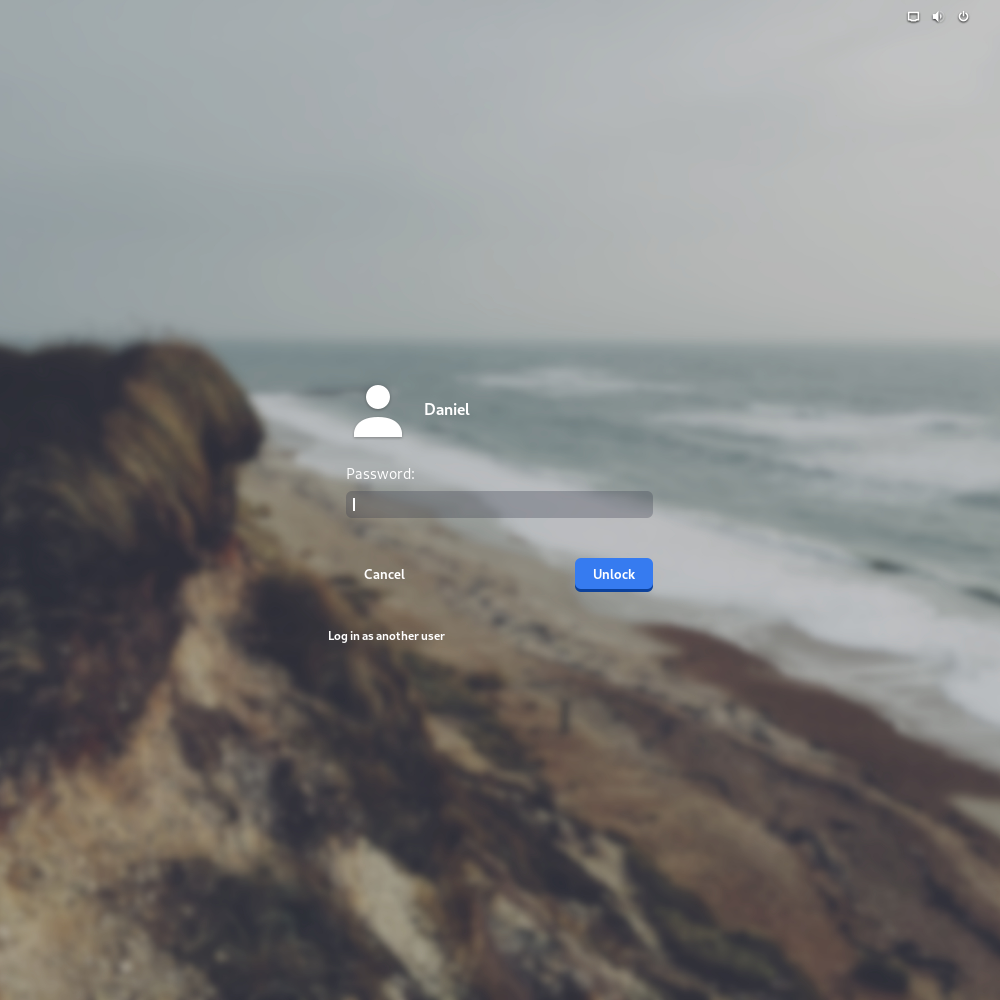
这个是作者的演示效果图,如果你将修改后的css文件直接使用,也会出现差不多的效果,唯一的区别在右上角的图标还系统原来的,因为上面的css使用的还是系统自带的图标和图片。