Chart.js 中文文档
此文档包含了用Chart.js创建漂亮图表的所有知识。
起步
引入Chart.js文件
首先我们需要在页面中引入Chart.js文件。此工具库在全局命名空间中定义了Chart变量。
<script src="Chart.js"></script>创建图表
为了创建图表,我们要实例化一个Chart对象。为了完成前面的步骤,首先需要需要传入一个绘制图表的2d context。以下是案例。
<canvas id="myChart" width="400" height="400"></canvas>//Get the context of the canvas element we want to selectvar ctx = document.getElementById("myChart").getContext("2d");var myNewChart = new Chart(ctx).PolarArea(data);我们还可以用jQuery获取canvas的context。首先从jQuery集合中获取我们需要的DOM节点,然后在这个DOM节点上调用 getContext("2d") 方法。
//Get context with jQuery - using jQuery's .get() method.var ctx = $("#myChart").get(0).getContext("2d");//This will get the first returned node in the jQuery collection.var myNewChart = new Chart(ctx);当我们完成了在指定的canvas上实例化Chart对象之后,Chart.js会自动针对retina屏幕做缩放。
Chart对象设置完成后,我们就可以继续创建Chart.js中提供的具体类型的图表了。下面这个案例中,我们将展示如何绘制一幅极地区域图(Polar area chart)。
new Chart(ctx).PolarArea(data,options);We call a method of the name of the chart we want to create. We pass in the data for that chart type, and the options for that chart as parameters. Chart.js will merge the options you pass in with the default options for that chart type.
曲线图(Line chart)
简介
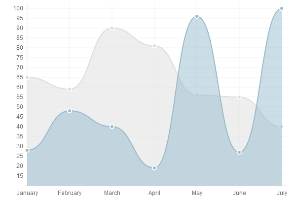
曲线图就是将数据标于曲线上的一种图表。
一般用于展示趋势数据,和比较两组数据集。
使用案例
new Chart(ctx).Line(data,options);
数据结构
var data = {
	labels : ["January","February","March","April","May","June","July"],
	datasets : [{
			fillColor : "rgba(220,220,220,0.5)",
			strokeColor : "rgba(220,220,220,1)",
			pointColor : "rgba(220,220,220,1)",
			pointStrokeColor : "#fff",
			data : [65,59,90,81,56,55,40]},{
			fillColor : "rgba(151,187,205,0.5)",
			strokeColor : "rgba(151,187,205,1)",
			pointColor : "rgba(151,187,205,1)",
			pointStrokeColor : "#fff",
			data : [28,48,40,19,96,27,100]}]}
The line chart requires an array of labels for each of the data points. This is show on the X axis.
The data for line charts is broken up into an array of datasets. Each dataset has a colour for the fill, a colour for the line and colours for the points and strokes of the points. These colours are strings just like CSS. You can use RGBA, RGB, HEX or HSL notation.
曲线图参数
scaleStartValue: null,
//坐标轴的颜色
scaleLineColor: "rgba(0,0,0,.1)",
//坐标轴线的宽度
scaleLineWidth: 1,
//是否显示Y坐标的标签
scaleShowLabels: false,
//Y轴标签自定义,如加个%之类的单位
scaleLabel: "<%=value%>",
//标签字体
scaleFontFamily: "'Arial'",
//标签字体大小
scaleFontSize: 12,
//标签字体样式
scaleFontStyle: "normal",
//标签字体颜色
scaleFontColor: "#666",
//网格线是否在数据的上面
scaleOverlay: false,
//是否显示辅助网格
scaleShowGridLines: true,
//图表辅助网格线颜色
scaleGridLineColor: "rgba(0,0,0,.05)",
//辅助网格线的宽度
scaleGridLineWidth: 1,
//是否用硬编码重新Y轴网格线
scaleOverride: false,
//使用硬编码重新Y轴网格线时, Y轴的刻度数量
scaleSteps: null,
//使用硬编码重新Y轴网格线时,Y轴每个刻度的宽度
scaleStepWidth: null,
//两点之间是否是曲线, false时变为折线图
bezierCurve: true,
//是否显示数据圆点
pointDot: true,
//数据圆点的半径
pointDotRadius: 3,
//数据圆点的边框宽度
pointDotStrokeWidth: 1,
//数据线的宽度
datasetStrokeWidth: 2,
//数据集行程
datasetStroke: true,
//是否填充曲线范围
datasetFill: true,
//是否有动画效果
animation: true,
//动画效果每帧间隔
animationSteps: 60,
//动画特效
animationEasing: "easeOutQuart",
//动画完成后调用的方法
onAnimationComplete: null
}
柱状图(Bar chart)
简介
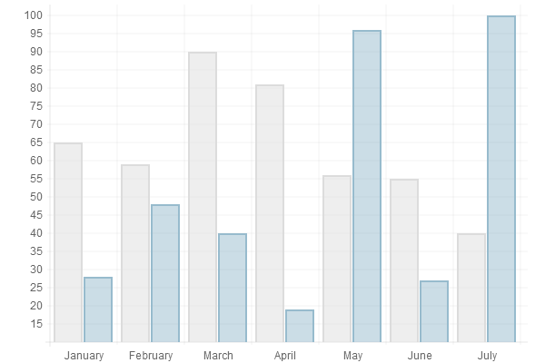
A bar chart is a way of showing data as bars.
It is sometimes used to show trend data, and the comparison of multiple data sets side by side.
使用案例
new Chart(ctx).Bar(data,options);
数据结构
var data = {
	labels : ["January","February","March","April","May","June","July"],
	datasets : [{
			fillColor : "rgba(220,220,220,0.5)",
			strokeColor : "rgba(220,220,220,1)",
			data : [65,59,90,81,56,55,40]},{
			fillColor : "rgba(151,187,205,0.5)",
			strokeColor : "rgba(151,187,205,1)",
			data : [28,48,40,19,96,27,100]}]}
The bar chart has the a very similar data structure to the line chart, and has an array of datasets, each with colours and an array of data. Again, colours are in CSS format.
We have an array of labels too for display. In the example, we are showing the same data as the previous line chart example.
柱状图参数
scaleStartValue: null,
//坐标轴的颜色
scaleLineColor: "rgba(0,0,0,.1)",
//坐标轴线的宽度
scaleLineWidth: 1,
//是否显示Y坐标的标签
scaleShowLabels: false,
//Y轴标签自定义,如加个%之类的单位
scaleLabel: "<%=value%>",
//标签字体
scaleFontFamily: "'Arial'",
//标签字体大小
scaleFontSize: 12,
//标签字体样式
scaleFontStyle: "normal",
//标签字体颜色
scaleFontColor: "#666",
//网格线是否在数据的上面
scaleOverlay: false,
//是否显示辅助网格
scaleShowGridLines: true,
//图表辅助网格线颜色
scaleGridLineColor: "rgba(0,0,0,.05)",
//辅助网格线的宽度
scaleGridLineWidth: 1,
//是否用硬编码重新Y轴网格线
scaleOverride: false,
//使用硬编码重新Y轴网格线时, Y轴的刻度数量
scaleSteps: null,
//使用硬编码重新Y轴网格线时,Y轴每个刻度的宽度
scaleStepWidth: null,
//是否有动画效果
animation: true,
//动画效果每帧间隔
animationSteps: 60,
//动画特效
animationEasing: "easeOutQuart",
//动画完成后调用的方法
onAnimationComplete: null,
//柱状图特有属性
//柱子上是否显示边框
barShowStroke: true,
//柱子上边框的宽度
barStrokeWidth: 2,
//柱状块与x值所形成的线(如:x=20这条线)之间的距离
barValueSpacing: 5,
//在同一x值内的柱状块之间的间距
barDatasetSpacing: 1
}
雷达图或蛛网图(Radar chart)
简介
A radar chart is a way of showing multiple data points and the variation between them.
They are often useful for comparing the points of two or more different data sets
使用案例

new Chart(ctx).Radar(data,options);数据结构
var data = {
	labels : ["Eating","Drinking","Sleeping","Designing","Coding","Partying","Running"],
	datasets : [{
			fillColor : "rgba(220,220,220,0.5)",
			strokeColor : "rgba(220,220,220,1)",
			pointColor : "rgba(220,220,220,1)",
			pointStrokeColor : "#fff",
			data : [65,59,90,81,56,55,40]},{
			fillColor : "rgba(151,187,205,0.5)",
			strokeColor : "rgba(151,187,205,1)",
			pointColor : "rgba(151,187,205,1)",
			pointStrokeColor : "#fff",
			data : [28,48,40,19,96,27,100]}]}
For a radar chart, usually you will want to show a label on each point of the chart, so we include an array of strings that we show around each point in the chart. If you do not want this, you can either not include the array of labels, or choose to hide them in the chart options.
For the radar chart data, we have an array of datasets. Each of these is an object, with a fill colour, a stroke colour, a colour for the fill of each point, and a colour for the stroke of each point. We also have an array of data values.
雷达图参数
Radar.defaults = {
scaleStartValue: null,
//坐标轴的颜色
scaleLineColor: "rgba(0,0,0,.1)",
//坐标轴线的宽度
scaleLineWidth: 1,
//是否显示Y坐标的标签
scaleShowLabels: false,
//Y轴标签自定义,如加个%之类的单位
scaleLabel: "<%=value%>",
//标签字体
scaleFontFamily: "'Arial'",
//标签字体大小
scaleFontSize: 12,
//标签字体样式
scaleFontStyle: "normal",
//标签字体颜色
scaleFontColor: "#666",
//网格线是否在数据的上面
scaleOverlay: false,
//是否用硬编码重新Y轴网格线
scaleOverride: false,
//使用硬编码重新Y轴网格线时, Y轴的刻度数量
scaleSteps: null,
//使用硬编码重新Y轴网格线时,Y轴每个刻度的宽度
scaleStepWidth: null,
//是否显示数据圆点
pointDot: true,
//数据圆点的半径
pointDotRadius: 3,
//数据圆点的边框宽度
pointDotStrokeWidth: 1,
//数据线的宽度
datasetStrokeWidth: 2,
//数据集行程
datasetStroke: true,
//是否填充曲线范围
datasetFill: true,
//是否有动画效果
animation: true,
//动画效果每帧间隔
animationSteps: 60,
//动画特效
animationEasing: "easeOutQuart",
//动画完成后调用的方法
onAnimationComplete: null,
//雷达图特有属性
//是否显示蛛网辅助线
scaleShowLine: true,
//蛛网辅助线中的Y轴是否显示
angleShowLineOut: true,
//蛛网辅助线中的Y轴颜色
angleLineColor: "rgba(0,0,0,.1)",
//蛛网辅助线中的Y轴宽度
angleLineWidth: 1,
//标签字体
pointLabelFontFamily: "'Arial'",
//标签字体样式
pointLabelFontStyle: "normal",
//标签字体大小
pointLabelFontSize: 12,
//标签字体颜色
pointLabelFontColor: "#666",
}
极地区域图(Polar area chart)
简介
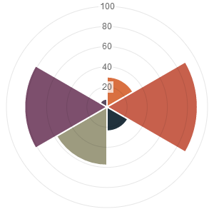
Polar area charts are similar to pie charts, but each segment has the same angle - the radius of the segment differs depending on the value.
This type of chart is often useful when we want to show a comparison data similar to a pie chart, but also show a scale of values for context.
使用案例
new Chart(ctx).PolarArea(data,options);数据结构
var data = [{
		value : 30,
		color: "#D97041"},{
		value : 90,
		color: "#C7604C"},{
		value : 24,
		color: "#21323D"},{
		value : 58,
		color: "#9D9B7F"},{
		value : 82,
		color: "#7D4F6D"},{
		value : 8,
		color: "#584A5E"}]
As you can see, for the chart data you pass in an array of objects, with a value and a colour. The value attribute should be a number, while the color attribute should be a string. Similar to CSS, for this string you can use HEX notation, RGB, RGBA or HSL.
极地图参数
These are the default chart options. By passing in an object with any of these attributes, Chart.js will merge these objects and the graph accordingly. Explanations of each option are commented in the code below.
scaleStartValue: null,
//坐标轴的颜色
scaleLineColor: "rgba(0,0,0,.1)",
//坐标轴线的宽度
scaleLineWidth: 1,
//是否显示Y坐标的标签
scaleShowLabels: false,
//Y轴标签自定义,如加个%之类的单位
scaleLabel: "<%=value%>",
//标签字体
scaleFontFamily: "'Arial'",
//标签字体大小
scaleFontSize: 12,
//标签字体样式
scaleFontStyle: "normal",
//标签字体颜色
scaleFontColor: "#666",
//网格线是否在数据的上面
scaleOverlay: false,
//是否用硬编码重新Y轴网格线
scaleOverride: false,
//使用硬编码重新Y轴网格线时, Y轴的刻度数量
scaleSteps: null,
//使用硬编码重新Y轴网格线时,Y轴每个刻度的宽度
scaleStepWidth: null,
//是否有动画效果
animation: true,
//动画效果每帧间隔
animationSteps: 60,
//动画特效
animationEasing: "easeOutQuart",
//动画完成后调用的方法
onAnimationComplete: null,
//极地图特有
//是否显示刻度文本背景
scaleShowLabelBackdrop: true,
//刻度背景颜色
scaleBackdropColor: "rgba(255,255,255,0.75)",
//刻度背景区域Y轴大小
scaleBackdropPaddingY: 2,
//刻度背景区域X轴大小
scaleBackdropPaddingX: 2,
//是否显示蛛网辅助线
scaleShowLine: true,
//圆形图表特有
//色块之间是否有间隔
segmentShowStroke: true,
//间隔的颜色
segmentStrokeColor: "#fff",
//间隔宽度
segmentStrokeWidth: 2,
//是否有从0度到360度的动画.和animateScale互斥, 两种动画效果只能有一种
animateRotate: true,
//是否有从中心到边缘的动画.和animateRotate互斥
animateScale: false,
}
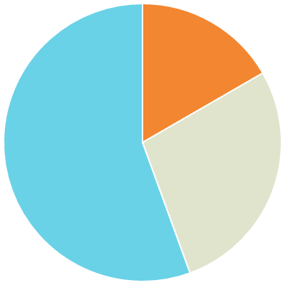
饼图(Pie chart)
简介
Pie charts are probably the most commonly used chart there are. They are divided into segments, the arc of each segment shows a the proportional value of each piece of data.
They are excellent at showing the relational proportions between data.
使用案例

new Chart(ctx).Pie(data,options);数据结构
var data = [{
		value: 30,
		color:"#F38630"},{
		value : 50,
		color : "#E0E4CC"},{
		value : 100,
		color : "#69D2E7"}]
For a pie chart, you must pass in an array of objects with a value and a colorproperty. The value attribute should be a number, Chart.js will total all of the numbers and calculate the relative proportion of each. The color attribute should be a string. Similar to CSS, for this string you can use HEX notation, RGB, RGBA or HSL.
饼图参数
These are the default options for the Pie chart. Pass in an object with any of these attributes to override them.
animation: true,
//动画效果每帧间隔
animationSteps: 60,
//动画特效
animationEasing: "easeOutQuart",
//动画完成后调用的方法
onAnimationComplete: null,
//圆形图表特有
//色块之间是否有间隔
segmentShowStroke: true,
//间隔的颜色
segmentStrokeColor: "#fff",
//间隔宽度
segmentStrokeWidth: 2,
//是否有从0度到360度的动画.和animateScale互斥, 两种动画效果只能有一种
animateRotate: true,
//是否有从中心到边缘的动画.和animateRotate互斥
animateScale: false,
环形图(Doughnut chart)
简介
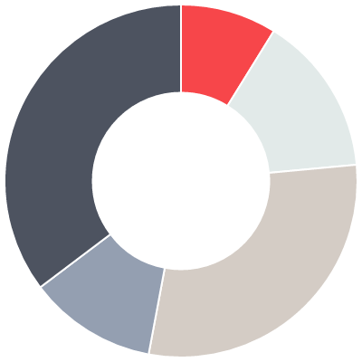
Doughnut charts are similar to pie charts, however they have the centre cut out, and are therefore shaped more like a doughnut than a pie!
They are aso excellent at showing the relational proportions between data.
使用案例
new Chart(ctx).Doughnut(data,options);数据结构
var data = [{
		value: 30,
		color:"#F7464A"},{
		value : 50,
		color : "#E2EAE9"},{
		value : 100,
		color : "#D4CCC5"},{
		value : 40,
		color : "#949FB1"},{
		value : 120,
		color : "#4D5360"}]
For a doughnut chart, you must pass in an array of objects with a value and acolor property. The value attribute should be a number, Chart.js will total all of the numbers and calculate the relative proportion of each. The color attribute should be a string. Similar to CSS, for this string you can use HEX notation, RGB, RGBA or HSL.
环形图参数
These are the default options for the doughnut chart. Pass in an object with any of these attributes to override them.
percentageInnerCutout: 50,
General issues
Chart interactivity
If you are looking to add interaction as a layer to charts, Chart.js is not the library for you. A better option would be using SVG, as this will let you attach event listeners to any of the elements in the chart, as these are all DOM nodes.
Chart.js uses the canvas element, which is a single DOM node, similar in characteristics to a static image. This does mean that it has a wider scope for compatibility, and less memory implications than SVG based charting solutions. The canvas element also allows for saving the contents as a base 64 string, allowing saving the chart as an image.
In SVG, all of the lines, data points and everything you see is a DOM node. As a result of this, complex charts with a lot of intricacies, or many charts on the page will often see dips in performance when scrolling or generating the chart, especially when there are multiple on the page. SVG also has relatively poor mobile support, with Android not supporting SVG at all before version 3.0, and iOS before 5.0. (caniuse.com/svg-html5).
浏览器支持
所有现代浏览器和大部分手机浏览器都支持canvas(caniuse.com/canvas)。
对于IE8及以下版本的浏览器,建议使用ExplorerCanvas - 见https://code.google.com/p/explorercanvas/。对于不支持canvas的IE会自动降级为VML格式。使用方法:
<head><!--[if lte IE 8]>
		<script src="excanvas.js"></script>
	<![endif]--></head>
Usually I would recommend feature detection to choose whether or not to load a polyfill, rather than IE conditional comments, however in this case, VML is a Microsoft proprietary format, so it will only work in IE.
Some important points to note in my experience using ExplorerCanvas as a fallback.
- Initialise charts on load rather than DOMContentReady when using the library, as sometimes a race condition will occur, and it will result in an error when trying to get the 2d context of a canvas.
- New VML DOM elements are being created for each animation frame and there is no hardware acceleration. As a result animation is usually slow and jerky, with flashing text. It is a good idea to dynamically turn off animation based on canvas support. I recommend using the excellent Modernizr to do this.
- When declaring fonts, the library explorercanvas requires the font name to be in single quotes inside the string. For example, instead of your scaleFontFamily property being simply "Arial", explorercanvas support, use "'Arial'" instead. Chart.js does this for default values.