zoukankan      html  css  js  c++  java
  • 02-CSS基础与进阶-day4__2018-08-31-20-22-57

    css
    文字阴影(css3)
    text-shadow: 水平位置 垂直位置 模糊距离 阴影颜色

    01凹凸文字效果.html

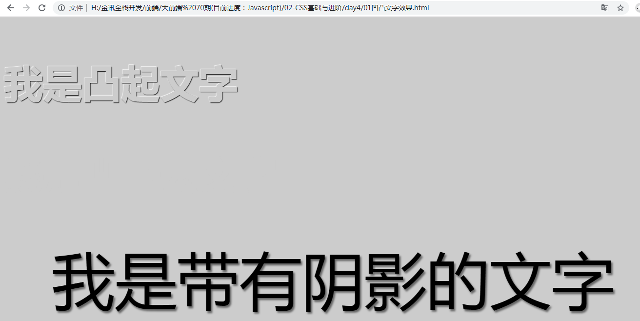
    <!DOCTYPE html>
    <html lang="en">
    <head>
        <meta charset="UTF-8">
        <title>Document</title>
        <style type="text/css">
            body {
                background-color: #ccc;
            }
    
            p {
                color: #ccc; 
                font-size: 80px;
                font-family: "微软雅黑";
                font-weight: 700;
            }
    
            p:first-child {
                /* 水平位置  垂直位置  模糊距离 阴影颜色*/
                text-shadow: 1px 1px 1px #000,-1px -1px 1px #fff;
            }
    
            p:last-child {
                /* 水平位置  垂直位置  模糊距离 阴影颜色*/
                text-shadow: -1px -1px 1px #000,1px 1px 1px #fff;
            }
    
            div {
                font-size: 8em;
                text-align: center;
                text-shadow: 3px 4px 5px  rgba(0,0,0,0.5);
            }
        </style>
    </head>
    <body>
        <p>我是凸起文字</p>
        <p>我是凹下去文字</p>
        <div>我是带有阴影的文字</div> 
    </body>
    </html>
  • 相关阅读:
    Codeforces Global Round 6
    Codeforces Global Round 5
    笔记
    笔记
    Codeforces Round #608 (Div. 2)
    模板
    Codeforces Round #607 (Div. 2)
    find命令
    while循环脚本
    发邮件
  • 原文地址:https://www.cnblogs.com/HiJackykun/p/11043281.html
Copyright © 2011-2022 走看看