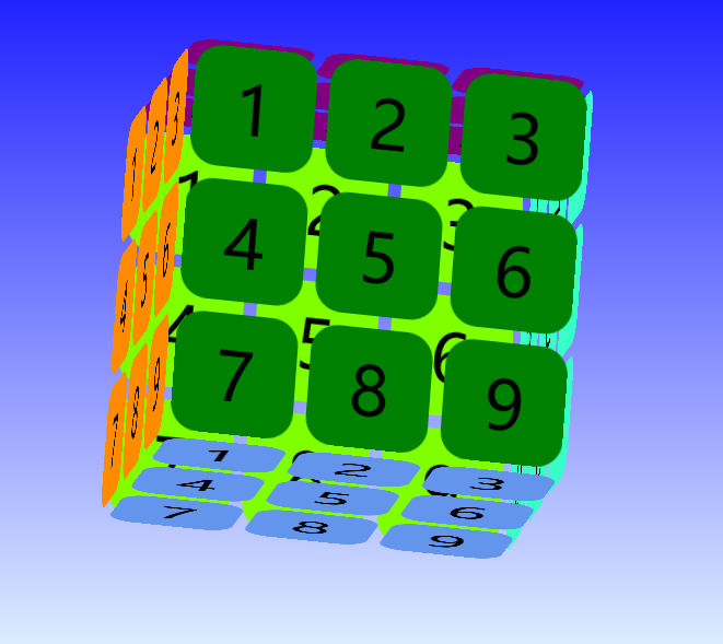
zoukankan      html  css  js  c++  java
  • 超级无敌海景拽掉咋天的魔方

    好吧,请无视标题。

    这是一个CSS3的魔方

    1.HTML

        <div class="box">
            <div class="before face">
                <div>1</div>
                <div>2</div>
                <div>3</div>
                <div>4</div>
                <div>5</div>
                <div>6</div>
                <div>7</div>
                <div>8</div>
                <div>9</div>
            </div>
            <div class="back face">
                <div>1</div>
                <div>2</div>
                <div>3</div>
                <div>4</div>
                <div>5</div>
                <div>6</div>
                <div>7</div>
                <div>8</div>
                <div>9</div>
            </div>
            <div class="top face">
                <div>1</div>
                <div>2</div>
                <div>3</div>
                <div>4</div>
                <div>5</div>
                <div>6</div>
                <div>7</div>
                <div>8</div>
                <div>9</div>
            </div>
            <div class="bottom face">
                <div>1</div>
                <div>2</div>
                <div>3</div>
                <div>4</div>
                <div>5</div>
                <div>6</div>
                <div>7</div>
                <div>8</div>
                <div>9</div>
            </div>
            <div class="left face">
                <div>1</div>
                <div>2</div>
                <div>3</div>
                <div>4</div>
                <div>5</div>
                <div>6</div>
                <div>7</div>
                <div>8</div>
                <div>9</div>
            </div>
            <div class="right face">
                <div>1</div>
                <div>2</div>
                <div>3</div>
                <div>4</div>
                <div>5</div>
                <div>6</div>
                <div>7</div>
                <div>8</div>
                <div>9</div>
            </div>
        </div>
    

    2.CSS

         body {
                /*background-color: azure;*/
                background-image: linear-gradient(180deg, blue, azure );
                background-repeat: no-repeat;
            }
    
            .box {
                 300px;
                height: 300px;
                margin: 150px auto;
                position: relative;
                font-size: 50px;
                transform-style: preserve-3d;
                animation: rotate 10s linear infinite alternate;
            }
    
            .face {
                display: flex;
                flex-wrap: wrap;
                 300px;
                height: 300px;
                position: absolute;
            }
    
                .face div {
                     90px;
                    height: 90px;
                    border-radius: 20px;
                    margin: 5px;
                    text-align: center;
                    line-height: 90px;
                }
    
            .right {
                background-color: transparent;
                transform: rotateY(90deg) translateZ(150px);
            }
    
            .left {
                background-color: transparent;
                transform: rotateY(-90deg) translateZ(150px);
            }
    
            .top {
                background-color: transparent;
                transform: rotateX(90deg) translateZ(150px);
            }
    
            .bottom {
                background-color: transparent;
                transform: rotateX(-90deg) translateZ(150px);
            }
    
            .before {
                background-color: transparent;
                transform: translateZ(150px);
            }
    
            .back {
                background-color: transparent;
                transform: translateZ(-150px);
            }
    
            .before div {
                background-color: green;
            }
    
            .back div {
                background-color: chartreuse;
            }
    
            .top div {
                background-color: purple;
            }
    
            .bottom div {
                background-color: cornflowerblue;
            }
    
            .left div {
                background-color: darkorange;
            }
    
            .right div {
                background-color: #37ffc7;
            }
    
            .box:hover {
                animation-play-state: paused;
            }
    
            @keyframes rotate {
                0% {
                    transform: rotateY(0deg) rotateX(0deg) rotateZ(0deg);
                }
    
                20% {
                    transform: rotateY(30deg) rotateX(40deg) rotateZ(20deg);
                }
    
                40% {
                    transform: rotateY(-60deg) rotateX(-40deg) rotateZ(-20deg);
                }
    
                60% {
                    transform: rotateY(145deg) rotateX(80deg) rotateZ(10deg);
                }
    
                80% {
                    transform: rotateY(90deg) rotateX(60deg) rotateZ(-20deg);
                }
    
                100% {
                    transform: rotateY(135deg) rotateX(-45deg) rotateZ(30deg);
                }
            }
    

    .box, .face组织了魔方。

    .right, .left, .top, .bottom, .before, .back 定义了了6个面,分别放到3D座标上。

            .right {
                background-color: transparent;
                transform: rotateY(90deg) translateZ(150px);。
            }
    
            .left {
                background-color: transparent;
                transform: rotateY(-90deg) translateZ(150px);
            }
    
            .top {
                background-color: transparent;
                transform: rotateX(90deg) translateZ(150px);
            }
    
            .bottom {
                background-color: transparent;
                transform: rotateX(-90deg) translateZ(150px);
            }
    
            .before {
                background-color: transparent;
                transform: translateZ(150px);
            }
    
            .back {
                background-color: transparent;
                transform: translateZ(-150px);
            }
    

    动画部分,定义了0%,20%,40%,60%,80%,100%的动画。

            @keyframes rotate {
                0% {
                    transform: rotateY(0deg) rotateX(0deg) rotateZ(0deg);
                }
    
                20% {
                    transform: rotateY(30deg) rotateX(40deg) rotateZ(20deg);
                }
    
                40% {
                    transform: rotateY(-60deg) rotateX(-40deg) rotateZ(-20deg);
                }
    
                60% {
                    transform: rotateY(145deg) rotateX(80deg) rotateZ(10deg);
                }
    
                80% {
                    transform: rotateY(90deg) rotateX(60deg) rotateZ(-20deg);
                }
    
                100% {
                    transform: rotateY(135deg) rotateX(-45deg) rotateZ(30deg);
                }
            }
    
    ------------------------------------------------------------
    如非注明都是原创,如需转载请注出处。
  • 相关阅读:
    Get distinct count of rows in the DataSet
    单引号双引号的html转义符
    PETS Public English Test System
    Code 39 basics (39条形码原理)
    Index was outside the bounds of the array ,LocalReport.Render
    Thread was being aborted Errors
    Reportviewer Error: ASP.NET session has expired
    ReportDataSource 值不在预期的范围内
    .NET/FCL 2.0在Serialization方面的增强
    Perl像C一样强大,像awk、sed等脚本描述语言一样方便。
  • 原文地址:https://www.cnblogs.com/Ivan83/p/9080472.html
Copyright © 2011-2022 走看看