bootstrap的栅格系统会将整个页面水平方向上平均分成12个小格子
当浏览器大小发生变化的时候,我们可以控制每行的元素占用几个格子,从而达到响应式的效果

显示屏幕的扩大和缩小. 实现如下效果
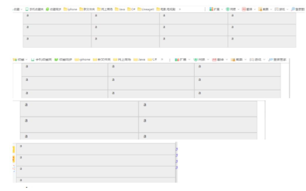
<style>
    .a{
        height: 50px;
        border: 1px solid black;
        background-color: #eeeeee;
    }
</style>
<body>
    <div class="container">
        <div class="row">
            <!-- col-lg-3 当大屏幕时,一个div占3份,一行显示4个div -->
            <!-- col-md-4 当中屏幕时,一个div占4份,一行显示3个div -->
            <!-- col-sm-6 当小屏幕时,一个div占6份,一行显示2个div -->
            <!-- 超小屏幕时,一个div占12份,一行显示1个div,默认 -->
            <div class="col-lg-3 col-md-4 col-sm-6 a">x</div>
            <div class="col-lg-3 col-md-4 col-sm-6 a">x</div>
            <div class="col-lg-3 col-md-4 col-sm-6 a">x</div>
            <div class="col-lg-3 col-md-4 col-sm-6 a">x</div>
            <div class="col-lg-3 col-md-4 col-sm-6 a">x</div>
            <div class="col-lg-3 col-md-4 col-sm-6 a">x</div>
            <div class="col-lg-3 col-md-4 col-sm-6 a">x</div>
            <div class="col-lg-3 col-md-4 col-sm-6 a">x</div>
            <div class="col-lg-3 col-md-4 col-sm-6 a">x</div>
            <div class="col-lg-3 col-md-4 col-sm-6 a">x</div>
            <div class="col-lg-3 col-md-4 col-sm-6 a">x</div>
            <div class="col-lg-3 col-md-4 col-sm-6 a">x</div>
        </div>
    </div>
</body>