Create Python visuals in Power BI Desktop
-
Select the Python visual icon in the Visualizations pane.
-
In the Enable script visuals dialog box that appears, select Enable.
When you add a Python visual to a report, Power BI Desktop takes the following actions:
-
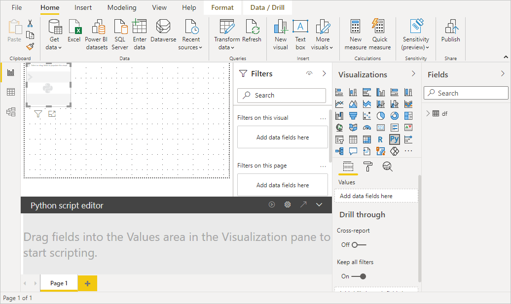
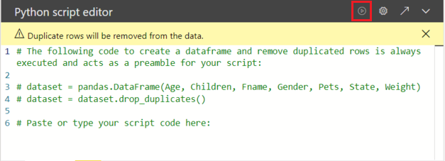
A placeholder Python visual image appears on the report canvas.
-
The Python script editor appears along the bottom of the center pane.
-
-
Next, drag the Age, Children, Fname, Gender, Pets, State, and Weight fields to the Values section where it says Add data fields here.
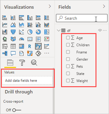
Your Python script can only use fields added to the Values section. You can add or remove fields from the Values section while working on your Python script. Power BI Desktop automatically detects field changes.
Note
The default aggregation type for Python visuals is do not summarize.
-
Now you can use the data you selected to create a plot.
As you select or remove fields, supporting code in the Python script editor is automatically generated or removed.
Based on your selections, the Python script editor generates the following binding code.
- The editor created a dataset dataframe, with the fields you added.
- The default aggregation is: do not summarize.
- Similar to table visuals, fields are grouped and duplicate rows appear only once.
Tip
In certain cases, you might not want automatic grouping to occur, or you'll want all rows to appear, including duplicates. If so, you can add an index field to your dataset that causes all rows to be considered unique and which prevents grouping.
You can access columns in the dataset using their respective names. For example, you can code
dataset["Age"]in your Python script to access the age field. -
With the dataframe automatically generated by the fields you selected, you're ready to write a Python script that results in plotting to the Python default device. When the script is complete, select Run from the Python script editor title bar.
Power BI Desktop replots the visual if any of the following events occur:
- When you select Run from the Python script editor title bar
- Whenever a data change occurs, due to data refresh, filtering, or highlighting
When you run a Python script that results in an error, the Python visual isn't plotted and a canvas error message appears. For error details, select See details from the message.
To get a larger view of the visualizations, you can minimize the Python script editor.
Ok, let's create some visuals.
Create a scatter plot
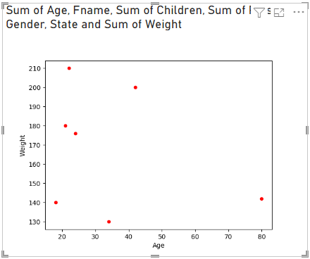
Let's create a scatter plot to see if there's a correlation between age and weight.
-
Under Paste or type your script code here, enter this code:
Pythonimport matplotlib.pyplot as plt dataset.plot(kind='scatter', x='Age', y='Weight', color='red') plt.show()Your Python script editor pane should now look like this:
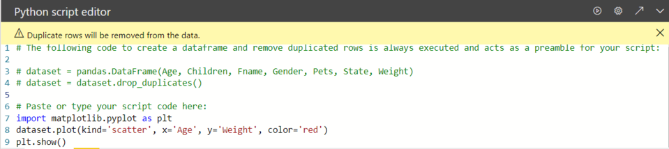
The matplotlib library is imported to plot and create our visuals.
-
When you select the Run script button, the following scatter plot generates in the placeholder Python visual image.
Create a line plot with multiple columns
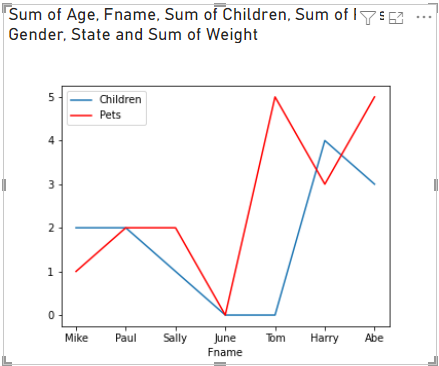
Let's create a line plot for each person showing their number of children and pets. Remove or comment the code under Paste or type your script code here and enter this Python code:
import matplotlib.pyplot as plt
ax = plt.gca()
dataset.plot(kind='line',x='Fname',y='Children',ax=ax)
dataset.plot(kind='line',x='Fname',y='Pets', color='red', ax=ax)
plt.show()
When you select the Run script button, the following line plot with multiple columns generates.
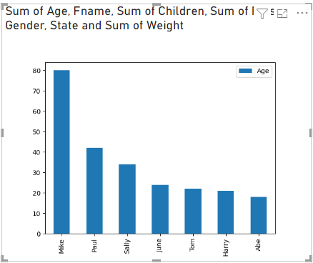
Create a bar plot
Let's create a bar plot for each person's age. Remove or comment the code under Paste or type your script code here and enter this Python code:
import matplotlib.pyplot as plt
dataset.plot(kind='bar',x='Fname',y='Age')
plt.show()
When you select the Run script button, the following bar plot generates: