-
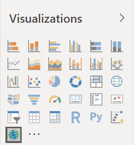
Select the ArcGIS Maps for Power BI icon from the Visualizations pane.
-
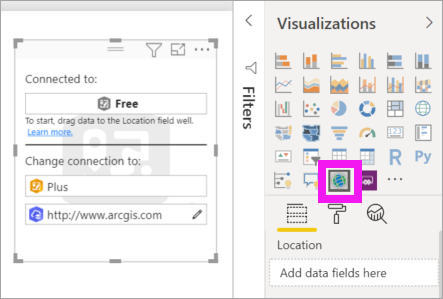
Power BI adds an empty template to the report canvas. For this tutorial, we'll be using the free version.
-
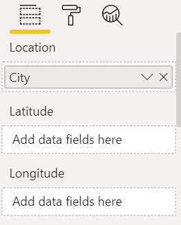
From the Fields pane, drag a data field to the Location or Latitude and/or Longitude buckets. In this example, we're using Store > City.
Note
ArcGIS Maps for Power BI will automatically detect if the fields you've selected are best viewed as a shape or a point on a map. You can adjust the default in the settings (see below).
-
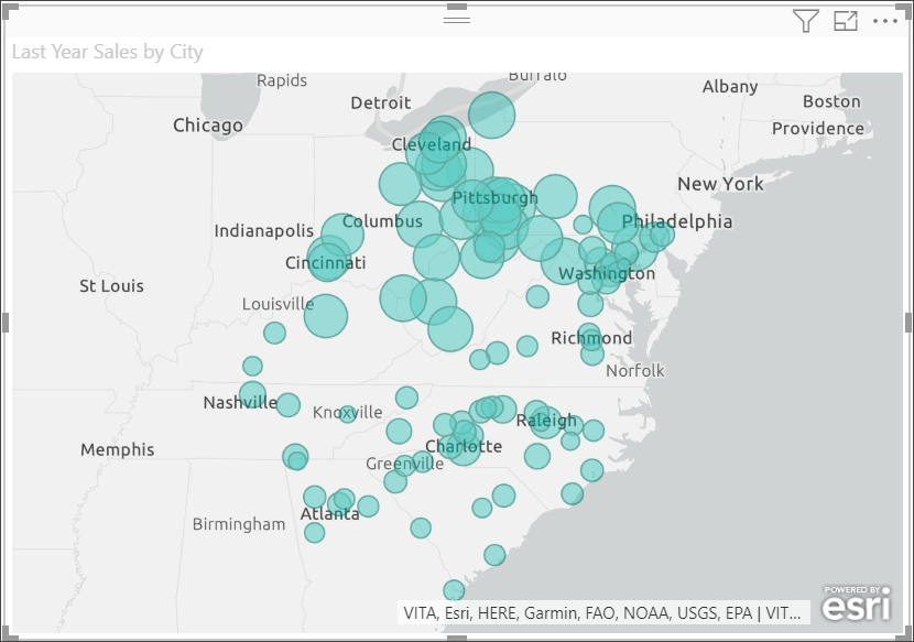
From the Fields pane, drag a measure to the Size bucket to adjust how the data is shown. In this example, we're using Sales > Last Year Sales.
You've created your first ArcGIS Map for Power BI map. Now, let's refine and format our map using base maps, location types, themes, and more.
Settings and formatting for ArcGIS Maps for Power BI
To access ArcGIS Maps for Power BI formatting features:
-
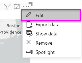
Access additional features by selecting More actions (...) in the upper right corner of the visualization and choosing Edit.
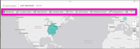
The visualization expands and the available features display across the top. Each feature, when selected, opens a task pane that provides detailed options.
Tip
Esri provides comprehensive documentation on the feature set of ArcGIS Maps for Power BI.
Base maps
Four base maps are provided: Dark Gray Canvas, Light Gray Canvas, OpenStreetMap, and Streets. Streets is the ArcGIS standard base map.
To apply a base map, select it in the task pane.

Location type
ArcGIS Maps for Power BI automatically detect the best way to show data on the map. It selects from points or boundaries. The Location type options allow you to fine-tune these selections.

Boundaries will only work if your data contains standard geographic values. ArcGIS Maps for Power BI automatically figures out the shape to show on the map. Standard geographic values include countries, provinces, zip codes, etc. But just like with GeoCoding, Power BI may not detect that a field should be a boundary by default, or it may not find a boundary for your data.
Map theme
Four map themes are provided. Power BI automatically selects either Location only or Size themes, based on the field(s) you added to the Location and Size buckets. Our map has defaulted to Size, since we added fields to both buckets. Try out the other themes and return to Size before moving on to the next step.

| Theme | Description |
|---|---|
| Location Only | Plots data points or filled boundaries on the map based on the field you added to the Location bucket. |
| Heat Map | Plots the intensity of data on the map. Areas of higher activity or value are represented by stronger and glowing colors. |
| Size | Plots data points on the map based on the field you added to the Size bucket. |
| Clustering | Points within the specified cluster radius are grouped into a single symbol that represents the number of points in that area of the map. |
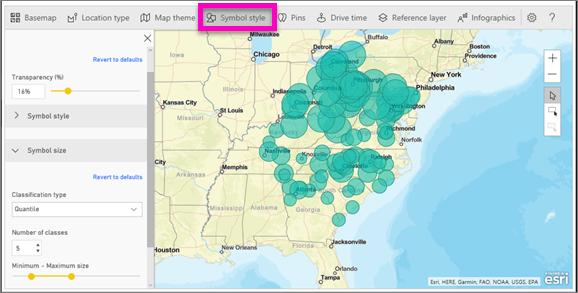
Symbol style
Symbol styles enable you to fine-tune how data is presented on the map. Symbol styles are context-sensitive based on the selected Location type and Map theme. The example below shows Map theme set to Size and several symbol style adjustments to transparency, style, and size.
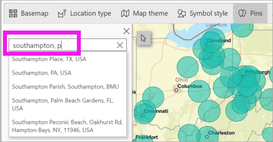
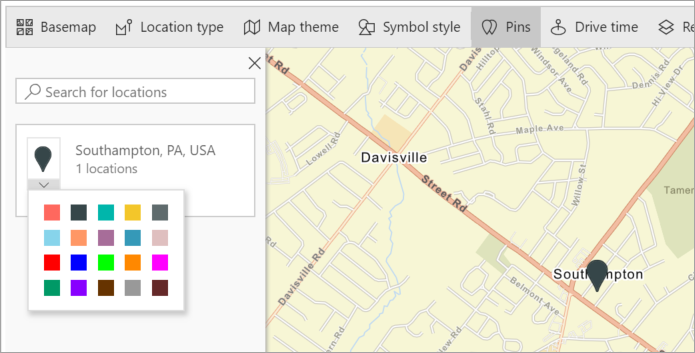
Pins
Call attention to points on your map by adding pins.
-
Select the Pins tab.
-
Type keywords (such as addresses, places, and point of interest), in the search box and select from the dropdown. A symbol appears on the map, and the map automatically zooms to the location. Search results are saved as location cards in the Pins pane. You can save up to 10 location cards.
-
Power BI adds a pin to that location and you can change the color of the pin.
-
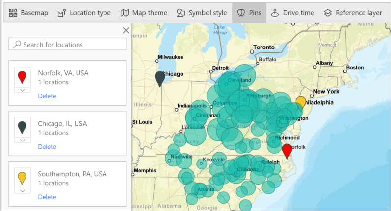
Add and delete pins.
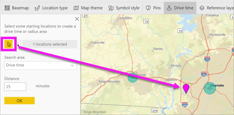
Drive time
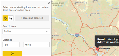
The Drive time pane lets you select a location and then determine what other map features are within a specified radius or driving time. The example below shows a 50-mile radius from Washington D.C. Follow the steps below to create your own drive time layer. 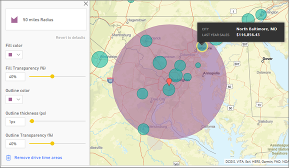
-
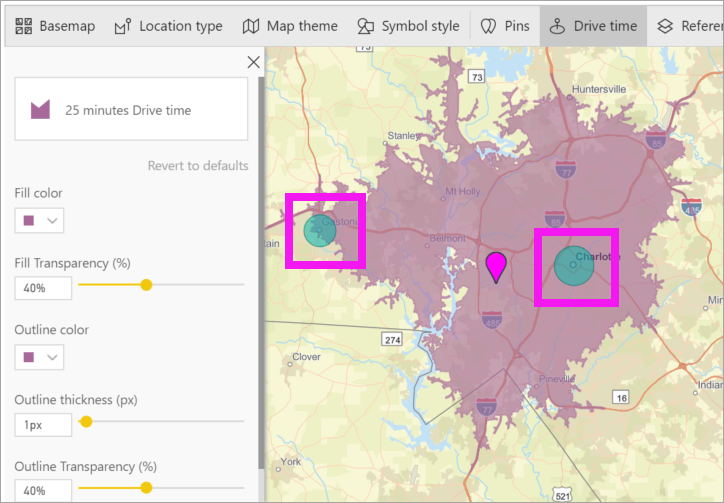
Select the single select tool and choose a pin or bubble. In this example, we've selected a pin for the Charlotte Douglas airport
Tip
It's easier to select a location if you zoom in on the map. You can zoom using the + icon or the scroll on your mouse.
-
Let's say you're flying into the Charlotte Douglas airport for a few days and want to figure out which of your chain stores are within a reasonable driving distance. Change Search area to Drive time and Distance to 25 minutes. Select OK.
-
There are two stores within a 25-minutes drive. The radius is shown in purple. Select any location to display its details. Optionally, format the radius by changing color and outline.
Reference Layer
Reference layer - Demographics
ArcGIS Maps for Power BI provides a selection of demographic layers that help contextualize data from Power BI.
-
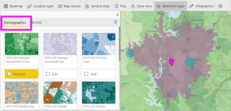
Select the Reference layer tab and choose Demographics.
-
Each layer listed has a checkbox. Add a checkmark to add that layer to the map. In this example we've added average household income.
-
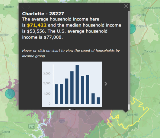
Each layer is interactive as well. Hover over a bubble to see the details. Click a shaded area to see details in the form of charts. Here we've selected the zip code 28227 and there are two charts for us to view.
Reference layer - ArcGIS
ArcGIS Online provides the ability for organizations to publish public web maps. Additionally, Esri provides a curated set of web maps through Living Atlas. In the ArcGIS tab, you can search all public web maps or Living Atlas maps, and add them to the map as reference layers.
-
Select the Reference layer tab and choose ArcGIS.
-
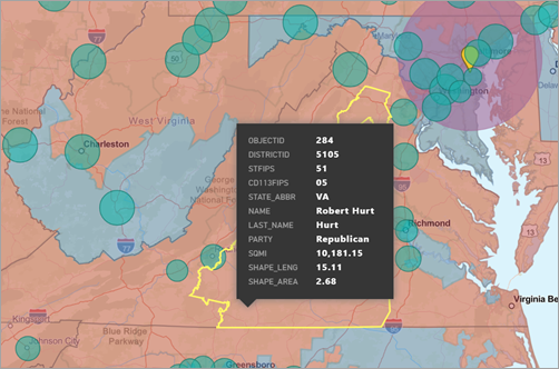
Enter search terms and then select a map layer. In this example we've chosen USA Congressional districts.
-
To see the details, select a shaded area to open the Select from reference layer: Use the reference layer selection tool to selection boundaries or objects on the reference layer.
Selecting Data points
ArcGIS Maps for Power BI allows five selection modes to help you select your data accurately and quickly.
Change the selection mode by hovering your cursor over the single selection tool icon shown in the below image. This will expand the hidden bar to show additional tools:
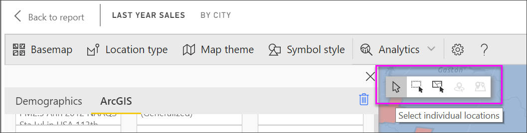
Each tool has a unique role in allowing you to select your data:
 Select individual data points.
 Draws a rectangle on the map and selects the contained data points.
 Allows boundaries or polygons within reference layers to be used to select contained data points.
 Allows you to select data using a buffer layer.
 Allows you to select data points that are similar to each other.