本文内容:
1.背景图片定位示例
2.background常用的属性值
3.background-repeat新增的round、space属性
4.background-size的属性值(着重介绍contain、cover)
5.background-origin属性值(borde-box、padding-box、content-box)
6.多背景图片示例
背景图片定位(background-position)原理
A. 语法:Background-position:水平位置 垂直位置
B. 水平位置/垂直位置设置方法:
1) 数值(px)正负值都可以,正数值表示向右移动或向下移动,负数值表示向左或向上移动;
2) 百分比(%)范围:0%—100%
3) 关键词:水平位置:left(左) center(中) right(右)
垂直位置:top(上) center(中) bottom(下)
默认情况下,background-position的原点位于左上角,换句话说,元素的左上角和图片的左上角是对齐的,随后图片向各个方向重复,都是以左上角为起点。
注意:当只设置一个值时:代表水平位置,垂直位置默认居中
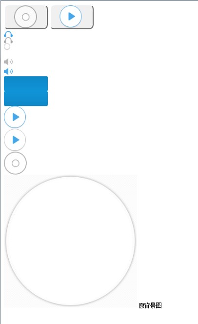
<style>input[type="button"]{width:100px;height:56px;border-radius:10px;}.btn1{background-image: url("allbgs2.png");background-position:21px355px;/*第一,第二属性值表示以图片左上角(left top)位置为原点的坐标(21px,355px),即向右移动21px,向下移动355px*/}.btn2{background-repeat:no-repeat;background-image: url("allbgs2.png");background-position:21px-175px;/*(21px,-225px),即向右移动21px,向上移动-175px*/}img{width:100px;. height:200 px;}img:hover{height:auto;width:auto;}</style><form><inputtype="button"class="btn1"><inputtype="button"class="btn2"><br/><imgsrc="allbgs2.png"><small>原背景图</small></form>
效果图
CSS常用背景属性
background-color 背景颜色;
background-image 背景图片
background-repeat 背景图片重复方式
background-position 背景图片位置
background-size 背景大小
background-attachment 背景图片滚动控制
background-clip:conten-box || padding-box || border-box 规定背景的绘制区域,注意提前设置好padding数值,这样能够效果更加明显。
background-origin 背景的定位“原点”
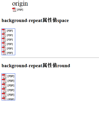
背景属性的缩写 backgroud:green url(“image/background.jpg”) top leftCSS3中为background-repeat提供了两个额外值,round、space。
测试代码
<style>figcaption{font-size:25px;}div.div1{background-color: aliceblue;width:50px;height:100px;background: url(".idea/pdf_icon.gif");border: solid 1px royalblue;background-repeat: space;/*space 尽可能地重复图片以占满背景,不行时则加大图片的边距*/}div.div2{background-color: aliceblue;width:50px;height:100px;background: url(".idea/pdf_icon.gif");border: solid 1px royalblue;background-repeat: round;/*round 尽可能地重复图片以占满背景,不行时则拉伸图片*/}</style><figure><figcaption>origin</figcaption><imgsrc=".idea/pdf_icon.gif"></figure><h3>background-repeat属性值space</h3><divclass="div1"></div><hrcolor="darkgray"/><h3>background-repeat属性值round</h3><divclass="div2"></div>
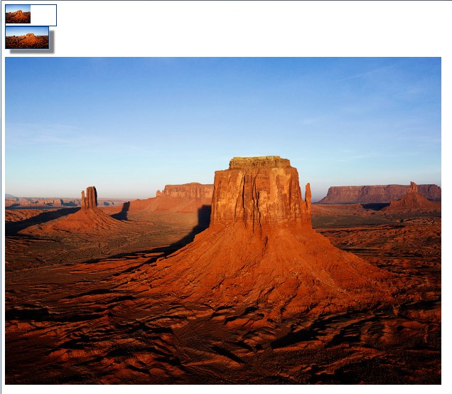
背景尺寸设置1
background-size:50%;
background-size:100px 50px;
测试代码
<style>div.div1{width:120px;height:50px;background:url("Desert.jpg")no-repeat;background-size:50%;/*将背景图像缩放成父级元素的50%,主要是背景图片的width是父级元素width的一半*/border:1px solid #00408f;}div.div2{width:100px;height:50px;background: url("Desert.jpg");background-size:100px50px;/*将背景图像设置成宽度为100px,高度为50px*/border:2px solid #00408f;box-shadow:12px10px5px gray;}</style><divclass="div1"></div><divclass="div2"></div><br/><imgsrc="Desert.jpg">
效果图
背景尺寸设置2
background-size:cover
拉大图片,使背景图片完全填满父级容器,并保持宽高比例
background-size:contain
缩放图片,使背景图片恰好适合背景区,保持宽高比例

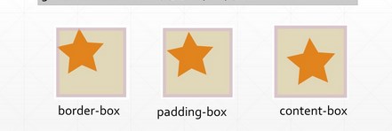
指定设定background-origin属性,可以指定背景图片原点位置。
(参考盒子模型 )
)
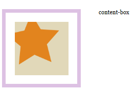
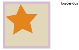
)background-origin:border-box,默认值,以边框左上角为原点;
background-origin:padding-box,去掉padding之后为原点;
background-origin:content-box,以内容区域为原点;
示例
联想:背景裁剪
backgroun-clip控制背景绘制区域,比如可以让背景色和背景图片只出现在内容区域(content-box),而不出现内边框区域(padding-content)。默认情况下,背景绘制区是扩展到边框外边距的(margain)。
background-clip的属性值border-box,padding-box,content-box的用法与backgroun-origin类似
示例
<styletype="text/css">body {margin:0;padding:0;font:100%Georgia,"Times New Roman",Times, serif;background:#3c6b92;}#wrapper {margin:0auto;width:960px;height:400px;background:#fff;padding:50px00200px;}#wrapper div {float: left;margin-right:50px;background:#e1d8b9;padding:25px;}#wrapper #one {width:150px;height:150px;border:10px solid rgba(212,178,220,.8);background:#e1d8b9 url(star_icon_large.png) no-repeat;/*因为背景图片是透明的,所以设置了背景颜色*//*在此试验各种值,比如border-box*/background-clip: content-box;/*background-clip: padding-box;background-clip: border-box;*/}</style></head><body><divid="wrapper"><divid="one"></div><span>content-box</span></div></body>


复合背景色
多背景示例
