Python第三方库之openpyxl(6)
折线图
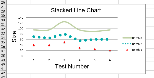
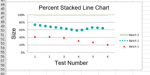
折线图允许在固定轴上绘制数据,它们类似于散列图,主要的区别在于,在折线图中,每个数据序列都是根据相同的值绘制的,不同的轴可以用于辅助轴,与条形图类似,有三种类型的折线图:standard、stacked 和percentStacked
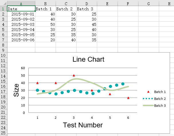
2D折线图
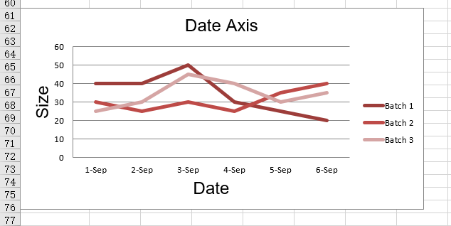
from datetime import date

from openpyxl import Workbook
from openpyxl.chart import (
    LineChart,
    Reference,
)
from openpyxl.chart.axis import DateAxis

wb = Workbook()
ws = wb.active

rows = [
    ['Date', 'Batch 1', 'Batch 2', 'Batch 3'],
    [date(2015,9, 1), 40, 30, 25],
    [date(2015,9, 2), 40, 25, 30],
    [date(2015,9, 3), 50, 30, 45],
    [date(2015,9, 4), 30, 25, 40],
    [date(2015,9, 5), 25, 35, 30],
    [date(2015,9, 6), 20, 40, 35],
]

for row in rows:
    ws.append(row)

c1 = LineChart()
c1.title = "Line Chart"
c1.style = 13
c1.y_axis.title = 'Size'
c1.x_axis.title = 'Test Number'

data = Reference(ws, min_col=2, min_row=1, max_col=4, max_row=7)
c1.add_data(data, titles_from_data=True)

# Style the lines
s1 = c1.series[0]
s1.marker.symbol = "triangle"
s1.marker.graphicalProperties.solidFill = "FF0000" # Marker filling
s1.marker.graphicalProperties.line.solidFill = "FF0000" # Marker outline

s1.graphicalProperties.line.noFill = True

s2 = c1.series[1]
s2.graphicalProperties.line.solidFill = "00AAAA"
s2.graphicalProperties.line.dashStyle = "sysDot"
s2.graphicalProperties.line.width = 100050 # width in EMUs

s2 = c1.series[2]
s2.smooth = True # Make the line smooth

ws.add_chart(c1, "A10")

from copy import deepcopy
stacked = deepcopy(c1)
stacked.grouping = "stacked"
stacked.title = "Stacked Line Chart"
ws.add_chart(stacked, "A27")

percent_stacked = deepcopy(c1)
percent_stacked.grouping = "percentStacked"
percent_stacked.title = "Percent Stacked Line Chart"
ws.add_chart(percent_stacked, "A44")

# Chart with date axis
c2 = LineChart()
c2.title = "Date Axis"
c2.style = 12
c2.y_axis.title = "Size"
c2.y_axis.crossAx = 500
c2.x_axis = DateAxis(crossAx=100)
c2.x_axis.number_format = 'd-mmm'
c2.x_axis.majorTimeUnit = "days"
c2.x_axis.title = "Date"

c2.add_data(data, titles_from_data=True)
dates = Reference(ws, min_col=1, min_row=2, max_row=7)
c2.set_categories(dates)

ws.add_chart(c2, "A61")

wb.save("line.xlsx")
运行结果
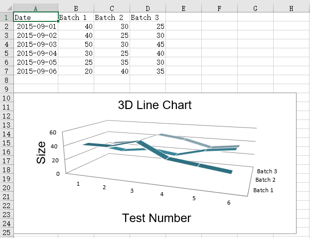
3D折线图
在三维图中,第三个轴和这个系列的图例是一样的
from datetime import date

from openpyxl import Workbook
from openpyxl.chart import (
    LineChart3D,
    Reference,
)
from openpyxl.chart.axis import DateAxis

wb = Workbook()
ws = wb.active

rows = [
    ['Date', 'Batch 1', 'Batch 2', 'Batch 3'],
    [date(2015,9, 1), 40, 30, 25],
    [date(2015,9, 2), 40, 25, 30],
    [date(2015,9, 3), 50, 30, 45],
    [date(2015,9, 4), 30, 25, 40],
    [date(2015,9, 5), 25, 35, 30],
    [date(2015,9, 6), 20, 40, 35],
]

for row in rows:
    ws.append(row)

c1 = LineChart3D()
c1.title = "3D Line Chart"
c1.legend = None
c1.style = 15
c1.y_axis.title = 'Size'
c1.x_axis.title = 'Test Number'

data = Reference(ws, min_col=2, min_row=1, max_col=4, max_row=7)
c1.add_data(data, titles_from_data=True)

ws.add_chart(c1, "A10")

wb.save("line3D.xlsx")
运行结果