要求三个面板(有指定宽度)并排,面板中有内容,内容的宽由标题确定,并且居中对齐,内容的其他段落与标题左对齐。
<div>
<center class="float_left">
<span>
<h2>这个比较短
<P>2013</p>
<p>2013</p>
<p>2013</p>
</h2>
</span>
</center>
<center class="float_left">
<span>
<h2>让父元素的宽度由子元素决定
<P>2013</p>
<p>2013</p>
<p>2013</p>
</h2>
</span>
</center>
<center class="float_left">
<span>
<h2>这个的长度也不一样
<P>2013</p>
<p>2013</p>
<p>2013</p>
</h2>
</span>
</center>
</div>
|
.float_left{
float:left;
width:350px;
height:200px;
border:1px solid #cdcdcd;
}
.float_left span{
display:inline-block;
}
.float_left h2{
margin:0;
color:white;
text-align: left;
height:200px;
background: orange;
}
.float_left h2 p{
font-size: 12px;
color:white;
}
|
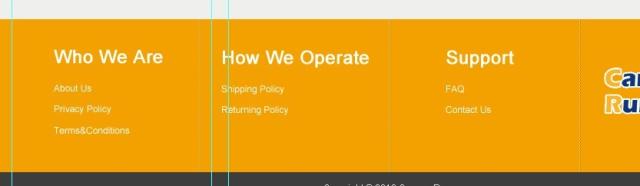
data:text/html,<style> article { display: -webkit-flex; background: rgba(255, 0, 0, 0.2) } div { width: 33.33%; border-right: green solid; } section { background: rgba(0, 0, 255, 0.2); margin: auto; width: -webkit-max-content; } </style><article><div><section><h1>Who We Are</h1><ol><li><li>ttttttttttttttttttttt<li></ol></section></div><div><section><h1>How We Operate</h1><ol><li><li><li></ol></section></div><div><section><h1>Support</h1><ol><li><li><li></ol></section></div></article>
|
data:text/html,<style> article { display: -webkit-flex; background: rgba(255, 0, 0, 0.2) } div { width: 33.33%; border-right: green solid; } section { background: rgba(0, 0, 255, 0.2); margin: auto; display: table } </style><article><div><section><h1>Who We Are</h1><ol><li><li>rrrrrrrrrrrr<li></ol></section></div><div><section><h1>How We Operate</h1><ol><li><li><li></ol></section></div><div><section><h1>Support</h1><ol><li><li><li></ol></section></div></article>
|