引自:http://www.hardcodet.net/2009/01/create-wpf-image-button-through-attached-properties
Today I came across a nice blog post that described how to create a WPF image button withthree different approaches. I’ve always taken an alternative route using attached properties, so here’s a short tutorial that complement’s the techniques outlined on Max’ Blog:
Basically, the work to get there consists of two parts:
- Declare an attached property that gets an image source.
- Create a style (or multiple styles) that makes use of the attached property in order to display the image.
Attached Property
There’s nothing special here – I just declared an attached property named Image, which is of type ImageSource.
using System.Windows;
using System.Windows.Media;

namespace Hardcodet.Wpf.Util
{
  public class EyeCandy
  {
    #region Image dependency property

    /// <summary>
    /// An attached dependency property which provides an
    /// <see cref="ImageSource" /> for arbitrary WPF elements.
    /// </summary>
    public static readonly DependencyProperty ImageProperty;

    /// <summary>
    /// Gets the <see cref="ImageProperty"/> for a given
    /// <see cref="DependencyObject"/>, which provides an
    /// <see cref="ImageSource" /> for arbitrary WPF elements.
    /// </summary>
    public static ImageSource GetImage(DependencyObject obj)
    {
      return (ImageSource) obj.GetValue(ImageProperty);
    }

    /// <summary>
    /// Sets the attached <see cref="ImageProperty"/> for a given
    /// <see cref="DependencyObject"/>, which provides an
    /// <see cref="ImageSource" /> for arbitrary WPF elements.
    /// </summary>
    public static void SetImage(DependencyObject obj, ImageSource value)
    {
      obj.SetValue(ImageProperty, value);
    }

    #endregion

    static EyeCandy()
    {
      //register attached dependency property
      var metadata = new FrameworkPropertyMetadata((ImageSource) null);
      ImageProperty = DependencyProperty.RegisterAttached("Image",
                                                          typeof (ImageSource),
                                                          typeof (EyeCandy), metadata);
    }
  }
}
Property Declaration
Once this is done, you can attach the property to arbitrary items. I want to enhance a standard WPF button, so my XAML looks like this:
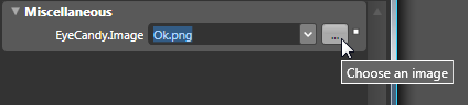
<Window
  x:Class="Hardcodet.Wpf.Util.Window1"
  xmlns="http://schemas.microsoft.com/winfx/2006/xaml/presentation"
  xmlns:x="http://schemas.microsoft.com/winfx/2006/xaml"
  xmlns:local="clr-namespace:Hardcodet.Wpf.Util">
  <Grid>

    <!-- declare a button with an attached image -->
    <Button
      Content="OK"
      local:EyeCandy.Image="Ok.png" />

  </Grid>
</Window>
Providing a Button Style
However, just setting the attached property doesn’t change anything at all. This is no surprise: After all, the button does not know what to do with the attached image. Yet 
This is were styles come into play. Here’s the button style I used for this sample:
<!--  A button style that displays an attached image -->
<Style
  x:Key="ImageButton"
  TargetType="{x:Type Button}">
  <Setter
    Property="HorizontalContentAlignment"
    Value="Stretch" />
  <Setter
    Property="ContentTemplate">
    <Setter.Value>
      <DataTemplate>
        <Grid>
          <Image
            Source="{Binding Path=(local:EyeCandy.Image),
                     RelativeSource={RelativeSource FindAncestor,
                       AncestorType={x:Type Button}}}"
            HorizontalAlignment="Left"
            Margin="8,0,0,0"
            Height="16"
            Width="16" />
          <TextBlock
            Text="{TemplateBinding Content}"
            HorizontalAlignment="Center" />
        </Grid>
      </DataTemplate>
    </Setter.Value>
  </Setter>
</Style>
A I explicitly named the style, the last step is to assign the style to the button:
<!-- declare a button with an attached image -->
<Button
  Content="OK"
  local:EyeCandy.Image="Ok.png"
  Style="{DynamicResource ImageButton}"
  />
Note that you are not limited to the standard WPF button class. Once the attached property is declared, you can attach an image to whatever control you like. All you have to do is just writing another style. You gotta love WPF
Blend Design Time Support
Blend fully supports attached properties. However, it might take one or two restarts.
Conclusion
User Controls are great, especially if want to create composite controls and provide multiple binding points. However, for simple customization, I still prefer the attached property approach over writing custom controls:
- Apart from the property declaration, everything else is pure XAML.
- I can style whatever control I like: Commercial 3rd party controls, tab headers, borders etc. without having to create new controls or even write code. All I have to do is create a new style.
- Its fully up to the designer how to style controls one the properties have been declared. And I can even write multiple styles for the same control type in order to provide a different look and feel for a given control.