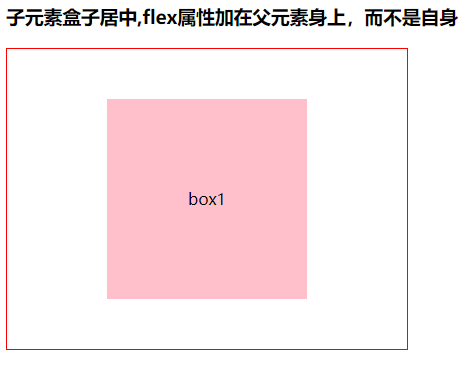
子元素盒子居中,flex属性加在父元素身上,而不是自身
  <h3>子元素盒子居中,flex属性加在父元素身上,而不是自身</h3>
  <div class="box1">
    <div>box1</div>
  </div>

  h3 {
    margin-top: 20px;
  }

  .box1 {
     400px;
    height: 300px;
    border: 1px solid red;
    display: flex;
    justify-content: center;
    align-items: center;
  }

  .box1 div {
     200px;
    height: 200px;
    background-color: pink;
    /* 居中子盒子中所有元素 并且不会换行 */
    display: -webkit-box;
    -webkit-box-pack: center;
    -webkit-box-align: center;
  }
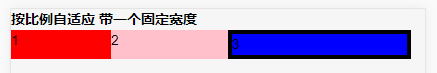
按比例自适应带一个固定宽度 默认 flex-direction:row; 所以这里没写 下面的横向加了 因为默认的所以没加
   <h3>按比例自适应带一个固定宽度</h3>
    <div class="box2">
      <div>1</div>
      <div>2</div>
      <div>3</div>
     </div>

  .box2{display:-webkit-flex; 400px;}
  .box2 div:nth-of-type(1){100px;background-color:red;}
  .box2 div:nth-of-type(2){flex:2;background-color:pink;}
  .box2 div:nth-of-type(3){flex:3;background-color:blue;border:4px solid black;}
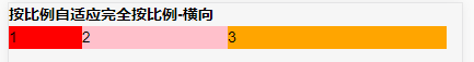
按比例自适应完全按比例-横向
   <h3>按比例自适应完全按比例-横向</h3>
    <div class="box3">
      <div>1</div>
      <div>2</div>
      <div>3</div>
    </div>

  .box3{ 400px;display:-webkit-flex;flex-direction:row;}
  .box3 div:nth-of-type(1){flex:1;background-color:red;}
  .box3 div:nth-of-type(2){flex:2;background-color:pink;}
  .box3 div:nth-of-type(3){flex:3;background-color:orange;}

按比例自适应完全按比例-纵向 flex-direction:column; 需要说明 不是默认的 默认是横向 也就是 flex-direction:row;
   <h3>按比例自适应完全按比例-纵向</h3>
    <div class="box4">
      <div>1</div>
      <div>2</div>
      <div>3</div>
   </div>

  .box4{display:-webkit-flex;flex-direction:column; 400px;}
  .box4 div:nth-of-type(1){flex:1;background-color:red;}
  .box4 div:nth-of-type(2){flex:2;background-color:pink;}
  .box4 div:nth-of-type(3){flex:3;background-color:orange;}
自身居中并且左右散开 就像float 一样 左边 left 右边 right
    display: flex;
    align-items: center;
    justify-content: space-between;