这是一个布局案例,其他的比如定宽布局,都可以按照这几个方法拓展。
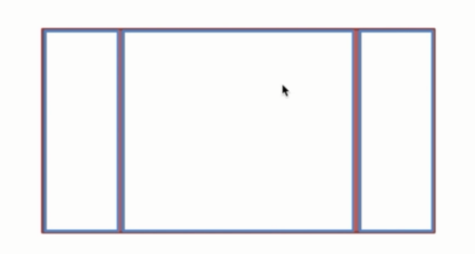
如下图所示的布局,高度已知的三栏布局,左栏,右栏各为300px,中间自适应。
分析可给出五种解决方案,flex,float,绝对定位,表格布局,网格布局。
下面所有方案的html通用部分:
<div class="box">
    <div class="d1"></div>
    <div class="d2">
        <h1>flexbox解决方案</h1>
        <p>这里是内容</p>
    </div>
    <div class="d3"></div>
</div>
下面直接贴出各个方案的代码:
1.利用flex布局
css:
.box{
    display: flex;
}
.box div{
    min-height: 100px;
}
.d1{
    background-color: blue;
    flex-grow: 0;
    flex-shrink: 0;
    flex-basis: 300px;
}
.d2{
    background-color: pink;
    flex-grow: 1;
    flex-shrink: 1;
}
.d3{
    background-color: blue;
    flex-grow: 0;
    flex-shrink: 0;
    flex-basis: 300px;
}
2.浮动解决方案
css:
.box div{
            min-height: 100px;
        }
        .left{
            float: left;
            width: 300px;
            background-color: blue;
        }
        .center{
            background-color: pink;
        }
        .right{
            float: right;
            width: 300px;
            background-color: blue;
        }
3.绝对定位
.box{
    position: relative;
}
.box div{
    min-height: 100px;
    position: absolute;
}
.left{
    background-color: blue;
    width: 300px;
    left: 0;
    top: 0;
}
.right{
    background-color: blue;
    width: 300px;
    right: 0;
    top: 0;
}
.center{
    left: 300px;
    right: 300px;
    background-color: pink;
}
4.表格
.box{
    width: 100%;
    display: table;
}
.box div{
    min-height: 100px;
    display: table-cell;
}
.left{
    width: 300px;
    background-color: blue;
}
.right{
    width: 300px;
    background-color: blue;
}
.center{
    background-color: pink;
}
5.网格
.box{
    display: grid;
    grid-template-columns: 300px auto 300px;
    grid-template-rows: 100px;
}
.left{
    background-color: blue;
}
.center{
    background-color: pink;
}
.right{
    background-color: blue;
}
以上方法最终浏览器显示效果:

对于上述五中方法的优缺点讨论。
浮动以后是脱离文档流的,处理不好会带来很多问题,这是局限性;优点:兼容性好。只要处理好清除浮动,处理好与周边元素关系的话这是很好的方案。
绝对定位:优点,快捷,不容易出问题。缺点:布局脱离文档流。下面所有子元素也会脱离文档流,导致可使用性比较差。
flex布局:是为了解决上述两个方案的不足而出现的,是比较完美的,现在的移动端基本是flex布局。这是非常重要的方案。
表格布局:兼容性非常好。当用flex无法解决时,可以尝试用表格布局。缺点:会受到其他单元格的宽高改变的影响。
但是如果抛弃高度已知,就只有表格和flex方法适用了。如下,其他方案就会出现问题。
