两列布局
效果:

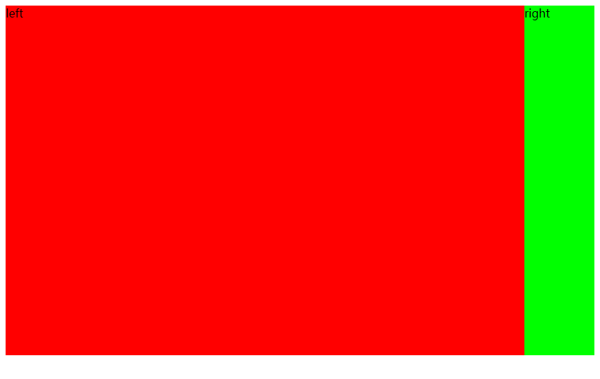
4.1 左列定宽,右列自适应
(1)利用float+margin实现
html代码:
<body>
<div id="left">左列定宽</div>
<div id="right">右列自适应</div>
</body>
css代码:
#left {
    background-color: #f00;
    float: left;
    width: 100px;
    height: 500px;
}
#right {
    background-color: #0f0;
    height: 500px;
    margin-left: 100px; /*大于等于#left的宽度*/
}
(2)利用float+margin(fix)实现
html代码:
<body>
<div id="left">左列定宽</div>
<div id="right-fix">
    <div id="right">右列自适应</div>
</div>
</body>
css代码:
#left {
    background-color: #f00;
    float: left;
    width: 100px;
    height: 500px;
}
#right-fix {
    float: right;
    width: 100%;
    margin-left: -100px; /*正值大于或等于#left的宽度,才能显示在同一行*/
}
#right{
    margin-left: 100px; /*大于或等于#left的宽度*/
    background-color: #0f0;
    height: 500px;
}
(3)使用float+overflow实现
html代码:
<body>
<div id="left">左列定宽</div>
<div id="right">右列自适应</div>
</body>
css代码:
#left {
    background-color: #f00;
    float: left;
    width: 100px;
    height: 500px;
}
#right {
    background-color: #0f0;
    height: 500px;
    overflow: hidden; /*触发bfc达到自适应*/
}
(4)使用table实现
html代码:
<div id="parent">
    <div id="left">左列定宽</div>
    <div id="right">右列自适应</div>
</div>
css代码:
#parent{
     100%;
    display: table;
    height: 500px;
}
#left {
     100px;
    background-color: #f00;
}
#right {
    background-color: #0f0;
}
#left,#right{
    display: table-cell;  /*利用单元格自动分配宽度*/
}
(5)使用绝对定位实现
html代码:
<body>
<div id="parent">
    <div id="left">左列定宽</div>
    <div id="right">右列自适应</div>
</div>
</body>
css代码:
#parent{
    position: relative;  /*子绝父相*/
}
#left {
    position: absolute;
    top: 0;
    left: 0;
    background-color: #f00;
    width: 100px;
    height: 500px;
}
#right {
    position: absolute;
    top: 0;
    left: 100px;  /*值大于等于#left的宽度*/
    right: 0;
    background-color: #0f0;
    height: 500px;
}
(6)使用flex实现
html代码:
<body>
<div id="parent">
    <div id="left">左列定宽</div>
    <div id="right">右列自适应</div>
</div>
</body>
css代码:
#parent{
    width: 100%;
    height: 500px;
    display: flex;
}
#left {
    width: 100px;
    background-color: #f00;
}
#right {
    flex: 1; /*让所有弹性盒模型对象的子元素都有相同的长度,忽略它们内部的内容:*/
    background-color: #0f0;
}
4.2 左列自适应,右列定宽
html代码:
<body>
<div id="parent">
    <div id="left">左列自适应</div>
    <div id="right">右列定宽</div>
</div>
</body>
css代码:
#parent{
    height: 500px;
    padding-left: 100px;  /*抵消#left的margin-left以达到#parent水平居中*/
}
#left {
    width: 100%;
    height: 500px;
    float: left;
    margin-left: -100px; /*正值等于#right的宽度*/
    background-color: #f00;
}
#right {
    height: 500px;
    width: 100px;
    float: right;
    background-color: #0f0;
}
(2)使用float+overflow实现
html代码:
<body>
<div id="parent">
    <div id="right">右列定宽</div>
    <div id="left">左列自适应</div>   <!--顺序要换一下-->
</div>
</body>
css代码:
#left {
    overflow: hidden;  /*触发bfc*/
    height: 500px;
    background-color: #f00;
}
#right {
    margin-left: 10px;  /*margin需要定义在#right中*/
    float: right;
    width: 100px;
    height: 500px;
    background-color: #0f0;
}
(3)使用table实现
html代码:
<body>
<div id="parent">
    <div id="left">左列自适应</div>
    <div id="right">右列定宽</div>
</div>
</body>
css代码:
#parent{
    width: 100%;
    height: 500px;
    display: table;
}
#left {
    background-color: #f00;
    display: table-cell;
}
#right {
    width: 100px;
    background-color: #0f0;
    display: table-cell;
}
(4)使用绝对定位实现
html代码:
<body>
<div id="parent">
    <div id="left">左列自适应</div>
    <div id="right">右列定宽</div>
</div>
</body>
css代码:
#parent{
    position: relative;  /*子绝父相*/
}
#left {
    position: absolute;
    top: 0;
    left: 0;
    right: 100px;  /*大于等于#rigth的宽度*/
    background-color: #f00;
    height: 500px;
}
#right {
    position: absolute;
    top: 0;
    right: 0;
    background-color: #0f0;
    width: 100px;
    height: 500px;
}
(5)使用flex实现
html代码:
<body>
<div id="parent">
    <div id="left">左列自适应</div>
    <div id="right">右列定宽</div>
</div>
</body>
css代码:
#parent{
    height: 500px;
    display: flex;
}
#left {
    flex: 1;
    background-color: #f00;
}
#right {
    width: 100px;
    background-color: #0f0;
}
4.3 一列不定,一列自适应
(盒子宽度随着内容增加或减少发生变化,另一个盒子自适应)
(1)使用float+overflow实现
html代码:
<body>
<div id="parent">
    <div id="left">左列不定宽</div>
    <div id="right">右列自适应</div>
</div>
</body>
css代码:
#left {
    margin-right: 10px;
    float: left;  /*只设置浮动,不设宽度*/
    height: 500px;
    background-color: #f00;
}
#right {
    overflow: hidden;  /*触发bfc*/
    height: 500px;
    background-color: #0f0;
}
(2)使用flex实现
html代码:
<body>
<div id="parent">
    <div id="left">左列不定宽</div>
    <div id="right">右列自适应</div>
</div>
</body>
css代码:
#parent{
    display: flex;
}
#left { /*不设宽度*/
    margin-right: 10px;
    height: 500px;
    background-color: #f00;
}
#right {
    height: 500px;
    background-color: #0f0;
    flex: 1;  /*均分#parent剩余的部分*/
}