网页设计实战1 如何实现纸叠登录效果
一、总结
一句话总结:这里面很多位置用了:before和:after。纸叠的那部分也是用的这个。这里也用了很多线性渐变linear-gradient。
1、如何实现下面云彩不断的动?
通过css的animation动画实现的,而且因为图片不够大,所以让html的高为100%,来拉伸图片,图片作为body的背景图,横轴反向不断的repeat,其实动画里面只是改变了图片的位置,用20秒的实现实现从600px的位置到0px的位置。
 1 html{
 2     height: 100%;
 3 }
 4 body {
 5     background: url(images/cloud.jpg) 0 bottom repeat-x #049ec4;
 6     -webkit-animation: animate-cloud 20s linear infinite;
 7     -moz-animation: animate-cloud 20s linear infinite;
 8     -ms-animation: animate-cloud 20s linear infinite;
 9     -o-animation: animate-cloud 20s linear infinite;
10     animation: animate-cloud 20s linear infinite;
11     width: 100%;
12     height: auto;
13 }
14
15 body {
16     /*background: #DCDDDF;*/
17     color: #000;
18     font: 14px Arial;
19     margin: 0 auto;
20     padding: 0;
21     position: relative;
22 }
23
24
25 @-webkit-keyframes animate-cloud {
26   from {
27     background-position: 600px 100%;
28   }
29   to {
30     background-position: 0 100%;
31   }
32 }
33 @-moz-keyframes animate-cloud {
34   from {
35     background-position: 600px 100%;
36   }
37   to {
38     background-position: 0 100%;
39   }
40 }
41 @-ms-keyframes animate-cloud {
42   from {
43     background-position: 600px 100%;
44   }
45   to {
46     background-position: 0 100%;
47   }
48 }
49 @-o-keyframes animate-cloud {
50   from {
51     background-position: 600px 100%;
52   }
53   to {
54     background-position: 0 100%;
55   }
56 }
2、如何实现div里面的input获得焦点的时候这个div改变样式?
css里面非input类型的标签好像:focus没用,所以我用的jquery,jquery也很简单
 1 $('input').focus(function(){
 2     $(this).parent().css(
 3         {
 4             'background':'#fff url(images/8bcLQqF.png) no-repeat',
 5             'border':'1px solid #f00',
 6         }
 7     );
 8 });
 9
10 $('input').blur(function(){
11     $(this).parent().css(
12         {'background':'#eae7e7 url(images/8bcLQqF.png) no-repeat','border':'1px solid #c8c8c8'}
13     );
14 });
15 $('.login_item').click(function(){
16     $(this).children("input").focus();
17 });
3、jquery如何判断是否获得焦点和失去焦点?
focus方法(获得焦点)和blur方法(失去焦点)是相对的
 1 $('input').focus(function(){
 2     $(this).parent().css(
 3         {
 4             'background':'#fff url(images/8bcLQqF.png) no-repeat',
 5             'border':'1px solid #f00',
 6         }
 7     );
 8 });
 9
10 $('input').blur(function(){
11     $(this).parent().css(
12         {'background':'#eae7e7 url(images/8bcLQqF.png) no-repeat','border':'1px solid #c8c8c8'}
13     );
14 });
15 $('.login_item').click(function(){
16     $(this).children("input").focus();
17 });
4、css选择器中h1:before和h1:after的作用是什么(会员登录两边的线条字样)?
设置在对象前(依据对象树的逻辑结构)发生的内容。用来和content属性一起使用,并且必须定义content属性
设置在对象后(依据对象树的逻辑结构)发生的内容。用来和content属性一起使用,并且必须定义content属性
 1 #login h1:before {
 2     background: rgb(126,126,126);
 3     background: -moz-linear-gradient(right, rgba(126,126,126,1) 0%, rgba(255,255,255,1) 100%);
 4     background: -webkit-linear-gradient(right, rgba(126,126,126,1) 0%,rgba(255,255,255,1) 100%);
 5     background: -o-linear-gradient(right, rgba(126,126,126,1) 0%,rgba(255,255,255,1) 100%);
 6     background: -ms-linear-gradient(right, rgba(126,126,126,1) 0%,rgba(255,255,255,1) 100%);
 7     background: linear-gradient(right, rgba(126,126,126,1) 0%,rgba(255,255,255,1) 100%);
 8     left: 0;
 9 }
10
11 #login h1:before, #login h1:after {
12     content: "";
13     height: 1px;
14     position: absolute;
15     top: 10px;
16     width: 27%;
17 }
18
19 #login h1:after {
20     background: rgb(126,126,126);
21     background: -moz-linear-gradient(left, rgba(126,126,126,1) 0%, rgba(255,255,255,1) 100%);
22     background: -webkit-linear-gradient(left, rgba(126,126,126,1) 0%,rgba(255,255,255,1) 100%);
23     background: -o-linear-gradient(left, rgba(126,126,126,1) 0%,rgba(255,255,255,1) 100%);
24     background: -ms-linear-gradient(left, rgba(126,126,126,1) 0%,rgba(255,255,255,1) 100%);
25     background: linear-gradient(left, rgba(126,126,126,1) 0%,rgba(255,255,255,1) 100%);
26     right: 0;
27 }
5、如何实现左宽右细的线的效果?
核心代码:background: linear-gradient(left, rgba(126,126,126,1) 0%,rgba(255,255,255,1) 100%);
 1 #login h1:before, #login h1:after {
 2     content: "";
 3     height: 1px;
 4     position: absolute;
 5     top: 10px;
 6     width: 27%;
 7 }
 8
 9 #login h1:after {
10     background: rgb(126,126,126);
11     background: -moz-linear-gradient(left, rgba(126,126,126,1) 0%, rgba(255,255,255,1) 100%);
12     background: -webkit-linear-gradient(left, rgba(126,126,126,1) 0%,rgba(255,255,255,1) 100%);
13     background: -o-linear-gradient(left, rgba(126,126,126,1) 0%,rgba(255,255,255,1) 100%);
14     background: -ms-linear-gradient(left, rgba(126,126,126,1) 0%,rgba(255,255,255,1) 100%);
15     background: linear-gradient(left, rgba(126,126,126,1) 0%,rgba(255,255,255,1) 100%);
16     right: 0;
17 }
6、纸叠效果如何实现?
用的:before和:after,然后:before里面的那个带边框的正方形旋转个-3度,:after里面的正方形旋转个2度,弄成绝对定位,放在底下,就可以了
 1 #login:before {
 2     -webkit-transform: rotate(-3deg);
 3     -moz-transform: rotate(-3deg);
 4     -ms-transform: rotate(-3deg);
 5     -o-transform: rotate(-3deg);
 6     transform: rotate(-3deg);
 7     top: 0;
 8     z-index: -2;
 9 }
10
11 #login:after {
12     -webkit-transform: rotate(2deg);
13     -moz-transform: rotate(2deg);
14     -ms-transform: rotate(2deg);
15     -o-transform: rotate(2deg);
16     transform: rotate(2deg);
17     top: 0;
18     z-index: -1;
19 }
20
21 #login:after, #login:before {
22     background: #f9f9f9;
23     background: -moz-linear-gradient(top, rgba(248,248,248,1) 0%, rgba(249,249,249,1) 100%);
24     background: -webkit-linear-gradient(top, rgba(248,248,248,1) 0%,rgba(249,249,249,1) 100%);
25     background: -o-linear-gradient(top, rgba(248,248,248,1) 0%,rgba(249,249,249,1) 100%);
26     background: -ms-linear-gradient(top, rgba(248,248,248,1) 0%,rgba(249,249,249,1) 100%);
27     background: linear-gradient(top, rgba(248,248,248,1) 0%,rgba(249,249,249,1) 100%);
28     border: 1px solid #c4c6ca;
29     content: "";
30     display: block;
31     height: 100%;
32     left: -1px;
33     position: absolute;
34     width: 100%;
35 }
7、如何将电脑网页改成手机网页(需要改外部css么)?
完全不需要,直接把要改的代码放在style部分就可以了
二、如何实现纸叠登录效果
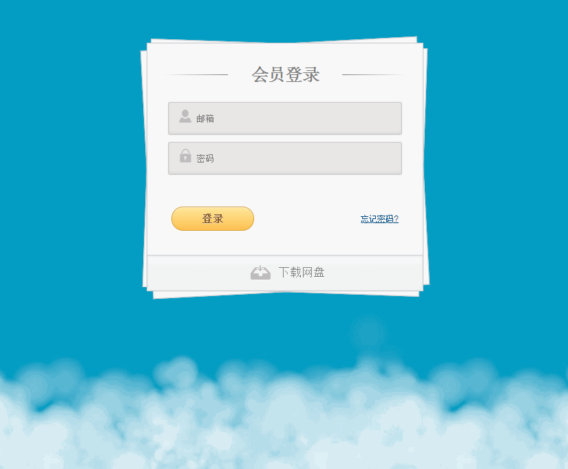
1、截图
2、代码
1 <!DOCTYPE html> 2 <html lang="en"> 3 <head> 4 <meta charset="UTF-8"> 5 <meta name="viewport" content="width=device-width, initial-scale=1, maximum-scale=1, user-scalable=no"> 6 <title>纸叠效果会员登录界面练习</title> 7 <script src="js/jquery.min.js"></script> 8 <style> 9 @charset "utf-8"; 10 /* Reset CSS */ 11 html, body, div, span, applet, object, iframe, 12 h1, h2, h3, h4, h5, h6, p, blockquote, pre, 13 a, abbr, acronym, address, big, cite, code, 14 del, dfn, em, font, img, ins, kbd, q, s, samp, 15 small, strike, strong, sub, sup, tt, var, 16 b, u, i, center, 17 dl, dt, dd, ol, ul, li, 18 fieldset, form, label, legend, 19 table, caption, tbody, tfoot, thead, tr, th, td { 20 margin: 0; 21 padding: 0; 22 border: 0; 23 outline: 0; 24 font-size: 100%; 25 vertical-align: baseline; 26 background: transparent; 27 } 28 body { 29 background: #DCDDDF ; 30 color: #000; 31 font: 14px Arial; 32 margin: 0 auto; 33 padding: 0; 34 position: relative; 35 } 36 h1{ font-size:28px;} 37 h2{ font-size:26px;} 38 h3{ font-size:18px;} 39 h4{ font-size:16px;} 40 h5{ font-size:14px;} 41 h6{ font-size:12px;} 42 h1,h2,h3,h4,h5,h6{ color:#563D64;} 43 small{ font-size:10px;} 44 b, strong{ font-weight:bold;} 45 a{ text-decoration: none; } 46 a:hover{ text-decoration: underline; } 47 .clearfix:after,form:after { 48 content: "."; 49 display: block; 50 height: 0; 51 clear: both; 52 visibility: hidden; 53 } 54 html{ 55 height: 100%; 56 } 57 body { 58 background: url(images/cloud.jpg) 0 bottom repeat-x #049ec4; 59 -webkit-animation: animate-cloud 20s linear infinite; 60 -moz-animation: animate-cloud 20s linear infinite; 61 -ms-animation: animate-cloud 20s linear infinite; 62 -o-animation: animate-cloud 20s linear infinite; 63 animation: animate-cloud 20s linear infinite; 64 width: 100%; 65 height: auto; 66 } 67 68 body { 69 /*background: #DCDDDF;*/ 70 color: #000; 71 font: 14px Arial; 72 margin: 0 auto; 73 padding: 0; 74 position: relative; 75 } 76 77 78 @-webkit-keyframes animate-cloud { 79 from { 80 background-position: 600px 100%; 81 } 82 to { 83 background-position: 0 100%; 84 } 85 } 86 @-moz-keyframes animate-cloud { 87 from { 88 background-position: 600px 100%; 89 } 90 to { 91 background-position: 0 100%; 92 } 93 } 94 @-ms-keyframes animate-cloud { 95 from { 96 background-position: 600px 100%; 97 } 98 to { 99 background-position: 0 100%; 100 } 101 } 102 @-o-keyframes animate-cloud { 103 from { 104 background-position: 600px 100%; 105 } 106 to { 107 background-position: 0 100%; 108 } 109 } 110 111 112 .login_item{ 113 114 box-shadow: 0 1px 0 #fff, 0 -2px 5px rgba(0,0,0,0.08) inset; 115 transition: all 0.5s ease; 116 117 border: 1px solid #c8c8c8; 118 color: #777; 119 font: 13px Helvetica, Arial, sans-serif; 120 margin: 0 0 10px; 121 padding: 15px 10px 15px 40px; 122 width: 80%; 123 border-radius: 3px; 124 125 } 126 .username{ 127 background: #eae7e7 url(images/8bcLQqF.png) no-repeat; 128 background-position: 10px 15px !important; 129 } 130 .username:focus{ 131 background: #fff url(images/8bcLQqF.png) no-repeat; 132 background-position: 10px 15px !important; 133 outline: 1px solid #f00; 134 } 135 .password{ 136 background: #eae7e7 url(images/8bcLQqF.png) no-repeat; 137 background-position: 10px -51px !important; 138 } 139 input{ 140 border-width: 0px; 141 outline: 0px; 142 background: none; 143 width: 100%; 144 } 145 input:focus{ 146 background: none; 147 } 148 #login{ 149 background: -webkit-linear-gradient(top, rgba(248,248,248,1) 0%,rgba(249,249,249,1) 100%); 150 box-shadow: 0 1px 0 #fff inset; 151 border: 1px solid #c4c6ca; 152 margin: 0 auto; 153 padding: 25px 0 0; 154 position: relative; 155 text-align: center; 156 text-shadow: 0 1px 0 #fff; 157 width: 400px; 158 } 159 160 #login h1 { 161 color: #7E7E7E; 162 font: bold 25px Helvetica, Arial, sans-serif; 163 letter-spacing: -0.05em; 164 line-height: 20px; 165 margin: 10px 0 30px; 166 } 167 168 #login h1:before { 169 background: rgb(126,126,126); 170 background: -moz-linear-gradient(right, rgba(126,126,126,1) 0%, rgba(255,255,255,1) 100%); 171 background: -webkit-linear-gradient(right, rgba(126,126,126,1) 0%,rgba(255,255,255,1) 100%); 172 background: -o-linear-gradient(right, rgba(126,126,126,1) 0%,rgba(255,255,255,1) 100%); 173 background: -ms-linear-gradient(right, rgba(126,126,126,1) 0%,rgba(255,255,255,1) 100%); 174 background: linear-gradient(right, rgba(126,126,126,1) 0%,rgba(255,255,255,1) 100%); 175 left: 0; 176 } 177 178 #login h1:before, #login h1:after { 179 content: ""; 180 height: 1px; 181 position: absolute; 182 top: 10px; 183 width: 27%; 184 } 185 186 #login h1:after { 187 background: rgb(126,126,126); 188 background: -moz-linear-gradient(left, rgba(126,126,126,1) 0%, rgba(255,255,255,1) 100%); 189 background: -webkit-linear-gradient(left, rgba(126,126,126,1) 0%,rgba(255,255,255,1) 100%); 190 background: -o-linear-gradient(left, rgba(126,126,126,1) 0%,rgba(255,255,255,1) 100%); 191 background: -ms-linear-gradient(left, rgba(126,126,126,1) 0%,rgba(255,255,255,1) 100%); 192 background: linear-gradient(left, rgba(126,126,126,1) 0%,rgba(255,255,255,1) 100%); 193 right: 0; 194 } 195 196 .container { 197 margin: 75px auto 0 auto; 198 position: relative; 199 width: 100%; 200 } 201 #login form { 202 margin: 0 20px; 203 position: relative; 204 } 205 206 input[type="submit"]{ 207 background: rgb(254,231,154); 208 background: -moz-linear-gradient(top, rgba(254,231,154,1) 0%, rgba(254,193,81,1) 100%); 209 background: -webkit-linear-gradient(top, rgba(254,231,154,1) 0%,rgba(254,193,81,1) 100%); 210 background: -o-linear-gradient(top, rgba(254,231,154,1) 0%,rgba(254,193,81,1) 100%); 211 background: -ms-linear-gradient(top, rgba(254,231,154,1) 0%,rgba(254,193,81,1) 100%); 212 background: linear-gradient(top, rgba(254,231,154,1) 0%,rgba(254,193,81,1) 100%); 213 214 border-radius: 30px; 215 box-shadow: 0 1px 0 rgba(255,255,255,0.8) inset; 216 border: 1px solid #D69E31; 217 color: #85592e; 218 cursor: pointer; 219 float: left; 220 font: bold 15px Helvetica, Arial, sans-serif; 221 height: 35px; 222 margin: 20px 0 35px 15px; 223 position: relative; 224 text-shadow: 0 1px 0 rgba(255,255,255,0.5); 225 width: 120px; 226 } 227 228 #login form>div.submit>a { 229 color: #004a80; 230 float: right; 231 font-size: 12px; 232 margin: 30px 15px 0 0; 233 text-decoration: underline; 234 } 235 236 div.button a { 237 background: url(images/8bcLQqF.png) 0 -112px no-repeat; 238 color: #7E7E7E; 239 font-size: 17px; 240 padding: 2px 0 2px 40px; 241 text-decoration: none; 242 -webkit-transition: all 0.3s ease; 243 -moz-transition: all 0.3s ease; 244 -ms-transition: all 0.3s ease; 245 -o-transition: all 0.3s ease; 246 transition: all 0.3s ease; 247 } 248 div.button a:hover { 249 background-position: 0 -135px; 250 color: #00aeef; 251 } 252 div.button { 253 background: rgb(247,249,250); 254 background: -moz-linear-gradient(top, rgba(247,249,250,1) 0%, rgba(240,240,240,1) 100%); 255 background: -webkit-linear-gradient(top, rgba(247,249,250,1) 0%,rgba(240,240,240,1) 100%); 256 background: -o-linear-gradient(top, rgba(247,249,250,1) 0%,rgba(240,240,240,1) 100%); 257 background: -ms-linear-gradient(top, rgba(247,249,250,1) 0%,rgba(240,240,240,1) 100%); 258 background: linear-gradient(top, rgba(247,249,250,1) 0%,rgba(240,240,240,1) 100%); 259 -webkit-box-shadow: 0 1px 2px rgba(0,0,0,0.1) inset; 260 -moz-box-shadow: 0 1px 2px rgba(0,0,0,0.1) inset; 261 -ms-box-shadow: 0 1px 2px rgba(0,0,0,0.1) inset; 262 -o-box-shadow: 0 1px 2px rgba(0,0,0,0.1) inset; 263 box-shadow: 0 1px 2px rgba(0,0,0,0.1) inset; 264 -webkit-border-radius: 0 0 5px 5px; 265 -moz-border-radius: 0 0 5px 5px; 266 -o-border-radius: 0 0 5px 5px; 267 -ms-border-radius: 0 0 5px 5px; 268 border-radius: 0 0 5px 5px; 269 border-top: 1px solid #CFD5D9; 270 padding: 15px 0; 271 } 272 273 #login:before { 274 -webkit-transform: rotate(-3deg); 275 -moz-transform: rotate(-3deg); 276 -ms-transform: rotate(-3deg); 277 -o-transform: rotate(-3deg); 278 transform: rotate(-3deg); 279 top: 0; 280 z-index: -2; 281 } 282 283 #login:after { 284 -webkit-transform: rotate(2deg); 285 -moz-transform: rotate(2deg); 286 -ms-transform: rotate(2deg); 287 -o-transform: rotate(2deg); 288 transform: rotate(2deg); 289 top: 0; 290 z-index: -1; 291 } 292 293 #login:after, #login:before { 294 background: #f9f9f9; 295 background: -moz-linear-gradient(top, rgba(248,248,248,1) 0%, rgba(249,249,249,1) 100%); 296 background: -webkit-linear-gradient(top, rgba(248,248,248,1) 0%,rgba(249,249,249,1) 100%); 297 background: -o-linear-gradient(top, rgba(248,248,248,1) 0%,rgba(249,249,249,1) 100%); 298 background: -ms-linear-gradient(top, rgba(248,248,248,1) 0%,rgba(249,249,249,1) 100%); 299 background: linear-gradient(top, rgba(248,248,248,1) 0%,rgba(249,249,249,1) 100%); 300 border: 1px solid #c4c6ca; 301 content: ""; 302 display: block; 303 height: 100%; 304 left: -1px; 305 position: absolute; 306 width: 100%; 307 } 308 309 </style> 310 </head> 311 <body> 312 <div class="container"> 313 <section id="login"> 314 <form action=""> 315 <h1>会员登录</h1> 316 <div class="login_item username"> 317 <input type="text" placeholder="邮箱" required="" id="username"> 318 </div> 319 <div class="login_item password"> 320 <input type="password" placeholder="密码" required="" id="password"> 321 </div> 322 <div > 323 <span> </span> 324 </div> 325 <div class="submit"> 326 <input type="submit" value="登录"> 327 <a href="#">忘记密码</a> 328 </div> 329 330 </form> 331 <div class="button"> 332 <span> </span> 333 <a href="#">下载网盘</a> 334 </div> 335 </section> 336 </div> 337 </body> 338 <script> 339 340 // $('#username').focus(function(){ 341 // $('.username').css( 342 // { 343 // 'background':'#fff url(images/8bcLQqF.png) no-repeat', 344 // 'border':'1px solid #f00', 345 // } 346 // ); 347 // }); 348 349 // $('#username').blur(function(){ 350 // $('.username').css( 351 // {'background':'#eae7e7 url(images/8bcLQqF.png) no-repeat','border':'1px solid #c8c8c8'} 352 // ); 353 // }); 354 // $('.username').click(function(){ 355 // $('#username').focus(); 356 // }); 357 358 $('input').focus(function(){ 359 $(this).parent().css( 360 { 361 'background':'#fff url(images/8bcLQqF.png) no-repeat', 362 'border':'1px solid #f00', 363 } 364 ); 365 }); 366 367 $('input').blur(function(){ 368 $(this).parent().css( 369 {'background':'#eae7e7 url(images/8bcLQqF.png) no-repeat','border':'1px solid #c8c8c8'} 370 ); 371 }); 372 $('.login_item').click(function(){ 373 $(this).children("input").focus(); 374 }); 375 376 </script> 377 </html>