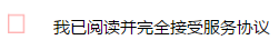
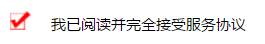
1、效果图
2、代码
<!DOCTYPE html>
<html>

<head>
    <meta charset="utf-8">
    <title>checkbox</title>
    <style type="text/css">
    label {
         20px;
        font-size: 12px;
        cursor: pointer;
    }
    label i {
        display: inline-block;
         18px;
        height: 16px;
        background-image: url("/imgs/tick-before.png");
        background-repeat: no-repeat;
        background-size: 18px 16px;
    }

    input[type="checkbox"],
    input[type="radio"] {
        display: none;
    }

    input[type="radio"]+i {
        border-radius: 7px;
    }

    input[type="checkbox"]:checked+i,
    input[type="radio"]:checked+i {
        background-image: url("/imgs/tick-after.png");
    }

    input {
        display: inline-block;
         18px;
        height: 16px;
        background-image: url("/imgs/tick-before.png");
        background-size: 18px 16px;
    }
    </style>
</head>

<body>
    <label>
        <input type="checkbox" name="check-protocol" checked>
        <i></i>
    </label>
     <span>我已阅读并完全接受服务协议</span>
</body>
</html>
3、总结
这里实现的核心是input[type='checkbox']:checked{}这属性,当checkbox被选中时的样式。(CSS3的UI选择器)