原文地址:https://www.kymphillpotts.com/xamarin-forms-layout-challenges-great-places/ (作者Kym Phillpotts)
项目Github地址:https://github.com/kphillpotts/XamarinFormsLayoutChallenges
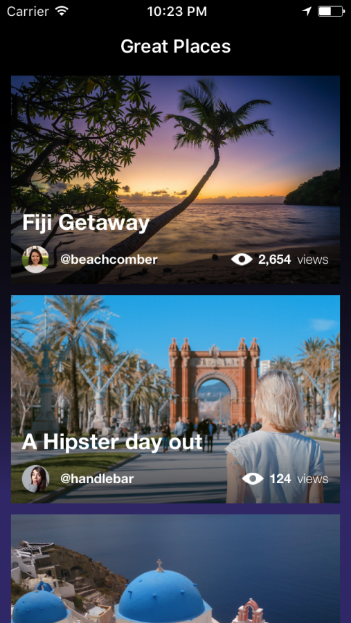
When your app is all about the images, sometimes you want your images to be hero of the UI. That’s what this weeks Xamarin.Forms Layout Challenge is all about. Normally I prefer a light themed application, so just to change things up a bit, I thought I would go for a dark themed layout. They say, variety is the spice of life.
当你的app充满了图片,你有时想让你的图片成为UI的主角. 这周的Xamarin.Forms 布局挑战就是关于此的.我通常更喜欢主题是明亮的app,为了改变这一点,我觉得我应该试试黑暗主题的布局.他们说,丰富多彩是生活的情趣所在.

Page Layout
The page layout, not surprisingly is really just a ListView. I played around with adding a bit of spice by making the ListView have a transparent background and put a purple gradient behind the ListView. I’m not sure it’s great, but kind of interesting, none-the-less.
页面布局,没什么可惊喜的,真的只有ListView. 通过让ListView的BackGround透明,把紫色渐变图片放在ListView的后面. 我不确定这样做很棒,但是至少很有趣.

    <Grid>
    <Image Source="ColoredBackground" VerticalOptions="Fill" HorizontalOptions="Fill" Aspect="Fill"/>
    <ListView x:Name="placeList"
        BackgroundColor="Transparent"
        RowHeight="200" ItemsSource="{Binding .}" SeparatorVisibility="None">
The ViewCell
The ViewCell is pretty straight forward. The whole cell is a Grid of 2 rows.
The “Hero Image” spans both the rows. At the bottom, I included a slight “Transparent to Black” overlay that helps the text to be more readable at the bottom
ViewCell真的很简单,整个Cell只有一个包含两行的Grid。Hero Image占了两行。在底部,我设置了一个从透明到黑色的图片去覆盖原有的图片,这样做是为了让底部的文字更容易被阅读.

<Grid RowSpacing="5" ColumnSpacing="0" Margin="10,5" >
  <Grid.RowDefinitions>
    <RowDefinition Height="*"/>
    <RowDefinition Height="AUTO"/>
  </Grid.RowDefinitions>

  <Image Source="{Binding HeroImage}" Aspect="AspectFill" Grid.RowSpan="2" />
  <Image Source="ShadowOverlay" Grid.RowSpan="2"  Aspect="Fill" VerticalOptions="End" HorizontalOptions="Fill" />
The text parts are done with a Grid that occupies the 2nd row
文字部分,是一个位于Grid的第二行的Grid.
<Grid Margin="10" RowSpacing="10" ColumnSpacing="10" Grid.Row="1">
  <Grid.RowDefinitions>
    <RowDefinition Height="AUTO"/>
    <RowDefinition Height="25"/>
  </Grid.RowDefinitions>
  <Grid.ColumnDefinitions>
    <ColumnDefinition Width="25"/>
    <ColumnDefinition Width="*"/>
    <ColumnDefinition Width="AUTO"/>
  </Grid.ColumnDefinitions>

  <Label Text="{Binding Title}"  Grid.Row="0" Grid.ColumnSpan="3" Style="{StaticResource TitleLabel}" LineBreakMode="NoWrap"/>

  <controls:CircleImage Source="{Binding ProfileImage}" Aspect="AspectFill" Grid.Row="1" Grid.Column="0" WidthRequest="25" HeightRequest="25" />

  <Label Text="{Binding Handle}" Grid.Row="1" Grid.Column="1" VerticalOptions="Center" Style="{StaticResource HandleLabel}" />

  <StackLayout Orientation="Horizontal"  VerticalOptions="Center" Grid.Column="2" Grid.Row="1" Spacing="5">
    <Image Source="Eye"/>
    <Label Text="{Binding ViewCount, StringFormat='{0:N0}'}" Style="{StaticResource HandleLabel}" />
    <Label Text="views" Style="{StaticResource BodyLabel}"/>
  </StackLayout>

</Grid>
You’ll notice that I have used the CircleImage plugin from James Montemagno. It just requires a little reference to the namespace at the top of the page:
你会注意到,我是用了CircleImage 插件,在Page的顶部需要写明 命名空间的引用.
xmlns:controls="clr-namespace:ImageCircle.Forms.Plugin.Abstractions;assembly=ImageCircle.Forms.Plugin.Abstractions"
Also for the viewcount, I added a little bit of string formatting, which is a nice little binding feature, to show the comma’s in the ViewCount.
在ViewCount,我添加了一点string formatting,是绑定的一部分,用来展示逗号.
<Label Text="{Binding ViewCount, StringFormat='{0:N0}'}" Style="{StaticResource HandleLabel}" />
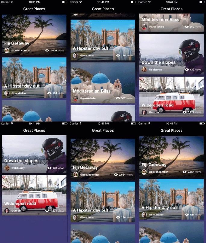
How does it scale

It even doesn’t look too bad in landscape…
在风景图上面的表现也相当不错.

Wrap Up
So that is it, a simple image ListView.
I thought I should also mention a couple of places I go to get nice images for mockups
- For random user data and images you can go to RandomUser.me
- For some really nice royalty free images you can use Unsplash.com
As always, and you can grab the project over at https://github.com/kphillpotts/XamarinFormsLayoutChallenges
Also, make sure you check out some of the other layouts in Xamarin.Forms Layout Challenges.
Happy Layouts!