实现方法
一、新建一个index.html的文件,代码如下
<!DOCTYPE html>
<html lang="en">
<head>
<meta charset="utf-8">
<meta name="viewport" content="width=device-width, initial-scale=1.0, maximum-scale=1.0, user-scalable=0" />
<title>纯CSS实现鼠标经过3D立体动态展示图片特效代码</title>
<!-- <link type="text/css" href="../css/抖音上很火的3D立体动态相册.css" rel="stylesheet" /> -->
<style>
*{
    margin:0;
    padding:0;
}
body{
    max-width: 100%;
    min-width: 100%;
    height: 100%;
    background-size: cover;
    background-repeat: no-repeat;
    background-attachment: fixed;
    background-size:100% 100%;
    position: absolute;
    margin-left: auto;
    margin-right: auto;
}
li{
    list-style: none;
}
.box{
    width:200px;
    height:200px;
    background-size: cover;
    background-repeat: no-repeat;
    background-attachment: fixed;
    background-size:100% 100%;
    position: absolute;
    margin-left: 42%;
    margin-top: 22%;
    -webkit-transform-style:preserve-3d;
    -webkit-transform:rotateX(13deg);
    -webkit-animation:move 5s linear infinite;
}
.minbox{
    width:100px;
    height:100px;
    position: absolute;
    left:50px;
    top:30px;
    -webkit-transform-style:preserve-3d;
}
.minbox li{
    width:100px;
    height:100px;
    position: absolute;
    left:0;
    top:0;
}
.minbox li:nth-child(1){
    background: url(../img/01.png) no-repeat 0 0;
    -webkit-transform:translateZ(50px);
}
.minbox li:nth-child(2){
    background: url(../img/02.png) no-repeat 0 0;
    -webkit-transform:rotateX(180deg) translateZ(50px);
}
.minbox li:nth-child(3){
    background: url(../img/03.png) no-repeat 0 0;
    -webkit-transform:rotateX(-90deg) translateZ(50px);
}
.minbox li:nth-child(4){
    background: url(../img/04.png) no-repeat 0 0;
    -webkit-transform:rotateX(90deg) translateZ(50px);
}
.minbox li:nth-child(5){
    background: url(../img/05.png) no-repeat 0 0;
    -webkit-transform:rotateY(-90deg) translateZ(50px);
}
.minbox li:nth-child(6){
    background: url(../img/06.png) no-repeat 0 0;
    -webkit-transform:rotateY(90deg) translateZ(50px);
}
.maxbox li:nth-child(1){
    background: url(../img/1.png) no-repeat 0 0;
    -webkit-transform:translateZ(50px);
}
.maxbox li:nth-child(2){
    background: url(../img/2.png) no-repeat 0 0;
    -webkit-transform:translateZ(50px);
}
.maxbox li:nth-child(3){
    background: url(../img/3.png) no-repeat 0 0;
    -webkit-transform:rotateX(-90deg) translateZ(50px);
}
.maxbox li:nth-child(4){
    background: url(../img/4.png) no-repeat 0 0;
    -webkit-transform:rotateX(90deg) translateZ(50px);
}
.maxbox li:nth-child(5){
    background: url(../img/5.png) no-repeat 0 0;
    -webkit-transform:rotateY(-90deg) translateZ(50px);
}
.maxbox li:nth-child(6){
    background: url(../img/6.png) no-repeat 0 0;
    -webkit-transform:rotateY(90deg) translateZ(50px);
}
.maxbox{
    width: 800px;
    height: 400px;
    position: absolute;
    left: 0;
    top: -20px;
    -webkit-transform-style: preserve-3d;

}
.maxbox li{
    width: 200px;
    height: 200px;
    background: #fff;
    border:1px solid #ccc;
    position: absolute;
    left: 0;
    top: 0;
    opacity: 0.2;
    -webkit-transition:all 1s ease;
}
.maxbox li:nth-child(1){
    -webkit-transform:translateZ(100px);
}
.maxbox li:nth-child(2){
    -webkit-transform:rotateX(180deg) translateZ(100px);
}
.maxbox li:nth-child(3){
    -webkit-transform:rotateX(-90deg) translateZ(100px);
}
.maxbox li:nth-child(4){
    -webkit-transform:rotateX(90deg) translateZ(100px);
}
.maxbox li:nth-child(5){
    -webkit-transform:rotateY(-90deg) translateZ(100px);
}
.maxbox li:nth-child(6){
    -webkit-transform:rotateY(90deg) translateZ(100px);
}
.box:hover ol li:nth-child(1){
    -webkit-transform:translateZ(300px);
    width: 400px;
    height: 400px;
    opacity: 0.8;
    left: -100px;
    top: -100px;
}
.box:hover ol li:nth-child(2){
    -webkit-transform:rotateX(180deg) translateZ(300px);
    width: 400px;
    height: 400px;
    opacity: 0.8;
    left: -100px;
    top: -100px;
}
.box:hover ol li:nth-child(3){
    -webkit-transform:rotateX(-90deg) translateZ(300px);
    width: 400px;
    height: 400px;
    opacity: 0.8;
    left: -100px;
    top: -100px;
}
.box:hover ol li:nth-child(4){
    -webkit-transform:rotateX(90deg) translateZ(300px);
    width: 400px;
    height: 400px;
    opacity: 0.8;
    left: -100px;
    top: -100px;
}
.box:hover ol li:nth-child(5){
    -webkit-transform:rotateY(-90deg) translateZ(300px);
    width: 400px;
    height: 400px;
    opacity: 0.8;
    left: -100px;
    top: -100px;
}
.box:hover ol li:nth-child(6){
    -webkit-transform:rotateY(90deg) translateZ(300px);
    width: 400px;
    height: 400px;
    opacity: 0.8;
    left: -100px;
    top: -100px;
}
@keyframes move{
    0%{
        -webkit-transform: rotateX(13deg) rotateY(0deg);
    }
    100%{
        -webkit-transform:rotateX(13deg) rotateY(360deg);
    }
}
/*背景音乐*/
.m-main{width:1200px; height: 60px;margin: 0 auto}
.m-main video{display: none; }
.m-main .player {
    width: 100%;
    height: 60px;
    position: relative;
    bottom: 0;
}
.m-main .player>a{display: inline-block; width: 20px; margin: 0 auto; padding: 10px; color: #FFF; text-align: center;float: left;font-size: 12px}
.m-main .player>a img{
    width: 20px;
    height: 20px;
    position: absolute;
    top: 20px;
    left: 41px;
}
#img1{
    display: block;
}
#img2{
    display: none;
}
.m-main .play-box {
    width: 1070px;
    height: 60px;
    margin: 0 auto;
    position: absolute;
    top: 0;
    right: 0;
}
.m-main .play-box .left {
    width: 100%;
    float: left;
}
.m-main .play-box .left p.timeline { width: 83%;height: 10px; background-color: rgba(216, 216, 216, 0.5); border-radius: 5px; margin:30px auto 0; position: relative; z-index: 2; }
.m-main .play-box .left p.timeline span {position: relative; width: 0; height: 10px; background-color: #D3EEDF; border-radius: 5px; display: block; -webkit-transition: width ease-out 0.3s;-o-transition: width ease-out 0.3s;transition: width ease-out 0.3s;}
.m-main .play-box .left p.timeline span:after{content: ""; position: absolute; top: -4px; right:-0.6rem;width: 1.2rem; height:1.2rem; border-radius: 50%;background-color: green;}
.m-main .play-box .left div.info { height: 26px; line-height: 26px; font-size: 14px; color: #9A9A9A; position: relative; top: -18px; margin:0 10px; z-index: 1;}
.m-main .play-box .left div.info .size { float: left; display: block;}
.m-main .play-box .left div.info .timeshow { float: right; display: block;margin-right: 30px}
</style>
</style>
</head>
<body>
<div class="box">
    <ul class="minbox">
        <li></li>
        <li></li>
        <li></li>
        <li></li>
        <li></li>
        <li></li>
    </ul>
    <ol class="maxbox">
        <li></li>
        <li></li>
        <li></li>
        <li></li>
        <li></li>
        <li></li>
    </ol>
</div>
<div class="m-main">
        <div class="player">
            <a href="javascript:void(0)" rel="external nofollow" rel="external nofollow" id="js-play">
                <img src="../img/play-btn_03.png" alt="" id="img1"/>
            </a>
            <a href="javascript:void(0)" rel="external nofollow" rel="external nofollow" id="js-pause">
                <img src="../img/pause.png" alt="" id="img2"/>
            </a>
            <div class="play-box">
                <div class="left">
                    <p class="timeline"><span style=""></span></p>
                    <div class="info">
                        <span class="size">00:00</span>
                        <span class="timeshow">00:00</span>
                    </div>
                </div>
            </div>
        </div>
        <div class="video">
            <video controls autoplay name="media" id="js-video"><source src="http://chipsguide.snaillove.com/Public/Uploads/file_server_storage/Audio/2017/03/23/19/192_20003137.mp3" type="video/mp4"></video>
        </div>
    </div>
</div>
<script type="text/javascript" src="http://apps.bdimg.com/libs/jquery/2.1.4/jquery.min.js"></script>
<script type="text/javascript">
    $(function(){
        AudioControl('js-video');
        function AudioControl(id){
            // 音频控制进度条
            var audio = document.getElementById(id);
            $(audio).on('loadedmetadata',function(){
                audio.pause();
                // 进度条控制
                $(document).on('touchend','.timeline',function(e){
                    var x = e.originalEvent.changedTouches[0].clientX-this.offsetLeft;
                    var X = x < 0 ? 0 : x ;
                    var W = $(this).width();
                    var place = X > W ? W : X;
                    audio.currentTime = (place/W).toFixed(2)*audio.duration;
                    $(this).children().css({(place/W).toFixed(2)*100+"%"})
                });
                // 播放
                $(document).on('click','#js-play',function(){
                    audio.play()
                });
                // 暂停
                $(document).on('click','#js-pause',function(){
                    audio.pause()
                });
            });
            setInterval(function () {
                var currentTime = audio.currentTime;
                setTimeShow(currentTime);
            }, 1000);
            // 设置播放时间
            function setTimeShow(t) {
                t = Math.floor(t);
                var playTime = secondToMin(audio.currentTime);
                $(".size").html(playTime);
                $('.timeshow').text(secondToMin(audio.duration));
                $('.timeline').children().css({(t/audio.duration).toFixed(4)*100+"%"})
            }
            // 计算时间
            function secondToMin(s) {
                var MM = Math.floor(s / 60);
                var SS = s % 60;
                if (MM < 10)
                    MM = "0" + MM;
                if (SS < 10)
                    SS = "0" + SS;
                var min = MM + ":" + SS;
                return min.split('.')[0];
            }
        }
    })
</script>
<script>
    var $img1=$('#img1');
    var $img2=$('#img2');
    $img1.click(function(){
        $img1.css({
            'display':'none'
        });
        $img2.css({
            'display':'block'
        });
    });
    $img2.click(function(){
        $img2.css({
            'display':'none'
        });
        $img1.css({
            'display':'block'
        });
    });
</script>
</body>
</html>
二、文件的目录结构,把代码放到HTML文件夹里,图片放到img文件夹里。

三、图片尺寸不会修改的,可以选择使用美图秀秀网页版很简单。
四、容易出现的问题 ,图片展示不全或展示的方向不对。
1.图片尺寸需要修改 (解决展示不全的情况)
01-06编号命名的图片尺寸是100x133px的大小的,1-6编号是400x533px。
2.图片的方向需要修改(解决头朝下的问题)
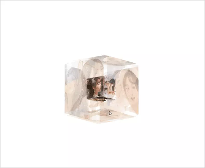
五、放一下动态效果图
总结:
生活虽然总有辛酸,但是我们不应该减少去创造生活的乐趣,不断寻找属于自己的那份快乐,才应该是我们生活的态度。