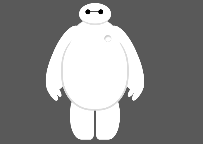
纯CSS打造网页大白知识点:
首先要把大白分割,整体baymax中包含header(eye1,eye2,mouth),torso(heart),belly(cover),l-bigfinger,r-bigfinger,l-smallfinger,r-smallfinger,l-leg,r-leg。
- 因为大白是白色,所以背景颜色(body)要设为深色。
- 大白居中,div居中要用margin:0 auto;
- 保险起见overflow:hidden
首先写head:
- 设置宽高之后以百分比定义圆角的形状 border-radius:50%
- margin-bottom设为负值,使身体与头部有重叠
- 因为只有设置了position 为relative absolute fixed 后 ,设置z-index才生效。并且z-index是相对于同一父亲元素的所有子元素的层级关系,z-index的值越大,说明他的位置越高。
所以给头部设置position:relative,然后将层级z-index:100
其次写eye1,eye2:
- 用到旋转对称使左右眼对称,transform:rotate(**deg)与transform:rotate(-**deg)左右对称,左右手臂,左右手指,左右腿都会用到。
附代码:
<!DOCTYPE html>
<html>
<head>
<meta charset="UTF-8">
<title></title>
<style>
body{background: #595959;}
#baymax{
margin: 0 auto;
height: 600px;
}
#head{
height: 64px;
width: 100px;
background-color: white;
border-radius: 50%;
margin: 0 auto;
margin-bottom: -20px;
border-bottom: 5px solid #E0E0E0;
z-index: 100;
/*生成相对定位的元素*/
position: relative;
}
#eye1{
width: 15px;
height: 15px;
background: black;
border-radius: 50%;
position: absolute;
left: 20px;
top: 20px;
transform: rotate(8deg);
}
#eye2{
width: 15px;
height: 15px;
background: black;
border-radius: 50%;
position: absolute;
transform: rotate(-8deg);
left: 60px;
top: 20px;
}
#mouth{
width: 40px;
height: 2px;
background: black;
position: absolute;
left: 30px;
top: 27px;
}
#torso,#belly{
width: 150px;
height: 180px;
margin: 0 auto;
background: white;
border-radius: 45%;
border: 5px solid #DCDCDC;
border-top: none ;
z-index:1;
}
#belly{
width: 200px;
height: 240px;
margin-top: -145px;
position: relative;
z-index: 5;
}
#cover{
width: 180px;
height: 250px;
margin: 0 auto;
background: white;
border-radius: 47%;
position: relative;
top:-20px ;
}
#heart{
width: 20px;
height:20px;
border-radius: 50%;
background: white;
border: 1px solid #DCDCDC;
box-shadow:2px 5px 2px #ccc inset;
margin: 0 auto;
z-index: 111;
position: relative;
right:-40px;
top:50px;
}
#left-arm,#right-arm{
width: 80px;
height: 220px;
margin: 0 auto;
background: white;
border-radius: 47%;
transform:rotate(23deg);
position: relative;
top: -270px;
left: -95px;
}
#right-arm{
transform:rotate(-23deg);
position: relative;
top: -490px;
left: 95px;
}
#l-bigfinger{
width: 20px;
height: 60px;
margin: 0 auto;
background: white;
border-radius: 47%;
transform:rotate(125deg);
position: absolute;
top: 190px;
left:35px;
}
#l-smallfinger{
width: 15px;
height: 40px;
margin: 0 auto;
background: white;
border-radius: 47%;
transform:rotate(125deg);
position: absolute;
top: 190px;
left:52px;
}
#r-smallfinger{
width: 15px;
height: 40px;
margin: 0 auto;
background: white;
border-radius: 47%;
transform:rotate(-125deg);
position: absolute;
top: 190px;
left:12px;
}
#r-bigfinger{
width: 20px;
height: 60px;
margin: 0 auto;
background: white;
border-radius: 47%;
transform:rotate(-125deg);
position: absolute;
top: 190px;
left:25px;
}
#left-leg{
width: 75px;
height: 150px;
margin: 0 auto;
background: white;
border-radius: 47%;
position: relative;
left: -40px;
top: -500px;
border-bottom-right-radius: 15%;
}
#right-leg{
width: 75px;
height: 150px;
margin: 0 auto;
background: white;
border-radius: 47%;
position: relative;
left: 40px;
top: -650px;
border-bottom-left-radius: 15%;
}
</style>
</head>
<body>
<div id="baymax">
<div id="head">
<div id="eye1"></div>
<div id="eye2"></div>
<div id="mouth"></div>
</div>
<div id="torso">
<div id="heart"></div>
</div>
<div id="belly">
<div id="cover"></div>
</div>
<div id="left-arm">
<div id="l-bigfinger"></div>
<div id="l-smallfinger"></div>
</div>
<div id="right-arm">
<div id="r-bigfinger"></div>
<div id="r-smallfinger"></div>
</div>
<div id="left-leg"></div>
<div id="right-leg"></div>
</div>
</body>
</html>