Bootstrap弹出框和警告框插件
学习要点:
1.弹出框
2.警告框
本节课我们主要学习一下 Bootstrap 中的弹出框和警告框插件。
一.弹出框
弹出框即点击一个元素弹出一个包含标题和内容的容器。
基本用法
注意:必须在js结合popover()方法使用
data-toggle="popover"弹出框事件绑定,写在触发弹出框的元素里,执行弹出框事件点击弹出或隐藏(Bootstrap)
title=""设置弹出框标题,写在弹出框元素里,(Bootstrap)
data-content=""设置弹出框内容,写在弹出框元素里,(Bootstrap)
popover()弹出框方法,将触发弹出框元素执行弹出框方法,一般在button元素上使用(Bootstrap)
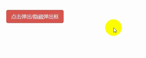
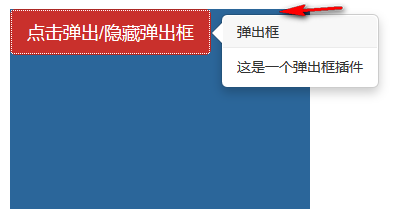
<button class="btn btn-lg btn-danger" type="button" data-toggle="popover" title="弹出框" data-content="这是一个弹出框插件">
    点击弹出/隐藏弹出框
</button>
js
$(function () {
    $('button').popover();
});
弹出框插件有很多属性来配置提示的显示,具体如下:
data-animation 默认 true,在 popover 上应用一个 CSS fade 动画。如果设置 false,则不应用。设置是否淡入淡出动画
data-html 默认 false,不允许提示内容格式为 html。如果设置为 true,则可以设置 html 格式的提示内容。设置内容或标题是否支持html标签
data-placement 默认值 top,还有 bottom、left、right 和 auto。如果 auto 会自行调整合适的位置,如果是 auto left则会尽量在左边显示,但左边不行就靠右边。设置弹出框位置
data-selector 默认 false,可以选择绑定指定的选择器。可以在一个按钮绑定一个指定的弹出框
data-original-title 默认空字符串,弹出框的标题。优先级比 title 低,设置标题
title 默认字空符串,弹出框的标题。设置标题
data-trigger 默认值 click,表示怎么触发 popover,其他值为:hover、focus、manual。多个值用空格隔开,manual手动不能和其他同时设置。设置触发弹出框的事件
data-delay 默认值 0,延迟触发 popover(毫秒),如果传数字则,表示 show/hide 的毫秒数,如果传对象,结构为:{show:500,hide:100},设置显示和隐藏的延迟时间
data-container 默认值 false,将 popover 附加到特定的元素上。比如组合按钮组提示,容器不够,可以附加 body 上。container : 'body',也就是如果提示信息被容器遮挡,可以设置一个外层div,将提示信息的容器重新指定到设置的div上
data-template 更改提示框的 HTML 提示语的模版,默认值为:设置提示框模板
<div class="popover">
<div class="arrow"></div>
<h3 class="popover-title"></h3>
<div class="popover-content"></div>
</div>
data-content 默认值为空,弹出框的内容。设置弹出框内容
data-viewport 设置外围容器的边际,具体代码看示例。
<div id="view">
    <button class="btn btn-lg btn-danger" type="button" data-toggle="popover" title="弹出框" data-content="这是一个弹出框插件">
        点击弹出/隐藏弹出框
    </button>
</div>
js
$(function () {
    $('button').popover({
        container:'#view',
        viewport: {
            selector: '#view',
            padding: 5,
        }
    });
});
重点,以上属性有两种使用方式,1是在html标签里用属性的方式,2是在js里用对象属性的方式
html标签里用属性的方式
<button class="btn btn-lg btn-danger" type="button" data-toggle="popover" title="弹出框" data-content="这是一个弹出框插件">
    点击弹出/隐藏弹出框
</button>
2是在js里用对象属性的方式,将上面的属性去掉data就是js对象属性
$(function () {
    $('button').popover({
        animation:true,     //设置弹出框支持淡入淡出
        placement:'top'     //设置弹出框头部显示
    });
});

弹出框方法
show弹出框方法参数,显示弹出框,(Bootstrap)
hide弹出框方法参数,隐藏弹出框,(Bootstrap)
toggle弹出框方法参数,反转显示和隐藏弹出框,(Bootstrap)
destroy弹出框方法参数,隐藏并销毁弹出框,(Bootstrap)
$(function () {
    $('button').popover({
        animation: true,     //设置弹出框支持淡入淡出
        placement: 'top'     //设置弹出框头部显示
    });
    //显示
    $('button').popover('show');
    //隐藏
    $('button').popover('hide');
    //反转显示和隐藏
    $('button').popover('toggle');
    //隐藏并销毁
    // $('button').popover('destroy');
});

弹出框事件
show.bs.popover 在调用 show 方法时触发(Bootstrap)
shown.bs.popover 在显示整个弹窗时时触发(Bootstrap)
hide.bs.popover 在调用 hide 方法时触发(Bootstrap)
hidden.bs.popover 在完全关闭整个弹出时触发(Bootstrap)
$(function () {
    $('button').popover({
        animation: true,     //设置弹出框支持淡入淡出
        placement: 'top'     //设置弹出框头部显示
    });
    $('button').on('show.bs.popover', function () {
        alert('在调用 show 方法时触发!');
    });
    $('button').on('shown.bs.popover', function () {
        alert('在显示整个弹窗时时触发!');
    });
    $('button').on('hide.bs.popover', function () {
        alert('在调用 hide 方法时触发!');
    });
    $('button').on('hidden.bs.popover', function () {
        alert('在完全关闭整个弹出时触发!');
    });
});

二.警告框
警告框即为点击消失的信息框。
基本实例
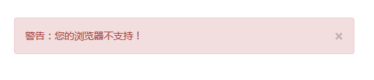
alert样式class类,写在<div>里,声明一个警告框区块(Bootstrap)
alert-danger样式class类,写在<div>里,设置警告框样式为红色(Bootstrap)
close样式class类,写在警告框里的<button>里,设置警告框关闭按钮样式(Bootstrap)
data-dismiss="alert"警告框事件,写在警告框里的button里,点击后关闭警告框(Bootstrap)
<div class="alert alert-danger"> <button class="close" type="button" data-dismiss="alert"> <span>×</span> </button> <p>警告:您的浏览器不支持!</p> </div>

添加淡入淡出效果
fade样式class类,写在警告框<div>里,设置警告框淡入淡出效果(Bootstrap)
in样式class类,写在警告框<div>里,设置警告框默认显示淡入淡出效果(Bootstrap)
<div class="alert alert-danger fade in"> <button class="close" type="button" data-dismiss="alert"> <span>×</span> </button> <p>警告:您的浏览器不支持!</p> </div>
警告框方法
如果用 JavaScript,可以代替 data-dismiss="alert"事件
alert()警告框框方法,将警告框元素执行警告框方法,一般在警告框区块div元素上使用(Bootstrap)
close警告框方法参数,关闭警告框(Bootstrap)
html
<div id="alert" class="alert alert-danger fade in"> <button class="close" type="button"> <span>×</span> </button> <p>警告:您的浏览器不支持!</p> </div>
js
$(function () {
    $('.close').on('click', function () {       //获取警告框按钮执行点击事件
        $('#alert').alert('close');             //点击后关闭警告框
    })
});
警告框事件
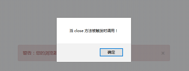
close.bs.alert 当 close 方法被调用后立即触发(Bootstrap)
closed.bs.alert 当警告框被完全关闭后立即触发(Bootstrap)
$(function () {
    $('.close').on('click', function () {       //获取警告框按钮执行点击事件
        $('#alert').alert('close');             //点击后关闭警告框
    });
    $('#alert').on('close.bs.alert', function () {
        alert('当 close 方法被触发时调用!');
    });
    $('#alert').on('closed.bs.alert', function () {
        alert('当警告框被完全关闭后立即触发!');
    });
});