一. Webkit浏览器
(1) 第一种写法:
background:-webkit-gradient(linear ,10% 10%,100% 100%,
color-stop(0.14,rgb(255,0,0)),
color-stop(0.5,rgb(255,255,0)),
color-stop(1,rgb(0,0,255)) );
第一个参数:表示的是渐变的类型
linear线性渐变
第二个参数:分别对应x,y方向渐变的起始位置
第三个参数:分别对应x,y方向渐变的终止位置
第四/五/N个参数:设置渐变的位置及颜色
(2)第二种写法:这种写法比较简单,而且效果比较自然
background:-webkit-gradient(linear, 0 0, 0 100%, from(#2074af), to(#2c91d2));
第一个参数:表示的是渐变的类型
linear线性渐变
第二个参数:分别对应x,y方向渐变的起始位置
第三个参数:分别对应x,y方向渐变的终止位置
第四个参数:设置了起始位置的颜色
第五个参数:设置了终止位置的颜色
二.Mozilla浏览器
(1)第一种写法:
background:-moz-linear-gradient(10 10 90deg,
rgb(25,0,0) 14%,
rgb(255,255,0) 50%,
rgb(0,0,255) 100%);
第一个参数:设置渐变起始位置及角度
第二/三/四/N个参数:设置渐变的颜色和位置
(2)第二种写法:这种写法比较简单,而且效果比较自然
background:-moz-linear-gradient(top, #FFC3C8,#FF9298);
第一个参数:设置渐变的起始位置
第二个参数:设置起始位置的颜色
第三个参数:设置终止位置的颜色
三.IE 浏览器
IE浏览器实现渐变只能使用IE自己的滤镜去实现
filter:progid:DXImageTransform.Microsoft.gradient(startColorstr=#00ffff,endColorstr=#9fffff,grandientType=1);
第一个参数:渐变起始位置的颜色
第二个参数:渐变终止位置的颜色
第三个参数:渐变的类型
0 代表竖向渐变 1 代表横向渐变
P.S.这里设置背景的时候不需要给background设置,直接用filter即可,不要和其他的浏览器混淆
IE浏览器下渐变背景的使用需要使用IE的渐变滤镜。如下代码:
filter: progid:DXImageTransform.Microsoft.gradient(startcolorstr=red,endcolorstr=blue,gradientType=1);
相关说明:
上面的滤镜代码主要有三个参数,依次是:startcolorstr, endcolorstr, 以及gradientType。
其中gradientType=1代表横向渐变,gradientType=0代表纵向淅变。startcolorstr=”色彩” 代表渐变渐变起始的色彩,endcolorstr=”色彩” 代表渐变结尾的色彩。
上面代码实现的是红色至蓝色的渐变,但是不含透明度变化,这是由于IE目前尚未支持opacity属性以及RGBA颜色,要实现IE下的透明度变化,还是需要使用IE滤镜,IE的透明度滤镜功能比较强大,这种强大反而与Firefox或是Safari浏览器下的css-gradient背景渐变的用法类似。例如下面的使用:
filter:alpha(opacity=100 finishopacity=0 style=1 startx=0,starty=5,finishx=90,finishy=60)
其中各个参数的含义如下:
opacity表示透明度,默认的范围是从0 到 100,他们其实是百分比的形式。也就是说,0代表完全透明,100代表完全不透明。
finishopacity 是一个可选参数,如果想要设置渐变的透明效果,就可以使用他们来指定结束时的透明度。范围也是0 到 100。
style用来指定透明区域的形状特征:
0 代表统一形状
1 代表线形
2 代表放射状
3 代表矩形。
startx 渐变透明效果开始处的 X坐标。
starty 渐变透明效果开始处的 Y坐标。
finishx 渐变透明效果结束处的 X坐标。
finishy 渐变透明效果结束处的 Y坐标。
综合上述,实现IE下含透明度变化红蓝垂直渐变的代码如下:
.gradient{
300px;
height:150px;
filter:alpha(opacity=100 finishopacity=50 style=1 startx=0,starty=0,finishx=0,finishy=150) progid:DXImageTransform.Microsoft.gradient(startcolorstr=red,endcolorstr=blue,gradientType=1);
-ms-filter:alpha(opacity=100 finishopacity=50 style=1 startx=0,starty=0,finishx=0,finishy=150) progid:DXImageTransform.Microsoft.gradient(startcolorstr=red,endcolorstr=blue,gradientType=1);
}
<div class="gradient"></div>
三、Firefox浏览器下的渐变背景
对于Firefox浏览器下(Firefox 3.6+)渐变背景的实现需使用CSS3渐变属性,-moz-linear-gradient属性,在之前文章我详细介绍了Firefox3.6下渐变背景的实现,您有兴趣可以狠狠地点击这里:CSS渐变之CSS3 gradient在Firefox3.6下的使用 。这里我就不再具体讲述了,对于本文开头提到的要实现的效果的实现可以参见下面的代码:
.gradient{
300px;
height:150px;
background:-moz-linear-gradient(top, red, rgba(0, 0, 255, 0.5));
}
<div class="gradient"></div>
四、chrome/Safari浏览器下的渐变背景实现
对于webkit核心的浏览器,如Chrome/Safari浏览器下渐变背景的实现也是使用CSS3 渐变方法,css-gradient,具体为-webkit-gradient,使用语Firefox浏览器是有一些差异的。我在上上一篇文章对此进行了非常详细的介绍,您可以狠狠地点击这里:CSS gradient渐变之webkit核心浏览器下的使用 。具体使用就不详述了,参见下面的代码:
.gradient{
300px;
height:150px;
background:-webkit-gradient(linear, 0 0, 0 bottom, from(#ff0000), to(rgba(0, 0, 255, 0.5)));
}
<div class="gradient"></div>
五、综合 – 兼容性的渐变背景效果
相关代码如下:
.gradient{
300px;
height:150px;
filter:alpha(opacity=100 finishopacity=50 style=1 startx=0,starty=0,finishx=0,finishy=150) progid:DXImageTransform.Microsoft.gradient(startcolorstr=red,endcolorstr=blue,gradientType=0);
-ms-filter:alpha(opacity=100 finishopacity=50 style=1 startx=0,starty=0,finishx=0,finishy=150) progid:DXImageTransform.Microsoft.gradient(startcolorstr=red,endcolorstr=blue,gradientType=0);
background:red;
background:-moz-linear-gradient(top, red, rgba(0, 0, 255, 0.5));
background:-webkit-gradient(linear, 0 0, 0 bottom, from(#ff0000), to(rgba(0, 0, 255, 0.5)));
}
<div class="gradient"></div>
效果如图:
代码如下:
background: rgb(30,87,153);
background: -moz-linear-gradient(top, rgba(30,87,153,1) 0%, rgba(32,124,202,1) 50%, rgba(41,137,216,1) 50%, rgba(125,185,232,1) 100%);
background: -webkit-gradient(linear, left top, left bottom, color-stop(0%,rgba(30,87,153,1)), color-stop(50%,rgba(32,124,202,1)), color-stop(50%,rgba(41,137,216,1)), color-stop(100%,rgba(125,185,232,1)));
background: -webkit-linear-gradient(top, rgba(30,87,153,1) 0%,rgba(32,124,202,1) 50%,rgba(41,137,216,1) 50%,rgba(125,185,232,1) 100%);
background: -o-linear-gradient(top, rgba(30,87,153,1) 0%,rgba(32,124,202,1) 50%,rgba(41,137,216,1) 50%,rgba(125,185,232,1) 100%);
background: -ms-linear-gradient(top, rgba(30,87,153,1) 0%,rgba(32,124,202,1) 50%,rgba(41,137,216,1) 50%,rgba(125,185,232,1) 100%);
background: linear-gradient(top, rgba(30,87,153,1) 0%,rgba(32,124,202,1) 50%,rgba(41,137,216,1) 50%,rgba(125,185,232,1) 100%);
filter: progid:DXImageTransform.Microsoft.gradient( startColorstr='#1e5799', endColorstr='#7db9e8',GradientType=0 );
效果二透明由有到无的透明效果
background: -moz-linear-gradient(top, rgba(30,87,153,1) 0%, rgba(125,185,232,0) 100%);
background: -webkit-gradient(linear, left top, left bottom, color-stop(0%,rgba(30,87,153,1)), color-stop(100%,rgba(125,185,232,0)));
background: -webkit-linear-gradient(top, rgba(30,87,153,1) 0%,rgba(125,185,232,0) 100%);
background: -o-linear-gradient(top, rgba(30,87,153,1) 0%,rgba(125,185,232,0) 100%);
background: -ms-linear-gradient(top, rgba(30,87,153,1) 0%,rgba(125,185,232,0) 100%);
background: linear-gradient(top, rgba(30,87,153,1) 0%,rgba(125,185,232,0) 100%);
filter: progid:DXImageTransform.Microsoft.gradient( startColorstr='#1e5799', endColorstr='#007db9e8',GradientType=0 );
++++++++++++++++++++++++++++++++++++++++++++++++++++++++++++++++++++++++++++++++++++
http://www.w3cplus.com/content/css3-gradient
CSS3的线性渐变
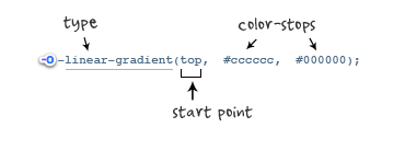
一、线性渐变在Mozilla下的应用
语法:
-moz-linear-gradient( [<point> || <angle>,]? <stop>, <stop> [, <stop>]* )
参数:其共有三个参数,第一个参数表示线性渐变的方向,top是从上到下、left是从左到右,如果定义成left top,那就是从左上角到右下角。第二个和第三个参数分别是起点颜色和终点颜色。你还可以在它们之间插入更多的参数,表示多种颜色的渐变。如图所示:

根据上面的介绍,我们先来看一个简单的例子:
HTML:
<div class="example example1"></div>
CSS:
.example {
   width: 150px;
   height: 80px;
 }
(如无特殊说明,我们后面的示例都是应用这一段html和css 的基本代码)
现在我们给这个div应用一个简单的渐变样式:
.example1 {
   background: -moz-linear-gradient( top,#ccc,#000);
}
效果如下:

注:这个效果暂时只有在Mozilla内核的浏览器下才能正常显示。
二、线性渐变在Webkit下的应用
语法:
-webkit-linear-gradient( [<point> || <angle>,]? <stop>, <stop> [, <stop>]* )//最新发布书写语法
-webkit-gradient(<type>, <point> [, <radius>]?, <point> [, <radius>]? [, <stop>]*) //老式语法书写规则
参数:-webkit-gradient是webkit引擎对渐变的实现参数,一共有五个。第一个参数表示渐变类型(type),可以是linear(线性渐变)或者radial(径向渐变)。第二个参数和第三个参数,都是一对值,分别表示渐变起点和终点。这对值可以用坐标形式表示,也可以用关键值表示,比如 left top(左上角)和left bottom(左下角)。第四个和第五个参数,分别是两个color-stop函数。color-stop函数接受两个参数,第一个表示渐变的位置,0为起点,0.5为中点,1为结束点;第二个表示该点的颜色。如图所示:


我们先来看一个老式的写法示例:
background: -webkit-gradient(linear,center top,center bottom,from(#ccc), to(#000));
效果如下所示
接着我们在来看一下新式的写法:
-webkit-linear-gradient(top,#ccc,#000);
这个效果我就不在贴出来了,大家在浏览器中一看就明白了,他们是否一致的效果。仔细对比,在Mozilla和Webkit下两者的学法都基本上一致了,只是其前缀的区别,当然哪一天他们能统一成一样,对我们来说当然是更好了,那就不用去处理了。将大大节省我们的开发时间哟。
三、线性渐变在Opera下的应用
语法:
-o-linear-gradient([<point> || <angle>,]? <stop>, <stop> [, <stop>]); /* Opera 11.10+ */
参数:-o-linear-gradient有三个参数。第一个参数表示线性渐变的方向,top是从上到下、left是从左到右,如果定义成left top,那就是从左上角到右下角。第二个和第三个参数分别是起点颜色和终点颜色。你还可以在它们之间插入更多的参数,表示多种颜色的渐变。(注:Opera支持的版本有限,本例测试都是在Opera11.1版本下,后面不在提示),如图所示:
示例:
background: -o-linear-gradient(top,#ccc, #000);
效果如图所示
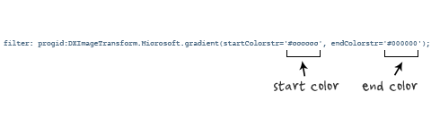
四、线性渐变在Trident (IE)下的应用
语法:
filter: progid:DXImageTransform.Microsoft.gradient(GradientType=0, startColorstr=#1471da, endColorstr=#1C85FB);/*IE<9>*/
-ms-filter: "progid:DXImageTransform.Microsoft.gradient (GradientType=0, startColorstr=#1471da, endColorstr=#1C85FB)";/*IE8+*/
IE依靠滤镜实现渐变。startColorstr表示起点的颜色,endColorstr表示终点颜色。GradientType表示渐变类型,0为缺省值,表示垂直渐变,1表示水平渐变。如图所示:
上面我们主要介绍了线性渐变在上述四大核心模块下的实现方法,接着我们主要针对线性渐变在MOZ、Webkit、Opera三大模块下实现各种不同线性渐变实例:
从上面的语法中我们可以很清楚的知道,要创建一个线性渐变,我们需要创建一个起点和一个渐变方向(或角度),定义一个起始色:
-moz-linear-gradient( [<point> || <angle>,]? <stop>, <stop> [, <stop>]* )
-webkit-linear-gradient( [<point> || <angle>,]? <stop>, <stop> [, <stop>]* )
-o-linear-gradient( [<point> || <angle>,]? <stop>, <stop> [, <stop>]* )
具体应用如下:
background:-moz-linear-gradient(left,#ace,#f96);/*Mozilla*/
background:-webkit-gradient(linear,0 50%,100% 50%,from(#ace),to(#f96));/*Old gradient for webkit*/
background:-webkit-linear-gradient(left,#ace,#f96);/*new gradient for Webkit*/
background:-o-linear-gradient(left,#ace,#f96); /*Opera11*/
效果如下:

起始点(Starting Point)的工作方式类似于background position。您可以设置水平和垂直位置为百分比,或以像素为单位,或在水平方向上可以使用left/center/right,在垂直方向上可以使用top/center/bottom。位置起始于左上角。如果你不指定水平或垂直位置,它将默认为center。其工作方式主要包含:Top → Bottom、Left → Right、bottom → top、right → left等,接着我们主要一种一种来看其实现的效果:
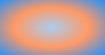
1、开始于center(水平方向)和top(垂直方向)也就是Top → Bottom:
/* Firefox 3.6+ */
background: -moz-linear-gradient(top, #ace, #f96);
/* Safari 4-5, Chrome 1-9 */
/* -webkit-gradient(,  [, ]?,  [, ]? [, ]*) */
background: -webkit-gradient(linear,top,from(#ace),to(#f96));
/* Safari 5.1+, Chrome 10+ */
background: -webkit-linear-gradient(top, #ace, #f96);
/* Opera 11.10+ */
background: -o-linear-gradient(top, #ace, #f96);
效果:

2、始于left(水平方向)和center(垂直方向)也是就Left → Right:
/* Firefox 3.6+ */
background: -moz-linear-gradient(left, #ace, #f96);
/* Safari 5.1+, Chrome 10+ */
background: -webkit-linear-gradient(left, #ace, #f96);
/* Opera 11.10+ */
background: -o-linear-gradient(left, #ace, #f96);
效果如下:

3、起始于left(水平方向)和top(垂直方向):
background: -moz-linear-gradient(left top, #ace, #f96);
background: -webkit-linear-gradient(left top, #ace, #f96);
background: -o-linear-gradient(left top, #ace, #f96);
效果如下:

4、Linear Gradient (with Even Stops):
/* Firefox 3.6+ */
background: -moz-linear-gradient(left, #ace, #f96, #ace, #f96, #ace);
/* Safari 4-5, Chrome 1-9 */
background: -webkit-gradient(linear, left top, right top, from(#ace), color-stop(0.25, #f96), color-stop(0.5, #ace), color-stop(0.75, #f96), to(#ace));
/* Safari 5.1+, Chrome 10+ */
background: -webkit-linear-gradient(left, #ace, #f96, #ace, #f96, #ace);
/* Opera 11.10+ */
background: -o-linear-gradient(left, #ace, #f96, #ace, #f96, #ace);
效果如下:

5、with Specified Arbitrary Stops:
 /* Firefox 3.6+ */
 background: -moz-linear-gradient(left, #ace, #f96 5%, #ace, #f96 95%, #ace);
 /* Safari 4-5, Chrome 1-9 */
 background: -webkit-gradient(linear, left top, right top, from(#ace), color-stop(0.05, #f96), color-stop(0.5, #ace), color-stop(0.95, #f96), to(#ace));
 /* Safari 5.1+, Chrome 10+ */
 background: -webkit-linear-gradient(left, #ace, #f96 5%, #ace, #f96 95%, #ace);
 /* Opera 11.10+ */
 background: -o-linear-gradient(left, #ace, #f96 5%, #ace, #f96 95%, #ace);
效果如下:

6、角度(Angle):
正如上面看到的示例,如果您不指定一个角度,它会根据起始位置自动定义。如果你想更多的控制渐变的方向,您不妨设置角度试试。例如,下面的两个渐变具有相同的起点left center,但是加上一个30度的角度。
没有角度的示例代码:
background: -moz-linear-gradient(left, #ace, #f96);
background: -webkit-linear-gradient(left,#ace,#f96);
background: -o-linear-gradient(left, #ace, #f96);
加上30度的角度代码:
background: -moz-linear-gradient(left 30deg, #ace, #f96);
background: -webkit-gradient(linear, 0 0, 100% 100%, from(#ace),to(#f96));
background: -o-linear-gradient(30deg, #ace, #f96);
效果图如下:


当指定的角度,请记住,它是一个由水平线与渐变线产生的的角度,逆时针方向。因此,使用0deg将产生一个左到右横向梯度,而90度将创建一个从底部到顶部的垂直渐变。我来看看你核心代码:
background: -moz-linear-gradient(<angle>, #ace, #f96);
background: -webkit-gradient(<type>,<angle>, from(#ace), to(#f96));
background: -webkit-linear-gradient(<angle>, #ace, #f96);
background: -o-linear-gradient(<angle>, #ace, #f96);
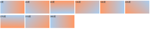
我们来看看各角度的区别
.deg0 {
  background: -moz-linear-gradient(0deg, #ace, #f96);
  background: -webkit-gradient(linear,0 50%,100% 50%,from(#ace),to(#f96));
  background: -webkit-linear-gradient(0deg, #ace, #f96);
  background: -o-linear-gradient(0deg, #ace, #f96);
}

.deg45 {
  background: -moz-linear-gradient(45deg, #ace, #f96);
  background: -webkit-gradient(linear,0 100%,100% 0%,from(#ace),to(#f96));
  background: -webkit-linear-gradient(45deg, #ace, #f96);
  background: -o-linear-gradient(45deg, #ace, #f96);
}
.deg90 {
  background: -moz-linear-gradient(90deg, #ace, #f96);
  background: -webkit-gradient(linear,50% 100%,50% 0%,from(#ace),to(#f96));
  background: -webkit-linear-gradient(90deg, #ace, #f96);
  background: -o-linear-gradient(90deg, #ace, #f96);
}
.deg135 {
  background: -moz-linear-gradient(135deg, #ace, #f96);
  background: -webkit-gradient(linear,100% 100%,0 0,from(#ace),to(#f96));
  background: -webkit-linear-gradient(135deg, #ace, #f96);
  background: -o-linear-gradient(135deg, #ace, #f96);
}
.deg180 {
  background: -moz-linear-gradient(180deg, #ace, #f96);
  background: -webkit-gradient(linear,100% 50%,0 50%,from(#ace),to(#f96));
  background: -webkit-linear-gradient(180deg, #ace, #f96);
  background: -o-linear-gradient(180deg, #ace, #f96);
}
.deg225 {
  background: -moz-linear-gradient(225deg, #ace, #f96);
  background: -webkit-gradient(linear,100% 0%,0 100%,from(#ace),to(#f96));
  background: -webkit-linear-gradient(225deg, #ace, #f96);
  background: -o-linear-gradient(225deg, #ace, #f96);
}
.deg270 {
  background: -moz-linear-gradient(270deg, #ace, #f96);
  background: -webkit-gradient(linear,50% 0%,50% 100%,from(#ace),to(#f96));
  background: -webkit-linear-gradient(270deg, #ace, #f96);
  background: -o-linear-gradient(270deg, #ace, #f96);
}
.deg315 {
  background: -moz-linear-gradient(315deg, #ace, #f96);
  background: -webkit-gradient(linear,0% 0%,100% 100%,from(#ace),to(#f96));
  background: -webkit-linear-gradient(315deg, #ace, #f96);
  background: -o-linear-gradient(315deg, #ace, #f96);
}
.deg360 {
  background: -moz-linear-gradient(360deg, #ace, #f96);
  background: -webkit-gradient(linear,0 50%,100% 50%,from(#ace),to(#f96));
  background: -webkit-linear-gradient(360deg, #ace, #f96);
  background: -o-linear-gradient(360deg, #ace, #f96);
}
效果如下:
除了起始位置和角度,你应该指定起止颜色。起止颜色是沿着渐变线,将会在指定位置(以百分比或长度设定)含有指定颜色的点。色彩的起止数是无限的。如果您使用一个百分比位置,0%代表起点和100%是终点,但区域外的值可以被用来达到预期的效果。 这也是通过CSS3 Gradient制作渐变的一个关键所在,其直接影响了你的设计效果,像我们这里的示例都不是完美的效果,只是为了能给大家展示一个渐变的效果,大家就这样先用着吧。我们接着看一下不同的起址色的示例:
background: -moz-linear-gradient(top, #ace, #f96 80%, #f96);
background: -webkit-linear-gradient(top,#ace,#f96 80%,#f96);
background: -o-linear-gradient(top, #ace, #f96 80%, #f96);
效果如下:

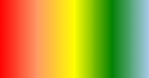
如果没有指定位置,颜色会均匀分布。如下面的示例:
background: -moz-linear-gradient(left, red, #f96, yellow, green, #ace);
background: -webkit-linear-gradient(left,red,#f96,yellow,green,#ace);
background: -o-linear-gradient(left, red, #f96, yellow, green, #ace);
效果如下
7、渐变上应用透明─透明度(Transparency):
透明度还支持透明渐变。这对于制作一些特殊的效果是相当有用的,例如,当堆叠多个背景时。这里是两个背景的结合:一张图片,一个白色到透明的线性渐变。我们来看一个官网的示例吧:
background: -moz-linear-gradient(right, rgba(255,255,255,0), rgba(255,255,255,1)),url(http://demos.hacks.mozilla.org/openweb/resources/images/patterns/flowers-pattern.jpg);
background: -webkit-linear-gradient(right, rgba(255,255,255,0), rgba(255,255,255,1)),url(http://demos.hacks.mozilla.org/openweb/resources/images/patterns/flowers-pattern.jpg);
background: -o-linear-gradient(right, rgba(255,255,255,0), rgba(255,255,255,1)),url(http://demos.hacks.mozilla.org/openweb/resources/images/patterns/flowers-pattern.jpg);
接着看看效果吧

大家可以时入这里和原图做一下比较,是不是很神奇呀。如果想体会的话,快点动手跟我一起做吧。
上面我们主要介绍了CSS3中线性渐变,文章一开始说过CSS3渐变包含两个部分,其一就是我们说的线性渐变,其二就是我们接下来要说的径向渐变。
CSS3的径向渐变
CSS3的径向渐变和其线性渐变是很相似的。我们首先来看其语法:
 -moz-radial-gradient([<bg-position> || <angle>,]? [<shape> || <size>,]? <color-stop>, <color-stop>[, <color-stop>]*);
 -webkit-radial-gradient([<bg-position> || <angle>,]? [<shape> || <size>,]? <color-stop>, <color-stop>[, <color-stop>]*);
(需要特别说明一点的是,径向渐变到目前还不支持Opera的内核浏览器,所以我们径向渐变都是在firefox,safari,chrome底下进行测试完成的。)
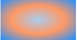
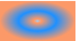
除了您已经在线性渐变中看到的起始位置,方向,和颜色,径向梯度允许你指定渐变的形状(圆形或椭圆形)和大小(最近端,最近角,最远端,最远角,包含或覆盖 (closest-side, closest-corner, farthest-side, farthest-corner, contain or cover))。 颜色起止(Color stops):就像用线性渐变,你应该沿着渐变线定义渐变的起止颜色。下面为了更好的理解其具体的用法,我们主要通过不同的示例来对比CSS3径向渐变的具体用法
示例一:
 background: -moz-radial-gradient(#ace, #f96, #1E90FF);
 background: -webkit-radial-gradient(#ace, #f96, #1E90FF);
效果:
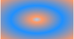
示例二:
 background: -moz-radial-gradient(#ace 5%, #f96 25%, #1E90FF 50%);
 background: -webkit-radial-gradient(#ace 5%, #f96 25%, #1E90FF 50%);
效果:
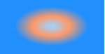
从以上俩个示例的代码中发现,他们起止色想同,但就是示例二定位了些数据,为什么会造成这么大的区别呢?其实在径向渐变中虽然具有相同的起止色,但是在没有设置位置时,其默认颜色为均匀间隔,这一点和我们前面的线性渐变是一样的,但是设置了渐变位置就会按照渐变位置去渐变,这就是我们示例一和示例的区别之处:虽然圆具有相同的起止颜色,但在示例一为默认的颜色间隔均匀的渐变,而示例二每种颜色都有特定的位置。
示例三
  background: -moz-radial-gradient(bottom left, circle, #ace, #f96, #1E90FF);
  background: -webkit-radial-gradient(bottom left, circle, #ace, #f96, #1E90FF);
效果
示例四
background: -moz-radial-gradient(bottom left, ellipse, #ace, #f96, #1E90FF);
background: -webkit-radial-gradient(bottom left, ellipse, #ace, #f96, #1E90FF);
效果
示例三和示例四我们从效果中就可以看出,其形状不一样,示例三程圆形而示例四程椭圆形状,也是就是说他们存在形状上的差异。然而我们在回到两个示例的代码中,显然在示例三中设置其形状为circle而在示例四中ellipse,换而言之在径向渐变中,我们是可以会渐变设置其形状的。
示例五
background: -moz-radial-gradient(ellipse closest-side, #ace, #f96 10%, #1E90FF 50%, #f96);
background: -webkit-radial-gradient(ellipse closest-side, #ace, #f96 10%, #1E90FF 50%, #f96);
效果:
示例六
background: -moz-radial-gradient(ellipse farthest-corner, #ace, #f96 10%, #1E90FF 50%, #f96);
background: -webkit-radial-gradient(ellipse farthest-corner, #ace, #f96 10%, #1E90FF 50%, #f96);
效果:
从示例五和示例六中的代码中我们可以清楚知道,在示例五中我人应用了closest-side而在示例六中我们应用了farthest-corner。这样我们可以知道在径向渐变中我们还可以为其设置大小(Size):size的不同选项(closest-side, closest-corner, farthest-side, farthest-corner, contain or cover)指向被用来定义圆或椭圆大小的点。 示例:椭圆的近边VS远角 下面的两个椭圆有不同的大小。示例五是由从起始点(center)到近边的距离设定的,而示例六是由从起始点到远角的的距离决定的。
示例七:
background: -moz-radial-gradient(circle closest-side, #ace, #f96 10%, #1E90FF 50%, #f96);
background: -webkit-radial-gradient(circle closest-side, #ace, #f96 10%, #1E90FF 50%, #f96);
效果:
示例八:
background: -moz-radial-gradient(circle farthest-side, #ace, #f96 10%, #1E90FF 50%, #f96);
background: -webkit-radial-gradient(circle farthest-side, #ace, #f96 10%, #1E90FF 50%, #f96);
效果:

示例七和示例八主要演示了圆的近边VS远边 ,示例七的圆的渐变大小由起始点(center)到近边的距离决定,而示例八的圆则有起始点到远边的距离决定。
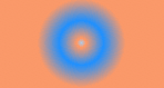
示例九:
background: -moz-radial-gradient(#ace, #f96, #1E90FF);
background: -webkit-radial-gradient(#ace, #f96, #1E90FF);
效果:
示例十:
background: -moz-radial-gradient(contain, #ace, #f96, #1E90FF);
background: -webkit-radial-gradient(contain, #ace, #f96, #1E90FF);
效果:

示例九和示例十演示了包含圆 。在这里你可以看到示例九的默认圈,同一渐变版本,但是被包含的示例十的圆。
最后我们在来看两个实例一个是应用了中心定位和full sized,如下所示:
 /* Firefox 3.6+ */
 background: -moz-radial-gradient(circle, #ace, #f96);
 /* Safari 4-5, Chrome 1-9 */
 /* Can't specify a percentage size? Laaaaaame. */
 background: -webkit-gradient(radial, center center, 0, center center, 460, from(#ace), to(#f96));
 /* Safari 5.1+, Chrome 10+ */
 background: -webkit-radial-gradient(circle, #ace, #f96);
效果如下:

下面这个实例应用的是Positioned, Sized,请看代码和效果
/* Firefox 3.6+ */
/* -moz-radial-gradient( [ || ,]? [ || ,]? , [, ]* ) */
background: -moz-radial-gradient(80% 20%, closest-corner, #ace, #f96);
/* Safari 4-5, Chrome 1-9 */
background: -webkit-gradient(radial, 80% 20%, 0, 80% 40%, 100, from(#ace), to(#f96));
/* Safari 5.1+, Chrome 10+ */
background: -webkit-radial-gradient(80% 20%, closest-corner, #ace, #f96);
效果:

到此关于CSS3的两种渐变方式我们都介绍完了。在浪费大家一点时间,我们看看CSS的重复渐变的应用。
如果您想重复一个渐变,您可以使用-moz-repeating-linear-gradient和-moz-repeating-radial-gradient。 在下面的例子,每个实例都指定了两个起止颜色,并无限重复。
background: -moz-repeating-radial-gradient(#ace, #ace 5px, #f96 5px, #f96 10px);
background: -webkit-repeating-radial-gradient(#ace, #ace 5px, #f96 5px, #f96 10px);
background: -moz-repeating-linear-gradient(top left -45deg, #ace, #ace 5px, #f96 5px, #f96 10px);
background: -webkit-repeating-linear-gradient(top left -45deg, #ace, #ace 5px, #f96 5px, #f96 10px);
效果:


有关于CSS3渐变的东西就完了,大家看完了肯定会想,他主要用在哪些方面呢?这个说起来就多了,最简单的就是制作背景,我们还可以应用其制作一些漂亮的按钮,还可以用他来制作patterns,我在这里列出几种制作patterns的示例代码吧:
HTML代码:
<ul>
   <li class="gradient gradient1"></li>
   <li class="gradient gradient2"></li>
   <li class="gradient gradient3"></li>
   <li class="gradient gradient4"></li>
   <li class="gradient gradient5"></li>
   <li class="gradient gradient6"></li>
   </ul>
CSS 代码:
ul {
  overflow: hidden;
  margin-top: 20px;
}
li{
  width: 150px;
  height: 80px;
  margin-bottom: 10px;
  float: left;
  margin-right: 5px;
  background: #ace;
  /*Controls the size*/
  -webkit-background-size: 20px 20px;
  -moz-background-size: 20px 20px;
  background-size: 20px 20px;
}

li.gradient1 {
  background-image: -webkit-gradient(
    linear,
    0 100%, 100% 0,
    color-stop(.25, rgba(255, 255, 255, .2)),
    color-stop(.25, transparent),
    color-stop(.5, transparent),
    color-stop(.5, rgba(255, 255, 255, .2)),
    color-stop(.75, rgba(255, 255, 255, .2)),
    color-stop(.75, transparent),
    to(transparent)
    );
  background-image: -moz-linear-gradient(
    45deg,
    rgba(255, 255, 255, .2) 25%,
    transparent 25%,
    transparent 50%,
    rgba(255, 255, 255, .2) 50%,
    rgba(255, 255, 255, .2) 75%,
    transparent 75%,
    transparent
    );
  background-image: -o-linear-gradient(
    45deg,
    rgba(255, 255, 255, .2) 25%,
    transparent 25%,
    transparent 50%,
    rgba(255, 255, 255, .2) 50%,
    rgba(255, 255, 255, .2) 75%,
    transparent 75%,
    transparent
  );
  background-image: linear-gradient(
    45deg,
    rgba(255, 255, 255, .2) 25%,
    transparent 25%,
    transparent 50%,
    gba(255, 255, 255, .2) 50%,
    rgba(255, 255, 255, .2) 75%,
    transparent 75%,
    transparent
    );
}

li.gradient2 {
   background-image: -webkit-gradient(linear, 0 0, 100% 100%,
      color-stop(.25, rgba(255, 255, 255, .2)), color-stop(.25, transparent),
      color-stop(.5, transparent), color-stop(.5, rgba(255, 255, 255, .2)),
      color-stop(.75, rgba(255, 255, 255, .2)), color-stop(.75, transparent),
      to(transparent));
   background-image: -moz-linear-gradient(-45deg, rgba(255, 255, 255, .2) 25%, transparent 25%,
      transparent 50%, rgba(255, 255, 255, .2) 50%, rgba(255, 255, 255, .2) 75%,
      transparent 75%, transparent);
   background-image: -o-linear-gradient(-45deg, rgba(255, 255, 255, .2) 25%, transparent 25%,
      transparent 50%, rgba(255, 255, 255, .2) 50%, rgba(255, 255, 255, .2) 75%,
      transparent 75%, transparent);
   background-image: linear-gradient(-45deg, rgba(255, 255, 255, .2) 25%, transparent 25%,
      transparent 50%, rgba(255, 255, 255, .2) 50%, rgba(255, 255, 255, .2) 75%,
      transparent 75%, transparent);
}

li.gradient3 {
  background-image: -webkit-gradient(linear, 0 0, 0 100%, color-stop(.5, rgba(255, 255, 255, .2)), color-stop(.5, transparent), to(transparent));
  background-image: -moz-linear-gradient(rgba(255, 255, 255, .2) 50%, transparent 50%, transparent);
  background-image: -o-linear-gradient(rgba(255, 255, 255, .2) 50%, transparent 50%, transparent);
  background-image: linear-gradient(rgba(255, 255, 255, .2) 50%, transparent 50%, transparent);
}

li.gradient4 {
  background-image: -webkit-gradient(linear, 0 0, 100% 0, color-stop(.5, rgba(255, 255, 255, .2)), color-stop(.5, transparent), to(transparent));
  background-image: -moz-linear-gradient(0deg, rgba(255, 255, 255, .2) 50%, transparent 50%, transparent);
  background-image: -o-linear-gradient(0deg, rgba(255, 255, 255, .2) 50%, transparent 50%, transparent);
  background-image: linear-gradient(0deg, rgba(255, 255, 255, .2) 50%, transparent 50%, transparent);
}

li.gradient5 {
  background-image: -webkit-gradient(linear, 0 0, 100% 100%, color-stop(.25, #555), color-stop(.25, transparent), to(transparent)),
      -webkit-gradient(linear, 0 100%, 100% 0, color-stop(.25, #555), color-stop(.25, transparent), to(transparent)),
      -webkit-gradient(linear, 0 0, 100% 100%, color-stop(.75, transparent), color-stop(.75, #555)),
      -webkit-gradient(linear, 0 100%, 100% 0, color-stop(.75, transparent), color-stop(.75, #555));
  background-image: -moz-linear-gradient(45deg, #555 25%, transparent 25%, transparent),
     -moz-linear-gradient(-45deg, #555 25%, transparent 25%, transparent),
     -moz-linear-gradient(45deg, transparent 75%, #555 75%),
     -moz-linear-gradient(-45deg, transparent 75%, #555 75%);
  background-image: -o-linear-gradient(45deg, #555 25%, transparent 25%, transparent),
     -o-linear-gradient(-45deg, #555 25%, transparent 25%, transparent),
     -o-linear-gradient(45deg, transparent 75%, #555 75%),
     -o-linear-gradient(-45deg, transparent 75%, #555 75%);
  background-image: linear-gradient(45deg, #555 25%, transparent 25%, transparent),
    linear-gradient(-45deg, #555 25%, transparent 25%, transparent),
    linear-gradient(45deg, transparent 75%, #555 75%),
    linear-gradient(-45deg, transparent 75%, #555 75%);
}

li.gradient6 {
  background-image: -webkit-gradient(linear, 0 0, 0 100%, color-stop(.5, transparent), color-stop(.5, rgba(200, 0, 0, .5)), to(rgba(200, 0, 0, .5))),
     -webkit-gradient(linear, 0 0, 100% 0, color-stop(.5, transparent), color-stop(.5, rgba(200, 0, 0, .5)), to(rgba(200, 0, 0, .5)));
  background-image: -moz-linear-gradient(transparent 50%, rgba(200, 0, 0, .5) 50%, rgba(200, 0, 0, .5)),
     -moz-linear-gradient(0deg, transparent 50%, rgba(200, 0, 0, .5) 50%, rgba(200, 0, 0, .5));
  background-image: -o-linear-gradient(transparent 50%, rgba(200, 0, 0, .5) 50%, rgba(200, 0, 0, .5)),
     -o-linear-gradient(0deg, transparent 50%, rgba(200, 0, 0, .5) 50%, rgba(200, 0, 0, .5));
  background-image: linear-gradient(transparent 50%, rgba(200, 0, 0, .5) 50%, rgba(200, 0, 0, .5)),
     linear-gradient(0deg, transparent 50%, rgba(200, 0, 0, .5) 50%, rgba(200, 0, 0, .5));
}
效果:

不错的效果吧,当然感兴趣的朋友可以到这里学习制作更多的不同效果。
到此我们关于CSS3─Gradient就介绍到这里了,如果想学习制作渐变效果的,大家可以看看W3CPLUS首页的彩色菜单,我采用的就是CSS3 Gradient实现的,当然大家还可以去看看这个DEMO的效果。希望能给大家对学习CSS3有点帮助,如果感兴趣的朋友请观注W3CPLUS,从今天开始我会系统的介绍一些CSS3的应用,希望大家能喜欢,更希望能跟大家一起探讨学习CSS3的相关技术。
更新一
今天为之碰到一个IE9下的渐变色结合圆角制作的bug。换句话说:在IE9下你使用渐变色而且还需要制作圆角时,这个bug就出现了,在IE9下背景色不能完全切完。经过他仔细研究,借助Ultimate CSS Gradient Generator工具终于找到了兼容IE9的方法,请看下面的截图:

我将代码截取如下:
/* IE9 SVG, needs conditional override of 'filter' to 'none' */
background: url(data:image/svg+xml;base64,PD94bWwgdmVyc2lvbj0iMS4wIiA/Pgo8c3ZnIHhtbG5zPSJodHRwOi8vd3d3LnczLm9yZy8yMDAwL3N2ZyIgd2lkdGg9IjEwMCUiIGhlaWdodD0iMTAwJSIgdmlld0JveD0iMCAwIDEgMSIgcHJlc2VydmVBc3BlY3RSYXRpbz0ibm9uZSI+CiAgPGxpbmVhckdyYWRpZW50IGlkPSJncmFkLXVjZ2ctZ2VuZXJhdGVkIiBncmFkaWVudFVuaXRzPSJ1c2VyU3BhY2VPblVzZSIgeDE9IjAlIiB5MT0iMCUiIHgyPSIwJSIgeTI9IjEwMCUiPgogICAgPHN0b3Agb2Zmc2V0PSIwJSIgc3RvcC1jb2xvcj0iIzJjZTA2MiIgc3RvcC1vcGFjaXR5PSIxIi8+CiAgICA8c3RvcCBvZmZzZXQ9IjEwMCUiIHN0b3AtY29sb3I9IiM3ZGI5ZTgiIHN0b3Atb3BhY2l0eT0iMCIvPgogIDwvbGluZWFyR3JhZGllbnQ+CiAgPHJlY3QgeD0iMCIgeT0iMCIgd2lkdGg9IjEiIGhlaWdodD0iMSIgZmlsbD0idXJsKCNncmFkLXVjZ2ctZ2VuZXJhdGVkKSIgLz4KPC9zdmc+);
background: -moz-linear-gradient(top,  rgba(44,224,98,1) 0%, rgba(125,185,232,0) 100%); /* FF3.6+ */
background: -webkit-gradient(linear, left top, left bottom, color-stop(0%,rgba(44,224,98,1)), color-stop(100%,rgba(125,185,232,0))); /* Chrome,Safari4+ */
background: -webkit-linear-gradient(top,  rgba(44,224,98,1) 0%,rgba(125,185,232,0) 100%); /* Chrome10+,Safari5.1+ */
background: -o-linear-gradient(top,  rgba(44,224,98,1) 0%,rgba(125,185,232,0) 100%); /* Opera 11.10+ */
background: -ms-linear-gradient(top,  rgba(44,224,98,1) 0%,rgba(125,185,232,0) 100%); /* IE10+ */
background: linear-gradient(top,  rgba(44,224,98,1) 0%,rgba(125,185,232,0) 100%); /* W3C */
filter: progid:DXImageTransform.Microsoft.gradient( startColorstr='#2ce062', endColorstr='#007db9e8',GradientType=0 ); /* IE6-8 */
filter: none90;/*ie9*/