1、简单的x-y图绘制
1 import matplotlib.pyplot as plt
2 plt.plot([1,2,3,4],[5,7,4,9]) #[1,2,3,4]是x轴,[5,7,4,9]是y轴
3 plt.show()
2、图例、标题、标签
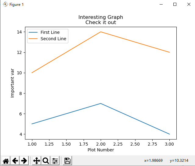
 1 import matplotlib.pyplot as plt
#坐标轴
 2 x = [1,2,3]
 3 y = [5,7,4]
 4 x2 = [1,2,3]
 5 y2 = [10,14,12]
#给线条添加标签
 6 plt.plot(x, y, label='First Line')
 7 plt.plot(x2, y2, label='Second Line')
#给坐标轴和图形添加标签
 8 plt.xlabel('Plot Number')
 9 plt.ylabel('Important var')
10 plt.title('Interesting Graph
Check it out')
#显示图形
11 plt.legend()
12 plt.show()
结果显示如图所示
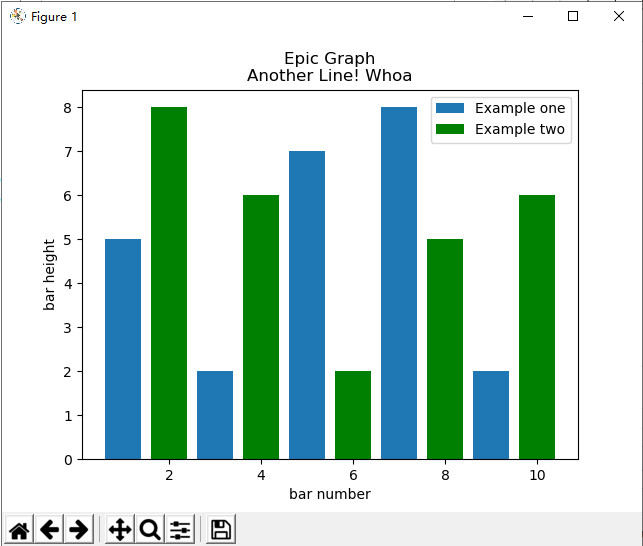
3、条形图和直方图
条形图
 1 import matplotlib.pyplot as plt
 2
 3 #绘制直方图,并且添加标签,设定第二个直方图为绿色
 4 plt.bar([1,3,5,7,9],[5,2,7,8,2], label="Example one")
 5 plt.bar([2,4,6,8,10],[8,6,2,5,6], label="Example two", color='g')
 6 plt.legend()
 7
 8 #个x、y轴和图形添加标签
 9 plt.xlabel('bar number')
10 plt.ylabel('bar height')
11 plt.title('Epic Graph
Another Line! Whoa')
12
13 #显示图形
14 plt.show()
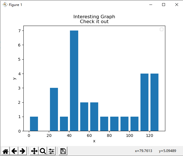
直方图
 1 import matplotlib.pyplot as plt
 2
 3 #直方图的坐标
 4 population_ages = [22,55,62,45,21,22,34,42,42,4,99,102,110,120,121,122,130,111,115,112,80,75,65,54,44,43,42,48]
 5
 6 bins = [0,10,20,30,40,50,60,70,80,90,100,110,120,130]
 7
 8 #设定容器为bar类型,宽度为0.8
 9 plt.hist(population_ages, bins, histtype='bar', rwidth=0.8)
10
11
12 plt.xlabel('x')
13 plt.ylabel('y')
14 plt.title('Interesting Graph
Check it out')
15 plt.legend()
16 plt.show()
直方图非常像条形图,倾向于通过将区段组合在一起来显示分布。结果如下
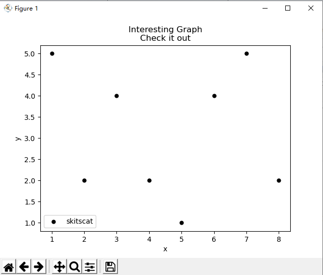
4、散点图
二维散点图
 1 import matplotlib.pyplot as plt
 2
 3 x = [1,2,3,4,5,6,7,8]
 4 y = [5,2,4,2,1,4,5,2]
 5
 6 plt.scatter(x,y, label='skitscat', color='k', s=25, marker="o")
 7
 8 plt.xlabel('x')
 9 plt.ylabel('y')
10 plt.title('Interesting Graph
Check it out')
11 plt.legend()
12 plt.show()
5、堆叠图
 1 import matplotlib.pyplot as plt
 2
 3 #x轴和y轴数据
 4 days = [1,2,3,4,5]
 5
 6 sleeping = [7,8,6,11,7]
 7 eating =   [2,3,4,3,2]
 8 working =  [7,8,7,2,2]
 9 playing =  [8,5,7,8,13]
10
11 #设定格式
12 plt.plot([],[],color='m', label='Sleeping', linewidth=5)
13 plt.plot([],[],color='c', label='Eating', linewidth=5)
14 plt.plot([],[],color='r', label='Working', linewidth=5)
15 plt.plot([],[],color='k', label='Playing', linewidth=5)
16
17 #画图
18 plt.stackplot(days, sleeping,eating,working,playing, colors=['m','c','r','k'])
19
20 plt.xlabel('x')
21 plt.ylabel('y')
22 plt.title('Interesting Graph
Check it out')
23 plt.legend()
24 plt.show()

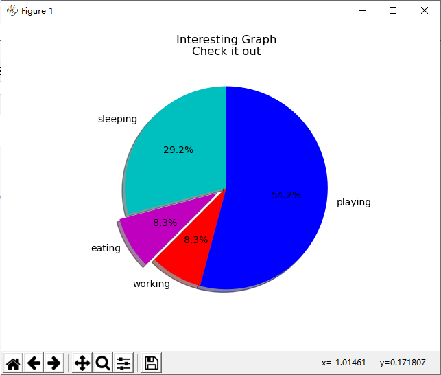
6、饼图
 1 import matplotlib.pyplot as plt
 2
 3 slices = [7,2,2,13]
 4 activities = ['sleeping','eating','working','playing']
 5 cols = ['c','m','r','b']
 6
 7 plt.pie(slices,
 8         labels=activities,
 9         colors=cols,
10         startangle=90, #我们为饼图选择了 90 度角,这意味着第一个部分是一个竖直线条
11         shadow= True,
12         explode=(0,0.1,0,0),  #我们将第二个切片拉出来,如果要拉出来第一个切片,则为(0.1,0,0,0)
13         autopct='%1.1f%%')  #我们使用autopct,选择将百分比放置到图表上面。
14
15 plt.title('Interesting Graph
Check it out')
16 plt.show()
结果显示如图所示
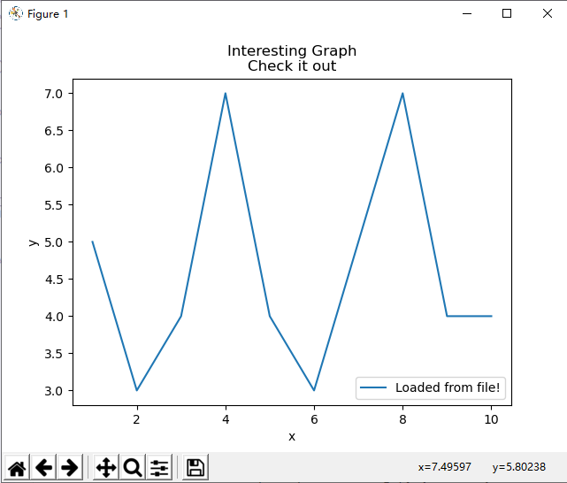
7、从文件中加载数据
7.1使用CSV模块加载数据
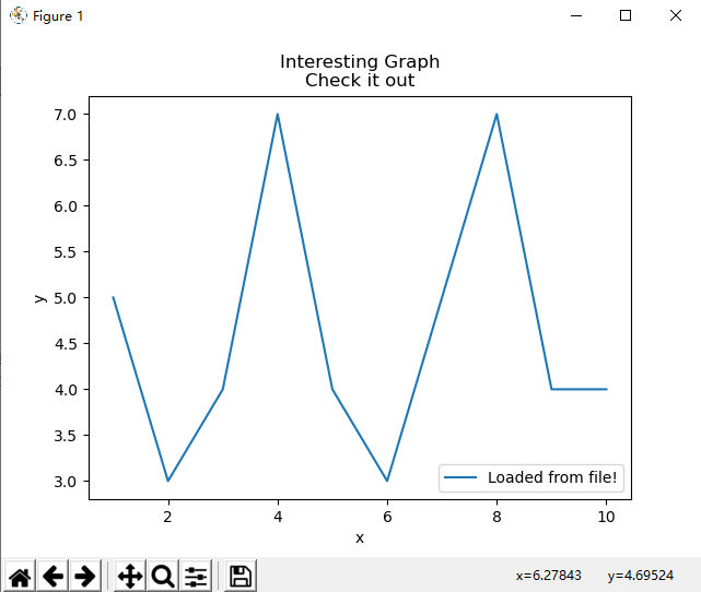
import matplotlib.pyplot as plt
import csv

x = []
y = []

with open('data.txt','r') as csvfile:
    plots = csv.reader(csvfile, delimiter=',')
    for row in plots:
        x.append(int(row[0]))  #第1列的数据作为x轴
        y.append(int(row[1]))  #第二列数据作为y轴

plt.plot(x,y, label='Loaded from file!')
plt.xlabel('x')
plt.ylabel('y')
plt.title('Interesting Graph
Check it out')
plt.legend()
plt.show()
data.txt文件中的数据和显示结果如图所示

7.2使用Numpy模块显示数据
 1 import matplotlib.pyplot as plt
 2 import numpy as np
 3
 4 #加载数据
 5 x, y = np.loadtxt('data.txt', delimiter=',', unpack=True)
 6 plt.plot(x,y, label='Loaded from file!')
 7
 8 #画图
 9 plt.xlabel('x')
10 plt.ylabel('y')
11 plt.title('Interesting Graph
Check it out')
12 plt.legend()
13 plt.show()