前言:
上篇介绍了自定义控件的基本要求以及绘制的基本原理,本篇文章主要介绍如何给自定义控件自定义一些属性。本篇文章将继续以上篇文章自定义圆形百分比为例进行讲解。有关原理知识请参考Android自定义控件之基本原理(一)这篇文章。
需求产生背景:
为何要引入自定义属性?当Android提供的原生属性不能满足实际的需求的时候,比如我们需要自定义圆形百分比半径大小、圆形背景、圆形显示的位置、圆形进度的背景等等。这个时候就需要我们自定义属性了。
自定义属性步骤:
1.)在res/values文件下添加一个attrs.xml文件,如果项目比较大的话,会导致attrs.xml代码相当庞大,这时可以根据相应的功能模块起名字,方便查找,例如:登录模块相关attrs_login.xml
<?xml version="1.0" encoding="utf-8"?>
<resources>
    <declare-styleable name="RoundImageView">
        <attr name="borderRadius" />
        <attr name="type" />
    </declare-styleable>

</resources>
2.)如何声明一组属性
使用<declare-styleable name="PercentView"></declare-styleable>来定义一个属性集合,name就是属性集合的名字,这个名字一定要起的见名知意。
  <declare-styleable name="PercentView">
    <!--添加属性-->
   </declare-styleable>
然后就是定义属性值了,通过<attr name="textColor" format="color" /> 方式定义属性值,属性名字同样也要起的见名知意,format表示这个属性的值的类型,类型有以下几种:
-
reference:引用资源
-
string:字符串
-
Color:颜色
-
boolean:布尔值
-
dimension:尺寸值
-
float:浮点型
-
integer:整型
-
fraction:百分数
-
enum:枚举类型
-
flag:位或运算
基于上面的要求,我们可以定义一下百分比控件属性
    <declare-styleable name="PercentView">
        <attr name="percent_circle_gravity"><!--圆形绘制的位置-->
            <flag name="left" value="0" />
            <flag name="top" value="1" />
            <flag name="center" value="2" />
            <flag name="right" value="3" />
            <flag name="bottom" value="4" />
        </attr>
        <attr name="percent_circle_radius" format="dimension" /><!--圆形半径-->
        <attr name="percent_circle_progress" format="integer" /><!--当前进度值-->
        <attr name="percent_progress_color" format="color" /><!--进度显示颜色-->
        <attr name="percent_background_color" format="color" /><!--圆形背景色-->
    </declare-styleable>
3.)布局中如何使用
<?xml version="1.0" encoding="utf-8"?>
<LinearLayout xmlns:android="http://schemas.android.com/apk/res/android"
xmlns:lee="http://schemas.android.com/apk/res-auto"
android:layout_width="match_parent"
android:layout_height="match_parent"
android:orientation="vertical">
<com.whoislcj.views.PercentView
android:layout_width="200dp"
android:layout_height="200dp"
android:layout_margin="10dp"
android:background="@color/red"
android:padding="10dp"
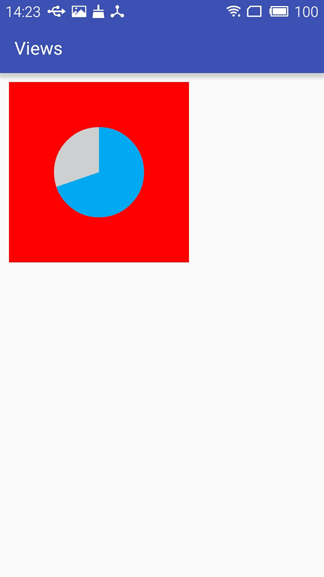
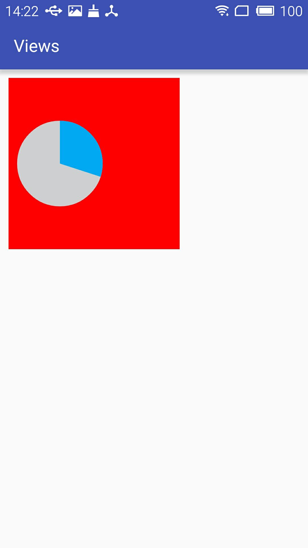
lee:percent_background_color="@color/gray"
lee:percent_circle_gravity="left"
lee:percent_circle_progress="30"
lee:percent_circle_radius="50dp"
lee:percent_progress_color="@color/blue" />
</LinearLayout>
为属性集设置一个属性集名称,我这里用的lee,我这是因为实在想不起使用什么属性集名称了,建议在真正的项目中使用项目的缩写,比如微信可能就是使用wx。
4.)自定义控件中如何获取自定义属性
每一个属性集合编译之后都会对应一个styleable对象,通过styleable对象获取TypedArray typedArray,然后通过键值对获取属性值,这点有点类似SharedPreference的取法。
  TypedArray typedArray = context.obtainStyledAttributes(attrs, R.styleable.PercentView);
    if (typedArray != null) {
        backgroundColor = typedArray.getColor(R.styleable.PercentView_percent_background_color, Color.GRAY);
        progressColor = typedArray.getColor(R.styleable.PercentView_percent_progress_color, Color.BLUE);
        radius = typedArray.getDimension(R.styleable.PercentView_percent_circle_radius, 0);
        progress = typedArray.getInt(R.styleable.PercentView_percent_circle_progress, 0);
        gravity = typedArray.getInt(R.styleable.PercentView_percent_circle_gravity, CENTER);
        typedArray.recycle();
     }
5.)完整示例
public class PercentView extends View {
    private final static String TAG = PercentView.class.getSimpleName();
    private Paint mPaint;
    private int backgroundColor = Color.GRAY;
    private int progressColor = Color.BLUE;
    private float radius;
    private int progress;
    private float centerX = 0;
    private float centerY = 0;
    public static final int LEFT = 0;
    public static final int TOP = 1;
    public static final int CENTER = 2;
    public static final int RIGHT = 3;
    public static final int BOTTOM = 4;
    private int gravity = CENTER;
    private RectF rectF;  //用于定义的圆弧的形状和大小的界限

    public PercentView(Context context) {
        super(context);
        init();
    }

    public PercentView(Context context, AttributeSet attrs) {
        super(context, attrs);
        initParams(context, attrs);
        init();
    }

    public PercentView(Context context, AttributeSet attrs, int defStyleAttr) {
        super(context, attrs, defStyleAttr);
        initParams(context, attrs);
        init();
    }

    private void init() {
        mPaint = new Paint();
        mPaint.setAntiAlias(true);
        rectF = new RectF();
    }

    private void initParams(Context context, AttributeSet attrs) {
        mPaint = new Paint();
        mPaint.setAntiAlias(true);
        rectF = new RectF();
        TypedArray typedArray = context.obtainStyledAttributes(attrs, R.styleable.PercentView);
        if (typedArray != null) {
            backgroundColor = typedArray.getColor(R.styleable.PercentView_percent_background_color, Color.GRAY);
            progressColor = typedArray.getColor(R.styleable.PercentView_percent_progress_color, Color.BLUE);
            radius = typedArray.getDimension(R.styleable.PercentView_percent_circle_radius, 0);
            progress = typedArray.getInt(R.styleable.PercentView_percent_circle_progress, 0);
            gravity = typedArray.getInt(R.styleable.PercentView_percent_circle_gravity, CENTER);
            typedArray.recycle();
        }
    }

    @Override
    protected void onMeasure(int widthMeasureSpec, int heightMeasureSpec) {
        super.onMeasure(widthMeasureSpec, heightMeasureSpec);
        int widthMode = MeasureSpec.getMode(widthMeasureSpec);
        int widthSize = MeasureSpec.getSize(widthMeasureSpec);
        int heightMode = MeasureSpec.getMode(heightMeasureSpec);
        int heightSize = MeasureSpec.getSize(heightMeasureSpec);
        Log.e(TAG, "onMeasure--widthMode-->" + widthMode);
        switch (widthMode) {
            case MeasureSpec.EXACTLY://
                break;
            case MeasureSpec.AT_MOST:
                break;
            case MeasureSpec.UNSPECIFIED:
                break;
        }
        Log.e(TAG, "onMeasure--widthSize-->" + widthSize);
        Log.e(TAG, "onMeasure--heightMode-->" + heightMode);
        Log.e(TAG, "onMeasure--heightSize-->" + heightSize);
        int with = getWidth();
        int height = getHeight();
        Log.e(TAG, "onDraw---->" + with + "*" + height);
        centerX = with / 2;
        centerY = with / 2;
        switch (gravity) {
            case LEFT:
                centerX = radius + getPaddingLeft();
                break;
            case TOP:
                centerY = radius + getPaddingTop();
                break;
            case CENTER:
                break;
            case RIGHT:
                centerX = with - radius - getPaddingRight();
                break;
            case BOTTOM:
                centerY = height - radius - getPaddingBottom();
                break;
        }
        float left = centerX - radius;
        float top = centerY - radius;
        float right = centerX + radius;
        float bottom = centerY + radius;
        rectF.set(left, top, right, bottom);
    }

    @Override
    protected void onLayout(boolean changed, int left, int top, int right, int bottom) {
        super.onLayout(changed, left, top, right, bottom);
        Log.e(TAG, "onLayout");
    }

    @Override
    protected void onDraw(Canvas canvas) {
        super.onDraw(canvas);
        mPaint.setColor(backgroundColor);
        // FILL填充, STROKE描边,FILL_AND_STROKE填充和描边
        mPaint.setStyle(Paint.Style.FILL_AND_STROKE);
        canvas.drawCircle(centerX, centerY, radius, mPaint);
        mPaint.setColor(progressColor);

        double percent = progress * 1.0 / 100;
        int angle = (int) (percent * 360);
        canvas.drawArc(rectF, 270, angle, true, mPaint);  //根据进度画圆弧
    }
}
运行结果:
根据不同的配置显示的两种效果
小结:
通过自定义属性可以达到自定义的控件也能像原生的控件一样实现可配置。但是在实际的项目开发中,像本文介绍的这种自定义控件使用频率并不是最高的,使用频率较高的是通过自定义一个组合控件的方式,来达到布局文件的复用,以减少项目维护成本以及开发成本,下篇文章将重点介绍如何自定义控件组合。