声明:本文为原创文章,如需转载,请注明来源WAxes,谢谢!
虽然现在很多浏览器都还不支持css3的3D转换,不过估计也已经有很多人都有玩css3的3D了。。。。。。所以我这篇也就相当于水一下了,哈哈。
用css3写3D立方体用到的属性不多,就那么几个:perspective,transform-style,以及transform。目前来说能完美支持3D的好像就只有chrome以及safari,也就是webkit引擎。所以本文的css3代码都只加了webkit前缀,因为产生3D的关键属性perspective其他浏览器都不支持,所以其他浏览器是应该是看不了3D的,所以看本文的例子请用chrome或者safari来看哦。
好吧,废话不多说,进入主题:先上DEMO: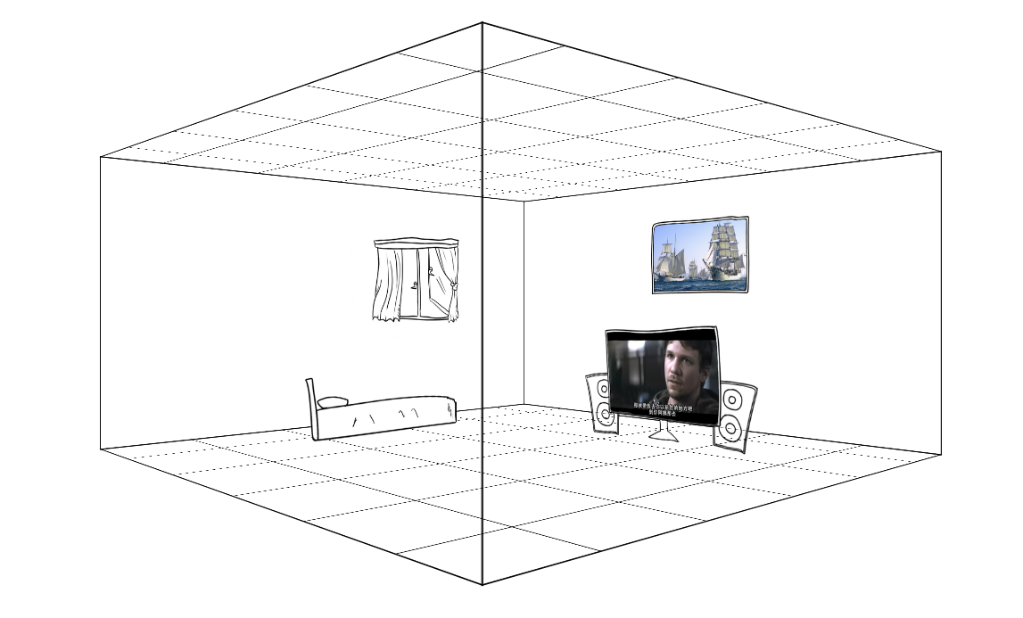 链接:3Dhouses (不要吐槽图片,因为找不到合适的素材,楼主只能自己画了,不过画是次要的哈,别介意)
【html的布局】
先说html该如何来布局:
<div class="cube">
        <div class="ant">
            <div class="face face-right"><img src="image/face-right.png" alt=""></div>
            <div class="face face-left"><img src="image/face-left.png" alt=""></div>
            <div class="face face-in"><img src="image/face-in.png" alt=""></div>
            <div class="face face-out"><img src="image/face-out.png" alt=""></div>
            <div class="face face-bottom"><img src="image/face-bottom.png" alt=""></div>
            <div class="face face-top"><img src="image/face-bottom.png" alt=""></div>

            <div class="face nohidden face-right"></div>
            <div class="face nohidden face-left"></div>
            <div class="face nohidden face-in"></div>
            <div class="face nohidden face-out"></div>

            <div class="house tv"><img src="image/tv.png" alt=""></div>
            <div class="house bed"><img src="image/bed.png" alt=""></div>
        </div>
    </div>
一个立方体总共有六个面,所以,我们首先需要六个div:上面的faceout这些就是六个面。下面的nohidden类的div是我为了产生边,提升立体感加上去的,因为上面的那几个面有加backface-visibility: hidden属性,所以当div背对我们的时候是看不见的(当然,连border也是看不见咯,具体你可以自己测试一下),加了下面那些div就是为了营造更强的空间感吧,楼主表达能力有限,如果不是很懂,待会我会把所有代码贴出,可以拷贝回去自己测试一下,还是挺好玩的。
好吧,回归主题,立方体是六个面,同时他还需要一个外壳,如果你想让整个立方体动起来,就需要一个外壳,让六个面的位置定好后,然后让那个外壳动起来,里面的六个面位置也就跟着变了,这其中涉及一个很关键的属性:transform-style,这个属性是使被转换的子元素保留其 3D 转换,意思就是如果没有这个属性,当你的外壳转动起来的时候,内部的六个面的3D效果就会消失了,所以一定要在外壳上加上:transform-style: preserve-3d。
除了外壳外,还需要一个3D区域,也就是上面的cube类div。在cube里加上perspective属性就可以让cube里面产生3D效果,上面也有说过perspective是设置元素被查看位置的视图,他能让里面的元素产生透视效果,也就是3D。这个属性如今只有webkit引擎支持。。
【CSS】
html写好后,就开始写css:
.cube{
            width: 800px;
            height: 400px;
            -webkit-perspective: 1000px;
            margin:200px auto 0 auto;
        }

        .ant{
            width: 100%;
            height: 100%;
            -webkit-transform-style: preserve-3d;
            -webkit-transform: translate3d(0,0,-200px) rotateY(0deg);
            -webkit-animation:xuanzhuan 10s infinite linear;
        }

        .face{
            width: 100%;
            height: 100%;
            position: absolute;
            border:1px solid;
            -webkit-backface-visibility: hidden;
            /*background-color: #FFF;*/
            overflow: hidden;
            z-index: 10;
        }

        .nohidden{
            -webkit-backface-visibility: visible;
        }
        .face img{
            width: 100%;
            height: 100%;

        }

        .face-right{
            -webkit-transform: translate3d(400px , 0 , 0px) rotateY(-90deg);
        }
        .face-left{
            -webkit-transform: translate3d(-400px , 0 , 0px) rotateY(90deg);
        }
        .face-in{
            -webkit-transform: translate3d(0px , 0 , -400px) rotateY(0deg);
        }
        .face-out{
            -webkit-transform: translate3d(0px , 0 , 400px) rotateY(180deg);
        }
        .face-bottom{
            height: 800px;
            -webkit-transform: translate3d(0px , 0px , 0px) rotateX(90deg);
        }
        .face-top{
            height: 800px;
            -webkit-transform: translate3d(0px , -400px , 0px) rotateX(-90deg);
        }

        .house{
            position: absolute;
            height: 200px;
            z-index: 100;
        }
        .tv{
            -webkit-transform: translate3d(200px , 230px , 300px) rotateY(180deg);
        }
        .bed{
            height: 100px;
            -webkit-transform: translate3d(550px , 310px , 0px) rotateY(-90deg);
        }

        .house img{
            height: 100%;
        }

        @-webkit-keyframes xuanzhuan{
            from{
                -webkit-transform: translate3d(0,0,-200px) rotateY(0deg);
            }
            to{
                -webkit-transform: translate3d(0,0,-200px) rotateY(360deg);
            }
        }
perspective和transform-style都说过了,就不说了,说一下六个面的布置,就用到了transform方法了,其实也很容易理解:就是通过transform里的translate3d以及rotate旋转来调整六个面的位置和角度,同时提醒一下,写transform时,先写translate再写rotate和先写rotate再写translate出来的效果是不一样的,虽然两个都可以做出3D效果,但是参数是不一样的,前者可能更容易理解。先平移再旋转。而后者是旋转了之后,不能用xy平移,而是通过z轴才行了。
当CSS也写好后,就可以加个动画效果看看了,这个就不多说了,就是通过animation很容易做的。
下面贴出完整代码


<!DOCTYPE html>
<html>
<head>
    <meta http-equiv="Content-Type" content="text/html;charset=UTF-8">
    <meta name="viewport" content="initial-scale=1.0,minimum-scale=1.0,maximum-scale=1.0,user-scalable=0">
    <style>
        body{
            margin:0;
            padding:0;
        }
        .cube{
            width: 800px;
            height: 400px;
            -webkit-perspective: 1000px;
            margin:200px auto 0 auto;
        }

        .ant{
            width: 100%;
            height: 100%;
            -webkit-transform-style: preserve-3d;
            -webkit-transform: translate3d(0,0,-200px) rotateY(0deg);
            -webkit-animation:xuanzhuan 10s infinite linear;
        }

        .face{
            width: 100%;
            height: 100%;
            position: absolute;
            border:1px solid;
            -webkit-backface-visibility: hidden;
            /*background-color: #FFF;*/
            overflow: hidden;
            z-index: 10;
        }

        .nohidden{
            -webkit-backface-visibility: visible;
        }
        .face img{
            width: 100%;
            height: 100%;

        }

        .face-right{
            -webkit-transform: translate3d(400px , 0 , 0px) rotateY(-90deg);
        }
        .face-left{
            -webkit-transform: translate3d(-400px , 0 , 0px) rotateY(90deg);
        }
        .face-in{
            -webkit-transform: translate3d(0px , 0 , -400px) rotateY(0deg);
        }
        .face-out{
            -webkit-transform: translate3d(0px , 0 , 400px) rotateY(180deg);
        }
        .face-bottom{
            height: 800px;
            -webkit-transform: translate3d(0px , 0px , 0px) rotateX(90deg);
        }
        .face-top{
            height: 800px;
            -webkit-transform: translate3d(0px , -400px , 0px) rotateX(-90deg);
        }

        .house{
            position: absolute;
            height: 200px;
            z-index: 100;
        }
        .tv{
            -webkit-transform: translate3d(200px , 230px , 300px) rotateY(180deg);
        }
        .bed{
            height: 100px;
            -webkit-transform: translate3d(550px , 310px , 0px) rotateY(-90deg);
        }

        .house img{
            height: 100%;
        }

        @-webkit-keyframes xuanzhuan{
            from{
                -webkit-transform: translate3d(0,0,-200px) rotateY(0deg);
            }
            to{
                -webkit-transform: translate3d(0,0,-200px) rotateY(360deg);
            }
        }
    </style>
    <title>Document</title>
</head>
<body>
    <div class="cube">
        <div class="ant">
            <div class="face face-right"><img src="image/face-right.png" alt=""></div>
            <div class="face face-left"><img src="image/face-left.png" alt=""></div>
            <div class="face face-in"><img src="image/face-in.png" alt=""></div>
            <div class="face face-out"><img src="image/face-out.png" alt=""></div>
            <div class="face face-bottom"><img src="image/face-bottom.png" alt=""></div>
            <div class="face face-top"><img src="image/face-bottom.png" alt=""></div>

            <div class="face nohidden face-right"></div>
            <div class="face nohidden face-left"></div>
            <div class="face nohidden face-in"></div>
            <div class="face nohidden face-out"></div>

            <div class="house tv"><img src="image/tv.png" alt=""></div>
            <div class="house bed"><img src="image/bed.png" alt=""></div>
        </div>
    </div>
</body>
</html>
如果能做出上面那个立方体的时候,网上那些看似很炫的css3的3D轮播图也就很容易做出来了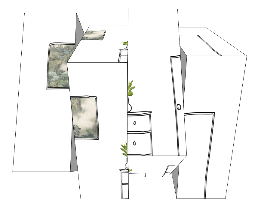 3D轮播图
3D轮播图
这个的原理就不解释了,自己看代码吧,都一个样的,每一块就是一个3D模型,我这个只是做出了效果,没去做轮播了,做轮播也很容易,用js控制更换图片的src就行了。对了,还有一点就是注意一下每个块的排序,我之前以为用z-index可以,但是好像不行,就只能通过排序来调整各个块的层级关系了。
下面贴出3D轮播的代码:
<!DOCTYPE html PUBLIC "-//W3C//DTD XHTML 1.0 Transitional//EN" "http://www.w3.org/TR/xhtml1/DTD/xhtml1-transitional.dtd">
<html xmlns="http://www.w3.org/1999/xhtml" xml:lang="en">
<head>
    <meta http-equiv="Content-Type" content="text/html;charset=UTF-8">
    <title>3D轮播图</title>
    <style>
        body{margin:0;padding:0;}
        .cube{
            width: 800px;
            height: 600px;
            -webkit-perspective: 1000px;
            margin:150px auto 0 auto;
            position: relative;
        }
        .ant{
            width: 200px;
            height: 100%;
            display: block;
            -webkit-transform-style: preserve-3d;
            -webkit-transform: translate3d(0,0,-400px);
            position:absolute;
        }

        .ant-1{left: 0px;}
        .ant-2{left: 200px;}
        .ant-3{left: 400px;}
        .ant-4{left: 600px;}
        .ant-1 img{left: 0px;}
        .ant-2 img{left: -200px;}
        .ant-3 img{left: -400px;}
        .ant-4 img{left: -600px;}

        .face{
            width: 100%;
            height: 100%;
            overflow: hidden;
            position: absolute;
            border:1px solid;
        }
        .face img{
            display: block;
            width: 800px;
            height: 100%;
            position: absolute;
        }
        .face-top{
            -webkit-transform: translate3d(0,-300px,0px) rotateX(90deg);
        }
        .face-bottom{
            -webkit-transform: translate3d(0,300px,0px) rotateX(-90deg);
        }
        .face-in{
            -webkit-transform: translate3d(0,0,-300px) rotateX(180deg);
        }
        .face-out{
            -webkit-transform: translate3d(0,0,300px) rotateX(0deg);
        }
        .face-left{
            background-color: #999;
            width: 600px;
            -webkit-transform: translate3d(-300px,0,0px) rotateY(90deg);
        }
        .face-right{
            background-color: #999;
            width: 600px;
            -webkit-transform: translate3d(-100px,0,0px) rotateY(-90deg);
        }

        .Animate{
            -webkit-animation:xuanzhuan 10s infinite linear;
        }

        @-webkit-keyframes xuanzhuan{
            0%{
                -webkit-transform: translate3d(0,0,-400px) rotateX(0deg);
            }
            50%{
                -webkit-transform: translate3d(0,0,-400px) rotateX(-360deg);
            }
            100%{
                -webkit-transform: translate3d(0,0,-400px) rotateX(0deg);
            }
        }
    </style>
    <script>
        var PIC_NUM = 5; //图片分成的块数
        window.onload = function(){
            var index = 1;
            document.querySelector(".ant-"+index).className += " Animate";
            setTimeout(function(){
                index++;
                document.querySelector(".ant-"+index).className += " Animate";
                setTimeout(function(){
                    index++;
                    document.querySelector(".ant-"+index).className += " Animate";
                    setTimeout(function(){
                        index++;
                        document.querySelector(".ant-"+index).className += " Animate";
                    },600)
                },600)
            } , 600);
        }
    </script>
</head>
<body>
    <ul class="cube">
        <li class="ant ant-1">
            <div class="face face-top">
                <img src="image/face-in.png" alt="" />
            </div>
            <div class="face face-bottom">
                <img src="image/face-in.png" alt="" />
            </div>
            <div class="face face-left"></div>
            <div class="face face-right"></div>
            <div class="face face-in">
                <img src="image/face-in.png" alt="" />
            </div>
            <div class="face face-out">
                <img src="image/face-in.png" alt="" />
            </div>
        </li>
        <li class="ant ant-2">
            <div class="face face-top">
                <img src="image/face-in.png" alt="" />
            </div>
            <div class="face face-bottom">
                <img src="image/face-in.png" alt="" />
            </div>
            <div class="face face-left"></div>
            <div class="face face-right"></div>
            <div class="face face-in">
                <img src="image/face-in.png" alt="" />
            </div>
            <div class="face face-out">
                <img src="image/face-in.png" alt="" />
            </div>
        </li>
        <li class="ant ant-4">
            <div class="face face-top">
                <img src="image/face-in.png" alt="" />
            </div>
            <div class="face face-bottom">
                <img src="image/face-in.png" alt="" />
            </div>
            <div class="face face-left"></div>
            <div class="face face-right"></div>
            <div class="face face-in">
                <img src="image/face-in.png" alt="" />
            </div>
            <div class="face face-out">
                <img src="image/face-in.png" alt="" />
            </div>
        </li>
        <li class="ant ant-3">
            <div class="face face-top">
                <img src="image/face-in.png" alt="" />
            </div>
            <div class="face face-bottom">
                <img src="image/face-in.png" alt="" />
            </div>
            <div class="face face-left"></div>
            <div class="face face-right"></div>
            <div class="face face-in">
                <img src="image/face-in.png" alt="" />
            </div>
            <div class="face face-out">
                <img src="image/face-in.png" alt="" />
            </div>
        </li>
    </ul>
</body>
</html>
没有用js封装成轮播图模块也是为了让代码更清晰易懂吧。。。。水完收工=。=|||