在制作网页的过程中少不了绘制类似图片的三角形箭头效果 ,虽然工程量不大,但是确实麻烦。在学习的过程中,总结了以下三种方法,以及相关的例子。
一、三种绘制三角形箭头方法
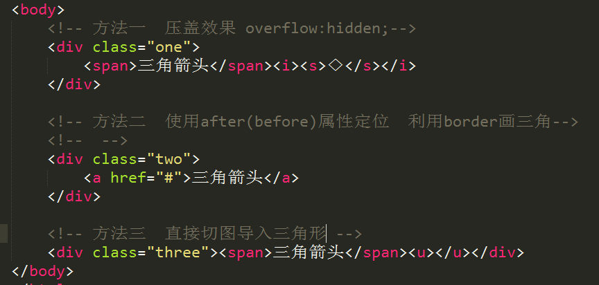
1、方法一:利用overflow:hidden;属性。
 1 div.one{
 2             margin-top: 30px;
 3              150px;
 4             /* height: 60px;*/   /*文本高度由内容撑起*/
 5             background-color: pink;
 6
 7         }
 8         i{
 9             font-style: normal;
10             display: inline-block;
11              16px;
12             height: 8px;  /*高度为s便签的一半*/
13             background-color: pink;
14
15             overflow: hidden;  /*要点:设置隐藏属性 超出部分不显示*/
16
17             position: relative;  /*微调  控制箭头在中间*/
18             top: 3px;
19
20         }
21         s{
22             text-decoration: none;
23             display: inline-block;
24              16px;
25             height: 16px;
26             font-size: 16px;
27             line-height: 16px; /*设置字体 和 行高改变◇属性*/
28
29             /*利用微调 控制箭头方向 未设置向上*/
30             position: relative;
31             top: -9px;
32         }
2、方法二:使用after(before)属性定位 利用border画三角。
 1 /*方法二*/
 2         div.two{
 3             margin-top: 30px;
 4              150px;
 5             /*height: 60px;*/
 6             background-color: #ddd;
 7         }
 8         a{
 9             text-decoration: none;
10         }
11         /*使用伪元素a:after*/
12         /*可以再制作一个与背景色相同的三角利用定位覆盖  制作方法一的效果*/
13         a:after{
14             content: '';
15             display: inline-block;
16
17             /*利用边框boeder设置*/
18             /*border-left:5px solid transparent;
19               border-top:5px solid #fff;
20               border-right:5px solid transparent;
21               border-bottom-0px;*/
22
23               border:5px solid transparent;
24               border-top-color: #fff;
25
26               position: relative;  /*微调位置*/
27               top: 5px;
28               left: 1px;
29
30                0;
31               height: 0;
32         }
3、方法三:直接使用切图导入三角形图标
 1     /*方法三*/
 2         div.three{
 3             margin-top: 30px;
 4              150px;
 5             /*height: 60px;*/
 6             background-color: #ddd;
 7         }
 8         div.three u{
 9             display: inline-block;
10              10px;
11             height: 7px;
12             background:url(jiantou.png) 2px -1389px no-repeat;
13             position: relative;
14             top: 2px;
15         }
以上三种方法的显示效果如下:
二、相关使用案例
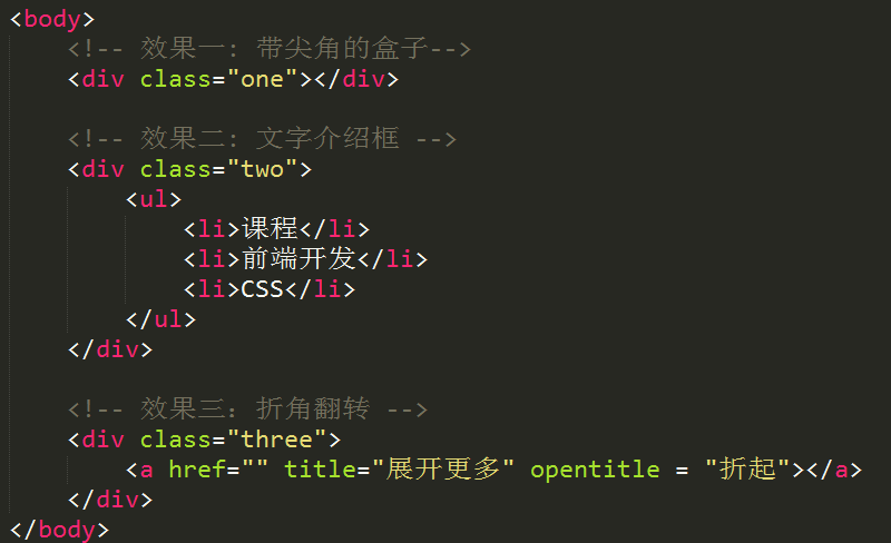
1、效果一:带尖角的盒子(聊天框)
 1 .one{
 2              100px;
 3             height: 50px;
 4             margin: 30px;
 5             background-color: pink;
 6             border:5px solid red;
 7             position: relative;
 8             border-radius: 10px;
 9         }
10         .one:before, .one:after{
11             content: '';
12              0px;
13             height: 0px;
14             border:0px solid transparent;
15             position: absolute;
16             top: 50px;
17             left: 10px;
18         }
19         .one:before{
20             border- 16px;
21               border-top-color: red;
22               /*left: -5px;*/
23         }
24         .one:after{
25             border- 11px;
26               border-top-color: pink;
27               /*top: 5px;*/
28               left: 15px;
29         }
2、文字介绍框
 1 .two{
 2             margin: 30px;
 3              400px;
 4             height: 100px;
 5             /*background-color: #ddd;*/
 6             border:1px solid red;
 7             position: relative;
 8         }
 9         .two ul{
10             margin:30px;
11         }
12         .two ul li{
13             float: left;
14             /* 100px;*/
15             height: 26px;
16             line-height: 26px;
17             text-align: center;
18             padding-right: 13px;
19             background-color: #eee;
20         }
21
22         .two ul li:after{
23             content: '';
24             border-left:13px solid transparent;
25               border-top:13px solid #fff;
26               border-bottom:13px solid #fff;
27               border-right-0px;
28               position: absolute;
29         }
3、翻转效果
 1 body{
 2             background-color: #333;
 3         }
 4         a{
 5             display: block;
 6              120px;
 7             height: 32px;
 8             line-height:32px;
 9             text-align: center;
10             margin: 0 auto;
11             background-color: black;
12             color: #fff;
13             text-decoration: none;
14             font-size: 14px;
15         }
16         /*初始效果*/
17         a:before{
18             content: attr(title);
19         }
20         a:after{
21             content: '';
22             display: inline-block;
23             border-left:5px solid transparent;
24               border-top:5px solid #fff;
25               border-right:5px solid transparent;
26               border-bottom-0px;
27               position: relative;
28               top: -2px;
29               left: 3px;
30         }
31         /*点击效果*/
32         a:hover:before{
33             content: attr(opentitle);
34         }
35         a:hover:after{
36             border-left:5px solid transparent;
37               border-bottom:5px solid #fff;
38               border-right:5px solid transparent;
39               border-top-0px;
40         }
效果展示:


end...