现代浏览器基本支持CSS3,但是一些旧版本的浏览器还是需要添加前缀的。像box-shadow, border-radius这类属性,目前较新版本的浏览器都是不需要前缀的(包括IE9),但是,有些CSS3属性,例如渐变,前缀少不了,每次都需要像盖高楼一样堆叠CSS3代码,如下图:

.bg {
        400px;
        height:177px;
        margin:70px auto 0;
        padding-top:73px;
        position:relative;
        background-image:-webkit-linear-gradient(top,rgb(255,255,255),rgb(242,242,242));
        background-image:-moz-linear-gradient(top,rgb(255,255,255),rgb(242,242,242));
        background-image:-ms-linear-gradient(top,rgb(255,255,255),rgb(242,242,242));
        background-image:-o-linear-gradient(top,rgb(255,255,255),rgb(242,242,242));
        background-image:linear-gradient(top,rgb(255,255,255),rgb(242,242,242));
        box-shadow:0 3px 3px rgba(21,62,78,0.8);
}
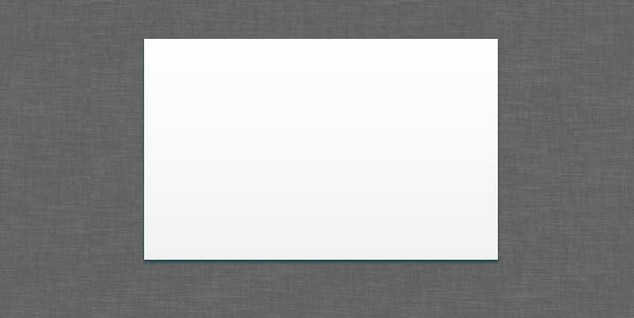
代码效果如下,点击这里查看演示:
那么如何省去CSS3中前缀“-moz”、“-webkit”、“-o”、“-ms”呢,需要使用prefixfree脚本来实现。
一,下面说说如何使用prefixfree脚本:
下面是官方网站截图:

那么如何使用该脚本呢?下面是截至官网的两个DEMO,使用环境为Chrome,所以建议下载最新版的Chrome浏览器对演示地址进行浏览,希望能对使用提供帮助:
有前缀官方DEMO,未使用prefixfree脚本:
@-webkit-keyframes rotate {
    from { -webkit-transform: rotate(15deg) }
    to { -webkit-transform: rotate(375deg) }
}

.download {
   position: absolute;
   top: 2em;
   left: 1em;
    6em;
   height: 6em;
   padding: 1em 0;
   background: #80A060;
   background-image: linear-gradient(90deg, transparent, rgba(10,0,0,.3)),linear-gradient(transparent, transparent);
   color: white;
   line-height: 1;
   font-size: 140%;
   text-align: center;
   text-decoration: initial;
   text-shadow: .08em .08em .2em rgba(0,0,0,.6);
   border-radius: 50%;
   box-shadow: .1em .2em .4em -.2em black;
   box-sizing: border-box;
   -webkit-transform: rotate(15deg);
   -webkit-animation: rotate;
   cursor: -webkit-zoom-in;
}

:read-write {}
在Chrome中的效果如下图, 如你使用的是最新版的Chrome浏览器也可以点击这里,查看演示页面:

无前缀官方DEMO,使用prefixfree.js脚本后能达到同意的效果:
<script src="prefixfree.min.js" type="text/javascript"></script><!--引入prefixfree脚本-->
<style>
@keyframes rotate {
    from { transform: rotate(15deg) }
    to { transform: rotate(375deg) }
}

.download {
   position: absolute;
   top: 2em;
   left:1em;
    6em;
   height: 6em;
   padding: 1em 0;
   background: #80A060;
   background-image: linear-gradient(90deg, transparent, rgba(10,0,0,.3)),linear-gradient(transparent, transparent);
   color: white;
   line-height: 1;
   font-size: 140%;
   text-align: center;
   text-decoration: initial;
   text-shadow: .08em .08em .2em rgba(0,0,0,.6);
   border-radius: 50%;
   box-shadow: .1em .2em .4em -.2em black;
   box-sizing: border-box;
   transform: rotate(15deg);
   animation: rotate;
   cursor: zoom-in;
}

:read-write {}
</style>
在Chrome中的效果如下图, 能达到使用前缀同样的效果,如你使用的是最新版的Chrome浏览器也可以点击这里,查看演示页面:

二,下面介绍Animatable 动画效果应用,该应用需与prefixfree脚本一起使用:
话不多说直接上截图吧:
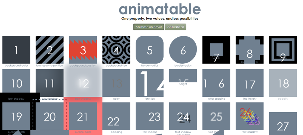
是不是有种百花齐放的感觉呢!
下面是官方演示地址:
http://leaverou.github.io/animatable/
如网页响应慢的话,可以查看下面的演示的:
http://www.li-cheng.cn/demo/animatable-master/index.html
Animatable项目页面动画效果的批量实现原理如下:
1. 遍历页面上每个含有data-property属性的a元素;
2. 根据dom元素上的data-property值,form值和to值组装无前缀的CSS3 animate样式代码;
3. 以style节点元素的形式将组装的CSS代码append到head标签中,因页面调用了prefixfree.js脚本,于是各个浏览器下的animate CSS被渲染,效果呈现。
以下是源码介绍,:
function $(expr, con) { return (con || document).querySelector(expr); }
function $$(expr, con) { return [].slice.call((con || document).querySelectorAll(expr)); }

var css = [];


//遍历页面中 a标签中含有 data-property 属性的所有元素
$$('a[data-property]').forEach(function(el, i){
    var property = el.getAttribute('data-property'),
        from = el.getAttribute('data-from'),
        to = el.getAttribute('data-to');

    var id = property, i = 1;

    while(document.getElementById(id)) {
        id = property + '/' + ++i;
    }

    el.id = id;
    el.href = '#' + id;

    el.title = property + ' from ' + from + ' to ' + to;

    var selector = '#' + id.replace(/([^w-])/g, '\$1'),
        ident = id.replace(/([^w-])/g, '-');

    //创建css3样式代码,push到css数组中
    css.push('@keyframes ' + ident + '{',
            'from{' + property + ':' + from + '}',
            'to{' + property + ':' + to + '}}',
            selector + ' { animation: ' + ident + ' 1s infinite alternate;' + property + ':' + from + '}');
});

var style = document.createElement('style');
style.textContent = css.join('
');
StyleFix.styleElement(style);
document.head.appendChild(style);  //在页面中添加 style标签

setTimeout(onhashchange = function() {
    var target = location.hash? $(location.hash.replace(/([^w-#])/g, '\$1')) : null;

    if(!target) {
        document.body.className = 'home';
        return;
    }

    document.body.className = 'in-page';

    var info = $('#info'),
        previous = target.previousElementSibling,
        next = target.nextElementSibling,
        author = target.getAttribute('data-author') || 'leaverou';

    $('h1', info).innerHTML = target.getAttribute('data-property');
    $('dd:first-of-type', info).innerHTML = target.getAttribute('data-from');
    $('dd:nth-of-type(2)', info).innerHTML = target.getAttribute('data-to');
    $('dd:nth-of-type(3)', info).innerHTML = '<a href="http://twitter.com/' + author + '" target="_blank"><img src="http://twitter.com//api/users/profile_image?screen_name=' + author + '&size=mini"/>@' + author + '</a>';

    $('a[title="Previous"]', info).setAttribute('href', '#' + (previous? previous.id : ''));
    $('a[title="Next"]', info).setAttribute('href', '#' + (next? next.id : ''));

    setTimeout(function() {
        if(2*target.offsetLeft + target.offsetWidth < innerWidth) {
            info.style.left = target.offsetLeft + target.offsetWidth + 30 + 'px';
        }
        else {
            info.style.left = target.offsetLeft - info.offsetWidth - 30 + 'px';
        }

        info.style.top = target.offsetTop + 'px';
    }, 10);
}, 50);

onkeyup = function(evt) {
    var key = evt.keyCode;

    switch (key) {
        case 27:
            location.hash = '';
            break;
        case 37:
        case 38:
            location.hash = location.hash? $('a[title="Previous"]').hash : $('a[data-property]:last-child').hash;
            break;
        case 39:
        case 40:
            location.hash = location.hash? $('a[title="Next"]').hash : $('a[data-property]:first-child').hash;
    }
};
文章参考了如下地址,有兴趣的可以点击查看:
http://www.zhangxinxu.com/wordpress/2011/11/css3-prefixfree-js-animatable/
prefixfree官方地址:
http://leaverou.github.io/prefixfree/
Animatable官方地址:
http://leaverou.github.io/animatable/