Python 数据分析中常用的可视化工具
1 Matplotlib
用于创建出版质量图表的绘图工具库,目的是为 Python 构建一个 Matlab 式的绘图接口。
1.1 安装
- Anaconada 自带。
- pip 安装
pip install matplotlib
1.2 引用
import matplotlib.pyplot as plt
1.3 常用方法
figure
Matplotlib 的图像均位于 figure 对象中
- 创建 figure
fig = plt.figure()
subplot
fig.add_subplot(a,b,c)
- a,b 表示讲 fig 分割成 axb 的区域
- c 表示当前选中要操作的区域,
注意 ·:从 1 开始编号 - 返回的是 AxesSubplot 对象
- plot 绘图的区域是最后一次指定 subplot 的位置(jupyter 里不能正确显
示) - 同时返回新创建的 figure 和 subplot 对象数组
fig,subplot arr=plt.subplots(2,2)在 jupyter 里可以正常显示,推荐使用这种方式创建多个图表
plt.plot()
作图方法。
# 在指定 subplot 作图
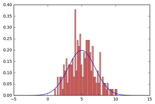
import scipy as sp
from scipy import stats
x = np.linspace(-5, 15, 50)
#print x.shape
# 绘制高斯分布
plt.plot(x, sp.stats.norm.pdf(x=x, loc=5, scale=2))
# 叠加直方图
plt.hist(sp.stats.norm.rvs(loc=5, scale=2, size=200), bins=50, normed=True, color='red', alpha=0.5)
plt.show()
绘制直方图
plt.hist(np.random.randn(100), bins=10, color='b', alpha=0.3)
绘制散点图
x = np.arange(50)
y = x + 5 * np.random.rand(50)
plt.scatter(x, y)
柱状图
x = np.arange(5)
y1, y2 = np.random.randint(1, 25, size=(2, 5))
width = 0.25
ax = plt.subplot(1,1,1)
ax.bar(x, y1, width, color='r')
ax.bar(x+width, y2, width, color='g')
ax.set_xticks(x+width)
ax.set_xticklabels(['a', 'b', 'c', 'd', 'e'])
plt.show()
矩阵绘图
m = np.random.rand(10,10)
print(m)
plt.imshow(m, interpolation='nearest', cmap=plt.cm.ocean)
plt.colorbar()
plt.show()
颜色 标记 线型
ax.plot(x,y,'r--') == ax.plotx,y,linestyle=--',color=r')
刻度、标签、图例
- 设置刻度范围
plt.xlim(),plt.ylim()ax.set_xlim(),ax.set_ylim()
- 设置显示的刻度
plt.xticks(),plt.yticks()ax.set_xticks(),ax.set yticks)
- 设置刻度标签
ax.set_xticklabels(),ax.set yticklabels()
- 设置坐标轴标签
- `ax.set_xlabel(),ax.set ylabel0()
- 设置标题
ax.set title()
- 图例
ax.plot(label=legend')ax.legend),plt.legend()loc=‘best'自动选择放置图例最佳位置
matplotlib 设置
plt.rc()
1.4 3D 绘图
matplotlib 支持 3D 绘图
下面代码给出了不同年份中,不同国家的平均寿命。
import matplotlib.pyplot as plt
from mpl_toolkits.mplot3d import Axes3D
import pandas as pd
import numpy as np
import matplotlib; matplotlib.style.use('ggplot')

%matplotlib inline

# 读取 csv 数据集
lexp = pd.read_csv('lexpectancy.csv')
lexp.dropna(inplace=True)
lexp.reset_index(inplace=True)
plot_data = lexp[['Country', '1960', '1970', '1980', '1990', '2000']][:3]
print(plot_data)

fig = plt.figure(figsize=(10, 8))
ax = fig.add_subplot(111, projection='3d')

country_list = plot_data['Country'].values.tolist()
year_list = ['1960', '1970', '1980', '1990', '2000']

for i, (color, z) in enumerate(zip(['r', 'g', 'b'], [0, 10, 20])):
    age_list = plot_data.iloc[i][1:].values.tolist()
    xs = np.arange(len(age_list))
    ys = age_list
    cs = [color] * len(age_list)
    ax.bar(xs, ys, zs=z, zdir='y', color=cs, alpha=0.8)


ax.set_xticklabels(year_list)
ax.set_yticks([0, 10, 20])
ax.set_yticklabels(country_list)

ax.set_xlabel('Year')
ax.set_ylabel('Country')
ax.set_zlabel('Age')
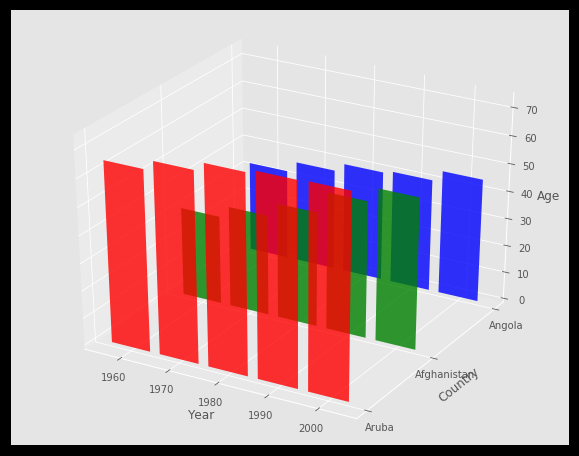
更多参考 mplot3d tutorial
2 Seaborn
什么是 Seaborn
- Python 中的一个制图工具库,可以制作出吸引人的、信息量大的统计图
- 在 Matplotlib 上构建,支持 numpy 和 pandas 的数据结构可视化,甚至是 scipy 和 statsmodels 的统计模型可视化
特点
- 多个 内置主题 及颜色主题
- 可视化 单一变量、二维变量 用于 比较 数据集中各变量的分布情况
- 可视化 线性回归模型 中的 独立变量 及不独立变量
- 可视化矩阵数据,通过聚类算法探究矩阵间的结构
- 可视化 时间序列数据 及不确定性的展示
- 可在 分割区域制图,用于复杂 的可视化
2.2 安装
conda 安装:conda install seaborn
pip 安装:pip install seaborn
2.3 引用
import seaborn as sns
2.4 数据集分布可视化
- 单变量分布
sns.distplot)- 直方图
sns.distplot(kde=False) - 核密度估计
sns.distplot(hist=False)或 sns.kdeplot) - 拟合参数分布
sns.distplot(kde=False,fit=)
- 直方图
- 双变量分布
- 散布图
sns.jointplot0 - 二维直方图
Hexbin sns.jointplot(kind=‘hex) - 核密度估计
sns.jointplot(kind=‘kde')
- 散布图
- 数据集中变量间关系可视化
sns.pairplot()
2.5 类别数据可视化
- 类别散布图
sns.stripplot()数据点会重叠sns.swarmplot()数据点避免重叠- hue 指定子类别
- 类别内数据分布
- 盒子图
sns.boxplot(),hue 指定子类别 - 小提琴图
sns.violinplot(),hue 指定子类别
- 盒子图
- 类别内统计图
- 柱状图
sns.barplot() - 点图
sns.pointplot()
- 柱状图
3 Bokeh
什么是 Bokeh
- 专门针对 Web 浏览器的交互式、可视化 Python 绘图库
- 可以做出像 D3.,js 简洁漂亮的交互可视化效果
特点
- 独立的 HTML 文档或服务端程序
- 可以处理大量、动态或数据流
- 支持 Python(或 Scala,R,Julia.)
- 不需要使用 Javascript
Bokeh 接口
- Charts:高层接口,以简单的方式绘制复杂的统计图
- Plotting:中层接口,用于组装图形元素
- Models:底层接口,为开发者提供了最大的灵活性
3.1 安装
conda 安装:conda install bokeh
pip 安装:pip install bokeh
3.2 引用
- 生成. html 文档
from bokeh.io import output file - 在 jupyter 中使用
from boken.io import output_notebook
3.3 bokeh.charts
引用和导入数据
# 引用
from bokeh.io import output_notebook, output_file, show
from bokeh.charts import Scatter, Bar, BoxPlot, Chord
from bokeh.layouts import row

import seaborn as sns

# 导入数据
exercise = sns.load_dataset('exercise')
# 在使用 Jupyter notebook 时设置
output_notebook()
散点图
p = Scatter(data=exercise, x='id', y='pulse', title='exercise dataset')
show(p)
柱状图
p = Bar(data=exercise, values='pulse', label='diet', stack='kind', title='exercise dataset')
show(p)
盒子图
box1 = BoxPlot(data=exercise, values='pulse', label='diet', color='diet', title='exercise dataset')
box2 = BoxPlot(data=exercise, values='pulse', label='diet', stack='kind', color='kind', title='exercise dataset')
show(row(box1, box2)) # 显示两张图
弦图 Chord
- 展示多个节点之间的联系
- 连线的粗细代表权重
chord1 = Chord(data=exercise, source="id", target="kind")
# value 设置以什么为粗细
chord2 = Chord(data=exercise, source="id", target="kind", value="pulse")

show(row(chord1, chord2))
更多参考:Bokeh 官网
3.4 bokeh.plotting
from bokeh.plotting import figure
import numpy as np

p = figure(plot_width=400, plot_height=400)
# 方框
p.square(np.random.randint(1,10,5), np.random.randint(1,10,5), size=20, color="navy")

# 圆形
p.circle(np.random.randint(1,10,5), np.random.randint(1,10,5), size=10, color="green")
show(p)
更多图形元素参考:Bokeh 官网