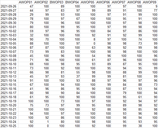
实例:绘制机器人过去days天的UPtime Trend Chart趋势变化图, 对小于90%的数值显示,可以明显的看出近期各机器人的机况状态,重点关注较低的。
import cx_Oracle
import xlrd
import xlwt
import matplotlib.pyplot as plt
import numpy as np
import pandas as pd
from matplotlib.ticker import FuncFormatter
import time
import datetime
#图表格式设置
plt.rcParams['font.sans-serif']=['SimHei']#中文支持
plt.rcParams['axes.unicode_minus']=False#显示负数
#百分比格式输出
def to_percent(temp, position):
  return '%1.0f'%(1*temp) + '%'
#数据库连接
conn=cx_Oracle.connect('用户名/密码@IP:端口/数据库')
c=conn.cursor()
#建立数据表
xl=xlwt.Workbook()
ws=xl.add_sheet("ROBOT_UPTIME")
date_day = []
robot=[]
xx=[]#中间变量
#sql查询机器人robot
def select_robotid():
    robotid=[]
    sql_rbtid=("select eqpid from 数据表 where eqptype='WIO'  "
            "group by eqpid order by substr(eqpid,5,6) ")
    x=c.execute(sql_rbtid)
    data=x.fetchall()
    for row in data:
        robotid.append(row[0])
    return robotid

#sql查询过去days天日期放入date_list中
def select_date(days):
    date_list=list()
    d = datetime.datetime.now()
    for i in range(1,days+1):
        oneday = datetime.timedelta(days=i)
        day = d - oneday
        #date_to = datetime.datetime(day.year, day.month, day.day)
        date_to=datetime.datetime(day.year,day.month,day.day).strftime('%Y-%m-%d')
        date_list.append(date_to)
    #print(date_list)
    #重新排序reverse()
    date_list.reverse()
    print(date_list)
    return date_list

#获取过去days天机器人uptime保存xls
def select_robot_uptime(days):
    sql_detail=("select histdate,eqpid,uptime*100 uptime "
            "from 数据表 "
            "where 1=1 "
            "and histdate>=to_char(trunc(sysdate)-"+str(days)+",'yyyy-mm-dd') "
            "and histdate< to_char(trunc(sysdate),'yyyy-mm-dd') "
            "order by histdate,substr(eqpid,2) ")

    x=c.execute(sql_detail)
    data=x.fetchall()
    #print(data)
    df=pd.DataFrame(data)
    print(df)

    #写入第一行
    for i in range(len(robot)):
        xx.append(robot[i])
        ws.write(0,i+1,robot[i]) #xls 0行i列第一行写入robot
    #写入第一列
    for i in range(len(date_day)):
        xx.append(date_day[i])
        ws.write(i+1,0,date_day[i]) #xls第一列写入日期
    #写入数据
    for i in range(len(robot)):
        for z in range(len(date_day)):
            for row in data:
                if row[0] == date_day[z] and row[1]==robot[i]  :
                    print(robot[i])
                    print(date_day[z])

                    ws.write(z+1,i+1,row[2])

    xl.save("E:\ROBOT_UPTIME.xls")

#结果可视化
def paint_result():
    df= pd.read_excel( "E:\ROBOT_UPTIME.xls",sheetname=0)
    df.fillna(0,inplace=True)
    print(df.columns)
    print(len(df.columns))#列数

    print(len(df.index))#行数
    color=['#6666cc','#66cc33','#ff4040','#ffa500','#00fa9a','#009acd','#cdcd00','#e066ff','#ffd700','#dda0dd','#548B54','#6A5ACD','#CD6839','#EE8262','#EEE685','#ccff00']
    bar_width=0.7
    fig,ax= plt.subplots(1,figsize=(24,12))
    #plt.figure(1,figsize=(15,10))

    #参考线
    target1=[90]*len(df.index)
    plt.plot(np.arange(len(df.index)),target1,label='90%target',color='red',linewidth=1,linestyle='dashdot')

    for j in range(0,len(df.columns)):#列数
        #取某列数据
        x=df.iloc[:,j]

        print(x)
        plt.plot(np.arange(len(df.index)),x,label=df.columns[j],color=color[j],linewidth=1.5,linestyle='solid',marker='o',markersize=5)
        for i in range(len(df.index)):
                if df.iloc[i,j]<90:
                    plt.text(i,df.iloc[i,j]+1.5,'%s' %df.iloc[i,j],ha='center',va='top',fontsize=13)

    #y轴x轴范围
    plt.ylim([0,105])
    plt.xlim([-1,len(df.columns)])
    #y轴百分比显示
    plt.gca().yaxis.set_major_formatter(FuncFormatter(to_percent))
    #x轴
    plt.xticks(np.arange(len(df.index)),date_day,rotation=45)
    #图例显示
    #plt.legend(loc='best')
    plt.legend(loc=2, bbox_to_anchor=(1.02,0.97),borderaxespad = 0.)
    #图表的标题
    plt.title("ROBOT UPTIME TREND CHART")
    fig.subplots_adjust(right=0.75)
    plt.savefig(r"E:\ROBOT_UPTIME.png",bbox_inches='tight')
    plt.show()

if __name__ == '__main__':
    #定义参数过去几天
    days=30
    #获取robotid
    robot = select_robotid()
    #查询过去days天
    date_day = select_date(days)
    #获取机器人uptime保存
    uptime=select_robot_uptime(days)
    #结果可视化
    paint_result()
    #关闭数据库连接
    c.close()
    conn.close()
结果展示:
图表可视化:
