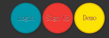
导航效果如图
HTML
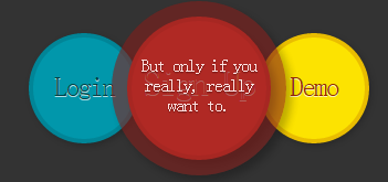
<!DOCTYPE html>
<html >
  <head>
    <meta charset="UTF-8">
    <title>CSS3  Animated buttons</title>
    <link href='http://fonts.googleapis.com/css?family=Hammersmith+One' rel='stylesheet' type='text/css'>
    <link rel="stylesheet" href="css/style.css">
  </head>
  <body>
    <ul>
          <li><a href="#" class="round green">Login<span class="round">That is, if you already have an account.</span></a></li>
          <li><a href="#" class="round red">Sign Up<span class="round">But only if you really, really want to. </span></a></li>
            <li><a href="#" class="round yellow">Demo<span class="round">Take a look. This product is totally rad!</span></a></li>
        </ul>
  </body>
</html>
CSS
* {
    margin: 0;
    padding: 0;
      -moz-box-sizing: border-box;
        -o-box-sizing: border-box;
        -webkit-box-sizing: border-box;
        box-sizing: border-box;
    }

    body {
        width: 100%;
        height: 100%;
        font-family: "helvetica neue", helvetica, arial, sans-serif;
        font-size: 13px;
        text-align: center;
        background: #333 url('http://subtlepatterns.subtlepatterns.netdna-cdn.com/patterns/low_contrast_linen.png');
    }

    ul {
        margin: 30px auto;
        text-align: center;
    }

    li {
        list-style: none;
        position: relative;
        display: inline-block;
        width: 100px;
        height: 100px;
    }

    @-moz-keyframes rotate {
        0% {transform: rotate(0deg);}
        100% {transform: rotate(-360deg);}
    }

    @-webkit-keyframes rotate {
        0% {transform: rotate(0deg);}
        100% {transform: rotate(-360deg);}
    }

    @-o-keyframes rotate {
        0% {transform: rotate(0deg);}
        100% {transform: rotate(-360deg);}
    }

    @keyframes rotate {
        0% {transform: rotate(0deg);}
        100% {transform: rotate(-360deg);}
    }

    .round {
        display: block;
        position: absolute;
        left: 0;
        top: 0;
        width: 100%;
        height: 100%;
        padding-top: 30px;
        text-decoration: none;
        text-align: center;
        font-size: 25px;
        text-shadow: 0 1px 0 rgba(255,255,255,.7);
        letter-spacing: -.065em;
        font-family: "Hammersmith One", sans-serif;
        -webkit-transition: all .25s ease-in-out;
        -o-transition: all .25s ease-in-out;
        -moz-transition: all .25s ease-in-out;
        transition: all .25s ease-in-out;
        box-shadow: 2px 2px 7px rgba(0,0,0,.2);
        border-radius: 300px;
        z-index: 1;
        border-width: 4px;
        border-style: solid;
        border-color: #ff0000;
    }

    .round:hover {
        width: 130%;
        height: 130%;
        left: -15%;
        top: -15%;
        font-size: 33px;
        padding-top: 38px;
        -webkit-box-shadow: 5px 5px 10px rgba(0,0,0,.3);
        -o-box-shadow: 5px 5px 10px rgba(0,0,0,.3);
        -moz-box-shadow: 5px 5px 10px rgba(0,0,0,.3);
        box-shadow: 5px 5px 10px rgba(0,0,0,.3);
        z-index: 2;
        border-size:40px;

    }

    a.red {
        background-color: rgba(239,57,50,1);
        color: rgba(133,32,28,1);
        border-color: rgba(133,32,28,.2);
    }

    a.red:hover {
        color: rgba(239,57,50,1);
    }

    a.green {
        background-color: rgba(1,151,171,1);
        color: rgba(0,63,71,1);
        border-color: rgba(0,63,71,.2);
    }

    a.green:hover {
        color: rgba(1,151,171,1);
    }

    a.yellow {
        background-color: rgba(252,227,1,1);
        color: rgba(153,38,0,1);
        border-color: rgba(153,38,0,.2);
    }

    a.yellow:hover {
        color: rgba(252,227,1,1);
    }

    .round span.round {
        display: block;
        opacity: 0;
        -webkit-transition: all .5s ease-in-out;
        -moz-transition: all .5s ease-in-out;
        -o-transition: all .5s ease-in-out;
        transition: all .5s ease-in-out;
        font-size: 1px;
        border: none;
        padding: 40% 20% 0 20%;
        color: #fff;
    }

    .round span:hover {
        opacity: .85;
        font-size: 16px;
        -webkit-text-shadow: 0 1px 1px rgba(0,0,0,.5);
        -moz-text-shadow: 0 1px 1px rgba(0,0,0,.5);
        -o-text-shadow: 0 1px 1px rgba(0,0,0,.5);
        text-shadow: 0 1px 1px rgba(0,0,0,.5);
    }

    .green span {
        background: rgba(0,63,71,.7);
    }

    .red span {
        background: rgba(133,32,28,.7);
    }

    .yellow span {
        background: rgba(161,145,0,.7);

    }