案例:实现步骤
1. 搭建HTML结构
<section>
    <div></div>
    <div></div>
    <div></div>
    <div></div>
    <div></div>
    <div></div>
</section>
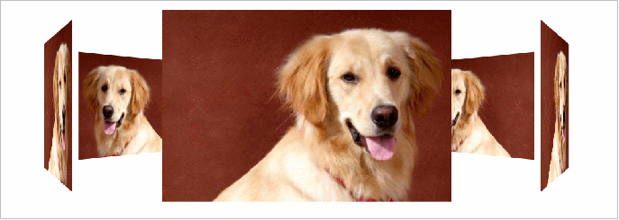
里面的6个div 分别是 6个狗狗图片
注意最终旋转是section标签 旋转
2. CSS样式
1>给body添加 透视效果 perspective: 1000px;
2>给section 添加 大小,一定不要忘记添加 3d呈现效果控制里面的6个div
3>别忘记子绝父相,section要加相对定位
4>里面6个div 全部绝对定位叠到一起,然后移动不同角度旋转和距离
注意:旋转角度用rotateY 距离 肯定用 translateZ来控制
给section 添加动画animation ,让它可以自动旋转即可
2>给section 添加 大小,一定不要忘记添加 3d呈现效果控制里面的6个div
3>别忘记子绝父相,section要加相对定位
4>里面6个div 全部绝对定位叠到一起,然后移动不同角度旋转和距离
注意:旋转角度用rotateY 距离 肯定用 translateZ来控制
给section 添加动画animation ,让它可以自动旋转即可
<!DOCTYPE html>
<html lang="en">

<head>
    <meta charset="UTF-8">
    <meta name="viewport" content="width=device-width, initial-scale=1.0">
    <meta http-equiv="X-UA-Compatible" content="ie=edge">
    <title>Document</title>
    <style>
        body {
            perspective: 1000px;
        }

        section {
            position: relative;
            width: 300px;
            height: 200px;
            margin: 150px auto;
            transform-style: preserve-3d;
            /* 添加动画效果 */
            animation: rotate 10s linear infinite;
            background: url(media/pig.jpg) no-repeat;
        }

        section:hover {
            /* 鼠标放入section 停止动画 */
            animation-play-state: paused;
        }

        @keyframes rotate {
            0% {
                transform: rotateY(0);
            }
            100% {
                transform: rotateY(360deg);
            }
        }

        section div {
            position: absolute;
            top: 0;
            left: 0;
            width: 100%;
            height: 100%;
            background: url(media/dog.jpg) no-repeat;
        }

        section div:nth-child(1) {
            transform: rotateY(0) translateZ(300px);
        }

        section div:nth-child(2) {
            /* 先旋转好了再 移动距离 */
            transform: rotateY(60deg) translateZ(300px);
        }

        section div:nth-child(3) {
            /* 先旋转好了再 移动距离 */
            transform: rotateY(120deg) translateZ(300px);
        }

        section div:nth-child(4) {
            /* 先旋转好了再 移动距离 */
            transform: rotateY(180deg) translateZ(300px);
        }

        section div:nth-child(5) {
            /* 先旋转好了再 移动距离 */
            transform: rotateY(240deg) translateZ(300px);
        }

        section div:nth-child(6) {
            /* 先旋转好了再 移动距离 */
            transform: rotateY(300deg) translateZ(300px);
        }
    </style>
</head>

<body>
    <section>
        <div></div>
        <div></div>
        <div></div>
        <div></div>
        <div></div>
        <div></div>
    </section>
</body>

</html>