引言
在客户端开发中,要说出现频率大的控件,必定有TextBox的身影.然而在TextBox的旁边通常得有个基友Label,形影不离.为此,我们都要写两个控件,布局两次,这样麻烦且有点浪费时间.不如,我们做狠点,将它们两个绑在一起算了.
简单需求
我们需要的控件该是怎样的.首先,它应该有TextBox的所有特性,其次,它的上方或者左边应该有个Label.我们可以通过设置属性,显示Label的内容.大体上就是这样.
构建方式的选取
WPF的控件开发有两种,分为用户控件和自定义控件.在这次的控件开发中,自定义控件又可以细分为三种,如下:
1.首先是用户控件,通过继承UserControl,直接在xaml上布局设计.这种方式开发上比较方便,适用于多个界面上重用不变的模块.但是专业的控件开发一般不采取这种方式.
2.自定义控件之一,通过继承Control和模板上采用TextBox和Label的布局构建控件.这种方式功能上的自由度很高,例如可以自定义text属性,但是要构建大量的依赖项属性和路由事件.
3.自定义控件之二,通过继承TextBox和修改采用msdn上提供TextBox的默认模板,这种方式轻量级些,但是要深入理解默认模板的设计,和需要重定义模板的一些触发器和效果等.
4.自定义控件之三,上面两种都是比较复杂,我们有折中的做法.通过继承TextBox和模板上采用TextBox和Label的布局构建控件,本文就是介绍一下这种做法.
新建项目
首先,新建一个WPF用户控件库的项目,VS已经帮我们添加了一些东西,如图:
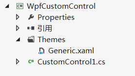
Themes文件夹下面的特定的Generic.xaml里面就是放我们的模板文件的了,一般我们不直接将模板直接写在里面,而是每个控件模板分别放在一个资源文件中,再合并在Generic里面.而真正的控件是CustomControl1.cs,里面包含着我们熟悉的各种依赖项属性和事件.当然,我们得重命名一下,就叫LabelTextBox吧.
无外观的LabelTextBox
在静态构造函数中,调用 DefaultStyleKeyProperty.OverrideMetadata,告诉WPF为此控件应用一个新样式,再新建一个LabelProperty和LabelPosition的依赖项属性,如下:
public class LabelTextBox : TextBox
    {
        static LabelTextBox()
        {
            DefaultStyleKeyProperty.OverrideMetadata(typeof(LabelTextBox), new FrameworkPropertyMetadata(typeof(LabelTextBox)));
        }

        public static readonly DependencyProperty LabelProperty = DependencyProperty.Register("Label", typeof(Object), typeof(LabelTextBox), new PropertyMetadata(string.Empty));

        public static readonly DependencyProperty LabelPositionProperty = DependencyProperty.Register("LabelPosition", typeof(Position), typeof(LabelTextBox), new PropertyMetadata(Position.Top));

        public Object Label
        {
            get { return (Object)GetValue(LabelProperty); }
            set { SetValue(LabelProperty, value); }
        }

        public Position LabelPosition
        {
            get { return (Position)GetValue(LabelPositionProperty); }
            set { SetValue(LabelPositionProperty, value); }
        }

    }

    public enum Position
    {
        Top,
        Left

    }
LabelTextBox的控件模板
上面已经完成了我们的LabelTextBox,但是它还没有样式模板.接下来我们来构建它的控件模板.在Themes文件夹下面新建一个资源字典名为LabelTextBox.xaml,其实模板的TextBox和LabelTextBox没有什么关联,所以我们给控件模板写上各种绑定和设置样式触发器,如下:
<ResourceDictionary xmlns="http://schemas.microsoft.com/winfx/2006/xaml/presentation"
                    xmlns:x="http://schemas.microsoft.com/winfx/2006/xaml"
                     xmlns:local="clr-namespace:WpfCustomControl">

    <ControlTemplate x:Key="TopLabelTextBoxTemplate" TargetType="{x:Type local:LabelTextBox}">
        <Grid>
            <Grid.RowDefinitions>
                <RowDefinition Height="auto"/>
                <RowDefinition Height="*"/>
            </Grid.RowDefinitions>
            <Label
                Content="{Binding Label, RelativeSource={RelativeSource TemplatedParent}}" Grid.Row="0"/>
            <TextBox Grid.Row="1"
                Text="{Binding Text, RelativeSource={RelativeSource TemplatedParent}, Mode=TwoWay, UpdateSourceTrigger=PropertyChanged}"
                HorizontalContentAlignment="{Binding HorizontalContentAlignment,RelativeSource={RelativeSource TemplatedParent}}"
                VerticalContentAlignment="{Binding VerticalContentAlignment,RelativeSource={RelativeSource TemplatedParent}}"
                Background="{Binding Background,RelativeSource={RelativeSource TemplatedParent}}"
                Foreground="{Binding Foreground,RelativeSource={RelativeSource TemplatedParent}}"
                TextWrapping="{Binding TextWrapping,RelativeSource={RelativeSource TemplatedParent}}"
                TextAlignment="{Binding TextAlignment,RelativeSource={RelativeSource TemplatedParent}}"
                HorizontalScrollBarVisibility="{Binding HorizontalScrollBarVisibility,RelativeSource={RelativeSource TemplatedParent}}"
                VerticalScrollBarVisibility="{Binding VerticalScrollBarVisibility,RelativeSource={RelativeSource TemplatedParent}}"
                                         MaxLength="{Binding MaxLength,RelativeSource={RelativeSource TemplatedParent}}"
                                         IsReadOnly="{Binding IsReadOnly,RelativeSource={RelativeSource TemplatedParent}}"
                                         IsEnabled="{Binding IsEnabled,RelativeSource={RelativeSource TemplatedParent}}"/>
        </Grid>
    </ControlTemplate>

    <ControlTemplate x:Key="LeftLabelTextBoxTemplate" TargetType="{x:Type local:LabelTextBox}">
        <Grid>
            <Grid.ColumnDefinitions>
                <ColumnDefinition Width="Auto"></ColumnDefinition>
                <ColumnDefinition Width="*"></ColumnDefinition>
            </Grid.ColumnDefinitions>
            <Label HorizontalAlignment="Center" VerticalAlignment="Center"
                Content="{Binding Label, RelativeSource={RelativeSource TemplatedParent}}" Grid.Column="0"/>
            <TextBox Grid.Column="1"
                Text="{Binding Text, RelativeSource={RelativeSource TemplatedParent}, Mode=TwoWay, UpdateSourceTrigger=PropertyChanged}"
                HorizontalContentAlignment="{Binding HorizontalContentAlignment,RelativeSource={RelativeSource TemplatedParent}}"
                VerticalContentAlignment="{Binding VerticalContentAlignment,RelativeSource={RelativeSource TemplatedParent}}"
                Background="{Binding Background,RelativeSource={RelativeSource TemplatedParent}}"
                Foreground="{Binding Foreground,RelativeSource={RelativeSource TemplatedParent}}"
                TextWrapping="{Binding TextWrapping,RelativeSource={RelativeSource TemplatedParent}}"
                TextAlignment="{Binding TextAlignment,RelativeSource={RelativeSource TemplatedParent}}"
                HorizontalScrollBarVisibility="{Binding HorizontalScrollBarVisibility,RelativeSource={RelativeSource TemplatedParent}}"
                VerticalScrollBarVisibility="{Binding VerticalScrollBarVisibility,RelativeSource={RelativeSource TemplatedParent}}"
                                         MaxLength="{Binding MaxLength,RelativeSource={RelativeSource TemplatedParent}}"
                                         IsReadOnly="{Binding IsReadOnly,RelativeSource={RelativeSource TemplatedParent}}"
                                         IsEnabled="{Binding IsEnabled,RelativeSource={RelativeSource TemplatedParent}}"/>
        </Grid>
    </ControlTemplate>

    <Style TargetType="{x:Type local:LabelTextBox}"  >
        <Setter Property="Template" Value="{StaticResource TopLabelTextBoxTemplate}"/>
        <Style.Triggers>
            <Trigger Property="LabelPosition" Value="Left">
                <Setter Property="Template" Value="{StaticResource ResourceKey=LeftLabelTextBoxTemplate}"></Setter>
            </Trigger>
        </Style.Triggers>
    </Style>

</ResourceDictionary>
接下来,将资源字典添加到Generic.xaml,如下:
<ResourceDictionary
    xmlns="http://schemas.microsoft.com/winfx/2006/xaml/presentation"
    xmlns:x="http://schemas.microsoft.com/winfx/2006/xaml"
    xmlns:local="clr-namespace:WpfCustomControl">

    <ResourceDictionary.MergedDictionaries>
        <ResourceDictionary Source="/WpfCustomControl;component/themes/LabelTextBox.xaml" ></ResourceDictionary>
    </ResourceDictionary.MergedDictionaries>

</ResourceDictionary>
编译通过后就得到我们的控件库WpfCustomControl.dll.
LabelTextBox的使用
在自己项目引用WpfCustomControl.dll,在xaml文件中添加标记引用,然后就可以直接使用,如下:
<Window x:Class="ControlsTest.MainWindow"
        xmlns="http://schemas.microsoft.com/winfx/2006/xaml/presentation"
        xmlns:x="http://schemas.microsoft.com/winfx/2006/xaml"
        xmlns:control="clr-namespace:WpfCustomControl;assembly=WpfCustomControl"
        Title="MainWindow" Height="350" Width="525">
    <Grid>
        <control:LabelTextBox Name="txtbox" LabelPosition="Top"  Label="标题" Width="100" TextChanged="LabelTextBox_TextChanged_1" Margin="209,136,209.4,136.4"/>
    </Grid>
</Window>
可以看到TextChanged等事件能正常触发,但是上面说到TextBox和LabelTextBox没什么关联,要手动绑定属性.然而我们没有为LabelTextBox事件绑定过什么,却依然生效了.那是因为它们公用一个事件路由,实质是TextBox触发了TextChanged事件,冒泡到LabelTextBox,触发了LabelTextBox的TextChanged事件.
小结
本文简单介绍了如何构建一个自定义控件,其中涉及到依赖项属性,控件模板,资源,事件的知识点.最后,如果您有更好的建议,请不吝指教.