——如果有想关注Java开发相关的内容,可以转我的博客
详细观看——
Matplotlib——Python可视化包
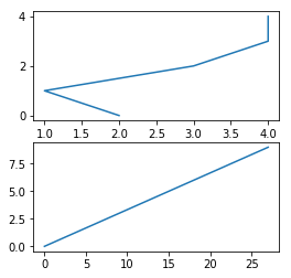
折线图绘制
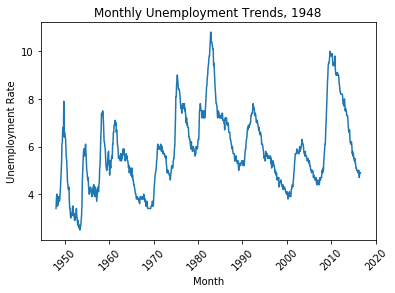
折线图适合二维的大数据集,还适合多个二维数据集的比较,主要是用于反映数据的发展趋势变化情况。
## 采用失业率的数据集进行绘制

import numpy as np
from numpy import arange
import pandas as pd
import matplotlib.pyplot as plt
dataSet = pd.read_csv("unrate.csv")
# print(dataSet)
dataSet['DATE'] = pd.to_datetime(dataSet['DATE'])
print(dataSet.head(10))

## 绘制折线图
plt.plot(dataSet['DATE'],dataSet['VALUE'])
plt.xticks(rotation=45)
## 添加x、y轴的标签
plt.xlabel("Month")
plt.ylabel("Unemployment Rate")
## 添加图标题
plt.title("Monthly Unemployment Trends, 1948")
plt.show()

Out:
	DATE  VALUE
0 1948-01-01    3.4
1 1948-02-01    3.8
2 1948-03-01    4.0
3 1948-04-01    3.9
4 1948-05-01    3.5
5 1948-06-01    3.6
6 1948-07-01    3.6
7 1948-08-01    3.9
8 1948-09-01    3.8
9 1948-10-01    3.7
## 在一个图中画出多个图
dataSet['MONTH'] = dataSet['DATE'].dt.month
dataSet['MONTH'] = dataSet['DATE'].dt.month

fig = plt.figure(figsize=(10,6))

colors = ['red','blue','green','yellow','black']

for i in range(5):
    start_index = i*12
    end_index = (i+1)*12
    subset = dataSet[start_index:end_index]
    label = str(1948+i*2)
    plt.plot(subset['MONTH'],subset['VALUE'],c=colors[i],label=label)

## 添加标注的位置,如果best,表示的是放在编译器认为组好的位置,center表示放在中间,等等还有其他的参数
plt.legend(loc='best')
plt.xlabel("MONTH")
plt.ylabel("Unemployment Rate")
## 添加图标题
plt.title("Monthly Unemployment Trends, 1948")
plt.show()
多子图的折线图
主要用于多个特征属性的发展趋势变化情况。
## 多子图
women_degrees = pd.read_csv('percent-bachelors-degrees-women-usa.csv')
stem_cats = ['Engineering', 'Computer Science', 'Psychology', 'Biology', 'Physical Sciences', 'Math and Statistics']
#Setting Line Width
cb_dark_blue = (0/255, 107/255, 164/255)
cb_orange = (255/255, 128/255, 14/255)
fig = plt.figure(figsize=(18, 3))

for sp in range(0,6):
    ax = fig.add_subplot(1,6,sp+1)
    ax.plot(women_degrees['Year'], women_degrees[stem_cats[sp]], c=cb_dark_blue, label='Women', linewidth=3)
    ax.plot(women_degrees['Year'], 100-women_degrees[stem_cats[sp]], c=cb_orange, label='Men', linewidth=3)
    for key,spine in ax.spines.items():
        spine.set_visible(False)
    ax.set_xlim(1968, 2011)
    ax.set_ylim(0,100)
    ax.set_title(stem_cats[sp])
    ## 去掉x、y轴的边框的线
    ax.tick_params(bottom=False, top=False, left=False, right=False)
plt.legend(loc='upper right')
plt.show()
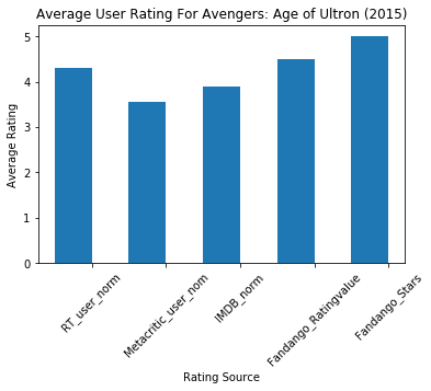
柱形图的绘制
柱形图适用场合是二维数据集(每个数据点包括两个值x和y),但只有一个维度需要比较。主要是反映数据的差异,局限性是只限于中小规模的数据集。
## 柱形图的绘制
data = pd.read_csv("fandango_scores.csv")
cols = ['FILM', 'RT_user_norm', 'Metacritic_user_nom', 'IMDB_norm', 'Fandango_Ratingvalue', 'Fandango_Stars']
norm_data = data[cols]
print(norm_data[:1])

#The Axes.bar() method has 2 required parameters, left and height.
#We use the left parameter to specify the x coordinates of the left sides of the bar.
#We use the height parameter to specify the height of each bar

num_cols = ['RT_user_norm', 'Metacritic_user_nom', 'IMDB_norm', 'Fandango_Ratingvalue', 'Fandango_Stars']
bar_heights = norm_data.loc[0, num_cols].values
bar_positions = arange(5) + 0.75
tick_positions = range(1,6)
fig, ax = plt.subplots()

ax.bar(bar_positions, bar_heights, 0.5)
ax.set_xticks(tick_positions)
ax.set_xticklabels(num_cols, rotation=45)


## 添加x、y轴图例以及标题
ax.set_xlabel('Rating Source')
ax.set_ylabel('Average Rating')
ax.set_title('Average User Rating For Avengers: Age of Ultron (2015)')
plt.show()
## 横向柱形图的绘制
import matplotlib.pyplot as plt
from numpy import arange
num_cols = ['RT_user_norm', 'Metacritic_user_nom', 'IMDB_norm', 'Fandango_Ratingvalue', 'Fandango_Stars']

bar_width = norm_data.loc[0,num_cols].values
bar_position = arange(5)+0.5
tick_position = range(1,6)
fig, ax = plt.subplots()

ax.barh(bar_positions, bar_width, 0.5)
ax.set_xticks(tick_positions)
ax.set_xticklabels(num_cols, rotation=45)


## 添加x、y轴图例以及标题
ax.set_xlabel('Rating Source')
ax.set_ylabel('Average Rating')
ax.set_title('Average User Rating For Avengers: Age of Ultron (2015)')
plt.show()

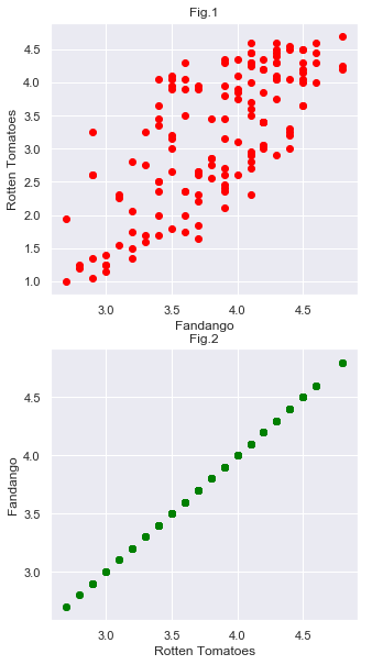
散点图
散点图是指在回归分析中,数据点在直角坐标系平面上的分布图,散点图表示因变量随自变量而变化的大致趋势,据此可以选择合适的函数对数据点进行拟合。散点图适用于三维数据集,但其中只有两维需要比较。主要用于显示所有的数据分布情况。
## 散点图的绘制
fig = plt.figure(figsize=(5,10))
subplot1 = fig.add_subplot(2,1,1)
subplot2 = fig.add_subplot(2,1,2)

subplot1.scatter(norm_data["Fandango_Ratingvalue"],norm_data['RT_user_norm'],c="red")
subplot1.set_xlabel('Fandango')
subplot1.set_ylabel('Rotten Tomatoes')
subplot1.set_title("Fig.1")

subplot2.scatter(norm_data["Fandango_Ratingvalue"],norm_data["Fandango_Ratingvalue"],c="green")
subplot2.set_xlabel('Rotten Tomatoes')
subplot2.set_ylabel('Fandango')
subplot2.set_title("Fig.2")
plt.show()
直方图
## toolbar
fig = plt.figure(figsize=(5,5))
subplot1 = fig.add_subplot(2,1,1)
subplot2 = fig.add_subplot(2,1,2)

subplot1.hist(norm_data["RT_user_norm"],bins=20,range=(0,5))
subplot1.set_title('Distribution of Fandango Ratings')
subplot1.set_ylim(0, 20)

subplot2.hist(norm_data['RT_user_norm'], 20, range=(0, 5))
subplot2.set_title('Distribution of Rotten Tomatoes Ratings')
subplot2.set_ylim(0, 30)

plt.show()

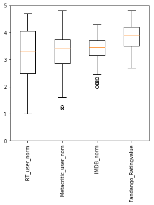
盒图
## 盒图的绘制
fig = plt.figure(figsize=(5,5))
subplot = fig.subplots()
num_cols = ['RT_user_norm', 'Metacritic_user_nom', 'IMDB_norm', 'Fandango_Ratingvalue']
subplot.boxplot(norm_data[num_cols].values)
subplot.set_xticklabels(num_cols,rotation=90)
subplot.set_ylim(0,5)
plt.show()