日常开发中,经常会用到css三栏布局,现将工作中常用的css 三栏布局整理如下:
什么是三栏布局:
三栏布局,顾名思义就是两边固定,中间自适应。
一、 float布局
<!DOCTYPE html>
<html lang="en">
<head>
<meta charset="UTF-8">
<title>1. float布局</title>
<style type="text/css">
* {
margin: 0;
padding: 0;
}
p{
margin: 20px 0;
text-align: center;
}
.container {
border: 1px solid #333333;
}
.left {
float: left;
100px;
height: 200px;
background: #bfbfbf;
}
.right {
float: right;
100px;
height: 200px;
background: #efefef;
}
.main{
height: 200px;
background:#888888;
}
</style>
</head>
<body>
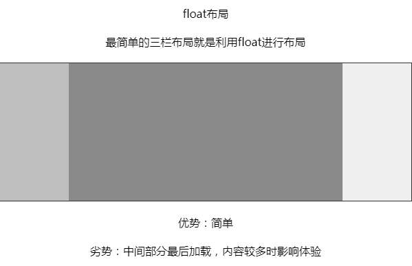
<p>float布局</p>
<p>最简单的三栏布局就是利用float进行布局</p>
<div class="container">
<div class="left"></div>
<div class="right"></div>
<div class="main"></div>
</div>
<p>优势:简单</p>
<p>劣势:中间部分最后加载,内容较多时影响体验</p>
</body>
</html>
二、BFC 规则
<!DOCTYPE html>
<html lang="en">
<head>
  <meta charset="UTF-8">
  <title>2. BFC 规则</title>
  <style type="text/css">
    * {
      margin: 0;
      padding: 0;
    }

    p {
      margin: 20px 0;
      text-align: center;
    }

    .left {
      float: left;
       100px;
      height: 200px;
      background: #bfbfbf;
    }

    .right {
      float: right;
       100px;
      height: 200px;
      background: #efefef;
    }

    .main {
      overflow: hidden;
      height: 200px;
      background: #888888;
    }
  </style>
</head>
<body>

<p>BFC 规则</p>
<p>BFC(块格式化上下文)规则规定:BFC不会和浮动元素重叠,将main元素设定为BFC元素即可</p>


<div class="container">
  <div class="left"></div>
  <div class="right"></div>
  <div class="main"></div>
</div>


</body>
</html>

三、圣杯布局
<!DOCTYPE html>
<html lang="en">
<head>
<meta charset="UTF-8">
<title>3. 圣杯布局</title>
<style type="text/css">
* {
margin: 0;
padding: 0;
}
p {
margin: 20px 0;
text-align: center;
}
.container {
padding-left: 100px;
padding-right: 100px;
}
.left {
float: left;
100px;
height: 200px;
margin-left: -100%;
position: relative;
left: -100px;
background: #bfbfbf;
}
.right {
float: left;
100px;
height: 200px;
margin-left: -100px;
position: relative;
right: -100px;
background-color: #efefef;
}
.main {
float: left;
100%;
height: 200px;
background-color: #888888;
}
</style>
</head>
<body>
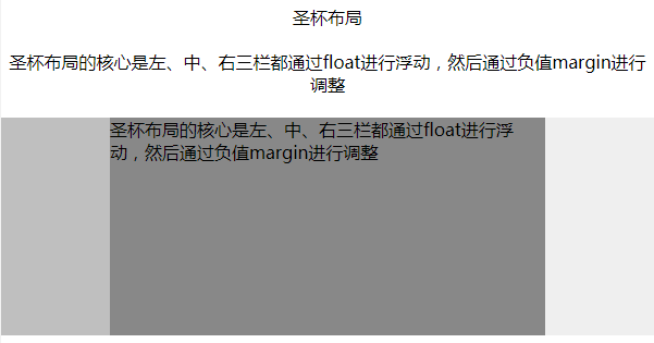
<p>圣杯布局</p>
<p>圣杯布局的核心是左、中、右三栏都通过float进行浮动,然后通过负值margin进行调整</p>
<div class="container">
<div class="main">圣杯布局的核心是左、中、右三栏都通过float进行浮动,然后通过负值margin进行调整</div>
<div class="left"></div>
<div class="right"></div>
</div>
</body>
</html>
四、双飞翼布局
<!DOCTYPE html>
<html lang="en">
<head>
<meta charset="UTF-8">
<title>4. 双飞翼布局</title>
<style type="text/css">
* {
margin: 0;
padding: 0;
}
p {
margin: 20px 0;
text-align: center;
}
.main {
float: left;
100%;
}
.content {
height: 200px;
margin-left: 110px;
margin-right: 220px;
background: #888888;
}
.main::after {
display: block;
content: '';
font-size: 0;
height: 0;
clear: both;
zoom: 1;
}
.left {
float: left;
height: 200px;
100px;
margin-left: -100%;
background-color: #efefef;
}
.right {
200px;
height: 200px;
float: left;
margin-left: -200px;
background: #bfbfbf;
}
</style>
</head>
<body>
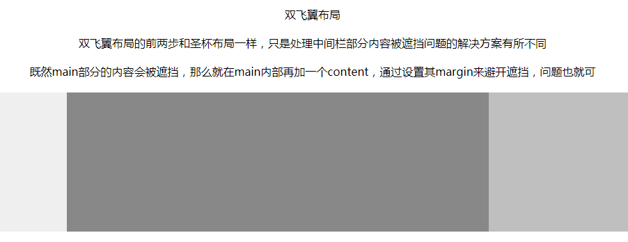
<p>双飞翼布局</p>
<p>双飞翼布局的前两步和圣杯布局一样,只是处理中间栏部分内容被遮挡问题的解决方案有所不同</p>
<p>既然main部分的内容会被遮挡,那么就在main内部再加一个content,通过设置其margin来避开遮挡</p>
<div class="main">
<div class="content"></div>
</div>
<div class="left"></div>
<div class="right"></div>
</body>
</html>
五、flex布局
<!DOCTYPE html>
<html lang="en">
<head>
<meta charset="UTF-8">
<title>5. flex布局</title>
<style type="text/css">
* {
margin: 0;
padding: 0;
}
p {
margin: 20px 0;
text-align: center;
}
.container {
display: flex;
flex-direction: row;
}
.middle {
height: 200px;
background-color: #888888;
flex-grow: 1;
}
.left {
height: 200px;
order: -1;
margin-right: 20px;
background-color: #efefef;
flex: 0 1 200px;
}
.right {
height: 200px;
margin-left: 20px;
background-color: #bfbfbf;
flex: 0 1 200px;
}
</style>
</head>
<body>
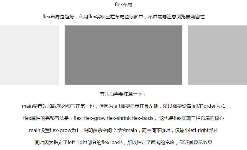
<p>flex布局</p>
<p>flex布局是趋势,利用flex实现三栏布局也很简单,不过需要注意浏览器兼容性</p>
<div class="container">
<div class="middle"></div>
<div class="left"></div>
<div class="right"></div>
</div>
<p>有几点需要注意一下:</p>
<p>main要首先加载就必须写在第一位,但因为left需要显示在最左侧,所以需要设置left的order为-1</p>
<p>flex属性的完整写法是:flex: flex-grow flex-shrink flex-basis 。这也是flex实现三栏布局的核心</p>
<p> main设置flex-grow为1,说明多余空间全部给main,而空间不够时,仅缩小left right部分</p>
<p>同时因为指定了left right部分的flex-basis,所以指定了两者的宽度,保证其显示效果</p>
</body>
</html>
六、绝对定位
<!DOCTYPE html>
<html lang="en">
<head>
  <meta charset="UTF-8">
  <title>6. 绝对定位</title>
  <style type="text/css">
    * {
      margin: 0;
      padding: 0;
    }

    p {
      margin: 20px 0;
      text-align: center;
    }

    .middle {
      position: absolute;
      left: 200px;
      right: 200px;
      height: 300px;
      background-color: #888888;
    }

    .left {
      position: absolute;
      left: 0px;
       200px;
      height: 300px;
      background-color: #bfbfbf;
    }

    .right {
      position: absolute;
      right: 0px;
       200px;
      background-color: #efefef;
      height: 300px;
    }

  </style>
</head>
<body>
<p>绝对定位</p>
<p>绝对定位的方式也比较简单,而且可以优先加载主体</p>
<div class="container">
  <div class="middle"></div>
  <div class="left"></div>
  <div class="right"></div>
</div>
</body>
</html>
