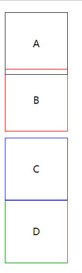
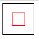
position: static; 静态定位 / 常规定位 / 自然定位
忽略top/right/bottom/left/z-index的影响,使元素回到自然流中
<!DOCTYPE html>
<html lang="en">
<head>
    <meta charset="UTF-8">
    <title>Document</title>
    <style>
        .block{
            width:100px;
            height:100px;
            line-height:100px;
            text-align:center;

            position: relative;
            top:10px;
        }
        .block:first-child{
            border:1px solid;
        }
        .block:nth-child(2){
            position: static;
            border:1px solid red;
        }
        .block:nth-child(3){
            border:1px solid blue;
        }
        .block:nth-child(4){
            border:1px solid green;
        }
    </style>
</head>
<body>
    <div class="block">A</div>
    <div class="block">B</div>
    <div class="block">C</div>
    <div class="block">D</div>
</body>
</html>
设置margin:auto为水平居中
<!DOCTYPE html>
<html lang="en">
<head>
    <meta charset="UTF-8">
    <title>Document</title>
    <style>
        .block{
            width:100px;
            height:100px;
            line-height:100px;
            text-align:center;

            position: static;
            margin:auto;
        }
        .block:first-child{
            border:1px solid;
        }
        .block:nth-child(2){
            border:1px solid red;
        }
        .block:nth-child(3){
            border:1px solid blue;
        }
        .block:nth-child(4){
            border:1px solid green;
        }
    </style>
</head>
<body>
    <div class="block">A</div>
    <div class="block">B</div>
    <div class="block">C</div>
    <div class="block">D</div>
</body>
</html>

position:relative 相对定位
相对于自己在常规流中的位置,进行偏移
原来的空间依然预留
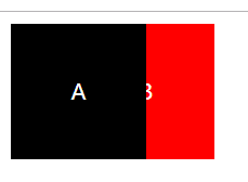
可以使浮动元素发生偏移,并控制堆叠顺序
<!DOCTYPE html>
<html lang="en">
<head>
    <meta charset="UTF-8">
    <title>Document</title>
    <style>
        .block{
            width:100px;
            height:100px;
            line-height:100px;
            text-align:center;
            color:white;

            float:left;
            position: relative;

        }
        .block:first-child{
            background:black;
            z-index:2;
        }
        .block:nth-child(2){
            background:red;
            left:-50px;
            z-index:1;
        }
    </style>
</head>
<body>
    <div class="block">A</div>
    <div class="block">B</div>
</body>
</html>
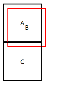
position:absolute;
参照物是最近定位的祖先元素
如果没有祖先元素被定位,则默认为body
<!DOCTYPE html>
<html lang="en">
<head>
    <meta charset="UTF-8">
    <title>Document</title>
    <style>
        .block{
            width:100px;
            height:100px;
            line-height:100px;
            text-align:center;
            border:2px solid;

            position: relative;
        }
        .block:nth-child(2){
            border-color:red;

            position: absolute;
            top:20px;
            left:20px;
        }
    </style>
</head>
<body>
    <div class="block">A</div>
    <div class="block">B</div>
    <div class="block">C</div>
</body>
</html>
实现水平垂直居中定位:
1、给父元素设置:position: relative;
2、给子元素设置:
position: absolute;
top:0;
left:0;
right:0;
bottom:0;
margin:auto auto;
<!DOCTYPE html>
<html lang="en">
<head>
    <meta charset="UTF-8">
    <title>Document</title>
    <style>
        .parent{
            width:100px;
            height:100px;
            border:2px solid;

            position: relative;
        }
        .child{
            width:40px;
            height:40px;
            border:2px solid;
            border-color:red;

            position: absolute;
            top:0;
            left:0;
            right:0;
            bottom:0;
            margin:auto auto;
        }
    </style>
</head>
<body>
    <div class="parent">
        <div class="child"></div>
    </div>
</body>
</html>
position:fixed;
继承position:absolute;的所有特征,区别是以视口做参照来定位
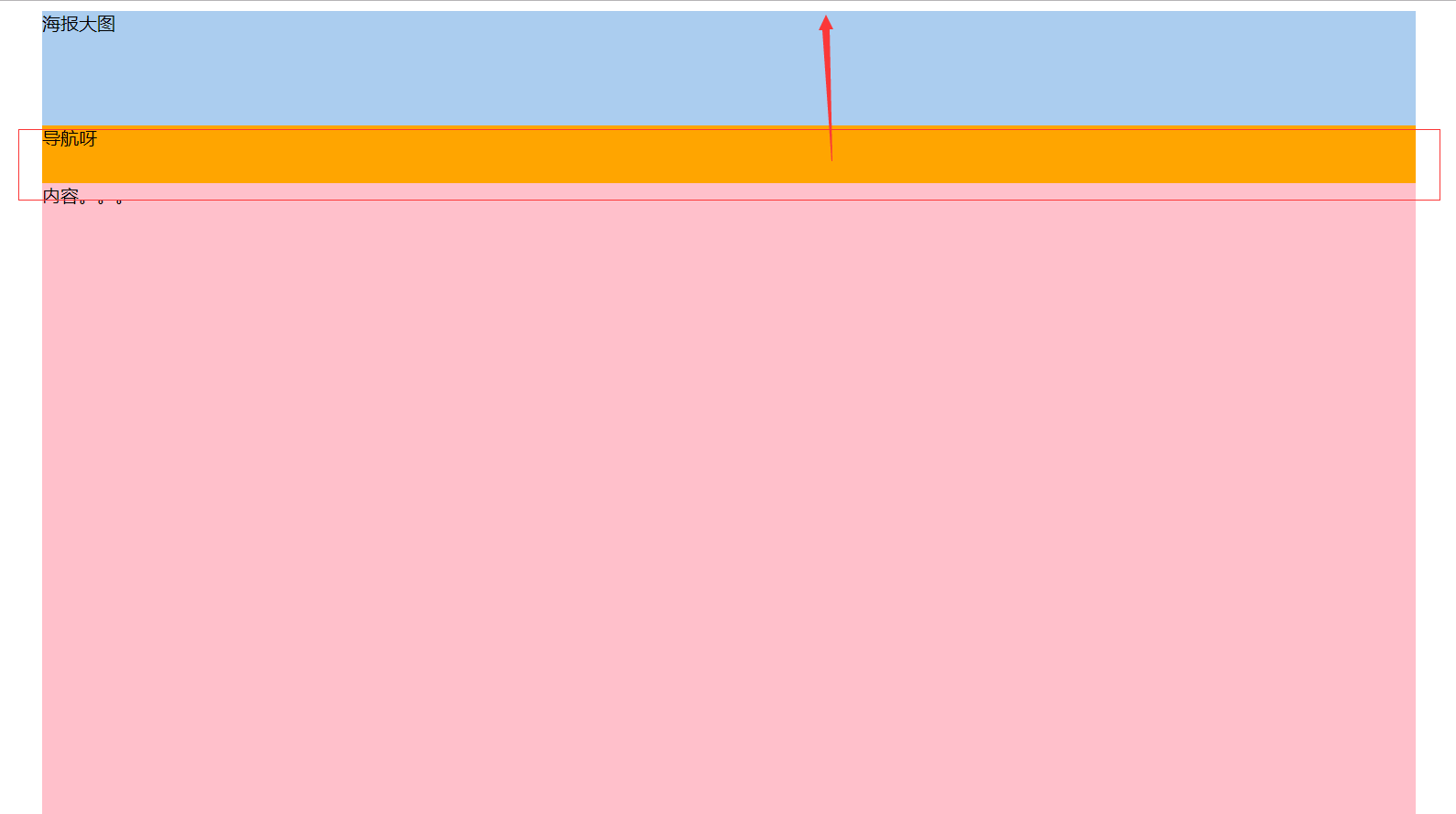
position:sticky;
与top偏移量结合使用
如果最近祖先元素有定位,则参考最近祖先元素;否则参考视口
<!DOCTYPE html>
<html lang="en">
<head>
    <meta charset="UTF-8">
    <title>Document</title>
    <style>
        .banner{
            width:1200px;
            height:100px;
            background:#abcdef;
            margin:0 auto;
        }
        .nav{
            width:1200px;
            height:50px;
            background:orange;
            margin:0 auto;
            position: sticky;
            top:0;
        }
        .container{
            width:1200px;
            height:1000px;
            background:pink;
            margin:0 auto;
        }
    </style>
</head>
<body>
    <div class="banner">海报大图</div>
    <div class="nav">导航呀</div>
    <div class="container">内容。。。</div>
</body>
</html>
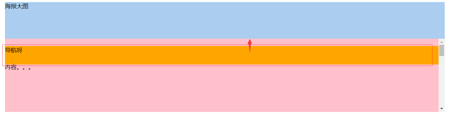
相对于最近定位的祖先元素做参考:
<!DOCTYPE html>
<html lang="en">
<head>
    <meta charset="UTF-8">
    <title>Document</title>
    <style>
        .banner{
            width:1200px;
            height:100px;
            background:#abcdef;
            margin:0 auto;
        }
        .nav{
            width:1200px;
            height:50px;
            background:orange;
            margin:0 auto;
            position: sticky;
            top:20px;
        }
        .container{
            width:1200px;
            height:200px;
            background:pink;
            margin:0 auto;
            position: relative;
            overflow-y: scroll;
            overflow-x: hidden;

        }
        p{
            height:1000px;
        }
    </style>
</head>
<body>
    <div class="banner">海报大图</div>
    <div class="container">
        <div class="nav">导航呀</div>
        <p>内容。。。</p>
    </div>
</body>
</html>
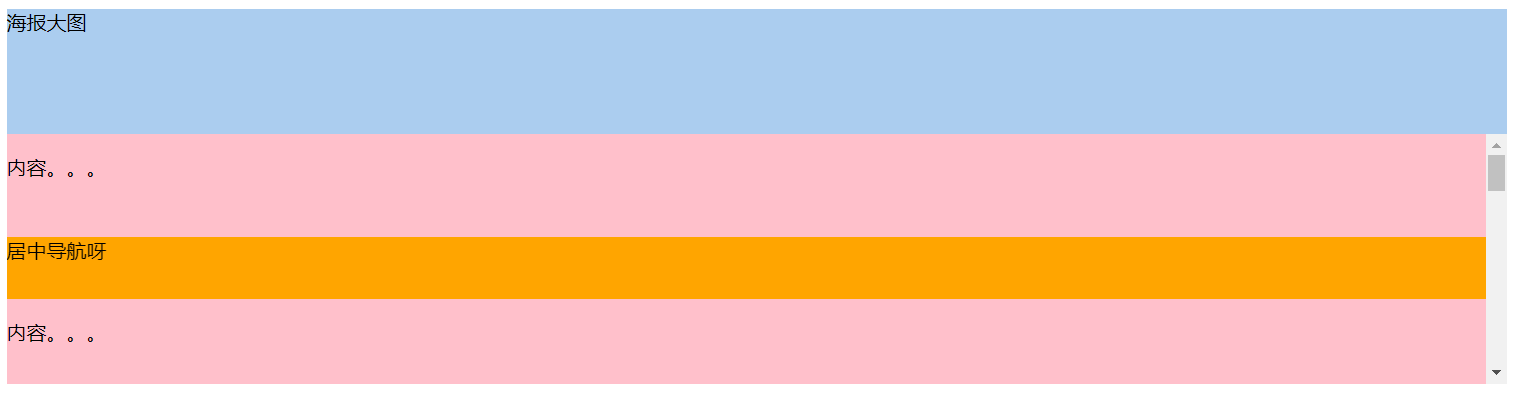
导航在居中位置
<!DOCTYPE html>
<html lang="en">
<head>
    <meta charset="UTF-8">
    <title>Document</title>
    <style>
        .banner{
            width:1200px;
            height:100px;
            background:#abcdef;
            margin:0 auto;
        }
        .nav{
            width:1200px;
            height:50px;
            background:orange;
            margin:0 auto;
            position: sticky;
            top:20px;
        }
        .container{
            width:1200px;
            height:200px;
            background:pink;
            margin:0 auto;
            position: relative;
            overflow-y: scroll;
            overflow-x: hidden;

        }
        p{
            height:1000px;
        }
        p:first-child{
            height:50px;
        }
    </style>
</head>
<body>
    <div class="banner">海报大图</div>
    <div class="container">
        <p>内容。。。</p>
        <div class="nav">居中导航呀</div>
        <p>内容。。。</p>
    </div>
</body>
</html>
www.caniuse.com 检测浏览器兼容性
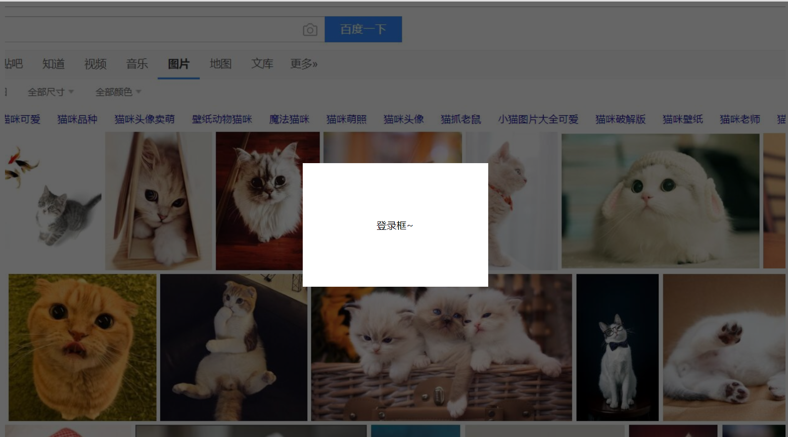
弹出层的简单实例
<!DOCTYPE html>
<html lang="en">
<head>
    <meta charset="UTF-8">
    <title>Document</title>
    <style>
        .content{
            width:100%;
            height:1000px;
            background:url(bg.jpg) top center no-repeat;
        }
        .opacity{
            width:100%;
            height:100%;
            background-color:rgba(0,0,0,.6);
            position: fixed;
            top:0;
            left:0;
        }
        .login{
            width:300px;
            height:200px;
            text-align:center;
            line-height:200px;
            position: fixed;
            background-color:#fff;
            top:50%;
            left:50%;
            margin-top:-100px;
            margin-left:-150px;
        }
    </style>
</head>
<body>
    <div class="content"></div>
    <div class="opacity"></div>
    <div class="login">登录框~</div>
</body>
</html>
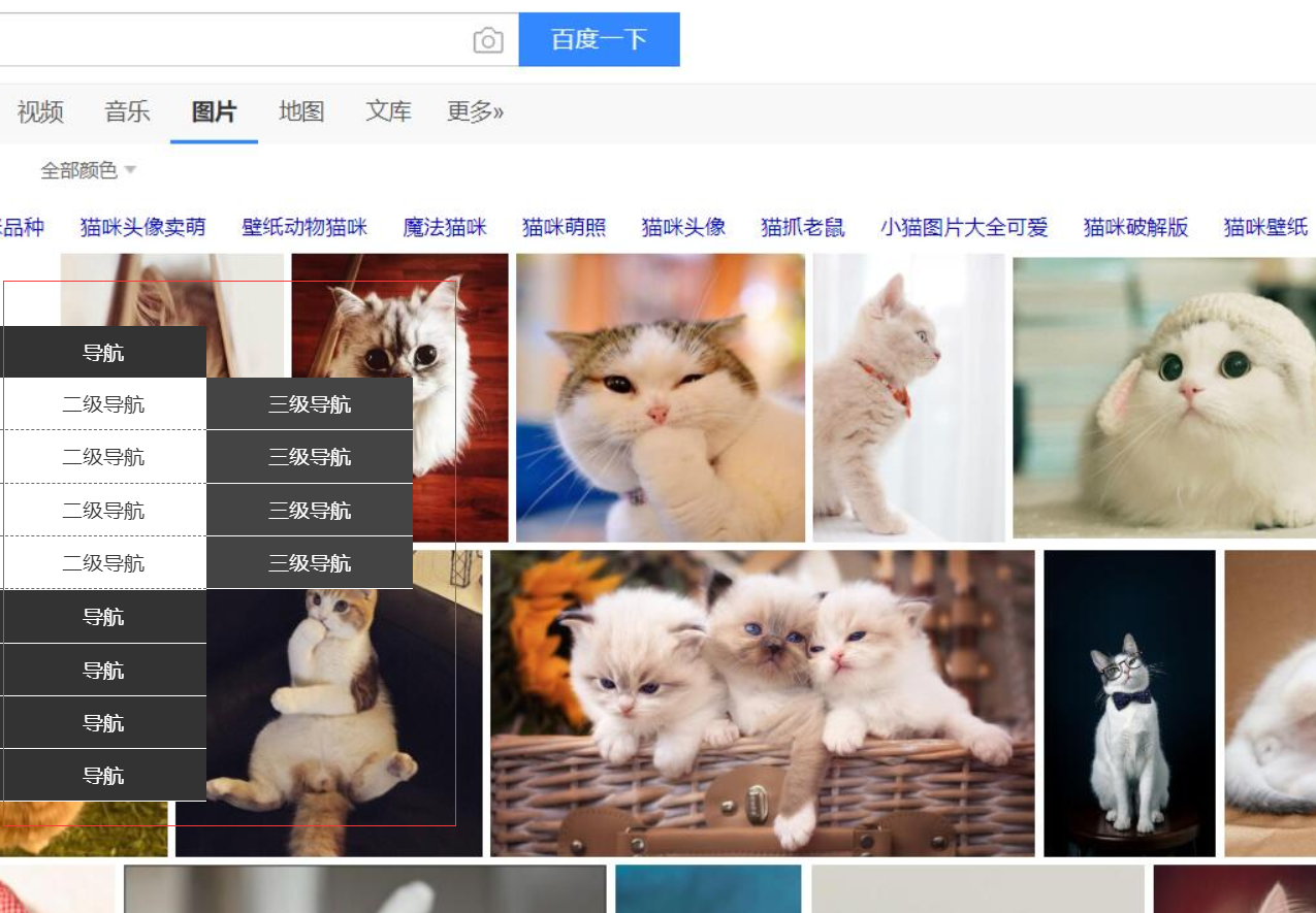
侧边栏导航实例
<!DOCTYPE html>
<html lang="en">
<head>
    <meta charset="UTF-8">
    <title>Document</title>
    <style>
        *{
            margin:0;
            padding:0;
        }

        ul{
            list-style:none;
        }

        .content{
            width:100%;
            height:1000px;
            background:url(bg.jpg) top center no-repeat;
        }

        .nav{
            width:160px;
            height:205px;
            position: fixed;
            left:0;
            top:50%;
            margin-top:-102px;
        }

        .nav-li{
            width:160px;
            height:auto;
            line-height:40px;
            border-bottom:1px solid #fff;
            color:#fff;
            background:#333;
            text-align: center;
            cursor:pointer;
        }

        .tit{
            width:160px;
            height:40px;
        }

        .nav-li ul{
            width:160px;
            height:auto;
            background:#fff;
            display: none;
        }

        .nav-li:hover ul{
            display: block
        }

        .nav-li ul li{
            width:160px;
            height:40px;
            color:#333;
            border-bottom:1px dashed #666;
            text-align: center;
            line-height:40px;
            position: relative;
        }

        .nav-li ul li:hover .subnav{
            display: block;
        }

        .subnav{
            position: absolute;
            width:160px;
            height:auto;
            top:0;
            left:160px;
            background:#444;
            display: none;
        }

        .subnav-item{
            width:160px;
            height:40px;
            border-bottom:1px solid #fff;
            color:#fff;
        }
    </style>
</head>
<body>
    <div class="content">
        <div class="nav">
            <div class="nav-li">
                <div class="tit">导航</div>
                <ul>
                    <li>
                        二级导航
                        <div class="subnav">
                            <div class="subnav-item">三级导航</div>
                            <div class="subnav-item">三级导航</div>
                            <div class="subnav-item">三级导航</div>
                            <div class="subnav-item">三级导航</div>
                        </div>
                    </li>
                    <li>二级导航</li>
                    <li>二级导航</li>
                    <li>二级导航</li>
                </ul>
            </div>
            <div class="nav-li">导航</div>
            <div class="nav-li">导航</div>
            <div class="nav-li">导航</div>
            <div class="nav-li">
                <div class="tit">导航</div>
                <ul>
                    <li>
                        二级导航
                        <div class="subnav">
                            <div class="subnav-item">三级导航</div>
                            <div class="subnav-item">三级导航</div>
                            <div class="subnav-item">三级导航</div>
                            <div class="subnav-item">三级导航</div>
                        </div>
                    </li>
                    <li>二级导航</li>
                    <li>二级导航</li>
                    <li>二级导航</li>
                </ul>
            </div>
        </div>
    </div>
</body>
</html>