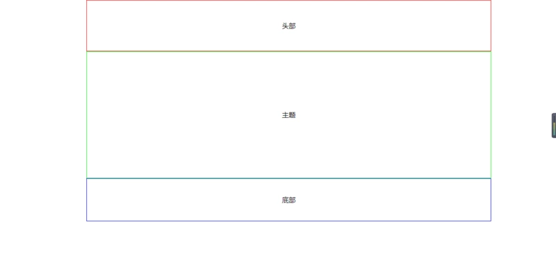
单列布局案例:
代码如下:
<!doctype html>
<html>
    <head>
        <meta charset="utf-8"/>
        <title>单列布局</title>
    </head>
    <style>
        body{
            margin:0;
        }
        .box{
            width:960px;
            margin:0 auto;
        }
        .box .header{
            height:120px;
            border:1px solid #f00;
            line-height:120px;
        }
        .box .main{
            height:300px;
            border:1px solid #0f0;
            line-height:300px;
        }
        .box .footer{
            height:100px;
            border:1px solid #00f;
            line-height:100px;
        }
        div{
            text-align:center;
        }
    </style>
    <body>
        <div class="box">
            <div class="header">头部</div>
            <div class="main">主题</div>
            <div class="footer">底部</div>
        </div>
    </body>
</html>
运行结果:
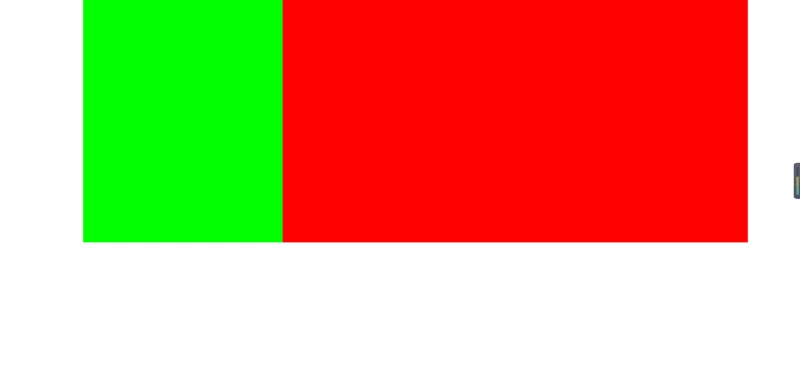
双列布局案例:
代码如下:
<!doctype html>
<html>
    <head>
        <meta charset="utf-8"/>
        <title>双列布局</title>
    </head>
    <style>
        body{
        margin:0;
        }
        .box{
            width:80%;
            margin:0 auto;
            overflow:hidden;
        }
        .box .left{
            width:30%;
            height:400px;
            background-color:#0f0;
            float:left;
        }
        .box .right{
            width:70%;
            height:400px;
            background-color:#f00;
            float:left;
        }
    </style>
    <body>
        <div class="box">
            <div class="left"></div>
            <div class="right"></div>
        </div>
    </body>
</html>
运行结果:
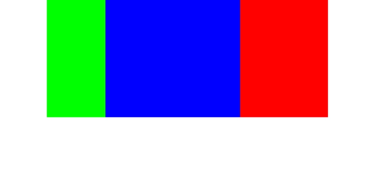
三列布局案例:
代码如下:
<!doctype html>
<html>
    <head>
        <meta charset="utf-8"/>
        <title>三列布局</title>
    </head>
    <style>
    body{
        margin:0;
    }
    .box{
        width:960px;
        margin:0 auto;
        position:relative;
    }
    .box .left{
        width:200px;
        height:400px;
        background-color:#0f0;
        position:absolute;
    }
    .box .center{
        height:400px;
        background-color:#00f;
        margin:0 300px 0 200px;
    }
    .box .right{
        width:300px;
        height:400px;
        background-color:#f00;
        position:absolute;
        right:0;
        top:0;
    }
    </style>
    <body>
        <div class="box">
            <div class="left"></div>
            <div class="center"></div>
            <div class="right"></div>
        </div>
    </body>
</html>
运行结果如下图
混合布局案例:
代码如下:
<!doctype html>
<html>
    <head>
        <meta charset="utf-8"/>
        <title>混合布局</title>
    </head>
    <style>
    body{
        margin:0;
    }
    .box{
        width:960px;
        margin:0 auto;
    }
    .header{
        height:120px;
        background-color:#ddd;
    }
    .main{
        height:400px;
        background-color:#f00;
        position:relative;
    }

    .main .left{
        width:200px;
        height:400px;
        position:absolute;
        left:0;
        top:0;
        background-color:#0fccaa;
    }
    .main .center{
        height:400px;
        margin:0 305px 0 205px;
        background-color:#123456;
    }

    .main .right{
        width:300px;
        height:400px;
        position:absolute;
        right:0;
        top:0;
        background-color:#ff0;
    }
    .footer{
        height:80px;
        background-color:#ddd;
    }
    </style>
    <body>
        <div class="box">
            <div class="header"></div>
            <div class="main">
                <div class="left"></div>
                <div class="center"></div>
                <div class="right"></div>
            </div>
            <div class="footer"></div>
        </div>
    </body>
</html>
运行结果如下图

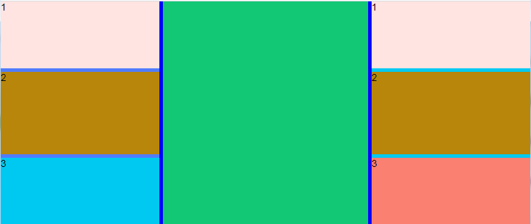
桌面布局:
代码:


<!DOCTYPE html>
<html>
    <head>
        <meta charset="UTF-8">
        <title></title>
        <link rel="stylesheet" href="js/layui/css/layui.css" />
        <style type="text/css">
            .content-body{
                width: 100%;height: 100%;position: absolute;background-color: blue;
            }
            .content{
                width: 100%;height: 100%;position: absolute;
            }
            .left-body{
                float:left;width: 30%;height: 100%;background-color: #507CFF;
            }
            .center-body{
                float:left;width: calc(40% - 10px);height: 100%;background-color: #12C875;margin:0px 5px;
            }
            .right-body{
                float:right;width: 30%;height: 100%;background-color: #00C9F1;
            }

            /*左侧内部样式*/
            .left-body .left-top {
                width: 100%;height: 30%;background-color: mistyrose;
            }
            .left-body .left-middle {
                width: 100%;height:calc(40% - 10px);background-color: darkgoldenrod;margin-top:5px;
            }
            .left-body .left-bottom {
                width: 100%; height: 30%;background-color: #00C9F1;margin-top:5px;
            }

            /*右侧内部样式*/
            .right-body .right-top {
                width: 100%;height: 30%;background-color: mistyrose;
            }
            .right-body .right-middle {
                width: 100%;height:calc(40% - 10px);background-color: darkgoldenrod;margin-top:5px;
            }
            .right-body .right-bottom {
                width: 100%; height: 30%;background-color: salmon;margin-top:5px;
            }
        </style>
           <script src="js/layui/layui.js"></script>
    </head>
    <body>
        <div class="content-body">
            <div class="content">
                <div class="left-body">
                    <div class="left-top">1</div>
                    <div class="left-middle">2</div>
                    <div class="left-bottom">3</div>
                </div>
                <div class="center-body">

                </div>
                <div class="right-body">
                    <div class="right-top">1</div>
                    <div class="right-middle">2</div>
                    <div class="right-bottom">3</div>
                </div>
            </div>
        </div>
    </body>
</html>
效果图:
总结:
排版布局需要掌握的知识
- div 相关属性
- float 浮动属性
- position 定位属性
- clear 清除浮动的应用