现在很火的是h5页面的开发,更多的视觉冲击,带来更多的关注度,更多的眼球,想要别人看你的东西,不在是以前的一段文字,或是一个图片的时代了,现在h5把一张张图片,一段段文字动起来,更有与客户的交互,而且强大的段子手写出的段子,让这个信息流的时代更加高速,更加具有冲击感。
我刚接触h5设计,其实在设计与编程中,你会考虑UI的设计稿,那一个元素,你可以摘出来做一个动画,那一部分需要用户进行互动。
CSS3动画:
1.随风摇曳的竹子、晃动的小人、旋转的音乐图标: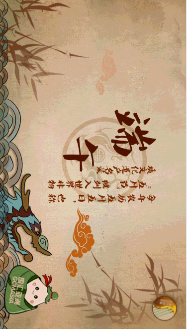
.logo{position: fixed;left: 10px;bottom: 20px;-webkit-animation: sway2 2s ease-in-out alternate infinite;animation: sway2 2s ease-in-out alternate infinite;z-index: 20;}
.play { -webkit-animation: music 4s linear infinite;animation: music 4s linear infinite;}
.bamboo1 {
    -webkit-animation: sway 4s ease-in-out alternate infinite;
    animation: sway 4s ease-in-out alternate infinite;
}
.bamboo2 {
    -webkit-animation: sway2 4s ease-in-out alternate infinite;
    animation: sway2 4s ease-in-out alternate infinite;
}
/** animation css **/
@-webkit-keyframes music {
   0% {
       -webkit-transform: rotate(0deg);
      transform: rotate(0deg);

    }
    100% {
       -webkit-transform: rotate(360deg);
        transform: rotate(360deg);

    }
}
 @-webkit-keyframes sway {
   0% {
       -webkit-transform: rotate(0deg);
      transform: rotate(0deg);
      transform-origin: center left;

    }

    100% {
       -webkit-transform: rotate(10deg);
        transform: rotate(10deg);
        transform-origin: center left;

    }
}
 @-webkit-keyframes sway2 {
   0% {
       -webkit-transform: rotate(-10deg);
      transform: rotate(-10deg);
      transform-origin: center right;

    }

    100% {
       -webkit-transform: rotate(10deg);
        transform: rotate(10deg);
        transform-origin: center right;

    }
}
h5页面中很重要的一个部分就是音乐,音乐的按钮可以循环播放,点击暂停哦,再次点击打开。
此处使用了h5的audio标签,已经js控制音乐的播放与暂停,代码如下:
<style> div#loading { 100%;height: 100%;position: fixed;background:#fff;z-index: 100000;}
div#loading img{ auto;position: fixed;left: 50%; top: 50%;}</style>
<div id="loading"><img src="images/loading.gif"></div>
 <audio autoplay="true">
    <source src="video.mp3" type="audio/mpeg">
</audio>
<div  id="M-btn" class="play"></div>
$(window).load(function() {
    $("#loading").hide();
        var music = document.getElementById('M-btn');
        var audio = document.getElementsByTagName('audio')[0];
        audio.addEventListener("ended", function(event){
            music.setAttribute("class", "");
        },false);
        music.addEventListener("touchstart", function(event){
            if (audio.paused) {
                audio.play();
                this.setAttribute("class", "play");
            }else{
                audio.pause();
                this.setAttribute("class", "");
            };
        },false);
})
$("#loading").hide();是我们的网速慢,服务器慢等问题,需要等2s左右才能完整体验h5页面。
2.荡漾的波浪,摇摆的小船和船夫:

.wave2 {
    -webkit-animation: wave 2s ease-in-out alternate infinite;
    animation: wave 2s ease-in-out alternate infinite;
}
.boat {
    -webkit-animation: boat-wave 2s ease-in-out alternate infinite;
    animation: boat-wave 2s ease-in-out alternate infinite;
}
.man {
    -webkit-animation: boat-wave 2s ease-in-out alternate infinite;
    animation: boat-wave 2s ease-in-out alternate infinite;
}
/** animation css **/
 @-webkit-keyframes boat-wave {
   0% {
       -webkit-transform: rotate(-2deg);
      transform: rotate(-2deg);
     /* transform-origin: center left;*/

    }

    100% {
       -webkit-transform: rotate(2deg);
        transform: rotate(2deg);
       /* transform-origin: center left;*/

    }
}
 @-webkit-keyframes wave {
   0% {
       -webkit-transform: translatex(-10px);
      transform: translatex(-10px);


    }

    100% {
       -webkit-transform: translatex(10px);
        transform: translatex(10px);


    }
}
3.发光的粽子,闪烁的指示,点击粽子出现的惊喜。
    .zongzi img:nth-child(2){75px;top: -20px;left: -30px;position: absolute;animation: light .5s infinite alternate;-webkit-animation: light .5s infinite alternate;}
@keyframes light{
    0%{
        opacity: .5;
        -webkit-transform: scale(.8,.8);
        transform: scale(.8,.8);
    }
    100%{
        opacity: 1;
    }
}
<script>
        surprise.addEventListener("touchstart", function(){
        var child = document.getElementById('child');
        $("body,html").animate({
            'scrollTop':"+=1000px"},1000);
        setTimeout(function() {
            child.setAttribute("class", "child fadeIn");
        },2000);
        },false);

        window.addEventListener('scroll' , function(){
        var top =$("body,html").scrollTop();
          if(top > 50){

            open.style.display="none";
        }
</script>